This is why this 3rd volume of our free font pairing guides is all about answering those questions! Continue reading to see some examples of Serif/Sans Serif and Sans Serif/Serif pairings explained.
General Guidelines
Pairing these two types of font is not something new. I'm saying two because this is what I usually do or see but you can obviously pair more than two fonts together and also can probably apply some of the basic guidelines we'll cover here to those multiple pairings.
The Serif/Sans Serif combo has been around for a while since you get the best of both categories in the same design. The refined more classic look of the serif always creates a good contrast with a more modern and sleek sans serif. Although this might sound easy, not all serifs go well with all sans serifs.
Before digging deeper into specific font pairings, here are 4 basic principles to follow when thinking of pairing the two main typeface categories. Keep in mind that those are just some reference points for when you start a new design and are not meant to be regarded as definitive rules.
Family first
In some occasion font superfamilies have Serif equivalents of their sans-serifs. For example, Source. It comes in three families, sans, mono and serif. Usually, these glyphs stem from the same initial design and will therefore provide some visual coherence while bringing some contrast to the pairing. It's always fun to work with a typeface with so many weights and options and it often makes the pairing that much easier.
Which brings us to my next point:
Good contrast
This is perhaps the single, best rule of thumb you can apply: contrast. Contrast can make or break a font serif to sans serif pairing, in fact, any pairing whatsoever. Use bolder weights for titles and lighter for body text or vice versa. Contrast can also be applied to the levels of details a font has. A quirky, display serif, in most cases, won't pair well with a quirky sans serif even if it's a bit more subtle to start with. It will most likely make the design too visually busy. Here's an example to show you how contrast can help in font pairings.

Hierarchy
Type hierarchy definitely ties with contrast. It's important to choose which of the 2 fonts will be the "leading" font. Ideally, in a pairing, the 2 fonts shouldn't compete against each other visually.
Character Shapes
In some cases, again, not always, you would pair fonts with similar shapes. Using 2 "squarer" or "rounder" fonts together can give a sense of unity and flow in the design while keeping that unique contrast between 2 typefaces.
—
So, now, enough with the theory, here are some real world examples, divided in two categories.
Serif Titles with Sans Serif body text
Woodland paired with Neue Montreal

Young Serif paired with Proxima Nova

GT Sectra paired with Haptik

Sans Serif Titles with Sans Serif body text
Monument Extended paired with Woodland

Minotaur Sans paired with Minotaur of the same super family

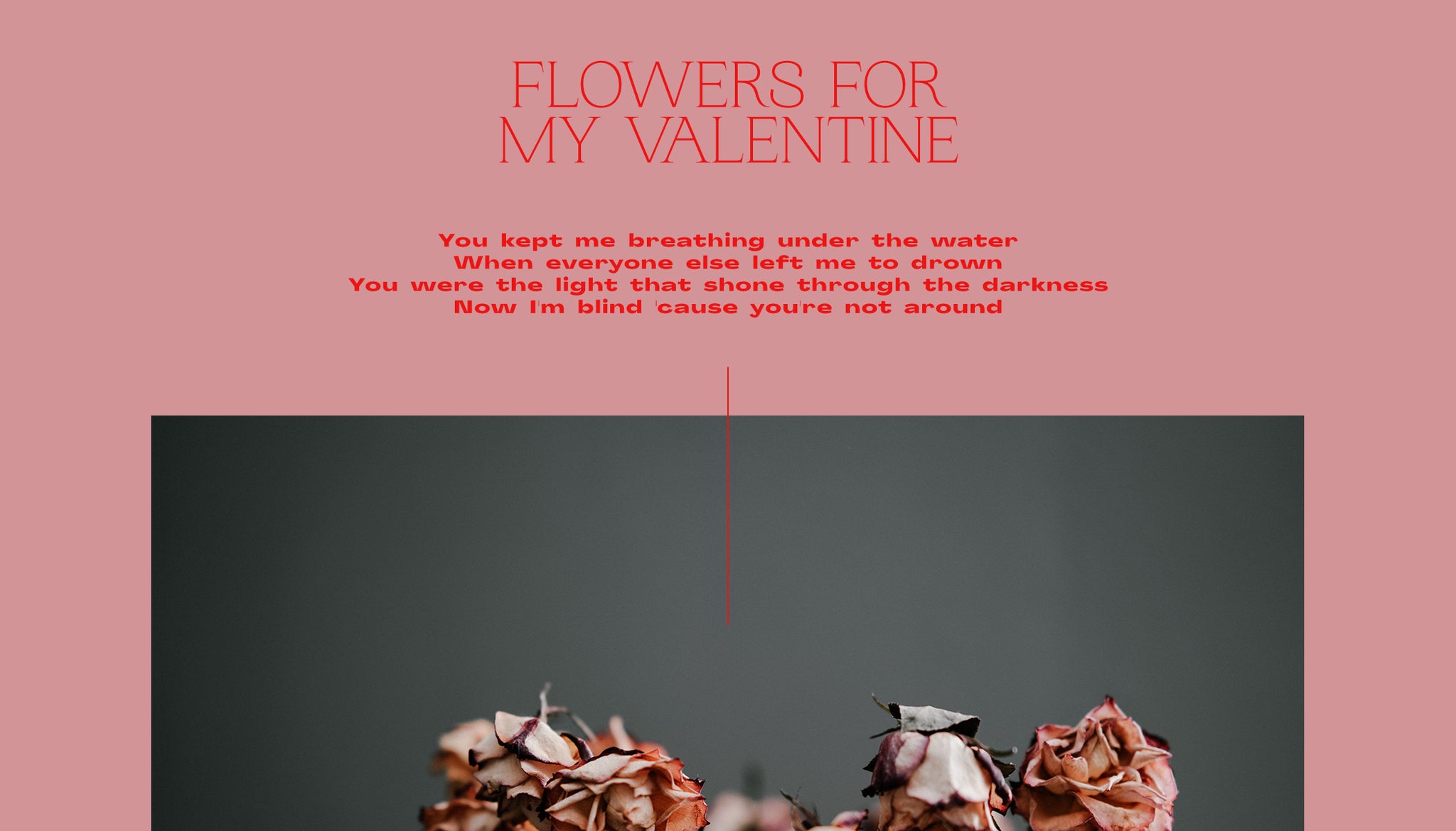
Formula Condensed paired with Times New Roman

Neue Montreal paired with Woodland

Here are just a few examples of possible pairing but there are a lot more possibility for you to discover. Just follow the basic guidelines and start exploring!
On a side [brutalist] note, since I'm a personal fan of the style. You can purposefully create weird and unequal pairings to create visual tension in a design which might work as well as a slick "by the book" pairing. You can read our article about brutalist types in brutalist designs to get a bit more insight on the matter.
Download our newest serif Woodland and our other sans serif to create new beautiful pairings and tag them on Instagram to get featured!


