PP Museum is a dialogue between past and present (and also a very nice typeface!)
Born from deep historical research and shaped through a thoughtful, collaborative process between designer Andrea Biggio and Pangram Pangram’s Mat and Francesca, the typeface blends legacy with modernity in a strikingly balanced way. What began with a fascination for Optima, a dive into Italian banknotes, and experiments with flares, ligatures, and swashes, evolved into something firmly contemporary—rich with references, but never weighed down by nostalgia.
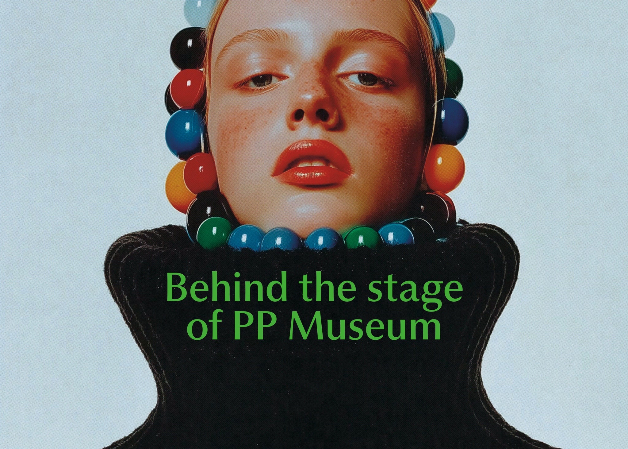
PP Museum reimagines archival details through a modern lens, pairing subtle decorative flourishes with a clean, versatile structure. From the gentle flaring in its lighter weights to the strong, harmonious rhythm in text, it’s a typeface designed with purpose. With nine carefully crafted weights, true italics, swashes, and expressive terminals, PP Museum is full of quiet surprises—each one adding to its depth and voice.
But before it starts telling other people’s stories, there’s one more to hear: the story of how it came to life. Over to Andrea and Mat.


Hey! How’s everything going? We’re excited about PP Museum’s release!
Andrea: Ciao! All good. We’re super excited too! Can’t wait to see it in use, fingers crossed people will actually use it haha.
Let’s start with the basics! What inspired you to design PP Museum , and what were the first steps of the creative process?
Mat: A lot of things, actually! I’d been wanting to add an elegant sans with a humanist touch to the library for a while—something super versatile, a workhorse, but with an elevated sense of style. I was also really inspired by the vibe Optima brings to a design when used in a certain way. Andrea researched some older versions of Optima, notably those found on old banknotes, which became a great source of inspiration. He then took it to a completely new level.


PP Museum’s design feels both modern and timeless. How did you balance these two aspects in your work?
Andrea: I didn’t really approach it with the idea of making something “timeless” in mind. That feeling probably came out naturally as the design evolved, at least from my perspective. I was more focused on finding the right tone, something that felt refined but still approachable. By combining different references and slowly adjusting shapes, proportions, and rhythm, the balance started to take shape on its own. It was less about chasing a specific aesthetic and more about responding to what was working visually as things came together.


As you’ve written before, PP Museum is teeeeechnicalllly a sans serif, but at what point do you make that distinction?
Andrea: From the very beginning, we ran a bunch of tests to figure out how wide or subtle the flares should be, not just on the sides of the strokes, but also above and below. Since we’re dealing with flares rather than actual serifs, Museum can’t really be classified as a serif typeface. It doesn’t have proper, defined serifs, it’s more about hinting at that direction without fully committing.
The idea was to keep it decorative in a controlled way, adding just enough personality without losing the overall sans structure. That balance is what makes it feel a bit in-between, technically a sans, but definitely with some serif energy in the details.
What was your approach to creating the distinct personality of PP Museum, especially when it comes to the letterforms and the use of contrast? Similarly, how did you decide on the proportions of PP Museum? Did you face any challenges in achieving the right balance between readability and a sense of flair/flourish?
Andrea: A lot of the typeface’s personality came out of the ongoing back-and-forth with Francesca and Mat. They gave super consistent, thoughtful feedback and helped shape a clear direction right from the start. Without that input, the design probably would’ve gone in a totally different direction
When you’re dealing with proportions, features, and details, it’s only natural for different opinions to come up, especially around things like contrast or stylistic touches. Those conversations were key to shaping the final result.
In the end, decisions about contrast and structure were guided by a mix of early visual references, testing, and lots of fine-tuning. Striking the right balance between readability and style is always tricky, but after lots of back-and-forth, we landed on a contrast and rhythm that really felt right for Museum.


The typeface has a large set of alternate characters and ligatures. How important was having these in the typeface to you?
Andrea: The ligatures came from some early research into Optima, which was one of our main references in terms of overall feel. While digging deeper, I came across a few early sketches by Hermann Zapf on old Italian banknotes. That discovery inspired me to extract some ligatures and alternates that could work as subtle legacy features in the typeface. From there, the idea expanded, I began developing a series of swash and terminal forms as well, building on that same historical reference with a more expressive twist.
Was there a particular design element, like a letterform or feature, that you found especially challenging to perfect?
Andrea: I wouldn’t say there was one specific letter or feature that was especially tricky. The real challenge was keeping everything coherent as the design evolved. It’s more about fine-tuning the overall flow than obsessing over a single detail.
We know that every typeface is a journey of some kind. What was the most surprising or ‘aha’ moment during the design of PP Museum ?
Mat: For me, it was when Andrea had completed the basic set and presented it to Francesca and me in different contexts—big and small text. The flow and texture were just amazing, the letterforms clicked, and the vibe felt spot-on. That’s when I knew we had something special!
Andrea: One of the most surprising moments was probably when I started testing the typeface in real layouts, seeing it used in blocks of text, headlines, and different sizes. Suddenly, the rhythm and texture we’d been working on just clicked. It felt like, “Okay, this is actually working.” It wasn’t one big breakthrough, but more a gradual build-up that led to that moment. Also, seeing Francesca’s and Mat’s reactions at certain stages helped confirm we were on the right track.


How did you decide on the name? Did it tie into the initial design concept, or was it something that came later in the process?
Mat: The naming process was definitely a journey. I usually try to come up with a name that reinforces the concept of the font and vice versa—where reading the name gives you an idea of the typeface, and seeing the type helps you understand the name. I think this plays a big role in a typeface’s success. Initially, after some research, I landed on “Tome” to tie into the book and printing theme for the campaign. But after discovering it was already used for another typeface, I switched to “Toma”—which I wasn’t fully convinced by, as it didn’t feel as connected to the concept
So, I kept my mind open while we continued designing, and then it just clicked—Museum! It was even better than “Tome,” both in meaning and how it looked as a word. It expanded the concept beyond just books. I’m truly, really happy with this name—it makes the typeface feel complete!


Are there any design features or details in PP Museum that you’re particularly proud of, or that you think will surprise users once they start working with it?
Mat: I’m sure Andrea has his own favorites, but for me, the standout feature is the texture—how the letters come together. Try it in small or medium text, and you’ll see it right away.
I also love sans serifs with true italics—you don’t see those too often. And then there are the details: the “R,” “O,” “Ss,” and “a” with their subtle flaring in the lighter weights, the “G,” the straight ear of the “g”… honestly, the list is long! Haha!
Andrea: Like Mat says, the texture and rhythm of the typeface are probably its most important features. On top of that, there’s a bunch of swash or “final” letters that could be used in a fun way — That’s not something you usually find in a sans.
How do you see PP Museum being used in the future? Are there any particular applications or projects you think it would shine in?
Andrea: I don’t know why, but I’d like to see it used for something like the Olympics or a big sports event someday haha. Might be aiming too high! I think the idea stuck with me after Mat once sent me a screenshot with the word “OLYMPIC” set in Museum, and it just looked good.
More realistically, I could totally see it in art books, album covers, or even in a museum context, makes sense, right?


Finally, if you could use PP Museum in one dream project, what would it be and why?
Andrea: Like I said earlier, it’d probably be something like the Olympics, xD haha.
I guess I’m a bit of an atypical type designer. I really enjoy drawing typefaces, but it still feels a bit surreal to see them out in the world. So to be honest, I don’t really have any specific dream projects where I’d want to see my type used.
With Museum, for example, the design process itself was the part I was most invested in. Once it’s released, I almost detach from it a little. Of course, it’s exciting to see it in use, but for me, the real satisfaction comes from the making, not necessarily from imagining it in a particular context.
PP Museum is free to try TODAY, with licences starting at only $40.


