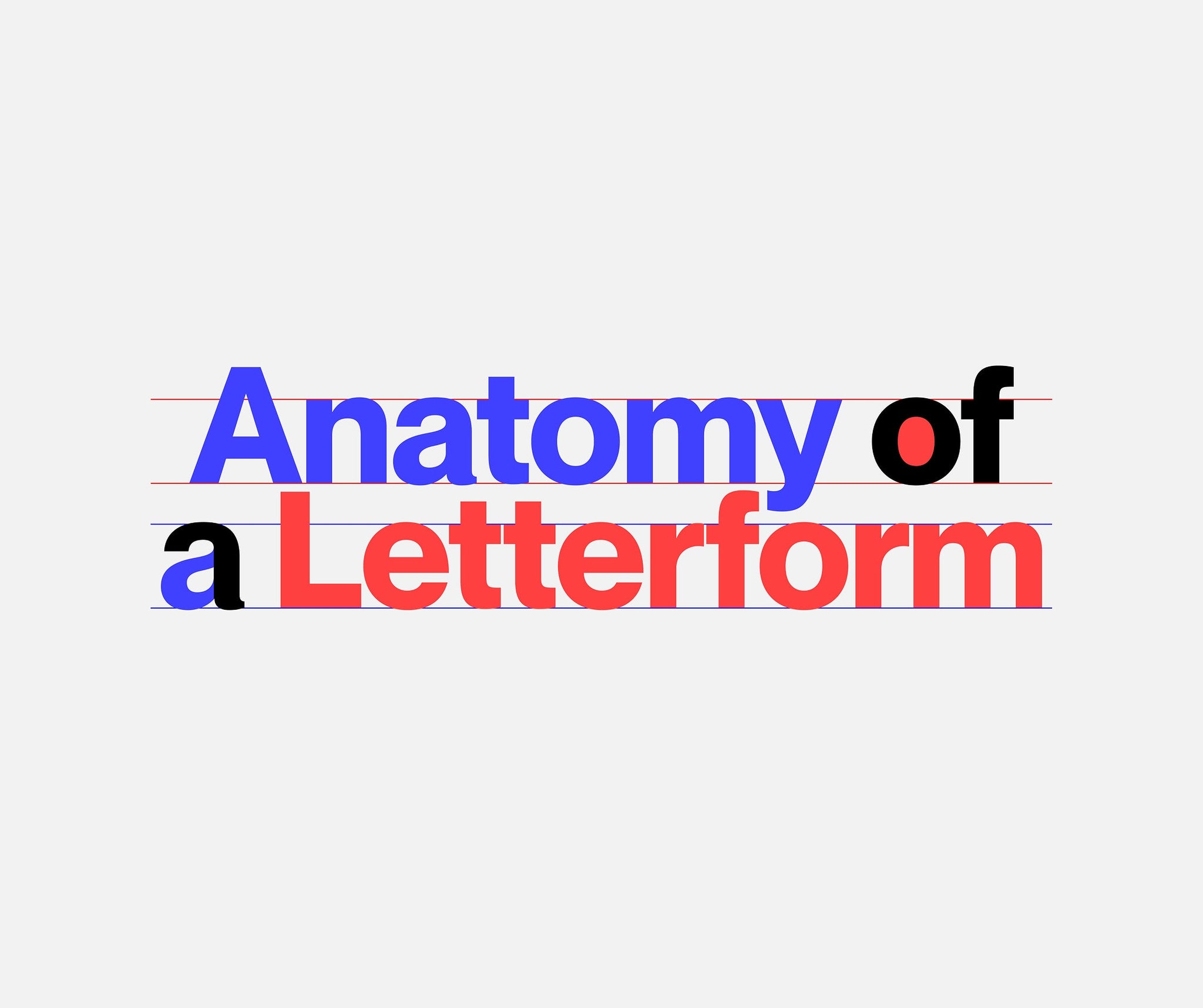
Typography, for all its concepts, expectations, implications, connotations and artistry, is, ultimately, a system. Just like a body has bones and muscles, every letterform has parts that give it shape, rhythm, and character.
If you're a graphic designer working with type, or a type designer drawing your own, learning the names of these parts helps you communicate clearly, better analyse your work and others, and design with precision. Everything comes down to a foundational understanding of the anatomy of the letterform and its essential component. So let’s help you with that.
Baseline and Vertical Proportions
Baseline: The baseline is the invisible line on which most letters sit. It's the anchor for horizontal alignment in text. Letters like “x” or “h” rest directly on this line, while others (like “j” or “y”) dip below it with their descenders.
x-Height: This is the height of the lowercase “x” in a given typeface and serves as a reference for the main body of all lowercase letters that don’t have ascenders or descenders. A large x-height makes a typeface feel more readable at small sizes, while a smaller x-height can give a typeface a more refined, elegant feel.
Cap Height: The cap height is the distance from the baseline to the top of a flat capital letter like “H” or “T.” It often aligns visually with the height of ascenders in lowercase letters, helping uppercase and lowercase characters coexist harmoniously.


Ascenders and Descenders
Ascenders: An ascender is the vertical stroke of a lowercase letter that extends above the x-height – seen in letters like “b,” “d,” “h,” and “k.” Ascenders help provide visual rhythm and differentiation between letterforms.
Descenders: A descender is the part of a letter that falls below the baseline, such as the lower strokes of “g,” “j,” “p,” “q,” and “y.” The length and shape of descenders contribute significantly to a typeface’s texture and readability.


Strokes and Structure
Stem: The stem is the primary vertical (or occasionally diagonal) stroke of a letterform. It’s the backbone of letters like “L,” “H,” or “P.” The thickness of the stem often determines the overall weight of the typeface.
Crossbar: A crossbar is a horizontal stroke that connects two stems (like in “A” or “H”) or crosses a stem (like in “e” or “f”).
Arm: An arm is a horizontal or upward-sloping stroke that is free on one end, like the top strokes of “T” or the diagonals of “Y.” Arms can dramatically affect the balance and direction of a letter.
Leg: A leg is the downward-sloping stroke that also ends freely, typically at the bottom right of a character, such as the diagonal stroke in “K” or the outstretched stroke of “R.”


Curves and Counters
Bowl: The bowl is the curved, enclosed part of a letterform. For example, in “b,” “d,” “o,” or “p.” Bowls can be perfectly circular or more organic in shape, depending on the style of the typeface.
Counter: Counters are the spaces inside letters. A closed counter is fully enclosed (as in “o” or “b”), while an open counter is partially open (as in “c” or “e”). Counter size greatly affects legibility – larger counters typically read more easily at small sizes.
Shoulder: A shoulder is a curved stroke that transitions from a stem, like the arching part of “n” or “h.” Shoulders often give a typeface its particular flow and personality.
Spine:The spine is the central curved stroke of the letter “S.” It’s a notoriously tricky shape to balance – too rigid, and the letter feels stiff; too loose, and it looks like it’s collapsing.


Details
Serif: Serifs are small projecting strokes at the ends of a letter’s main strokes. They come in many styles – bracketed, slab, wedge – and can dramatically change the tone of a typeface.
Terminal: A terminal is the end of a stroke that doesn’t have a serif. It can be rounded, angled, or flared, and its treatment helps define the overall character of a typeface.
Tail: A tail is a decorative stroke that extends from a letterform – usually in a flourish. You’ll find tails in letters like “Q,” “R,” and “y.” In some typefaces, tails are modest; in others, they’re wildly expressive.
Ear: The ear is a small stroke that projects from the top of a lowercase “g” (in its double-storey form). Some ears are subtle hooks, others are prominent swashes – either way, they add personality and can help distinguish the typeface.
Tittle: Yes, there’s a name for the dot above the “i” and “j”! It’s called the tittle. It may be tiny, but its shape and placement can influence legibility and visual tone. Some are round, others square or even diamond-shaped.
-------
Understanding letterform anatomy is a useful framework for anyone working with text. In knwoing how letters are constructed you can choose typefaces more intentionally, better explain design decisions clearly (to both clients and collaborators), and you can spot (and fix) legibility or spacing issues. Once you know what a shoulder, bowl, or descender is, you’ll never unsee them. You’ll start to notice the subtle differences that give typefaces their voices – whether that’s the quirky ear on a “g” or the sharp, decisive leg of an “R.”


Go test your new found knowledge with one of our free-to-try fonts.


