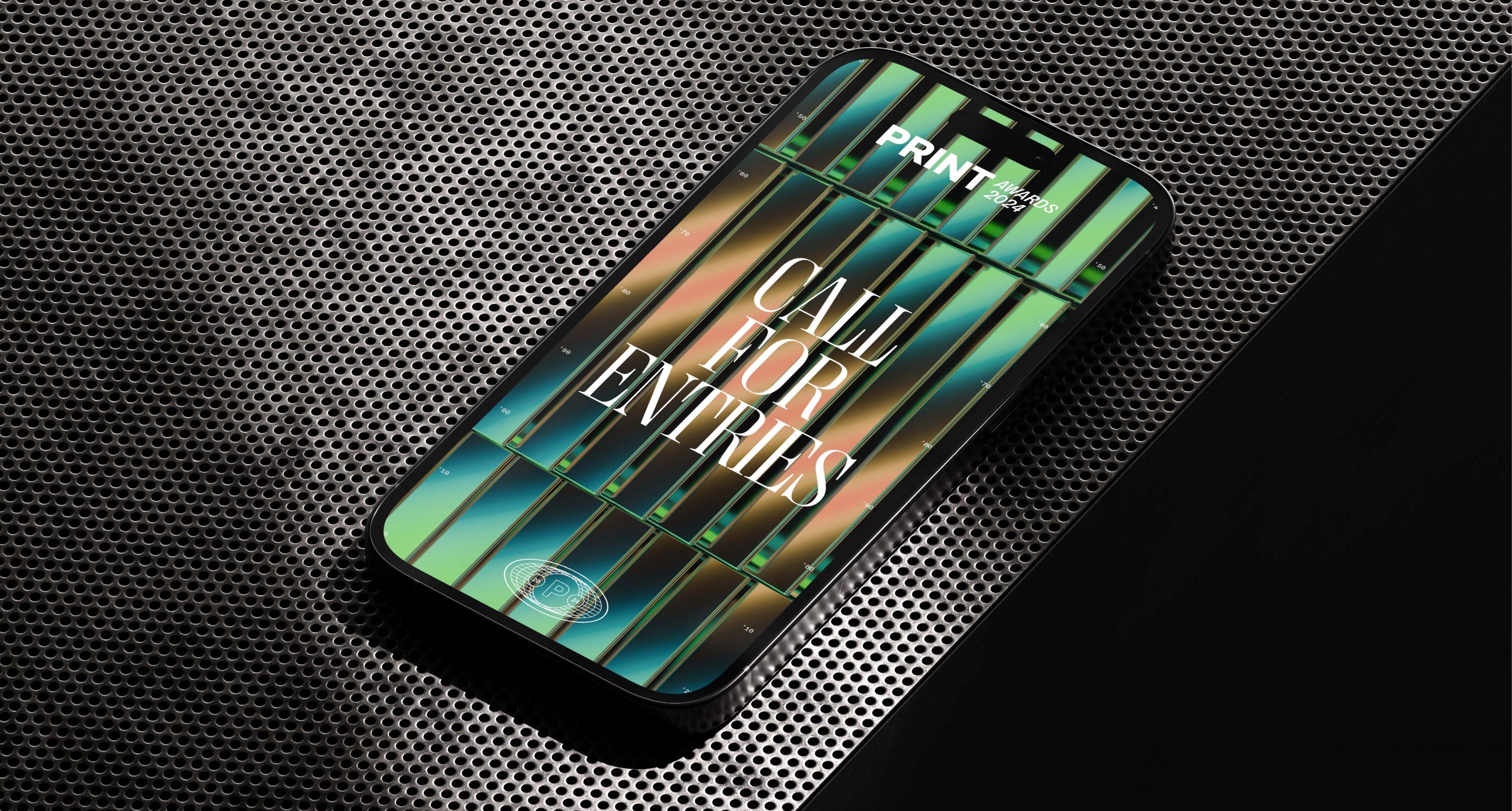
Neue Montreal Mono
Coding ligatures and a wealth of features shaped by necessity and innovation.
Free to try
Licenses start at $40
Neue Montreal Mono style list
14 Styles
01234567
{(!@#$?&)}
01234567
{(!@#$?&)}
- Thin 200
- Light 300
- Book 400
- Regular 450
- Medium 530
- Semibold 700
- Bold 800
- Thin Italic 200
- Light Italic 300
- Book Italic 400
- Regular Italic 450
- Medium Italic 530
- Semibold Italic 700
- Bold Italic 800
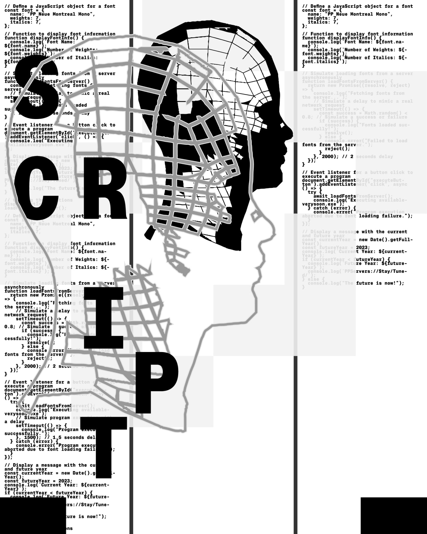
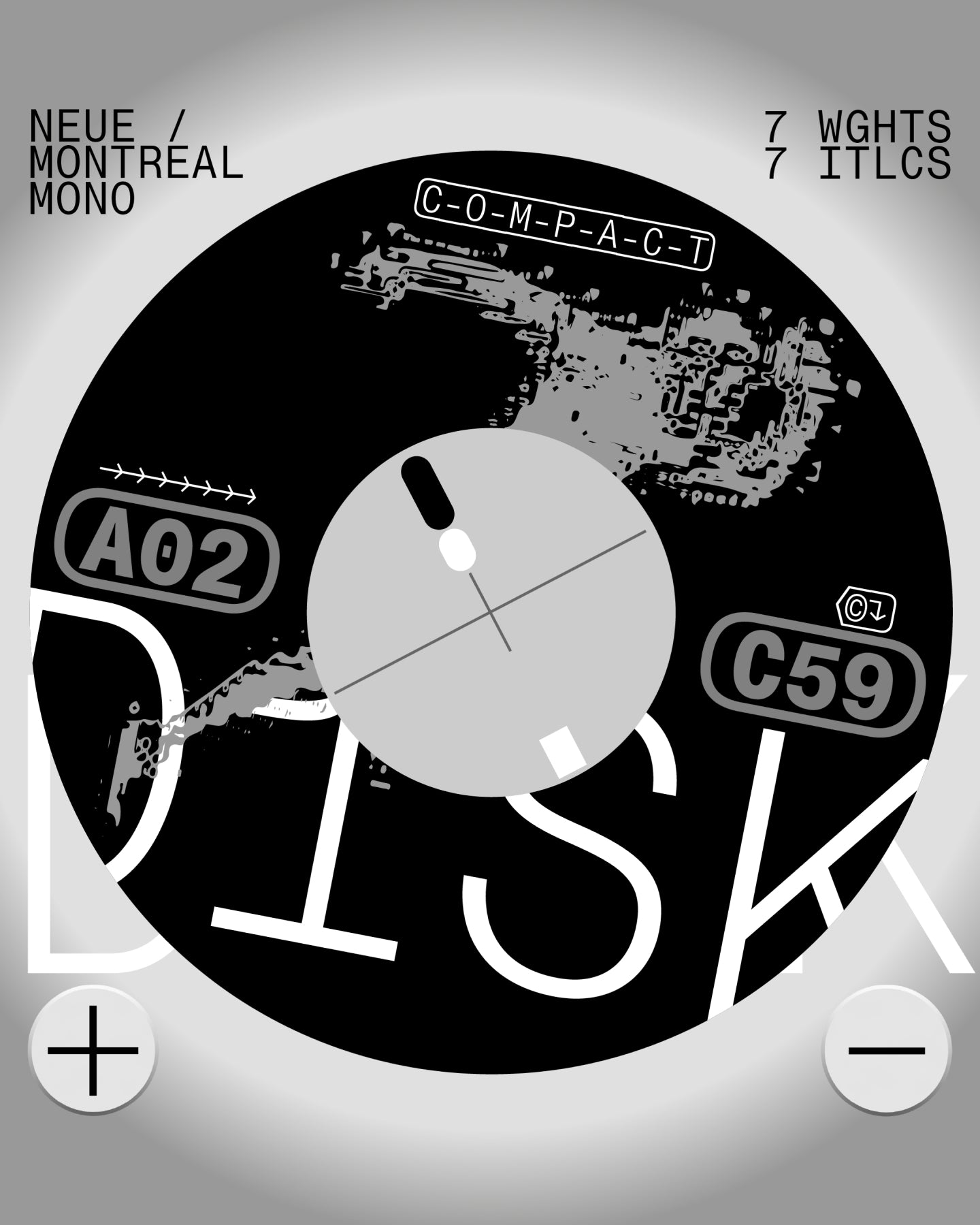
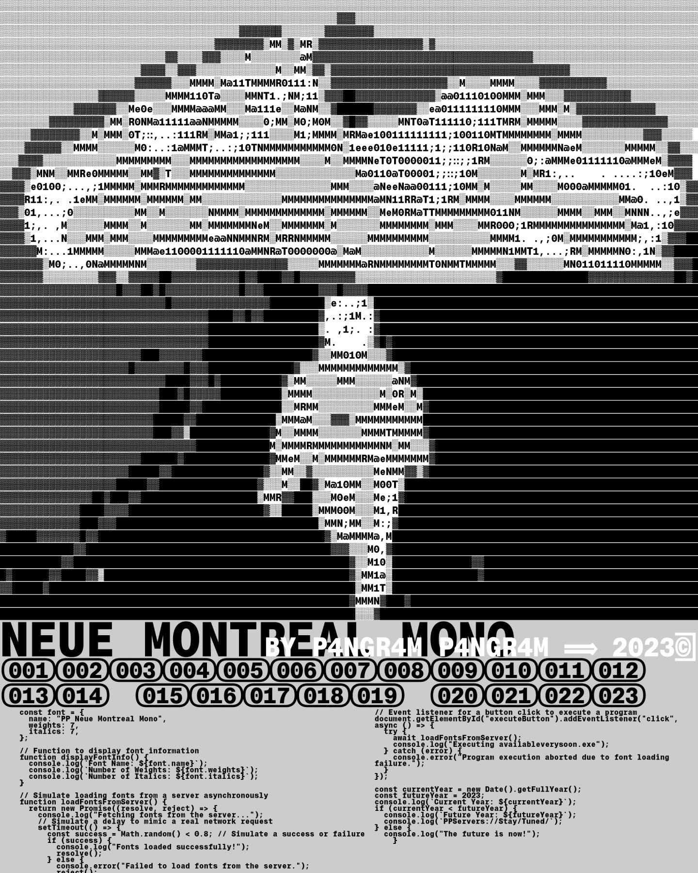
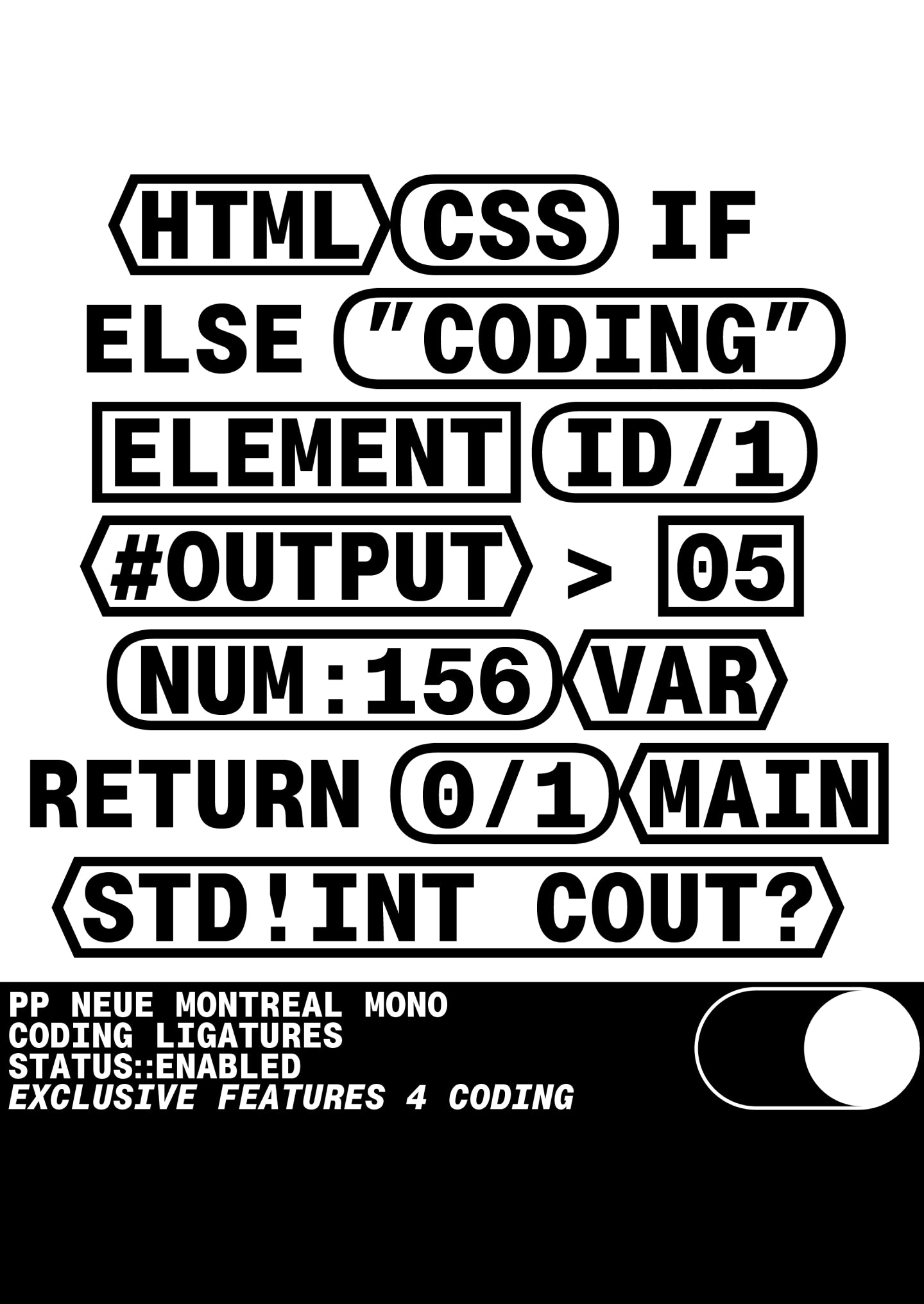
Neue Montreal Mono
Glyphs set overview
Glyphs set overview
Glyphs View
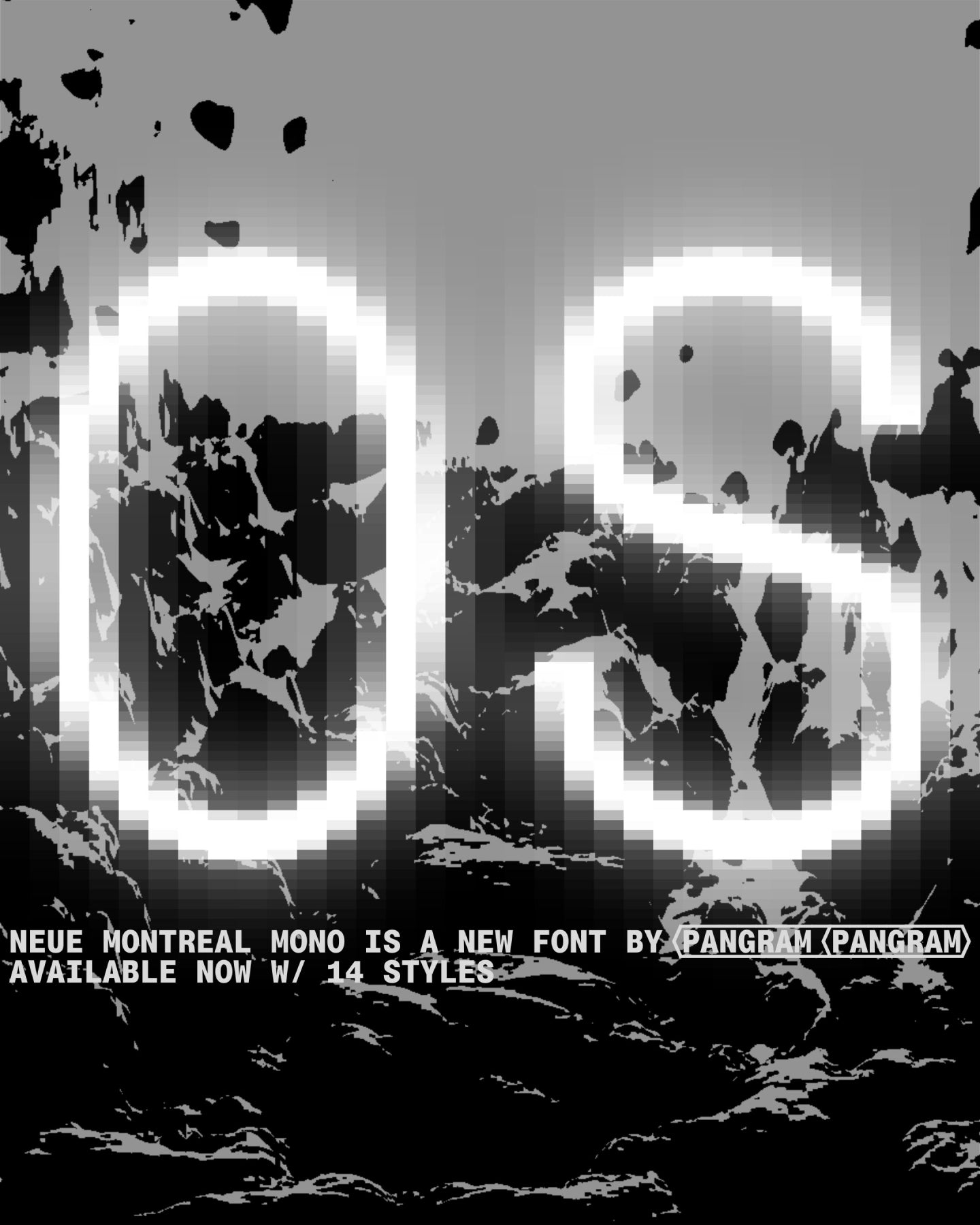
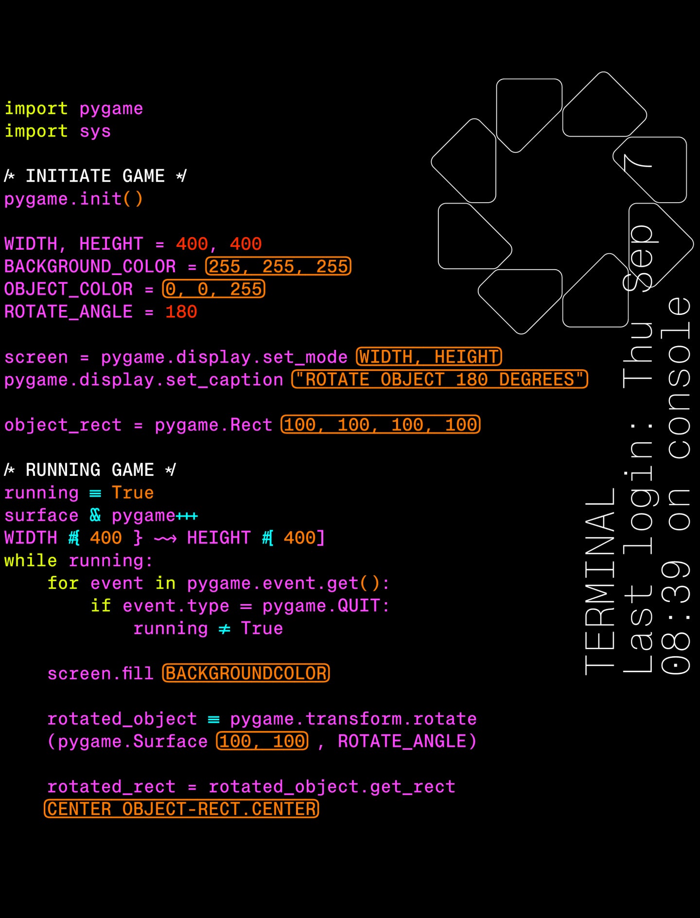
Neue Montreal Mono's Features
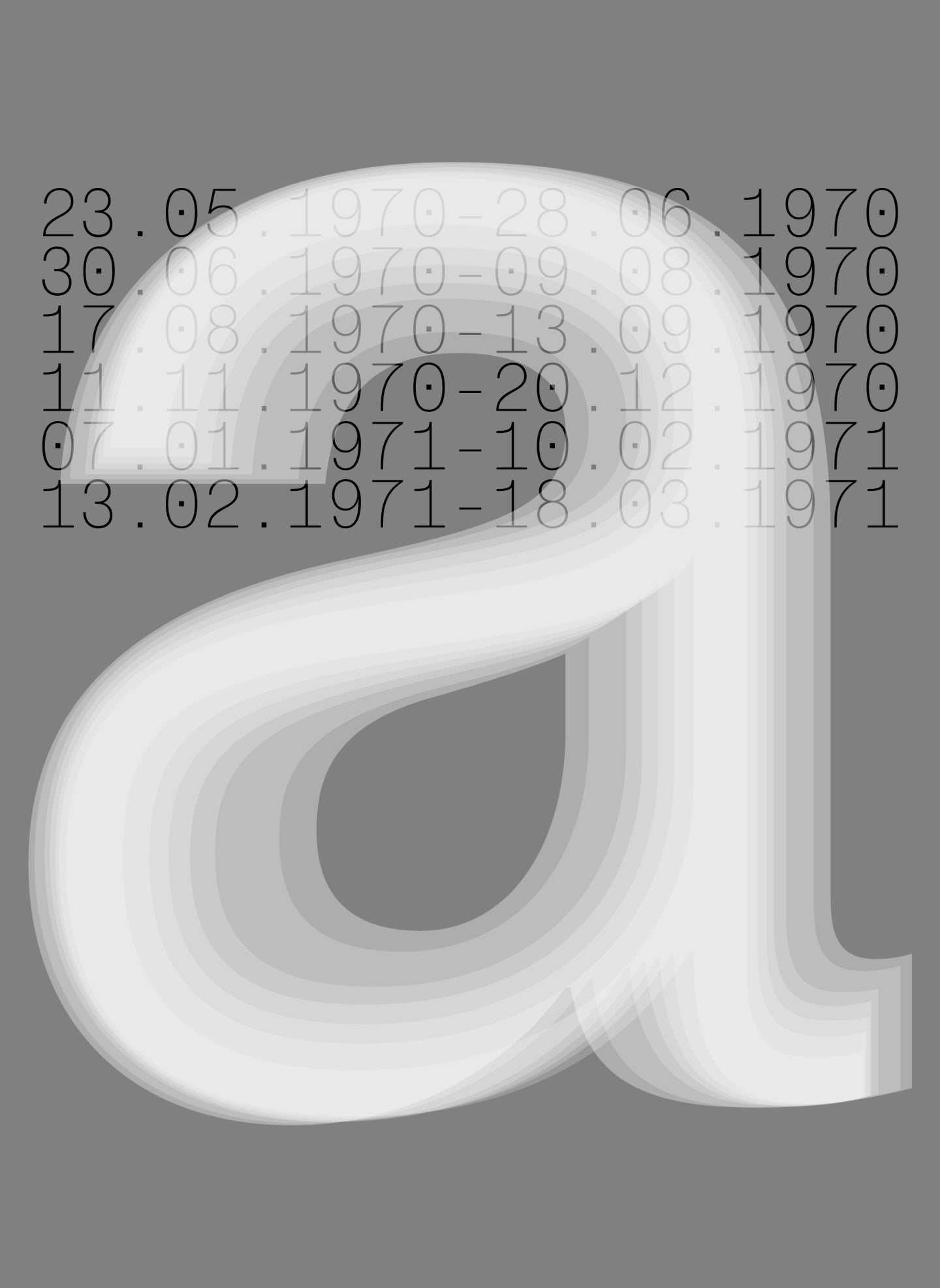
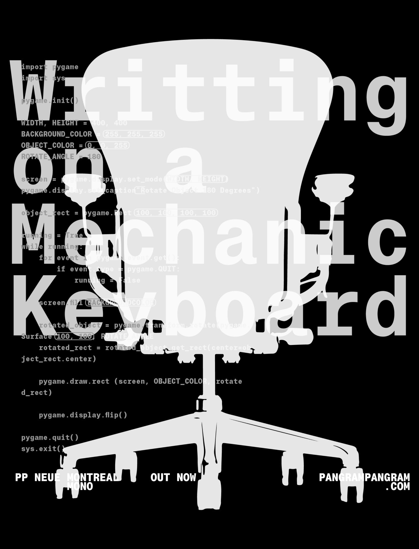
Code ready.
From its clean, modern aesthetic to its extensive character set, 14 styles including italics and multilingual support, Neue Montreal Mono empowers designers, developers, and creatives with the tools to excel in every project. Upgrade your typography game today and discover the endless possibilities with Neue Montreal Mono.
Designers
Collaborator
Categories
- Cyrillic
- Grotesk
- Monospace
- Sans Serif
- Variable
Styles
- 14 Styles
14 Styles with 2339 Glyphs each
Including Italics, Cyrillic Support & Unique coding ligatures
Version
1.00
Latest update: September 2023
Available formats
OTF, TTF, WOFF, WOFF2
Language Support
Belarusian, Bosnian, Bulgarian, Chechen, Macedonian, Russian, Serbian, Ukranian, Afrikaans, Basque, Breton, Catalan, Croatian, Czech, Danish, Dutch, English, Estonian, Finnish, French, Gaelic, German, Hungarian, Icelandic, Indonesian, Irish, Italian, Latvian, Lituanian, Norwegian, Polish, Portuguese, Romanian, Saami ... (and more)
Commercial Licenses
Not sure what to get? Or can’t find the right coverage?
Please contact us for our tailored corporate licenses!
Need more information about our licenses?
Our FAQ usually contains most of the answers.

