PP Museum has already made a splash in 2025, and for good reason. With 18 Styles to its name, the meticulously (and masterfully) crafted humanist sans-serif, from designers Andrea Biggio, Mat Desjardins and Francesca Bolognini, embodies the perfect blend of charm, elegance and versatility.
Drawing inspiration from the sketches of Optima found on aged banknotes, PP Museum reinterprets this typographic icon and, indeed, its classic aesthetic with forward-thinking sensibility, practically enhancing readability to cement it as a profoundly contemporary typeface.
Its subtle terminal flares and tapered diagonals distill each letterform with a sense of dynamism and movement, lending a modern edge to its timeless character. With nine meticulously engineered weights, each with true italics that feature swashes and decorative terminals, PP Museum invites a sense of exploration, especially in relationship with other typefaces. With such a distinctive charm, it could be overwhelming to consider what fonts to pair PP Museum with, but rest easy, we’ve got some ideas. Here are some typefaces – serif and sans serif alike – that wonderfully complement PP Museum, in both supporting and hero roles.
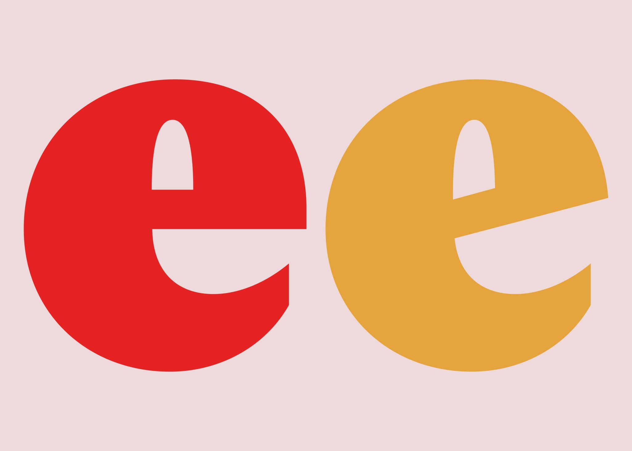
Museum X Museum
It’s a shoe in! PP Museum, with such a variety of weights and alternate characters, is a perfect pairing for itself. By combining different weights and italics within the family, you can create neat contrast while maintaining a cohesive and refined look. The true italics – with their swashes and decorative terminals – add a playful touch to the typeface’s overall distinctive tone.


Museum X Right Grotesk
PP Right Grotesk is a versatile grotesque sans-serif typeface that balances neutrality with distinctive personality. Its smooth curves and moderate contrast make it suitable for both serious and playful spaces – especially when paired with PP Museum, Right Grotesk provides a harmonious contrast, enhancing readability while maintaining a cohesive design aesthetic.


Museum X Neue Montreal
An undisputed classic, PP Neue Montreal is a versatile grotesque font inspired by the design spirit of Montreal. Its modern and clean lines, whilst rooted in history, legacy and lineage, offer a distinctly contemporary feel, making it a perfect match for PP Museum's elegant structure. Together, they create a balanced and sophisticated typographic pair.


Museum X Fragment
PP Fragment is a powerful and versatile typeface that gracefully oscillates between elegant serifs and strong sans forms. Its distinct personality adds depth and character to both printed and digital applications. When paired with PP Museum, Fragment’s bold presence complements Museum’s refined, unencumbered elegance, resulting in a dynamic and engaging typographic pair.


Museum X Watch
A little sneak peak at what’s to come (keep an eye out on the PP Newsletter…) PP Watch is a modern, confidently wide, and effortlessly luxurious typeface born from the intricate world of horology. Its understated precision and timeless design make it an excellent companion to PP Museum, albeit a slightly unconventional one. The pairing of Watch’s mechanical structure with Museum’s naturally elegant form creates a sophisticated and harmonious font pairing that, depending on its application, can feel quite retro in tone.


Museum X Playground
PP Playground is a contemporary script that reimagines the classical Copperplate calligraphic style for the modern age, and does so with such an engaging, satisfying character. Already a fan-favourite, its expressive curves and playful design offer a striking contrast to the clean lines of PP Museum. Together, they create a dynamic and engaging typographic pairing that balances elegance, oddity and play.


