The brutalist trend touches many areas of the design world from architecture to pieces of furniture, materials, and color palettes, this style seems to have earned a permanent spot on the design trend list.
What is brutalism exactly?
You probably heard the term floating around in some design-centric conversations. It is defined as a style of architecture or art characterized by a deliberate plainness, crudity, or violence of imagery. The term was first applied to functionalist buildings of the 1950s and 1960s that made much use of steel and concrete in starkly massive blocks.
Cool, cool. So, how does it apply to graphic design?
Brutalism in graphic design is a great way to create visual tension in your designs. It's so raw and unpolished that it stands out well enough to grab the person's attention. It's a great option when designing artists websites portfolios or posters.
I've been doing a lot of research lately and have been noticing/following people that are full on delving into the matter. A lot of them are creating posters (most of them daily) to showcase brutalist designs in combination of graphics and typefaces.
Here are a few of the accounts I follow to get inspired when it comes to this design trend.
But ultimately how does this relate to type?
As you can see from the previous examples, fonts play a major role in brutalist designs. The busy-ness of those design most definitely require type to convey a message which is ultimately what design needs to do. Some of them are really edgy while some are more conventional while following a specific trend.
I recently came across the work of Jacob Wise — who just designed a couple of typefaces so far — You'll quickly notice how each of his fonts are more quirky and brutalist than the other yet really powerful and sophisticated. This is just one example of brutalist typeface we like but you can find a bunch on here.
The brutalist typefaces of Pangram Pangram
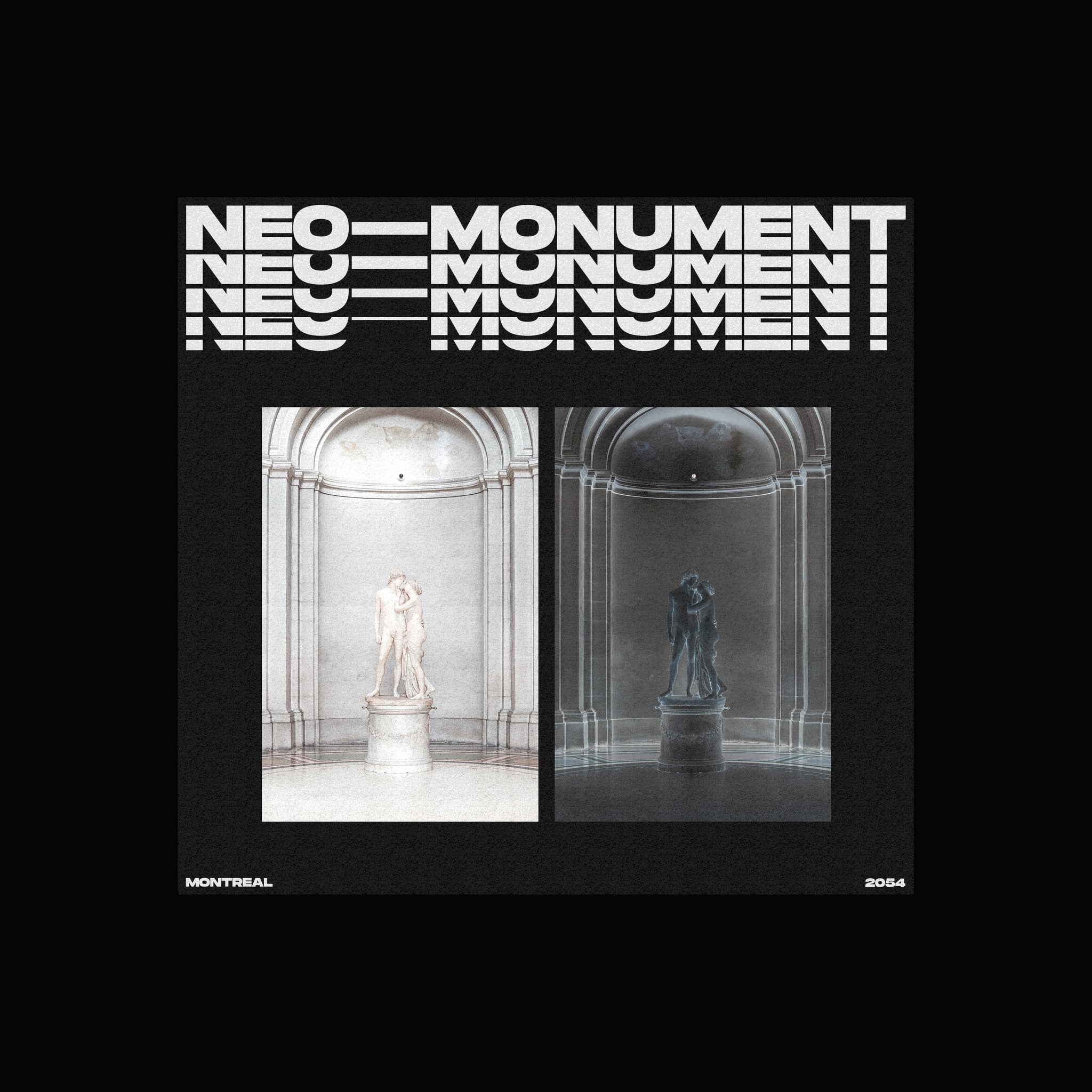
One of the inspiration behind our recent Monument Extended was those brutalist designs. A lot of them are using extended typefaces sometimes outlined, sometimes full. You can see it in action below in one of the designs we created for the launch.

Our latest release, Agrandir, by designer Alex Slobzheninov is another great brutalist option. With its 42 styles from narrow to oversized each with 7 weights you have plenty of options to choose from when creating your raw, eye catching designs, especially that Oversized Thin weight. Here, you have a good example of this font's flexibility.

Lastly, Gosha Sans should also be in your font set when creating your next brutalist poster or website. With its square corners and squared bowls it has this raw look to complement your designs very well as you can see below.

Thank you for reading!
If you want more brutalist inspiration make sure to go check our newly launched Fonts In Use page showcasing all the projects using our fonts or go follow our instagram.
Also, don't miss our free font pairing guide Vol. 2 for another good dose of inspiration. Don't forget that all our quality typefaces are free to try so don't hesitate to download and use them in your next designs.


