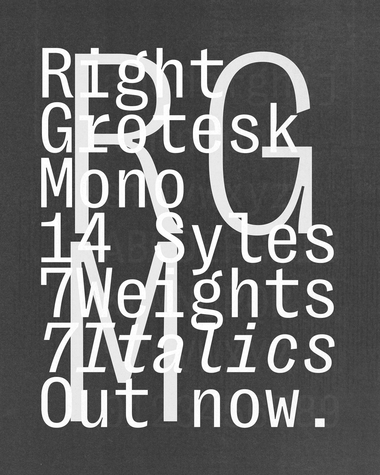
Right Grotesk Mono
Right Grotesk Mono keeps it tight, tidy, and just the right amount of weird.
Free to try
Licenses start at $40
Right Grotesk Mono style list
14 Styles
AaBbCc
01234567
{(!@#$?&)}
01234567
{(!@#$?&)}
AaBbCc
01234567
{(!@#$?&)}
01234567
{(!@#$?&)}
- Fine 100
- Light 200
- Regular 340
- Medium 470
- Bold 620
- Dark 770
- Black 900
- Fine Italic 100
- Light Italic 200
- Regular Italic 340
- Medium Italic 470
- Bold Italic 620
- Dark Italic 770
- Black Italic 900
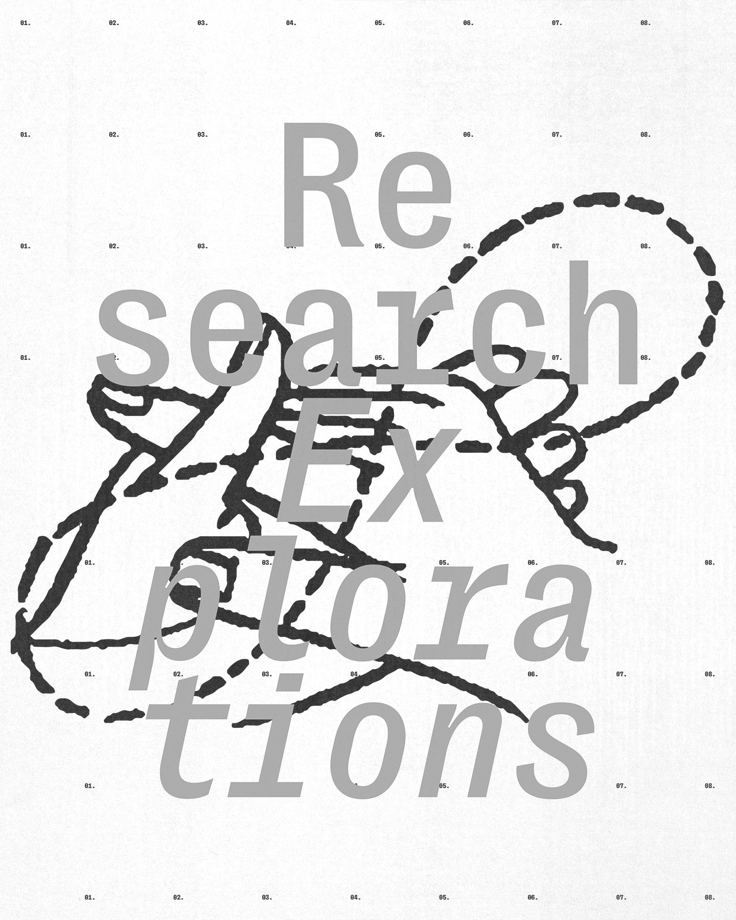
Mono, but not monotone.
Right Grotesk Mono keeps it tight, tidy, and just the right amount of weird.
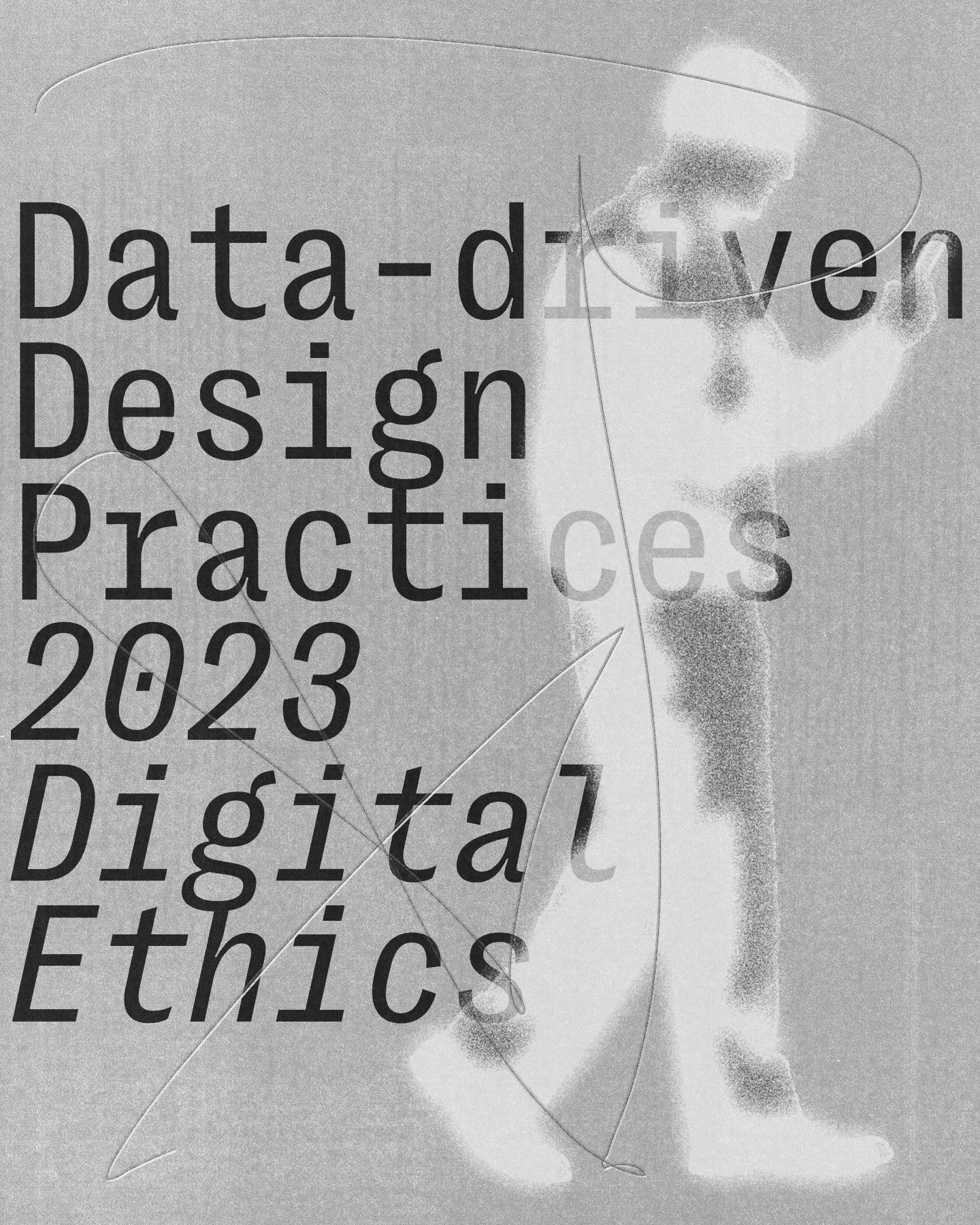
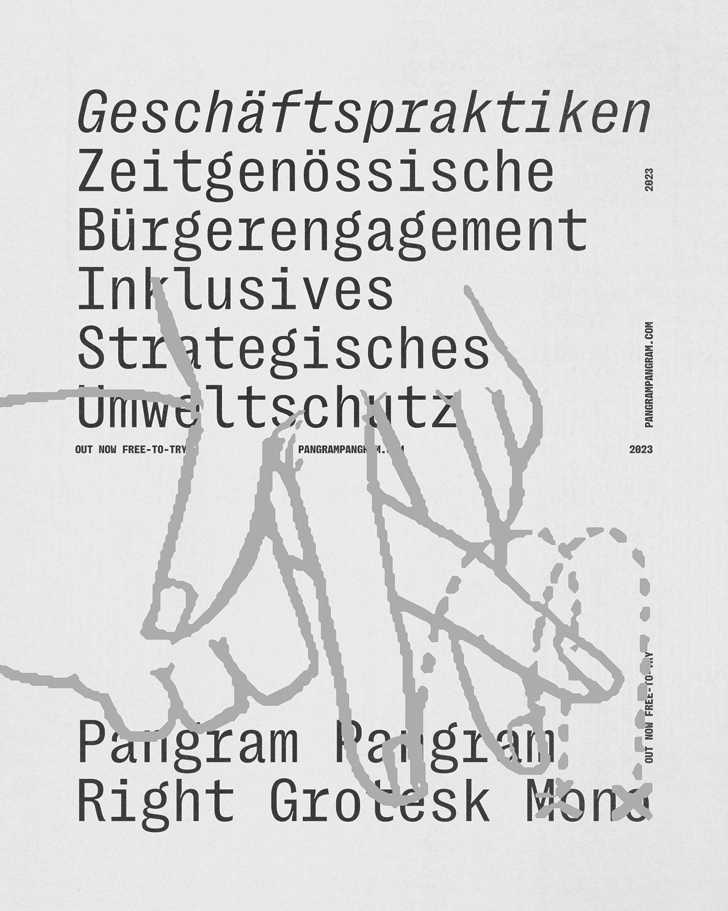
Right Grotesk Mono takes the strict, fixed-width skeleton of a monospaced typeface and breathes some actual life into it. Think of it as the organized one in the group project—but with a really good sense of humor. It follows the rules just enough to pass inspection, while still sneaking in a few well-placed winks and nudges.
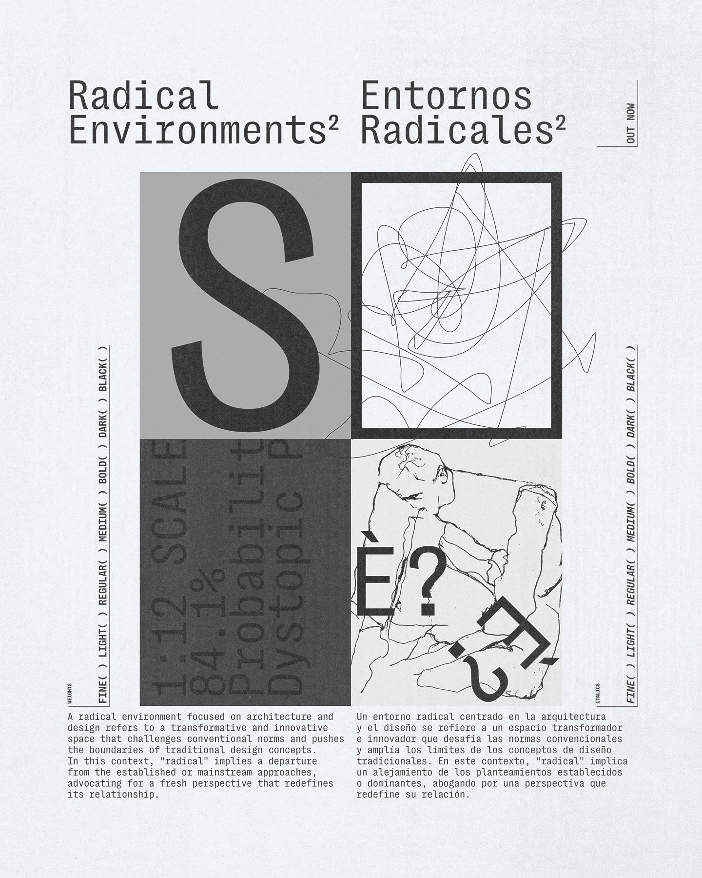
This isn’t your average cold, robotic mono. It’s got compact proportions, subtle quirks, and a friendly tech-forward vibe that makes it feel at home in everything from clean UI layouts to poster designs, edgy branding, or editorial systems. It’s got range—and it knows how to use it. Despite its rigid grid, Right Grotesk Mono manages to feel casual, readable, even approachable. In paragraphs, it flows effortlessly. In display sizes, the personality shines. It’s practical, yes—but it’s also playful. A little unexpected in all the right places. Font pairing? Easy. Right Grotesk Mono slots seamlessly into the Right superfamily. Mix it with Right Grotesk for a clean sans/sans combo, or with Right Serif Mono for a high-tech, high-style serif/sans mono pairing. Or get wild—there’s a whole type universe to explore here. Right Grotesk Mono is the typeface that proves structure doesn't have to be stiff. It’s organized, optimized, and just a little off-center. In the best way.
Right Grotesk Mono is variable
Right Grotesk Mono
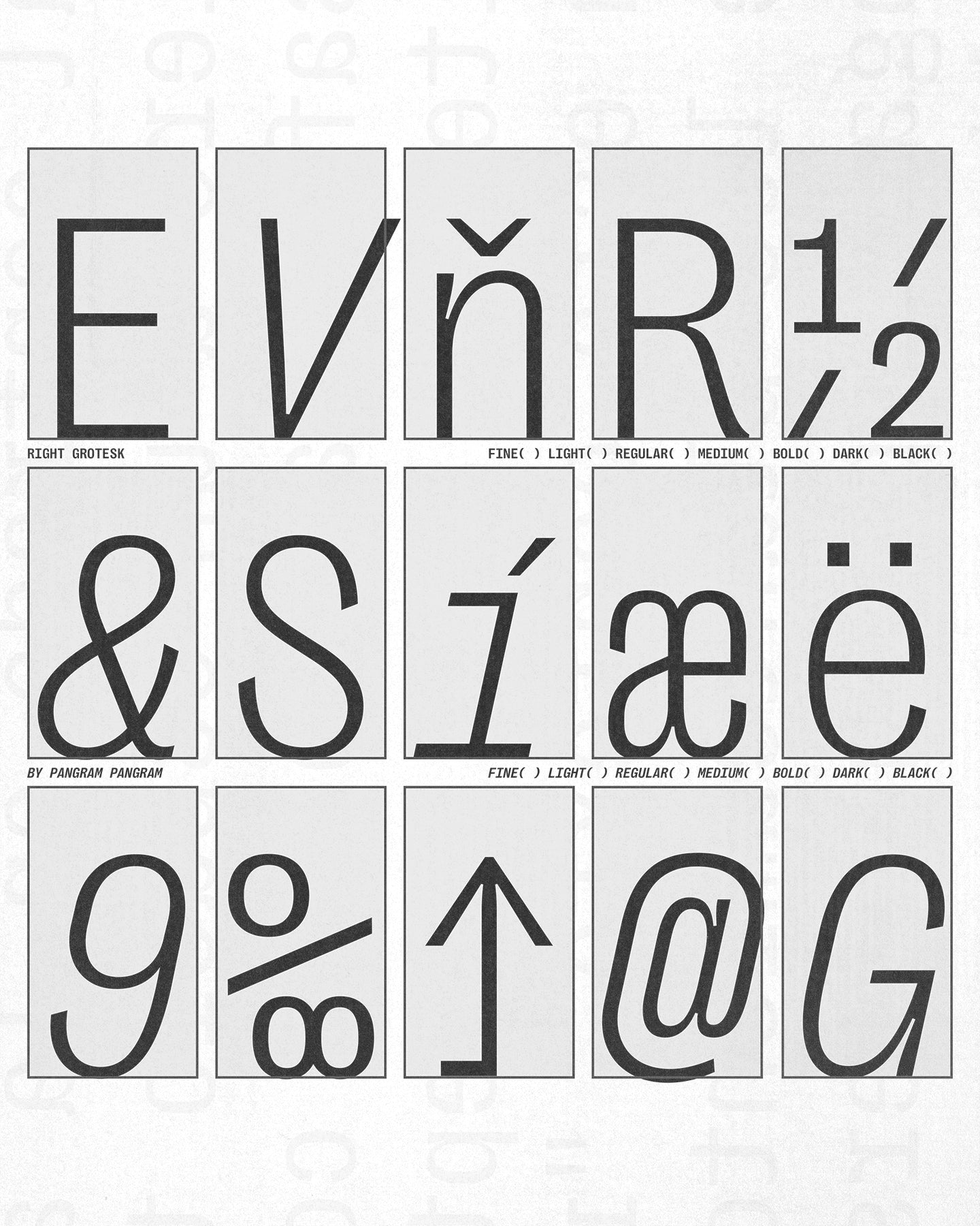
Glyphs set overview
Glyphs set overview
Glyphs View
Right Grotesk Mono's Features
Alternate a
a
→
a
Alternate g
g
→
g
Circled Numerals
0123
0123
Black Circled Numerals
4567
4567
Arrow
→
→
→
Case sensitive forms
{[(OH-@11:11!)]}
{[(OH-@11:11!)]}
Mono, but not monotone.
Right Grotesk Mono spices up the rigid structure of the monospaced genre with playful details and subtle twists. Its friendly technological look makes the font family a good fit for a wide range of projects from branding and posters to websites and books. Having fairly compact proportions, it reads comfortably in paragraphs and remains recognizable in large sizes.
When it comes to font pairing, the proportional Right Grotesk and the matching Right Serif Mono make perfect combos, but there are also plenty of other sans and serif counterparts from the extensive Right superfamily.
When it comes to font pairing, the proportional Right Grotesk and the matching Right Serif Mono make perfect combos, but there are also plenty of other sans and serif counterparts from the extensive Right superfamily.
Designer
Categories
- Grotesk
- Italics
- Monospace
- Sans Serif
- Variable
Styles
- 14 Styles
14 Styles with 508 Glyphs each
Including Italics
Version
1.00
Latest update: December 2023
Available formats
OTF, TTF, WOFF, WOFF2
Language Support
Afrikaans, Basque, Breton, Catalan, Croatian, Czech, Danish, Dutch, English, Estonian, Finnish, French, Gaelic, German, Hungarian, Icelandic, Indonesian, Irish, Italian, Latvian, Lituanian, Norwegian, Polish, Portuguese, Romanian, Saami, Serbian, Slovak, Slovenian, Spanish, Swahili, Swedish, Turkish, (and more)
Commercial Licenses
Love Right Grotesk Mono for your project? Grab our comprehensive licenses below.
Not sure what to get? Or can’t find the right coverage?
Please contact us for our tailored corporate licenses!
Need more information about our licenses?
Our FAQ usually contains most of the answers.
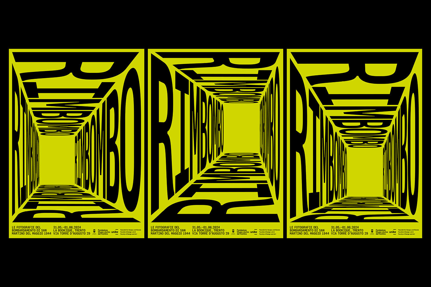
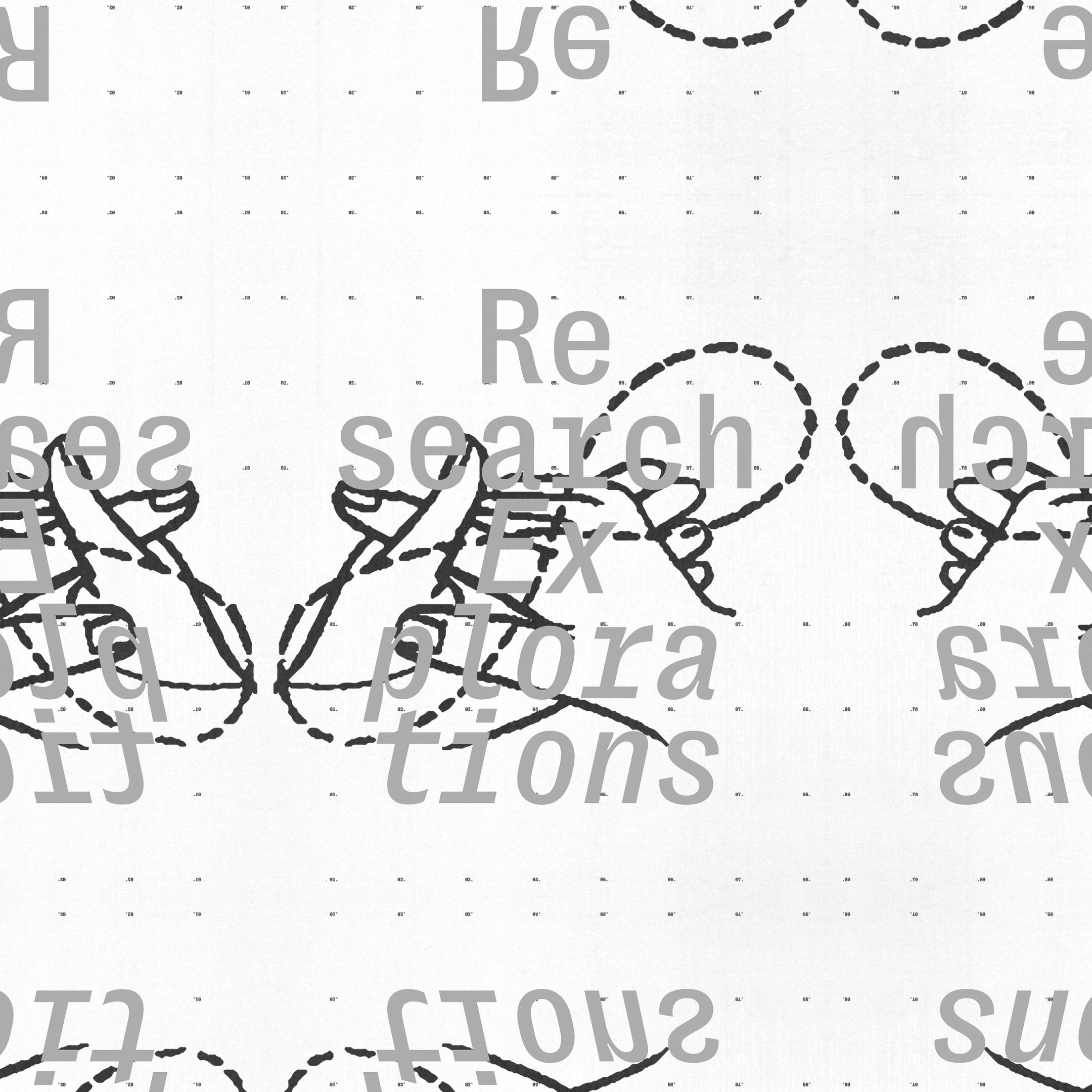
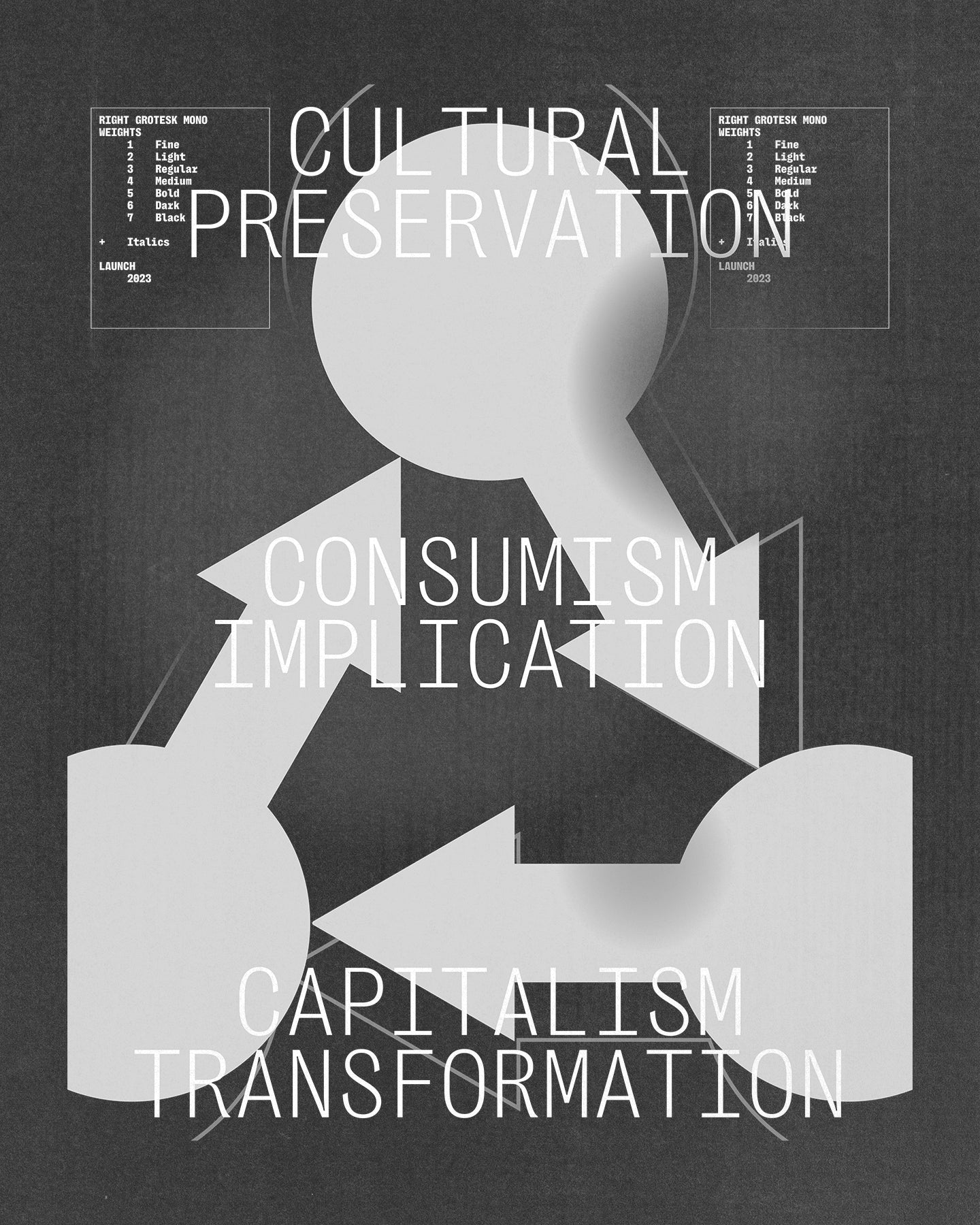
Right Grotesk Mono in use
View all using Right Grotesk Mono