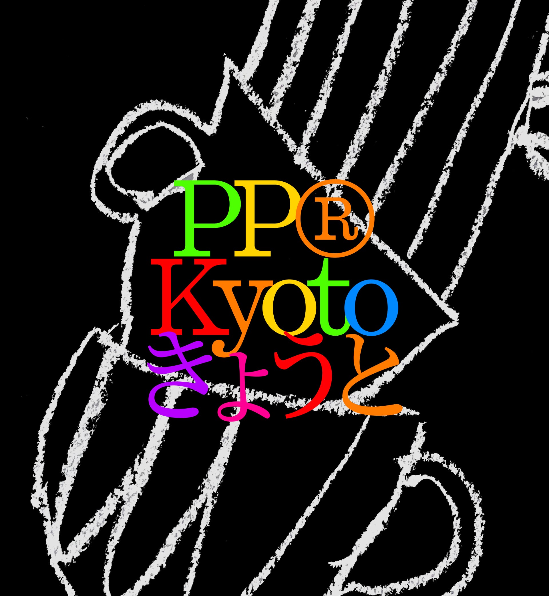
Kyoto
A Slab serif confidence with calligraphic sensitivity. Shaped by language, legacy, and time.
Free to try
Licenses start at $40
Kyoto style list
18 Styles
01234567
{(!@#$?&)}
01234567
{(!@#$?&)}
- Thin 100
- Extralight 200
- Light 300
- Regular 400
- Medium 500
- Semibold 600
- Bold 700
- Extrabold 800
- Heavy 900
- Thin Italic 100
- Extralight Italic 200
- Light Italic 300
- Regular Italic 400
- Medium Italic 500
- Semibold Italic 600
- Bold Italic 700
- Extrabold Italic 800
- Heavy Italic 900
Kyoto
with Italics
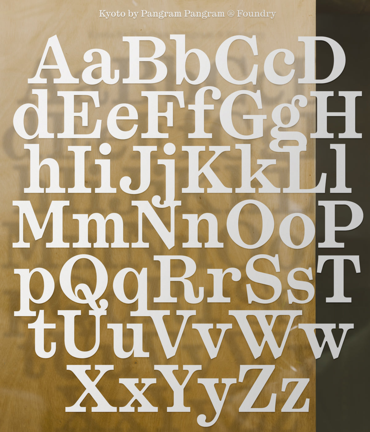
Glyphs set overview
Glyphs set overview
Glyphs View
Kyoto's Features
Bold slabs.
Soft teardrops.
Impact with grace.
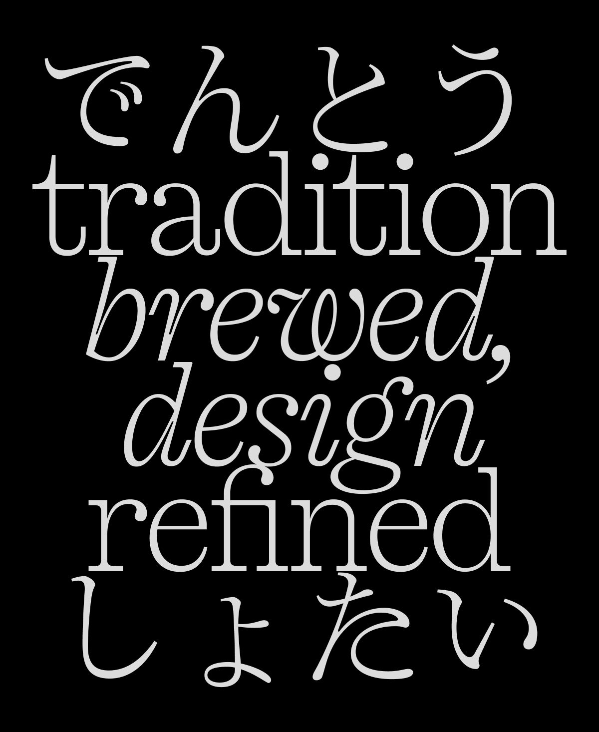
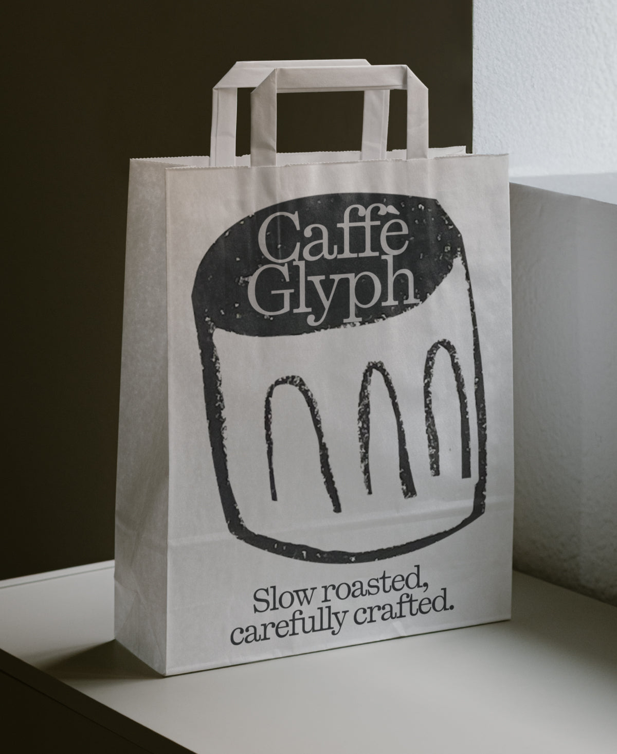
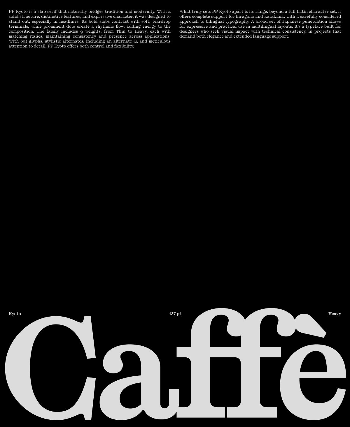
PP Kyoto is a slab serif that naturally bridges tradition and modernity. With a solid structure, distinctive features, and expressive character, it was designed to stand out, especially in headlines. Its bold slabs contrast with soft, teardrop terminals, while prominent dots create a rhythmic flow, adding energy to the composition.
The design remained on the shelf for years, slowly maturing into its current form. It all began as a study of Japanese writing systems, an exploration of how a slab serif could visually connect with the Japanese writing systems. The result is a unique typeface, shaped by trial, error, and persistence, now brought fully to life.
The family includes 9 weights, from Thin to Heavy, each with matching italics, maintaining consistency and presence across applications. What truly sets PP Kyoto apart is its range: beyond a full Latin character set, it offers complete support for hiragana and katakana, with a carefully considered approach to bilingual typography. A broad set of Japanese punctuation allows for expressive and practical use in multilingual layouts.
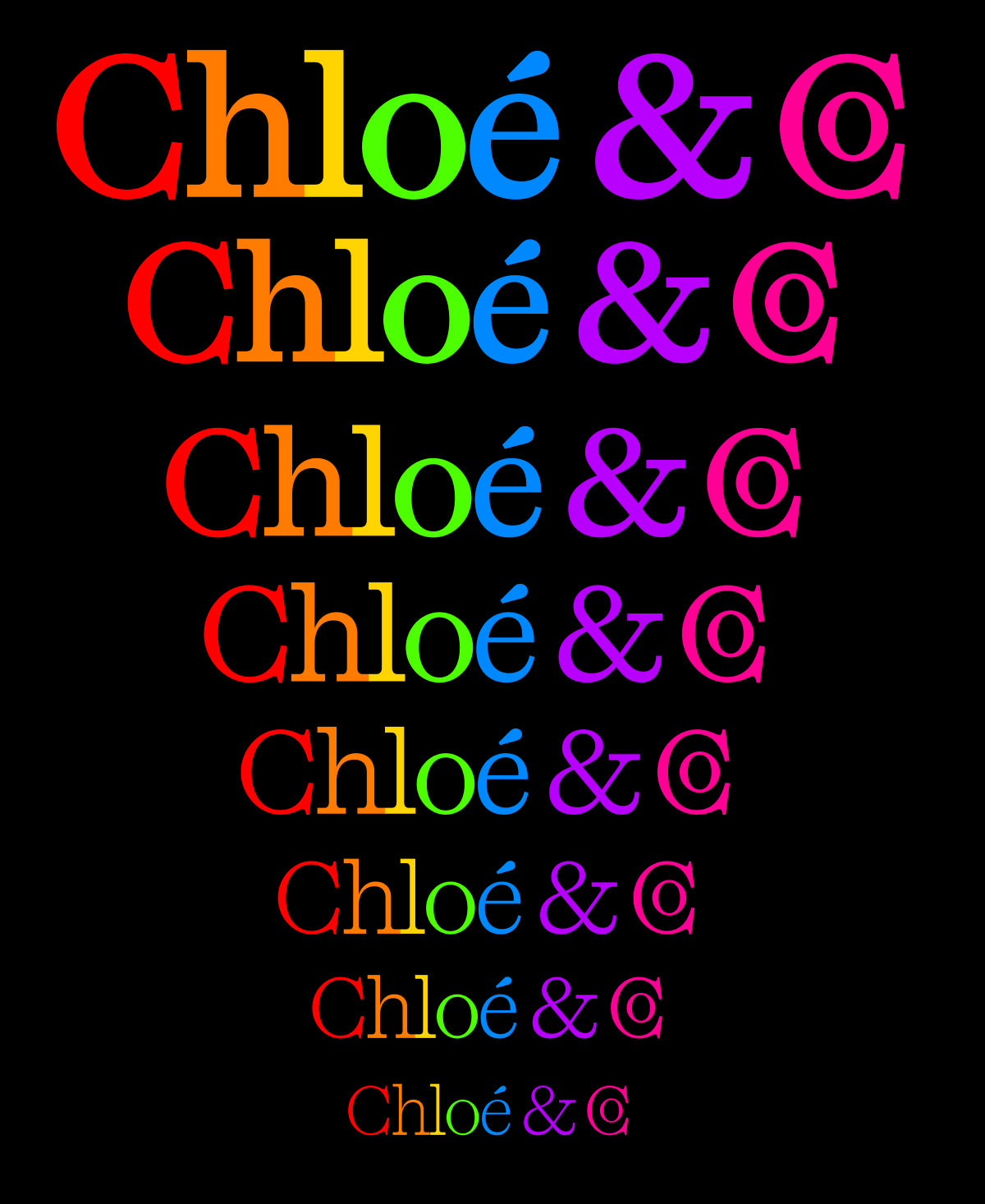
With 692 glyphs, stylistic alternates, including an alternate Q, and meticulous attention to detail, PP Kyoto offers both control and flexibility. It’s a typeface built for designers who seek visual impact with technical consistency, in projects that demand both elegance and extended language support.
Designers
Categories
- Display
- Italics
- Japanese
- Serif
- Variable
Styles
- 18 Styles
18 Styles with 692 Glyphs each
Version
v1.00
Latest update: May 2025
Available formats
OTF, TTF, WOFF, WOFF2
Language Support
Afrikaans, Basque, Breton, Catalan, Croatian, Czech, Danish, Dutch, English, Estonian, Finnish, French, Gaelic, German, Hungarian, Icelandic, Indonesian, Irish, Italian, Latvian, Lituanian, Norwegian, Polish, Portuguese, Romanian, Saami, Serbian, Slovak, Slovenian, Spanish, Swahili, Swedish, Turkish, (and more)
Download PDF specimenCommercial Licenses
Not sure what to get? Or can’t find the right coverage?
Please contact us for our tailored corporate licenses!
Need more information about our licenses?
Our FAQ usually contains most of the answers.
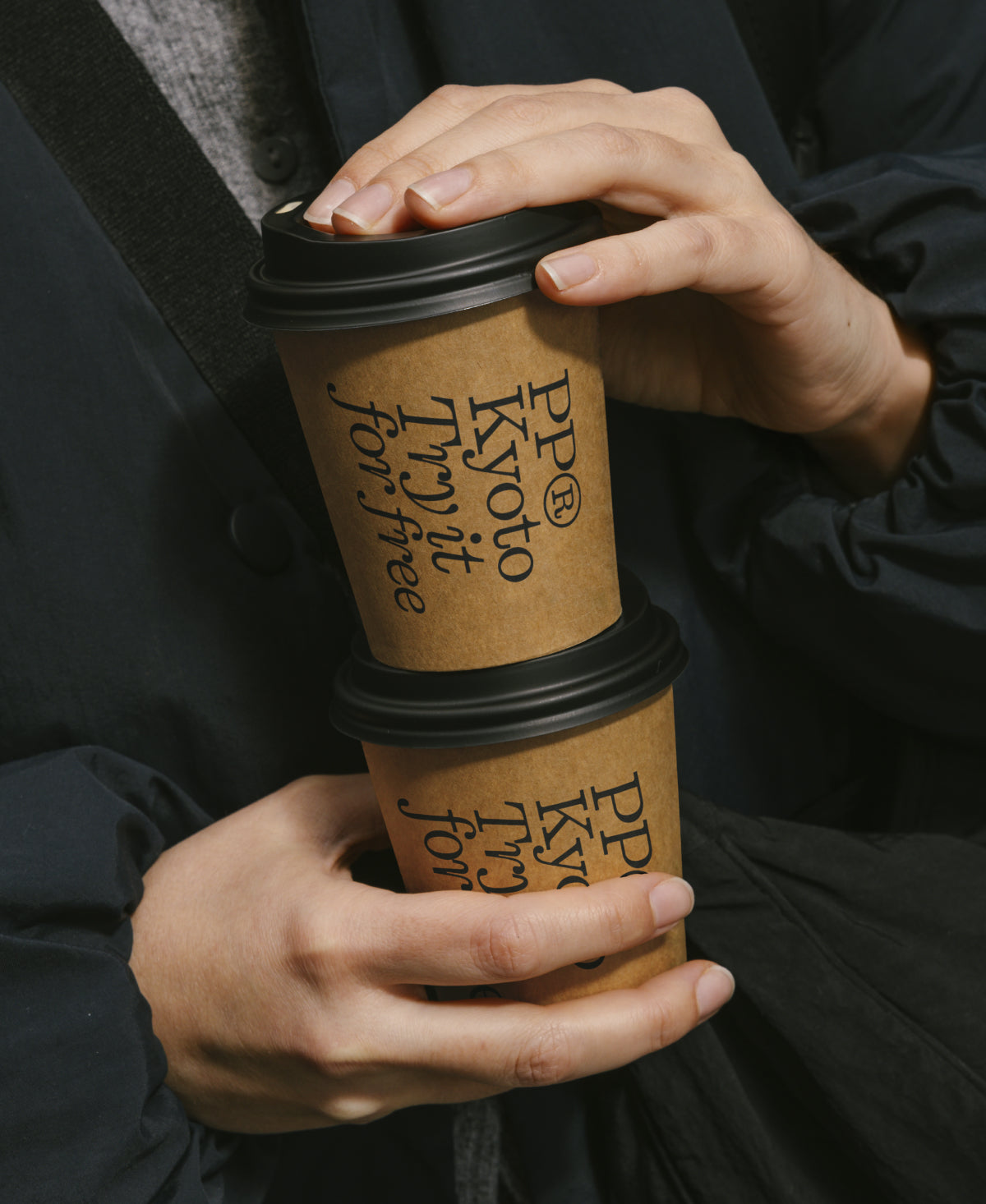
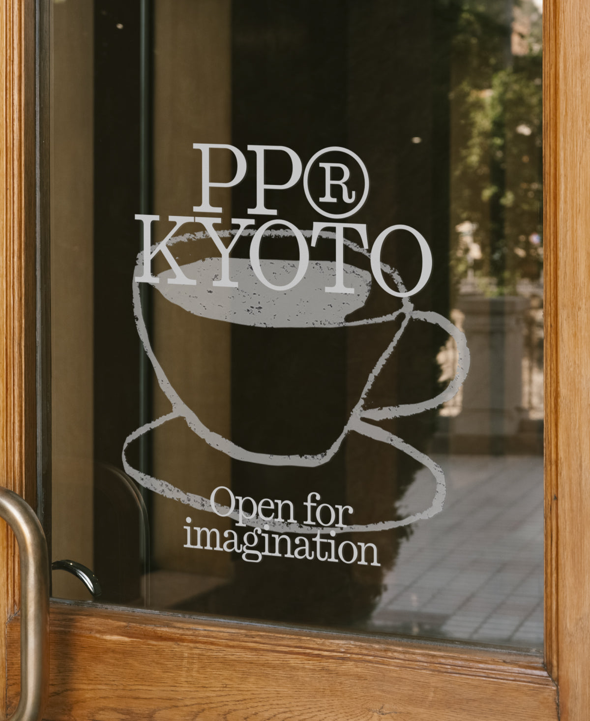
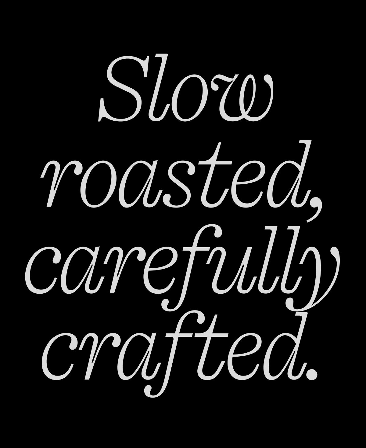
Kyoto in use
View all using Kyoto