We’re super super thrilled to launch our new website, a true labour of love that’s been WIP for over a year.
It’s been a big decision, especially with our previous website being so revered (and awarded!), but there isn’t time to rest on one’s laurels. We’ve been on quite a roll the last few years, with even more extensive type families, styles and genres, and we knew we needed something new (and something special) to live up to not only where Pangram Pangram is now but future-proofing it for what lies ahead.
Designed at the hands of our founder, we’ve spoken to Mat about the ins and outs of the site, diving into the big reasons behind the change and what little easter eggs you might expect to find…

Mat! It’s happened, it’s done! The new website is finally out – how are you feeling?
Very proud! It was a lot of work from the whole team but we finally got there. It’s never a small project to update your main touch point and it’s also always a bit stressful because you never know how people are going to react to it. But again, I’m proud and very happy with the result.

How long has this been in the works now?
At least a year, from concept to design to development. We also had to update a lot of the content format from the previous version so that took some time as well. While designing I had a lot of interactions, features and details in mind so we worked really hard to get those just right.


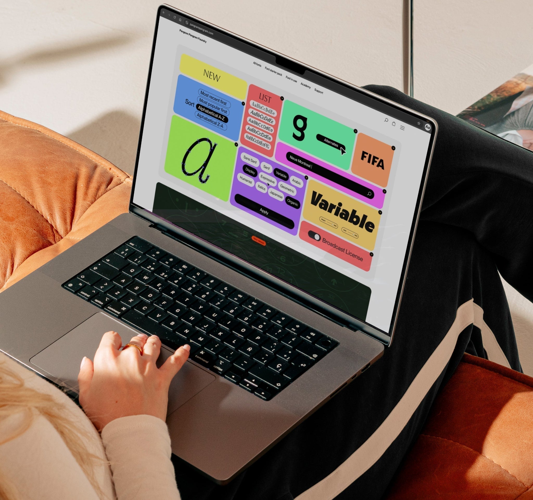
People loved the old (award-winning) website, why did you feel it was time for a change?
Believe it or not, the website was already five years old. The foundry and business grew a lot in those five years. Being more established now, I thought the timing was good for an update. Plus we were missing some key features like a search!


What lessons did you learn from the old site that you channelled into the new one? What was the idea behind PP 2.0?
A lot actually! Even if it was award-wining like you mention, it was lacking a few things that would take it to the same level as where the foundry is at as a business. We added a much better way to browse our ever expanding collection with a search, filtering, sorting, modes of viewing. We also completely reimagined the font page to be a lot more complete and showcase all the features and details we put in each and everyone of our typefaces. Revamped menus, font in use section, a new Academy section and much, much more not to mention the new light theme!
Another polarizing feature we had on the previous version was the scroll effect. Some liked it, others hated it so we decided to go with a more natural scroll behaviour.
Having a strong background in web design, I did the whole thing myself from strategy to UX to design. Our resident graphic designer Radek helped with all the new content found throughout the new site like the intro animation and the videos on the about page.

What was the process like? It must be quite a challenge, considering all the complexities of a type foundry website.
It honestly came pretty naturally this time around. I think I was just ready for it. I say this time around because I tried to redesign the website many times before that. Especially just before the previous version. Like you say, there are a lot of complexities and subtleties that come with designing a commercial font foundry website and it’s definitely not easy. I feel that all the years of living with one helped me craft this new and improved version.

What’s your favourite thing (and favourite little feature) from the new site?
I think the look and feel of it is my favourite thing. It feels a lot more refined and usable than the previous one. It’s an approach that will be able to evolve through time without needing an overhaul every 4-5 years. It’s a more mature version of the last one which I like a lot. It reflects where we are as a foundry without forgetting our roots. It’s very design-centric, very form-follows-function-esque.
Favourite little features: There are a few! The functional one has to be the search. The fun one has to be the card flips in the new Font Starter Pack page (still to come). And the quirky one is the 404 page, but I’ll let people discover this one on their own!
Anything else to add?
I’d say to everyone to just go and play around with the site, explore it, discover it, checkout the new features. Let us know what you think!
We’re very confident that this version will please most but please let us know if you spot anything wrong or not working. There’s always a few bugs a few months following a big overhaul like this!
And most importantly, enjoy the site and the fonts!!
We have a lot more in store while we establish ourselves as one of the best foundries out there!


