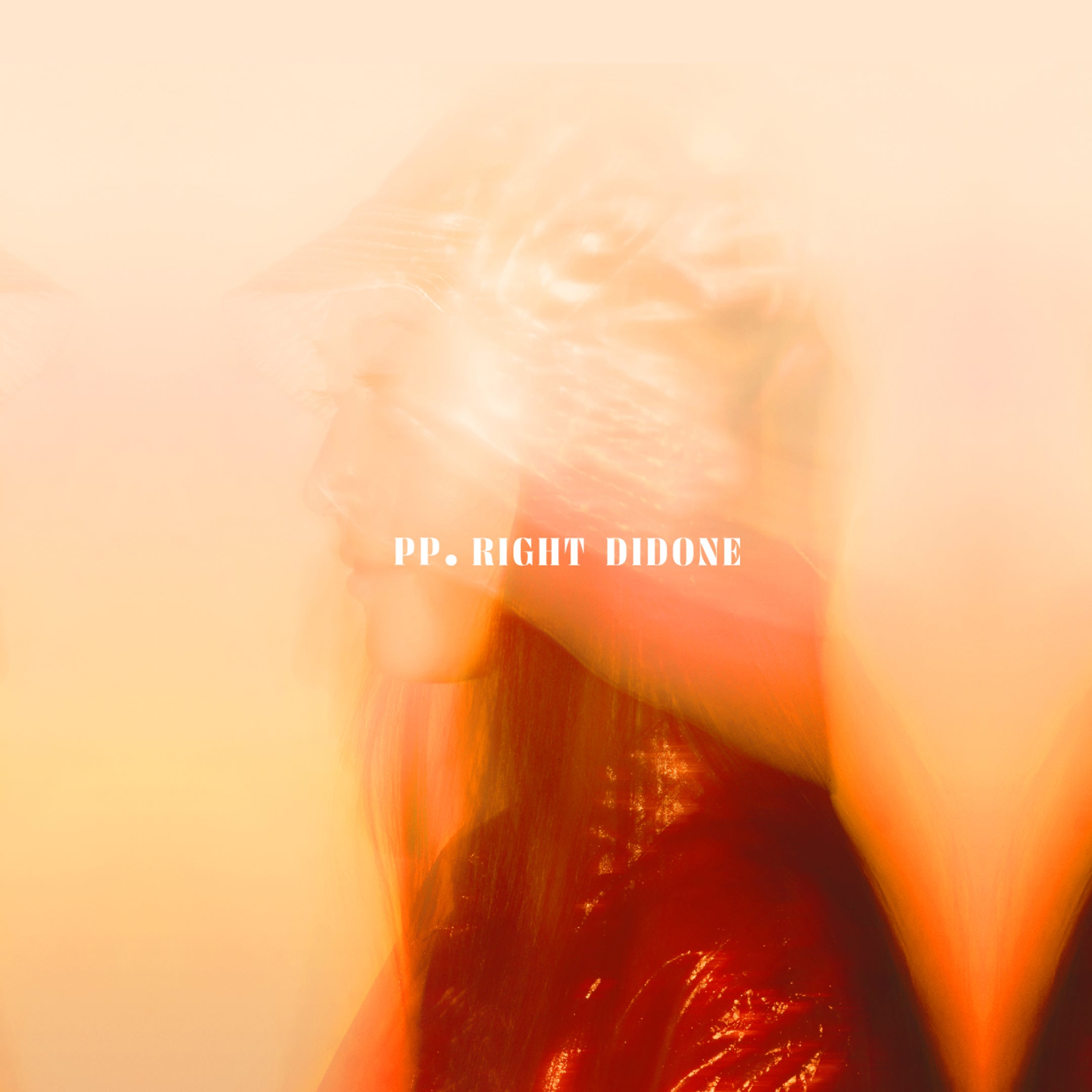
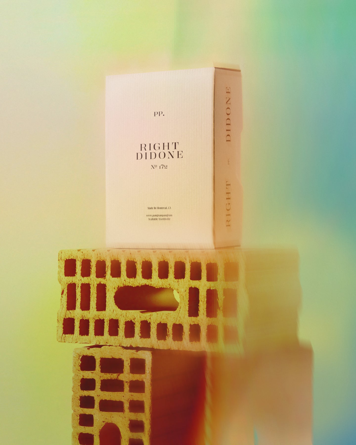
Right Didone
Right Didone is not your professor’s serif, it’s smoother, sharper, and slightly rebellious.
Free to try
Licenses start at $40
Explore the sub-families by clicking on the cards below.
8 Sub-Families
Right Didone
Collection
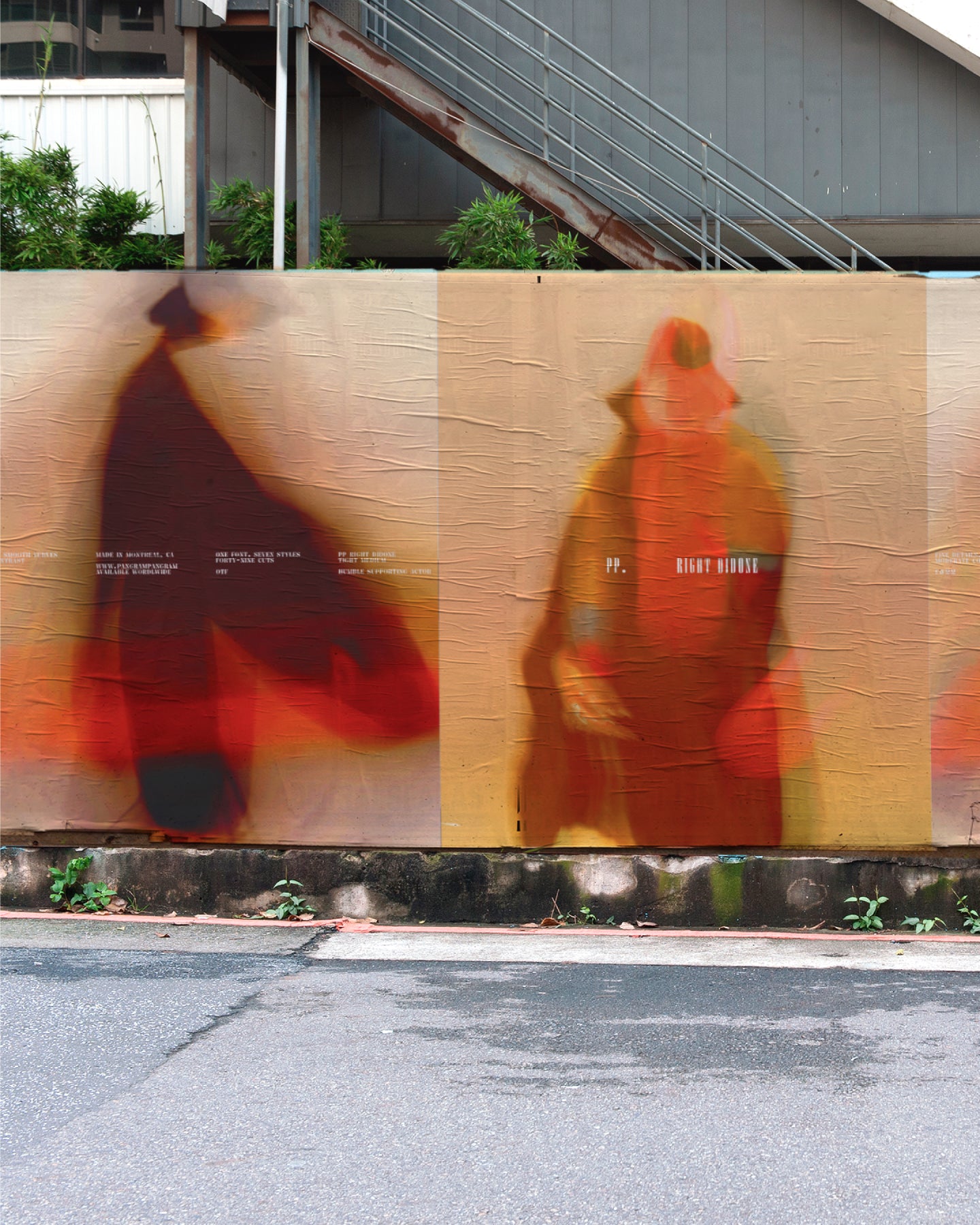
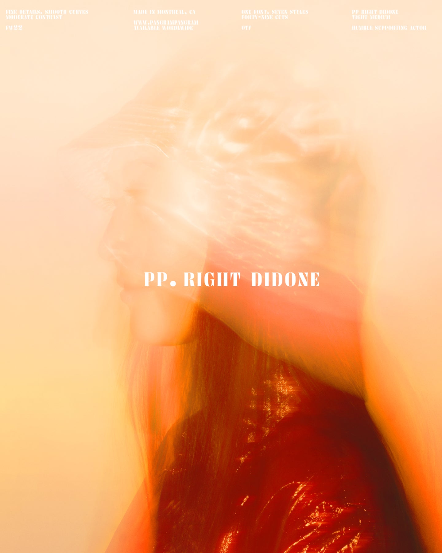
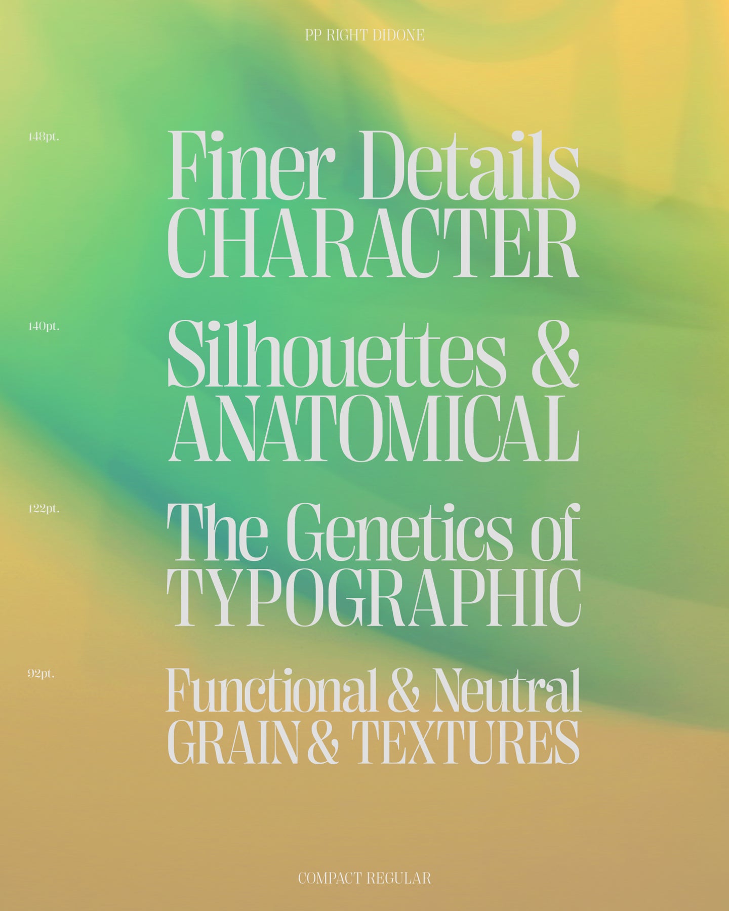
Not Your Grandmother’s Didone.
Right Didone beams elegance in a slightly quirky manner. Fancy and smooooth in some styles, edgy and sharp in others, this high-contrast type family works best when you need to catch eyes in a big way: posters, websites, magazine headlines, logotypes; you get the idea. Right Didone is more than “not a historical revival”—it was created by adding serifs to Right Sans and smoothing it out, an approach going very much against the natural flow. That’s also where a large x-height and a lot of styles come from, features typical for grotesks, but seldom seen among serif typefaces.
Designer
Collaborator
Categories
- Display
- Italics
- Serif
- Variable
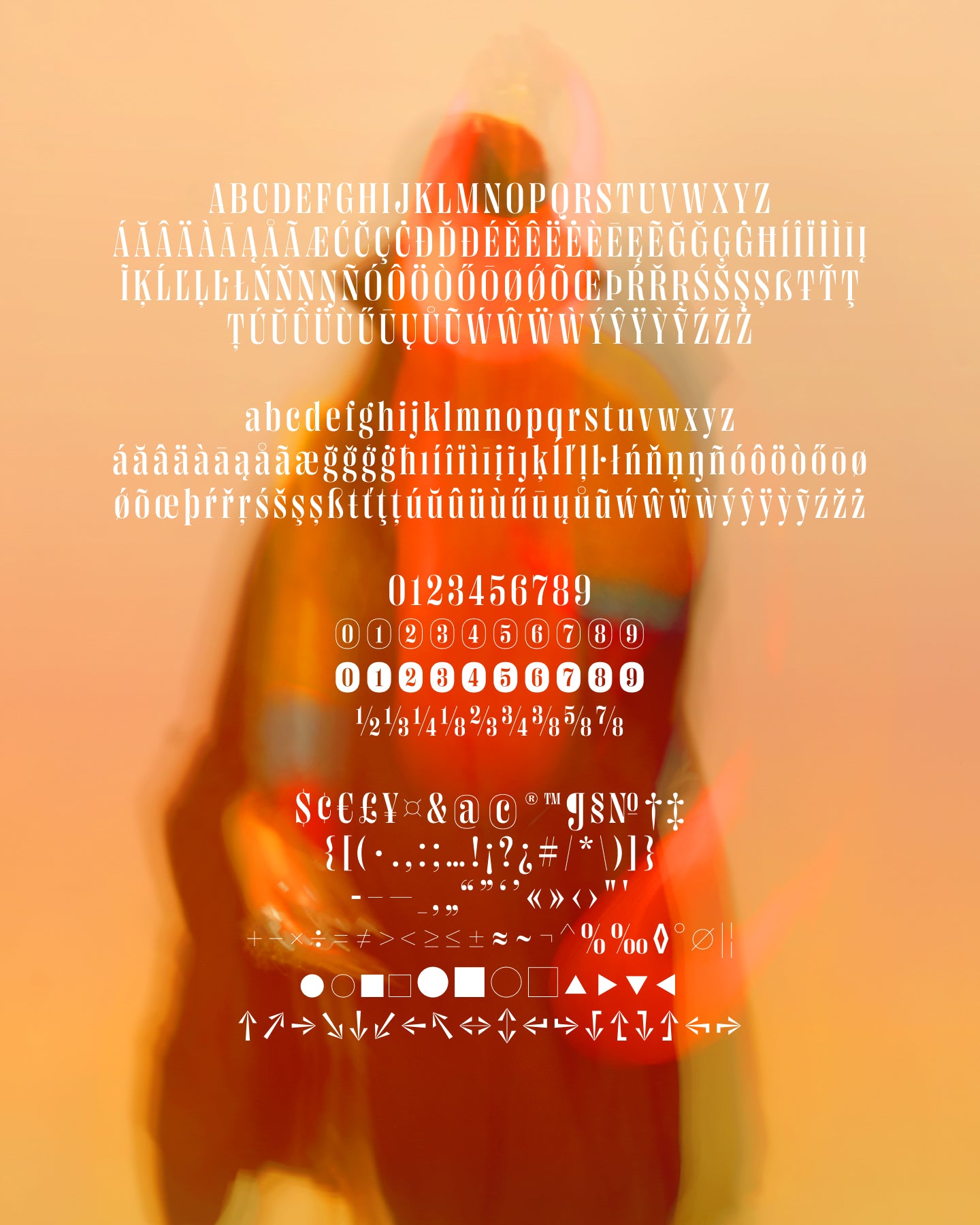
Styles
- 8 Subfamilies
- 7 Styles each
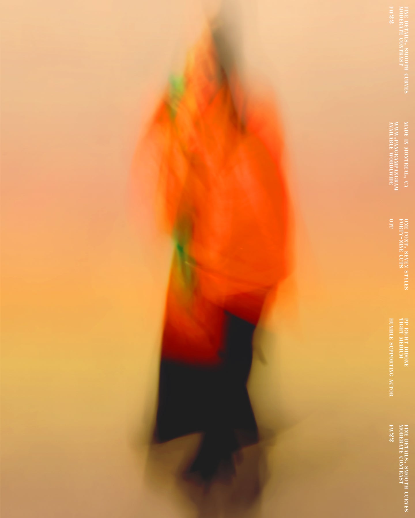
7 Cuts (49 Styles Total) with 564 Glyphs each
Version
1.00
Latest update: November 2022
Available formats
OTF, TTF, WOFF, WOFF2
Language Support
Afrikaans, Albanian, Asu, Basque, Bemba, Bena, Breton, Catalan, Chiga, Colognian, Cornish, Croatian, Czech, Danish, Dutch, English, Estonian, Faroese, Filipino, Finnish, French, Friulian, Galician, Ganda, German, Gusii, Hungarian, Inari Sami, Indonesian, Irish, Italian, Jola-Fonyi, Kabuverdianu, Kalenjin ... (and more)
Commercial Licenses
Not sure what to get? Or can’t find the right coverage?
Please contact us for our tailored corporate licenses!
Need more information about our licenses?
Our FAQ usually contains most of the answers.
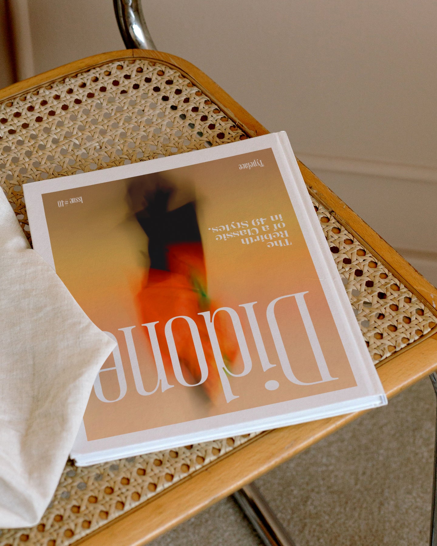
Right Didone pairs well with these typefaces.
View all fontsRight Didone in use
View all using Right Didone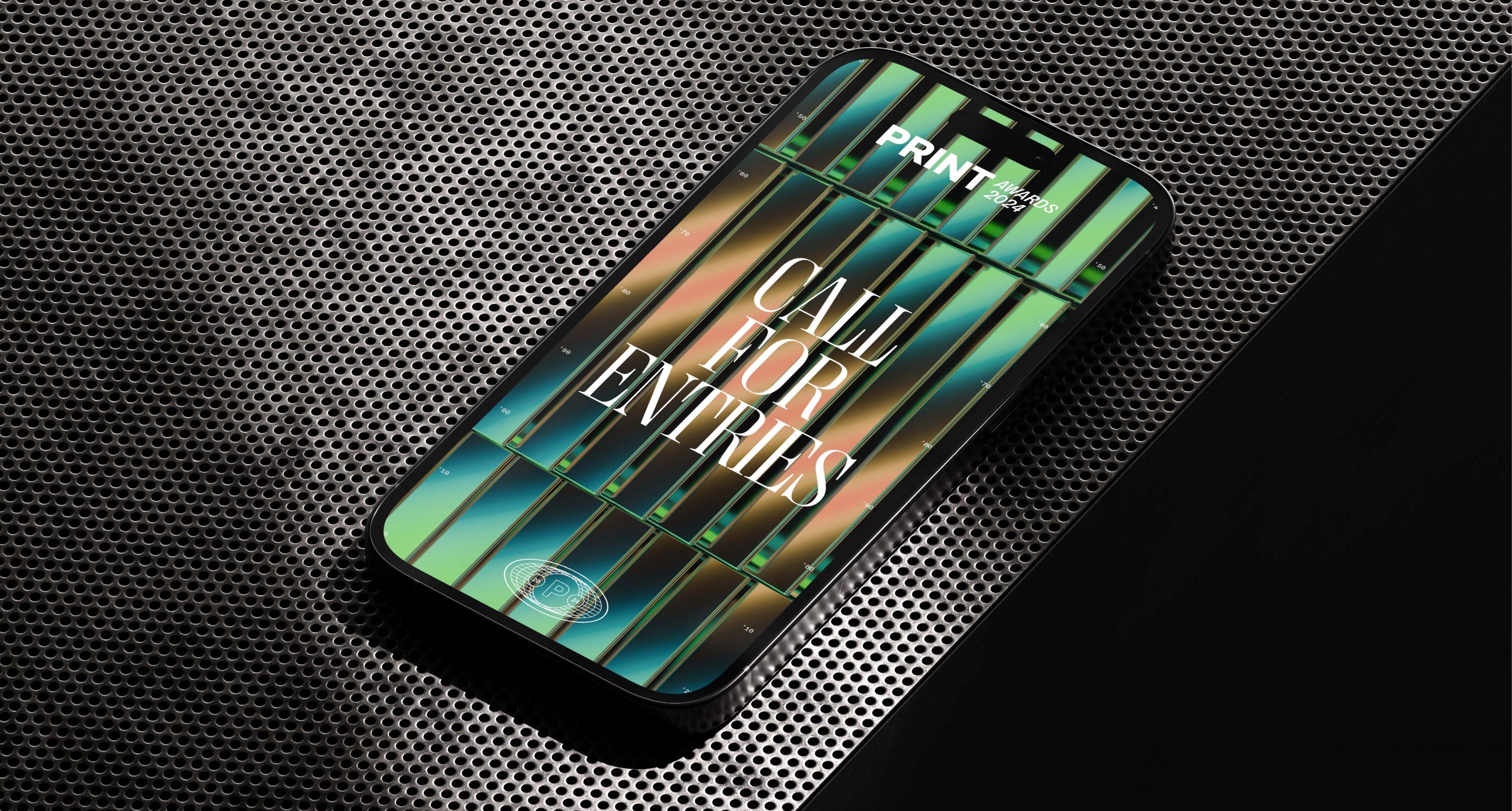
Print Awards 2024
View project