Neue Montreal
Where design history isn’t locked in museums, but lived, quietly, in the details.
Free to try
Licenses starting at $40
Neue Montreal style list
14 Styles
01234567
{(!@#$?&)}
- Thin 200
- Light 300
- Book 400
- Regular 450
- Medium 530
- Semibold 700
- Bold 800
- Thin Italic 200
- Light Italic 300
- Book Italic 400
- Italic 450
- Medium Italic 530
- Semibold Italic 700
- Bold Italic 800
Neue Montreal
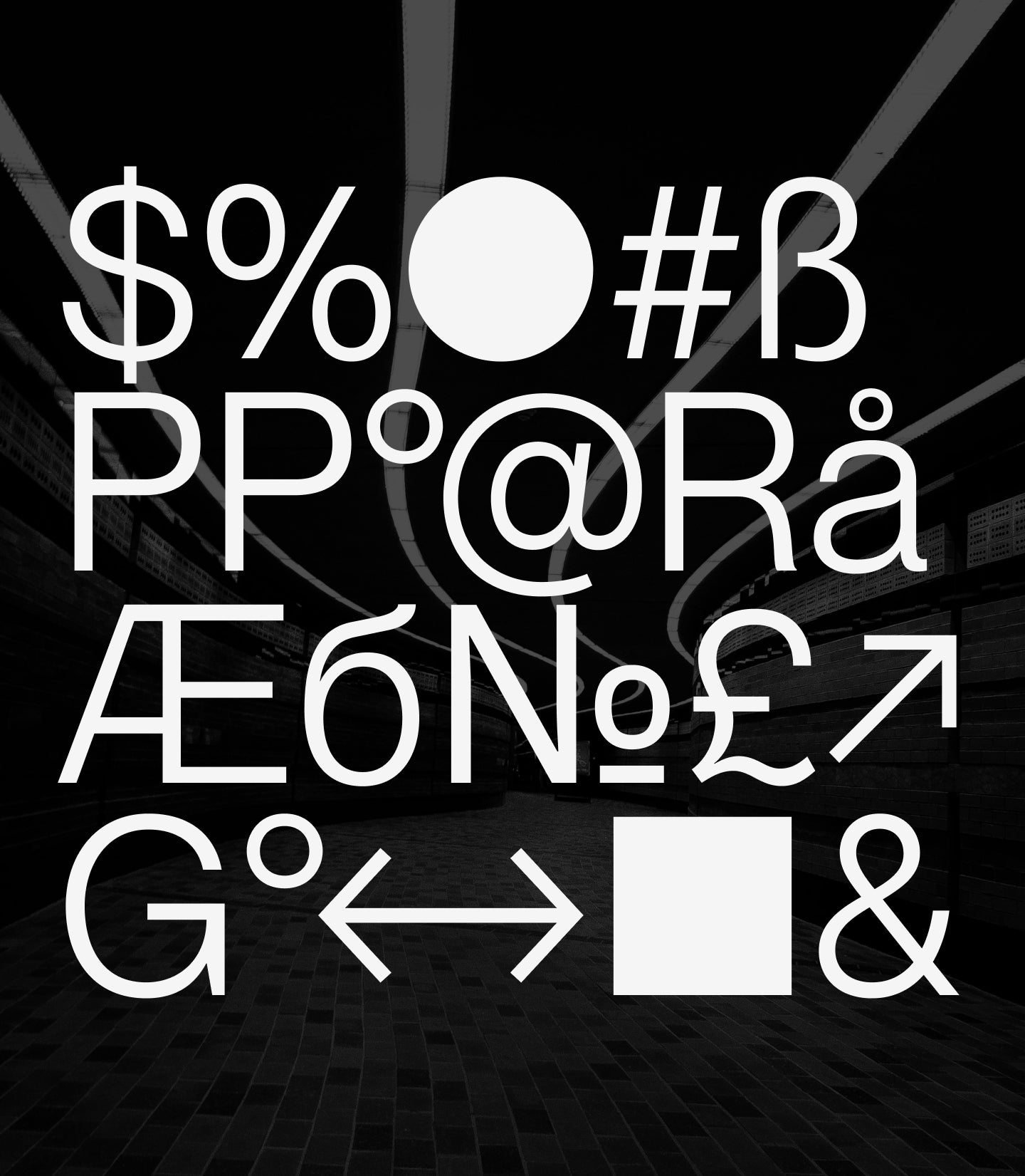
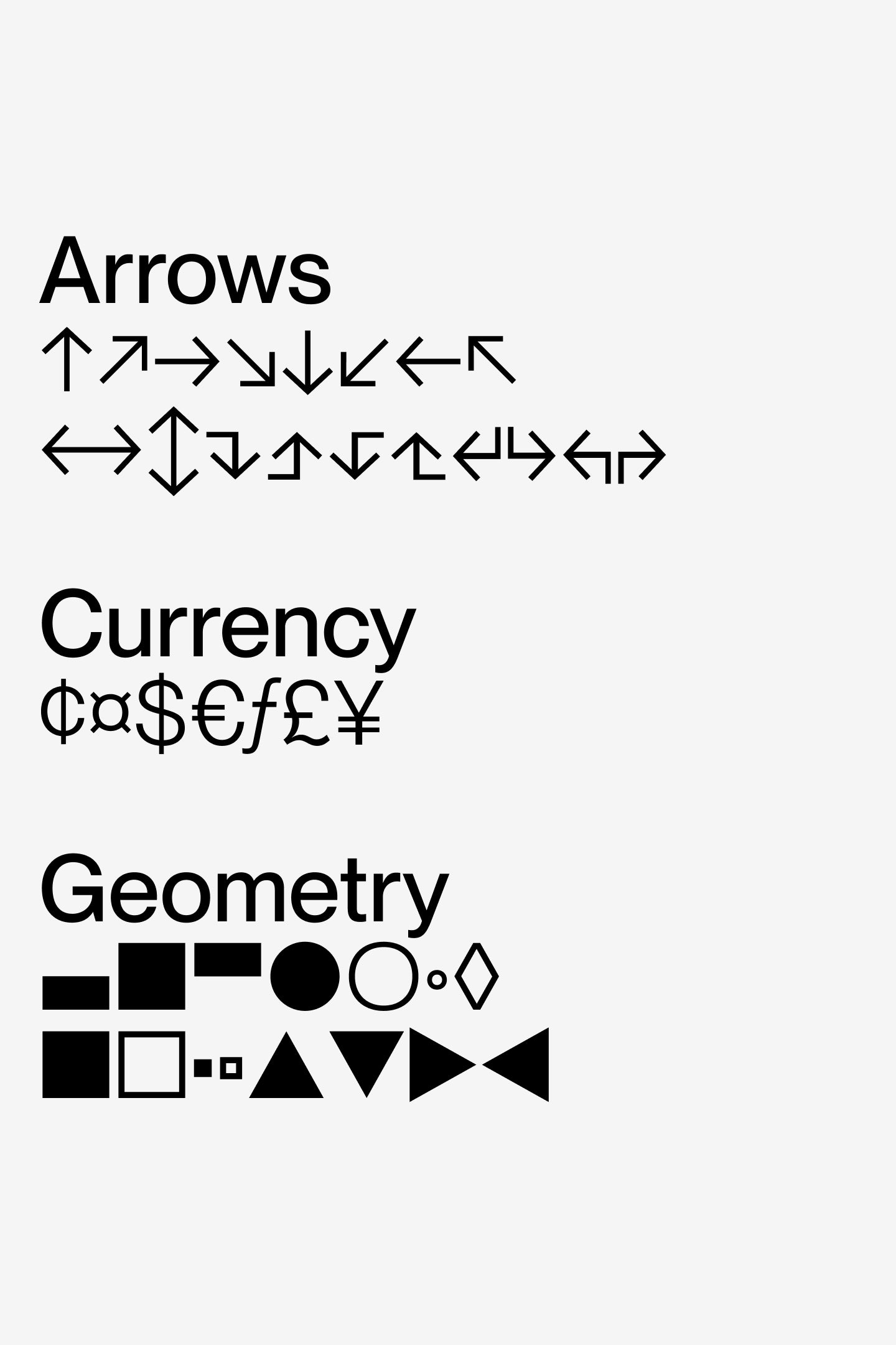
Glyphs set overview
Glyphs set overview
Glyphs View
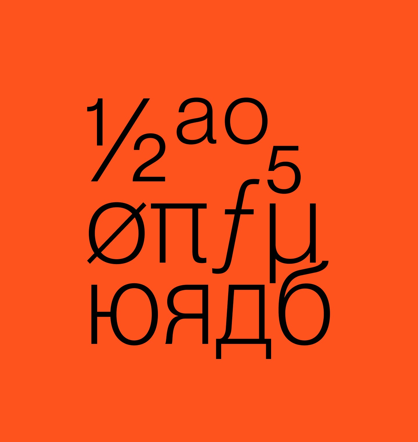
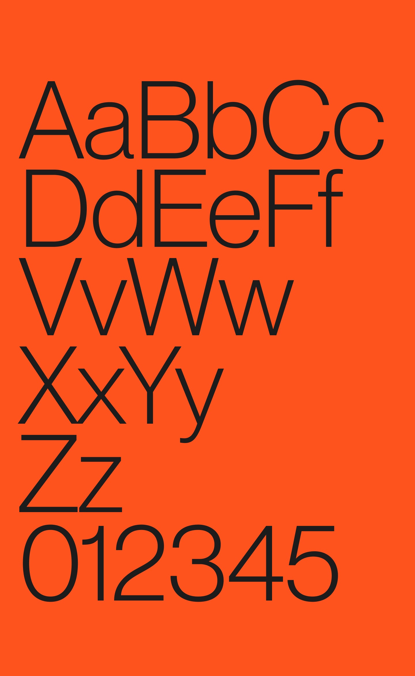
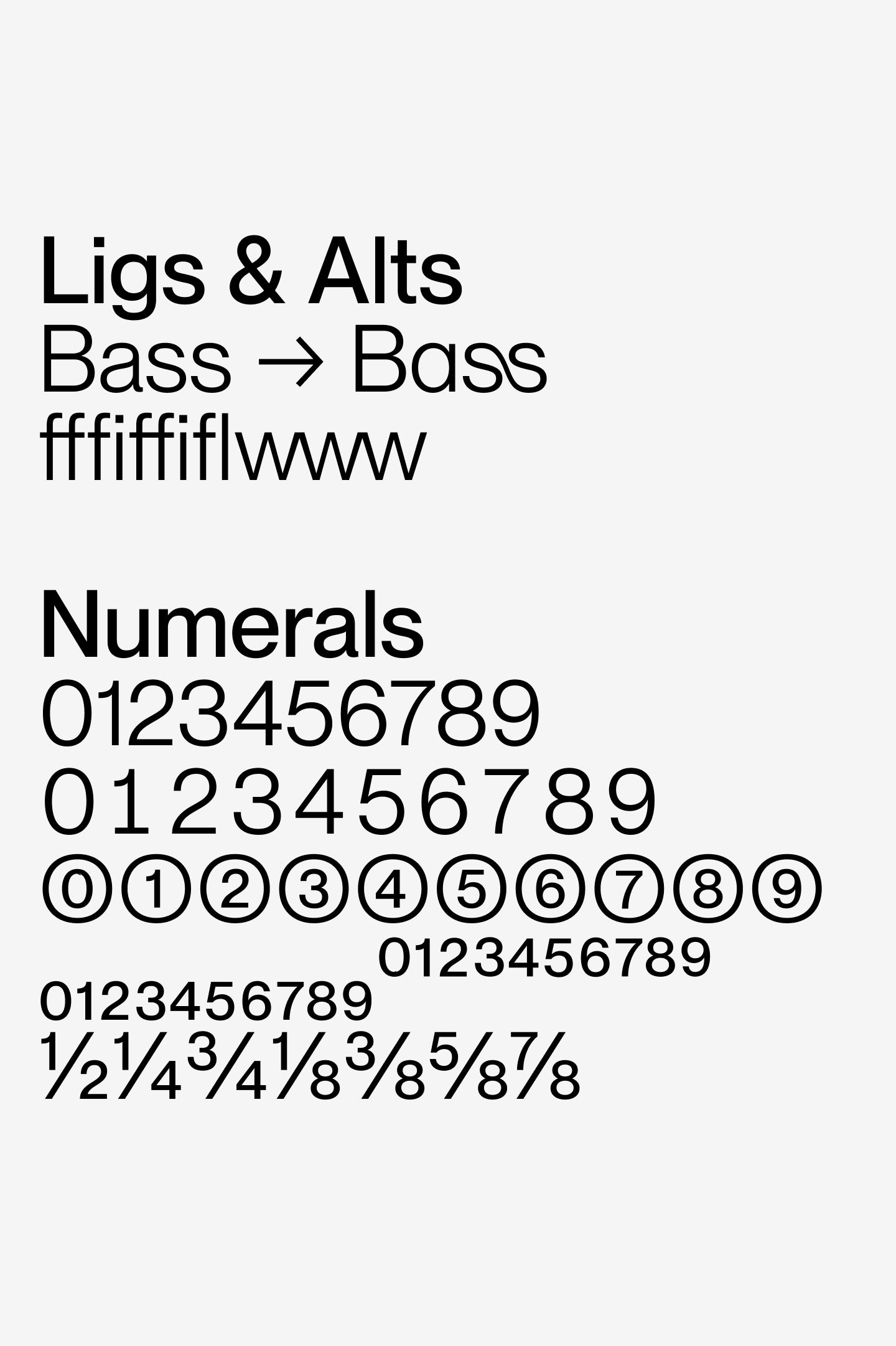
Neue Montreal's Features
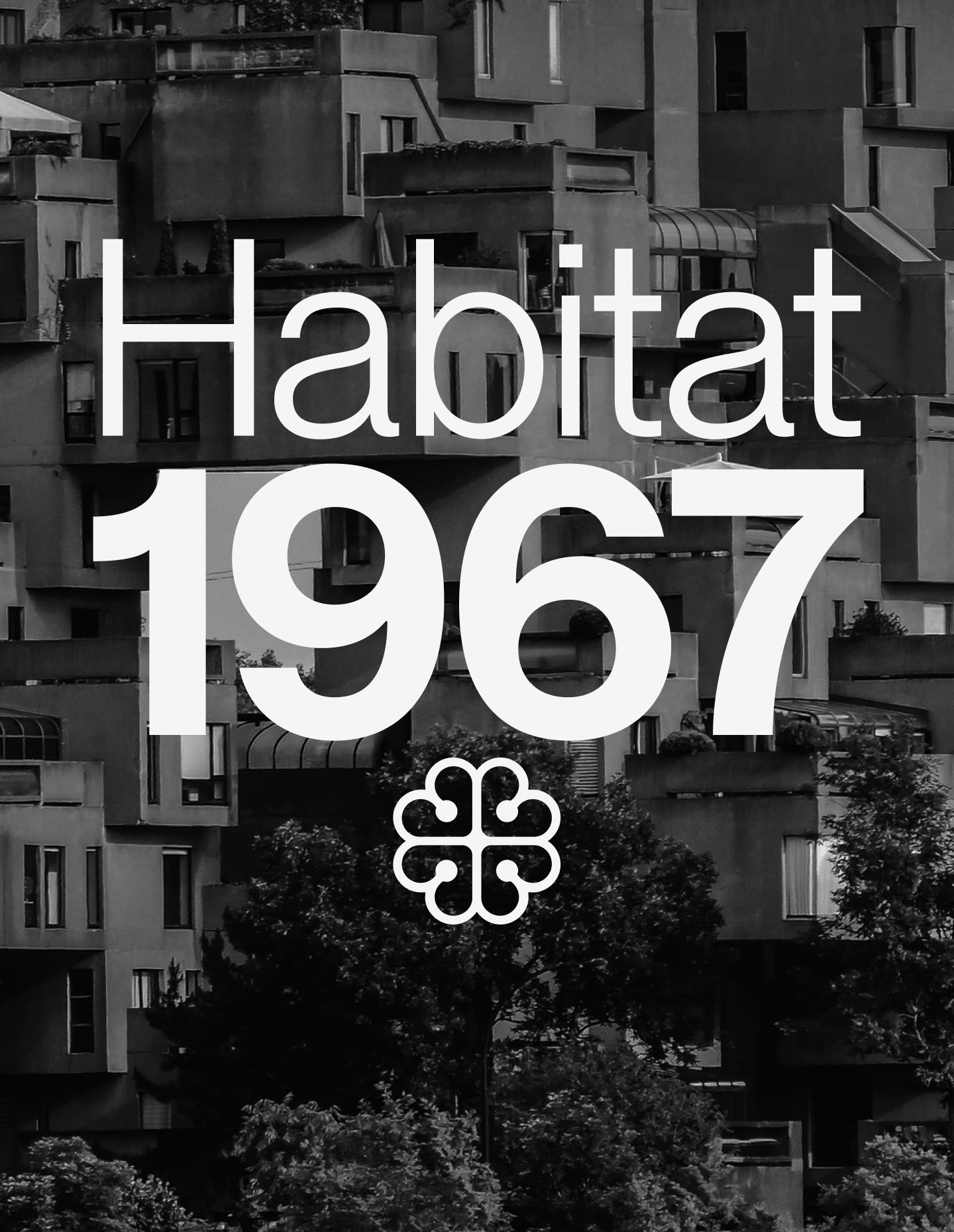
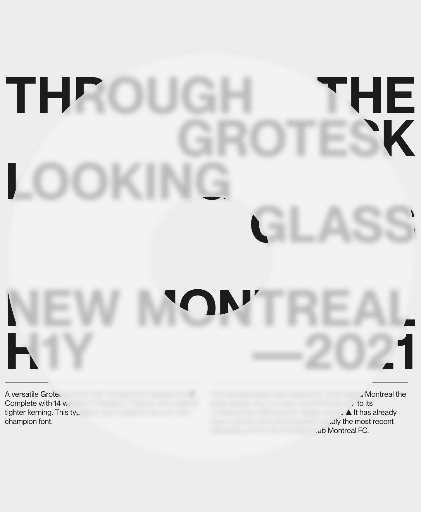
The Ultimate Grotesk
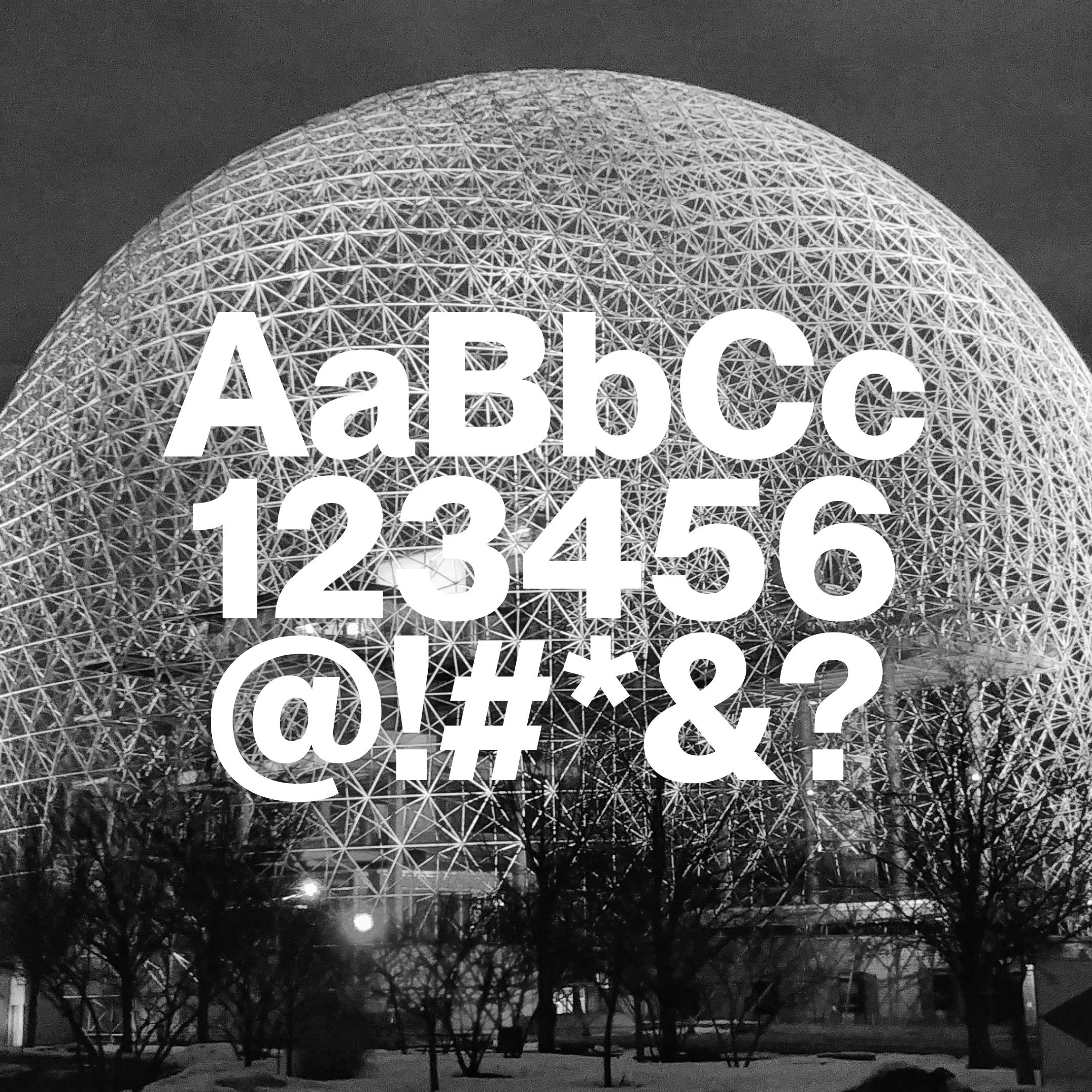
This timeless Sans was inspired by what makes Montreal the great design city it is today, from the Expo 67 to its contemporary effervescent design scene ▲ It has already been used by many local brands notably the most recent rebranding of the city's football club Montreal FC.
Designer
Categories
- Cyrillic
- Grotesk
- Sans Serif
- Variable
Styles
- 14 Styles
14 Styles with 751 Glyphs each
Including Italics & Cyrillic Support
Version
2.40
Latest update: March 2022
Available formats
OTF, TTF, WOFF, WOFF2
Language Support
Belarusian, Bosnian, Bulgarian, Chechen, Macedonian, Russian, Serbian, Ukranian, Afrikaans, Basque, Breton, Catalan, Croatian, Czech, Danish, Dutch, English, Estonian, Finnish, French, Gaelic, German, Hungarian, Icelandic, Indonesian, Irish, Italian, Latvian, Lituanian, Norwegian, Polish, Portuguese, Romanian, Saami ... (and more)
Commercial Licenses
Not sure what to get? Or can’t find the right coverage?
Please contact us for our tailored corporate licenses!
Need more information about our licenses?
Our FAQ usually contains most of the answers.
Neue Montreal in use
View all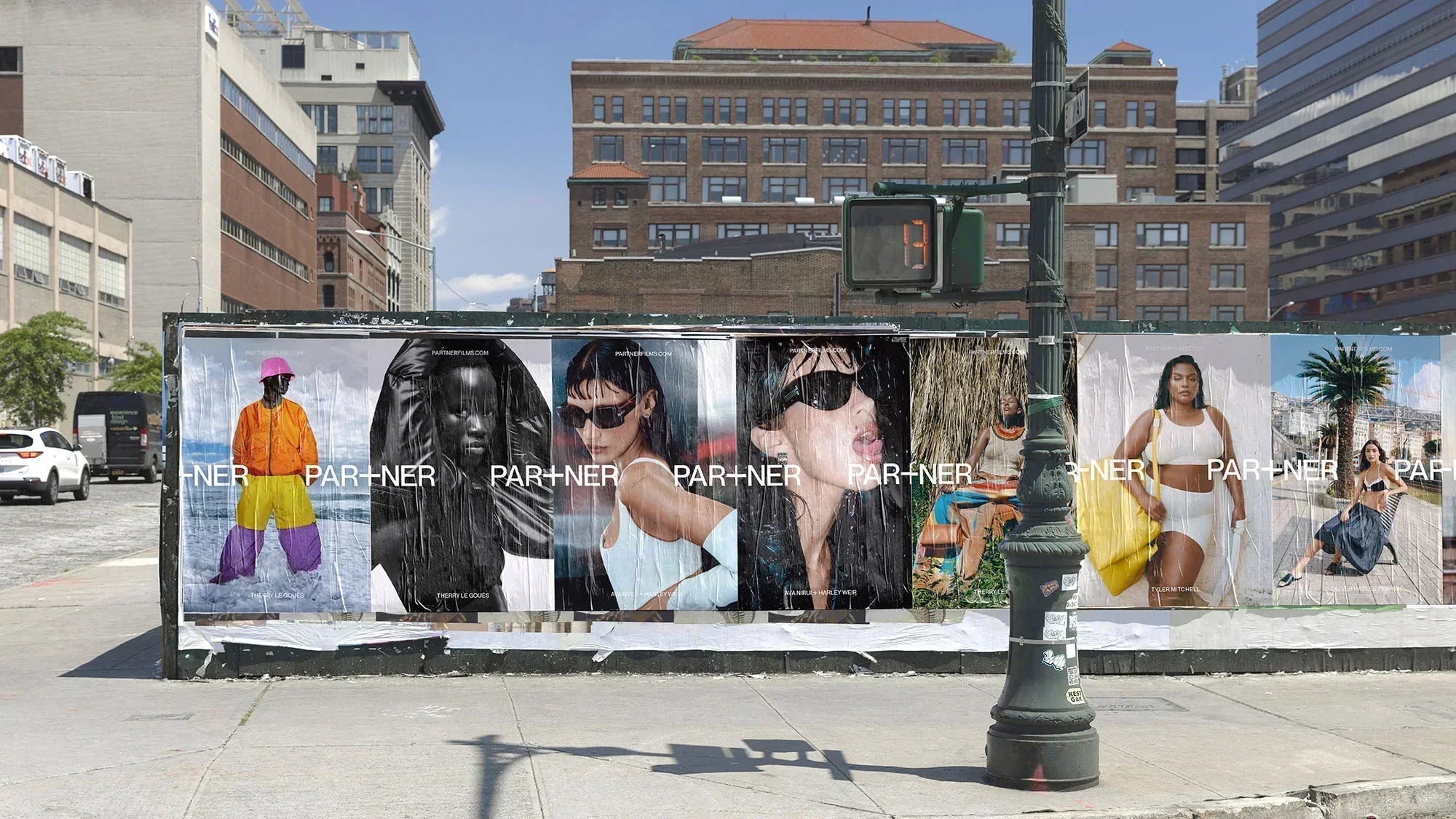
Partner Films
View project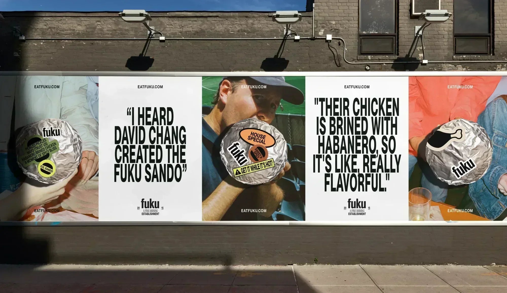
Fuku
View project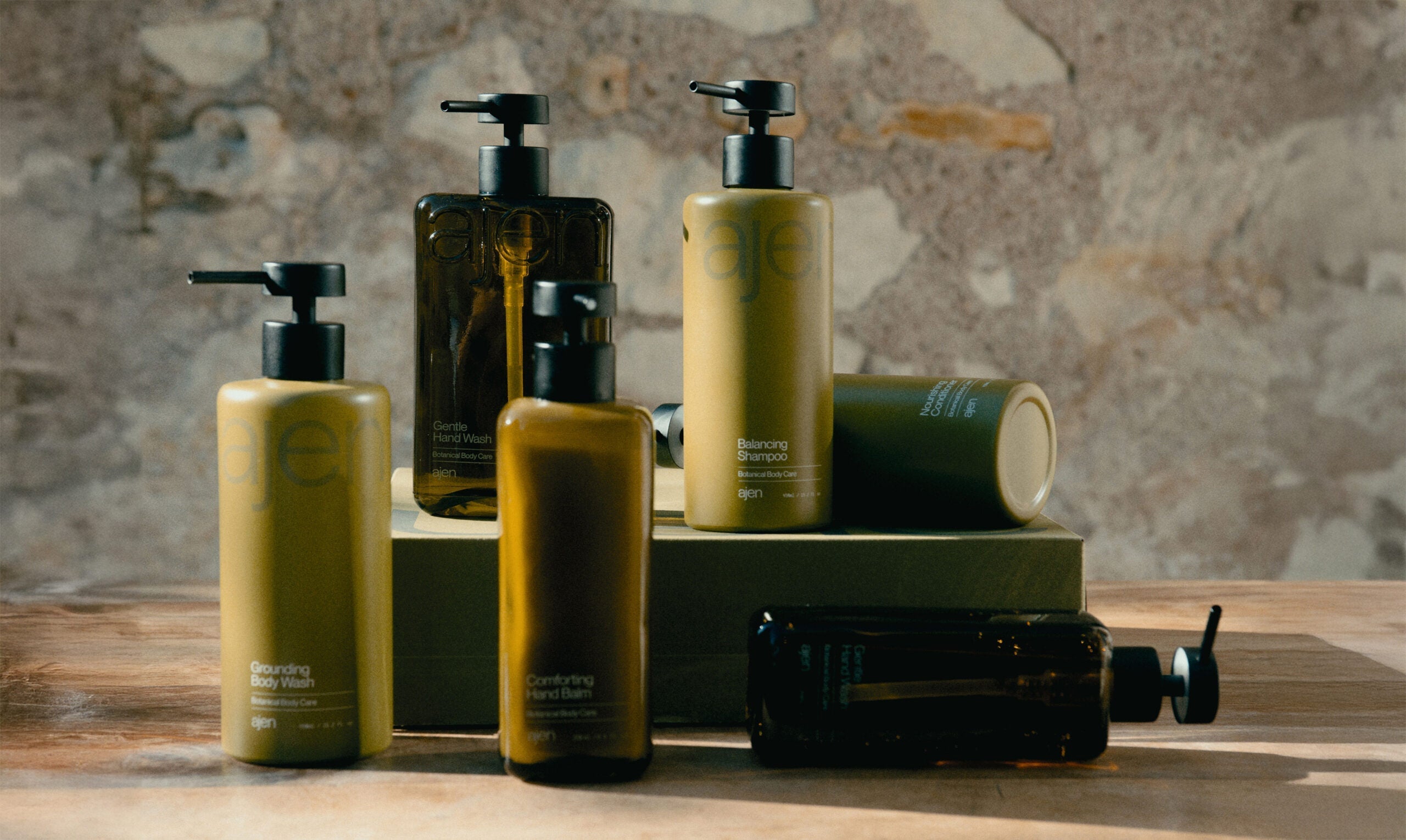
Ajen
View project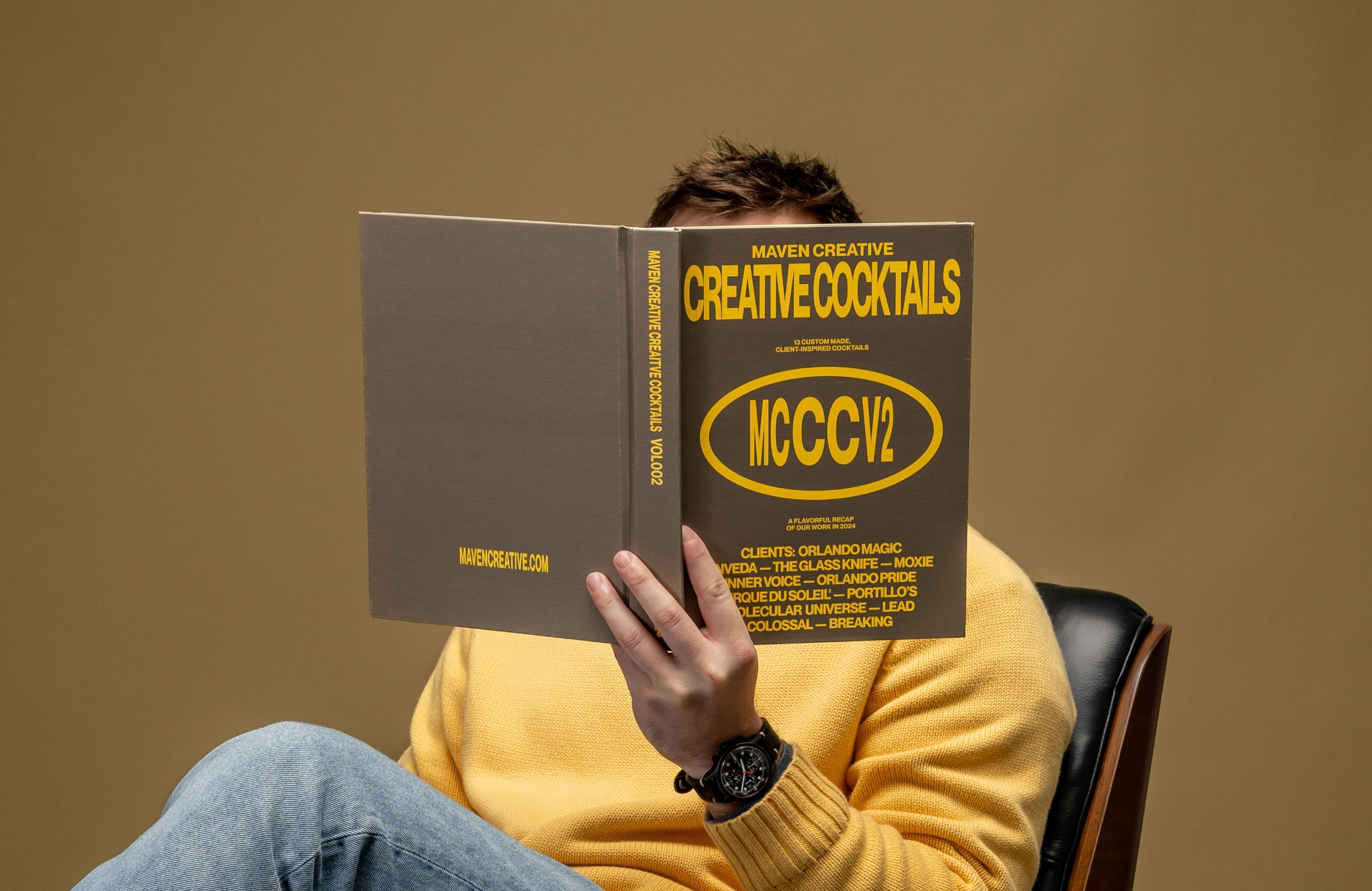
MCCCv2
View project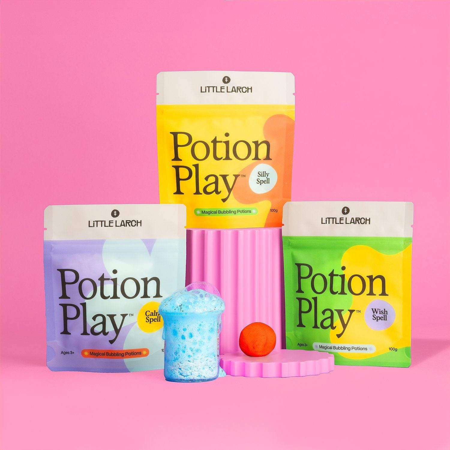
Little Larch
View project