Fuku is a bit of an institution
The birth of the restaurant is tied to David Chang’s Momofuku Noodle Bar in East Village, where the Fuku spicy sando was first debuted, going on to quickly become a cult favourite and earning its own restaurant, Fuku. Nearly a decade after it launched, the restaurant chain was ready for a design shake-up, and it reached out to branding and design agency, Red Antler, to show them the ropes.
When it came to the facelift, the wordmark was already dripping with brand recognition, so it only needed slight tweaks and not a complete overhaul. “We didn’t want to create a completely new mark – that didn’t feel right spiritually. When it comes to rebrands, you have to evaluate what to carry through because you’re never starting from a blank canvas,” Creative Director Devry Drosky tells us. The team chose to keep the lowercase condensed sans, and dial up the details.
They got rid of the italics, and made light-handed adjustments to the characters to bring in a modern edge. “Scalability and recognition were important considerations in landing the final result,” adds Drosky. “How does the wordmark translate through signage? How does it reduce down in smaller branded moments? And does it maintain its impact? The previous mark was lacking in that impactful presence, especially at varying scales.”
The Fuku brand is all about a sense of no-nonsense honesty and this is felt in the logo – a literal chicken sandwiched between the buns. The design doesn’t leave you scratching your head, but tells you what you need to know quite simply, but effectively. “There’s a frankness and simplicity we wanted to celebrate. This attitude extends to our tone of voice, with lines like ‘take it or take it’ embracing the no-nonsense ethos of New York City,” says Drosky.

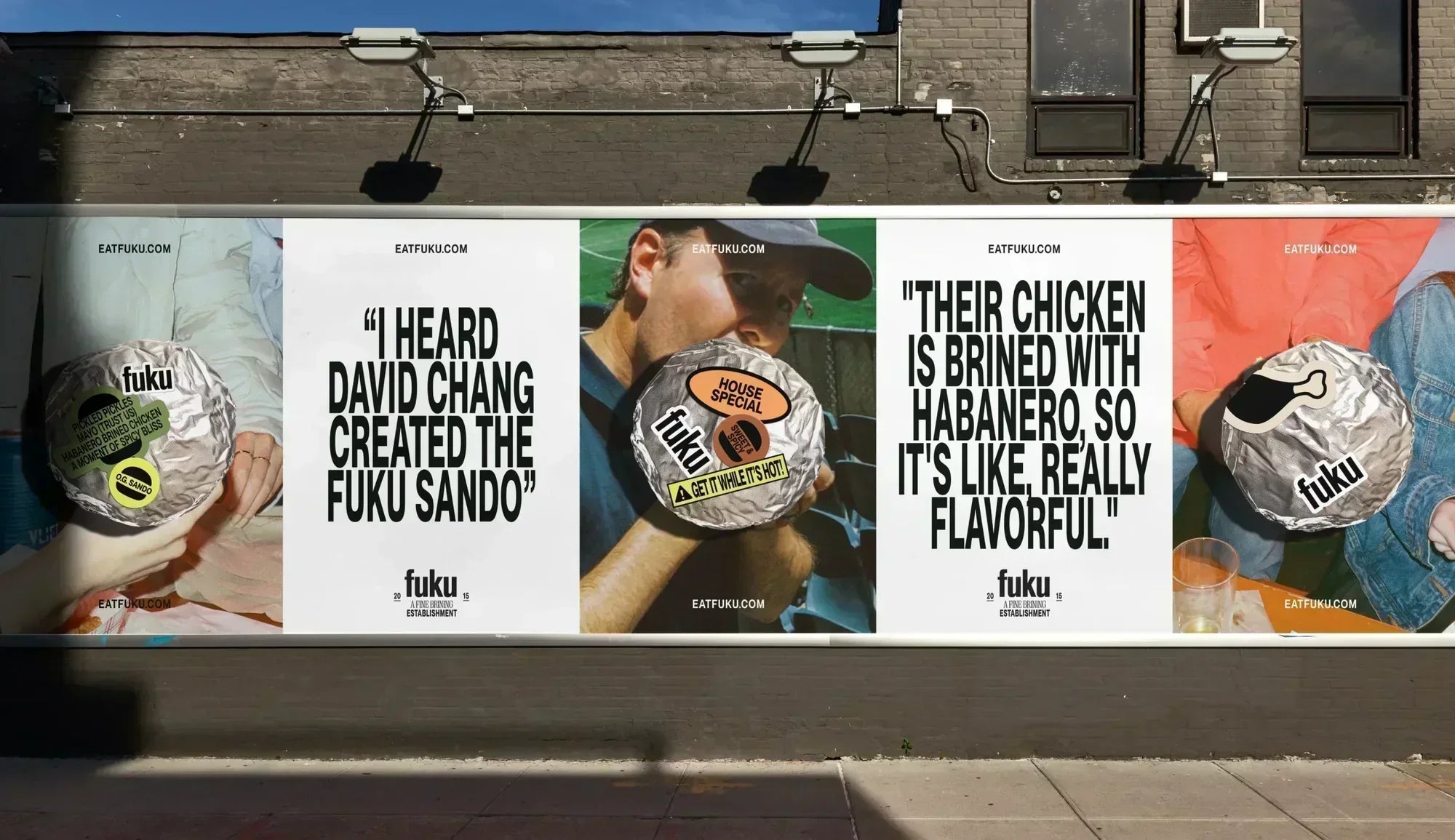
Everywhere else, the team chose to incorporate an explosion of type, pulling inspiration directly from the streets of the city, particularly downtown where David Chang first planted his roots. “We looked to the gritty charm of hand-painted awnings, event flyers, and layered urban graphics for our typographic choices and broader graphic language. Street photography also played a huge role, inspiring high-flash, textural art direction with candid captures,” Drosky explains.
While the wordmark is set in Akzidenz-Grotesk BQ Condensed to echo the typography “you see on awnings all over downtown Manhattan,” the rest of brand uses OT and PP Neue Montreal families and PP Right Serif to create a dynamic, versatile type system. “The appeal of Neue Montreal is in its ability to serve both the functional and display typeface roles through its varying widths, weights and cuts.
It’s culturally relevant yet timeless,” says Drosky. “PP Right Serif acts as a refined counterpoint, adding a sense of craft and sophistication that mirrors Fuku’s devotion to making delicious food. The interplay between these two typefaces creates a compelling tension, blending bold personality with polished craftsmanship.”


All the typefaces come together on the bun wrapper where stickers jostle for space. They’re pasted haphazardly on top of each other, as if put together by someone quite quickly, championing Fuku’s essence of handmade deliciousness. “We were inspired by the flyers, graffiti, and stickers that wallpaper NYC sidewalks. There’s a chaoticness to the sticker applications that harness the unpredictability of NYC,” says Drosky. “It’s also a subtle homage to kitchen culture; we thought a lot about the overarching world of David Chang, and how this could sit uniquely in that ecosystem while simultaneously existing alongside his other ventures.”
All images © of their respective owners.
Content taken from Red Antler
