A nifty ‘+’ speaks to the strength of collaboration in Studio Roses’ look for Partner Films
Working with some of the biggest, most daring names in the fashion and luxury worlds, Partner Films is a creative production company specialising in film and digital media. From Acne Studios and Alexander McQueen to Loewe and Louis Vuitton, they help to conceptualise and produce powerful imagery and videos (for film, TV, and social media) that capture the essence of each brand.
Partner Films stands out from the crowd with its unique approach. Unlike most, it does not have a fixed roster of artists. Instead, it assembles the ideal talent for each project, ensuring the best possible results. As Rafa Roses, Founder & Creative Director of Studio Roses explains, this method defines Partner Films as “the sum of the industry’s most talented and inspired creatives.” Designed by the Mallorca-based branding and design consultancy, the company’s reimagined identity reflects key concepts like ‘collaboration,’ ‘teamwork,’ and ‘junction,’ sealed with a bold and minimalist aesthetic that enhances Partner Films’ philosophy without overwhelming it.
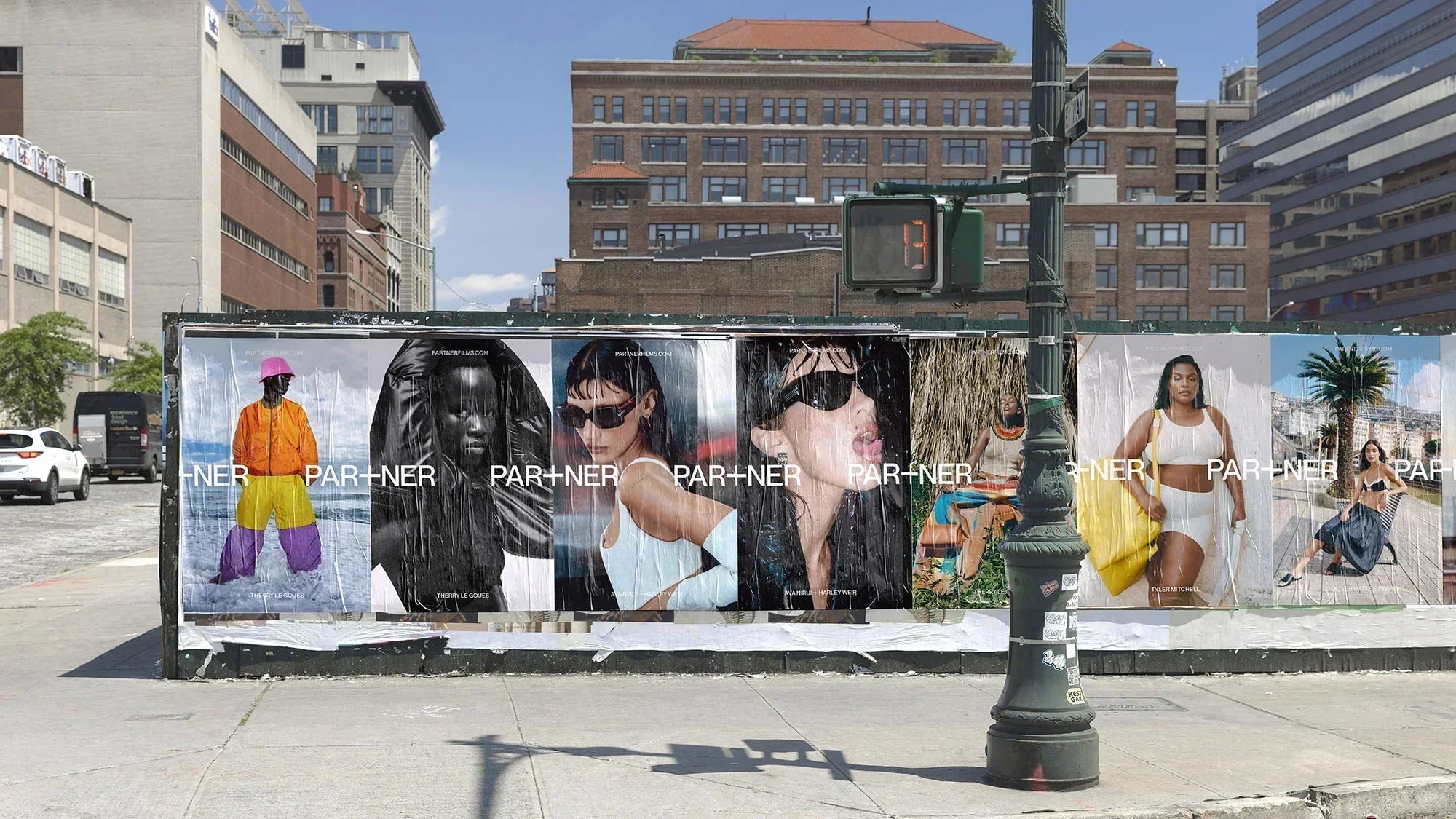
The cornerstone of the look, which Roses refers to as “one of those eureka moments when everything falls into place,” is the letter ‘T’ in the word ‘Partner,’ which has been creatively reimagined as a ‘+’ symbol. This sparked the creation of an intersecting wordmark made from two instances of the word ‘Partner,’ which cross at the centre where the plus sign is located. Subtle yet clever and highly memorable, it echoes the idea of collaboration and embodies the collective talent and creativity of the industry’s most inspired individuals.
The ‘+,’ a proud brand mark, is used liberally throughout the brand. For example, it’s seen all over the website, turning into the main cursor – closely accompanied by the name of the project as you hover over a certain case study – and is even seen in the text on the ‘About us’ page, cleverly replacing bullet points. By peppering the symbol across the website, Studio Roses unifies Partner Films’ digital expression and identity.
While the typography is not entirely minimal, Roses tells us, it is expressive – “at times bold and loud, and others, quieter and more restrained” thanks to the use of Pangram Pangram’s Neue Montreal, setting all text in its medium and book weights. “The typeface has a strong personality,” adds Roses, “particularly in uppercase letters, while maintaining a neutral character that helps achieve our desired minimal aesthetic.”
Taking cues from the editorial world and its “dramatic layouts,” the visual system places imagery front and centre, allowing it to speak for itself. “Our goal was to create an identity that is neutral enough to seamlessly complement any of Partner Films’ projects, regardless of their style or art direction, while maintaining a clear and distinctive personality that gives the brand its own voice,” Roses concludes.
All images © of their respective owners.
Content taken from Studio Roses


