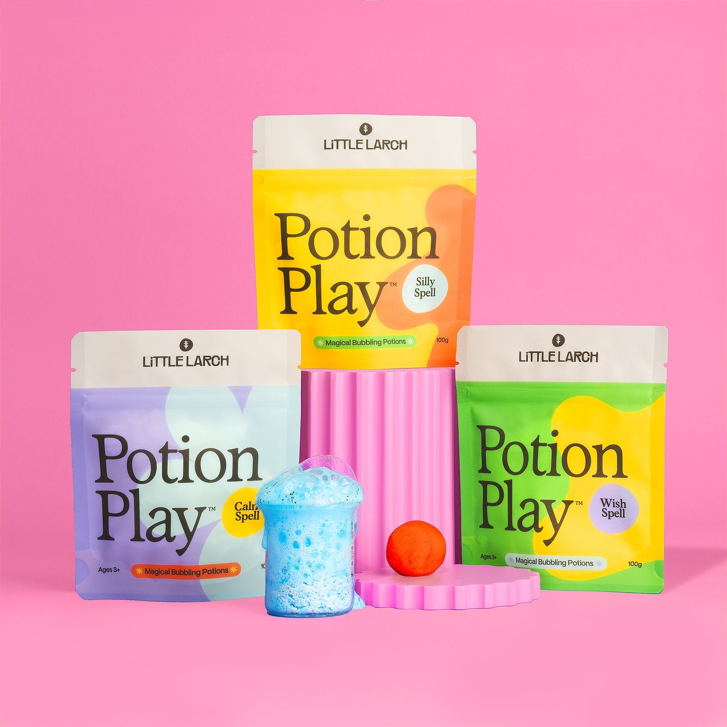
Little Larch is changing the game when it comes to sensory play for kids, with innovative products that are good for little hands, and better for the planet.
Working closely with the brand’s founder, we developed a new visual and verbal identity to match the company’s goals and ambition: to expand outside of Canada and become a household name in the industry.


From bespoke typography, iconography, and illustrations to updated packaging designs for their signature Doughs, Glitter Doughs, and Potion Plays, the end result is a fun, bold and expressive brand that stands out on shelves and doesn’t take itself too seriously.


All images © of their respective owners.
Content taken from Otherwise Brands

