A quiet beauty: The Phoney Club’s look for Ajen is a testament to the transporting power of a brand.
One look at Ajen’s brand world, and you’re transported to the beauty of the Dutch landscapes, perhaps lying on a light-dappled patch of grass, or swimming in a quite lake. Such is the power of the branding and art direction for the personal care brand by Rotterdam-based creative studio, The Phoney Club.
A brand, as we all know, is more than the sum of its parts, and this is beautifully captured in Ajen’s brand world which creates a mood and feeling that doesn’t quite hinge on a single element of the design, but is evoked in the coming together of every little nuance that makes up the brand.


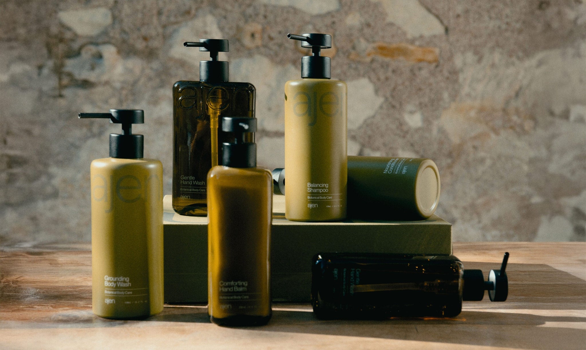
This holistic result was born from a comprehensive approach, one where, before going into the design details, The Phone Club decided to flesh out the brand’s story. It all started with an intention to define what Ajen offers, and also find the perfect name. “From the very beginning, we worked closely with Ajen’s founders to shape a brand that rethinks personal care at its core,” Creative Director Sanne de Wild tells us. “Their vision was clear – a forever bottle made of glass and steel, paired with custom and recyclable refill packaging, delivered to your door. A concept rooted in sustainability and thoughtful design.”


For the name, the team explored many possibilities, before finally landing on ‘Ajen,’ a free translation of the Old Frisian word ‘Ajēn,’ meaning “again,” reflecting the brand’s core focus on repeated use and sustainability. “Ajen became the starting point of a deeper concept, one that spoke to cycles in nature – the steady rhythm of tides, the changing seasons, and the grounding effect they have when we truly take the time to notice them,” says de Wild. “The name carried a deeply rooted Dutch heritage. It wasn’t about exotic, paradisiacal far-away destinations, but instead, it invited us to look closer at our own local nature. A lake just around the corner, the misty woodlands on a rainy winter day, the dunes on a crisp autumn afternoon.”


This worldbuilding was important for the brand, as it touched everything that came after it. Inspired by this idea, a quiet beauty is imbued through the brand, felt in the clean, crisp design, especially the wordmark, set in Neue Montreal. “We aimed to create a striking contrast to the moody, muted analogue imagery that evokes a deeply sensory experience. While the imagery mirrors the landscape – soft, moody, and atmospheric – the graphic identity embodies Dutch culture, bold, straightforward, and unapologetically honest. Delivering exactly what it promises – no more, no less,” adds de Wild. The wordmark is simple and confident, often used as a graphic statement, while its all-lowercase format introduces a certain softness to the brand.


Ajen’s connection to Dutch culture didn’t stop there. “Building on the brand story, we delved into the history of Dutch typography. The Netherlands boasts a rich tradition in type design – something we can be quite proud of for such a small country! This exploration led us to Wim Crouwel, the renowned graphic designer born in 1928, whose iconic typefaces, like Gridnik, remain influential to this day,” de Wild explains. Driven by this legacy, the team chose PP Supply Mono as the secondary typeface, reflecting the clean, structured heritage of Dutch design. “The primary typeface, Neue Montreal, guided this selection, ensuring a cohesive and harmonious relationship between the two typefaces within the brand’s identity,” says de Wild.

The rest of the brand is pulled together by a suite of graphic illustrations of the botanicals found in the products – lemon, cloves, mandarin, bergamot, and black pepper – and a packaging design that’s mindful of its presence in the world. To tie in with the brand’s sustainable ethos, the team chose to create an all-glass and steel bottle that inspires reuse. “To me, true luxury is about thoughtful choices – responsibly crafted products, wrapped in recycled boxes. It’s about intentional design that considers the lifecycle of the materials we interact with daily, including the ones that hold and protect the products we use,” says de Wild. “To me, that’s what a modern luxury brand should strive for – adding something meaningful and deeply considered to the world.”

All images © of their respective owners.
Content taken from The Phoney Club
