Agrandir Wide
Agrandir is a contemporary serifless type family that flips modernist neutrality on its head.
Free to try
Licenses start at $40
Agrandir Wide style list
14 Styles
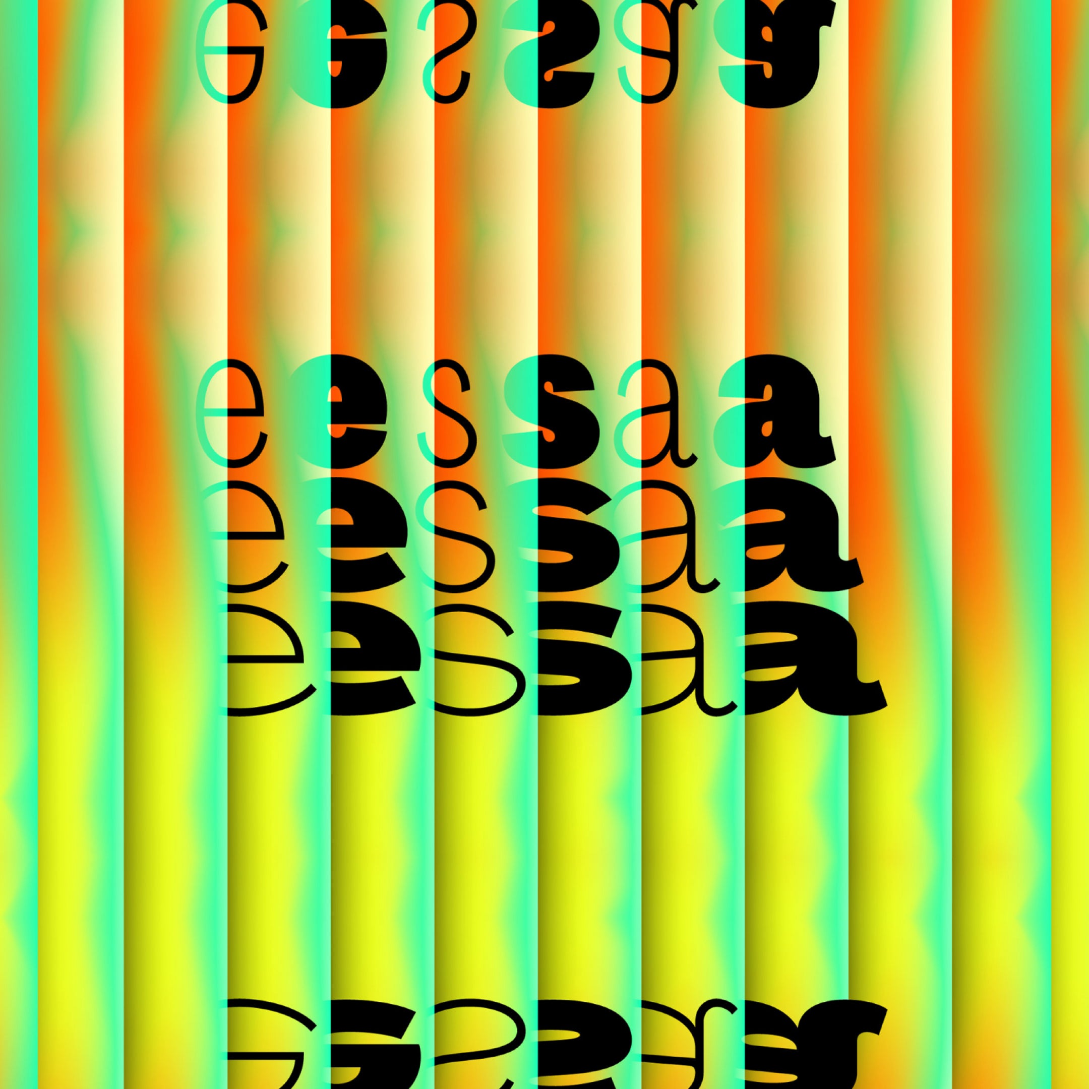
01234567
{(!@#$?&)}
01234567
{(!@#$?&)}
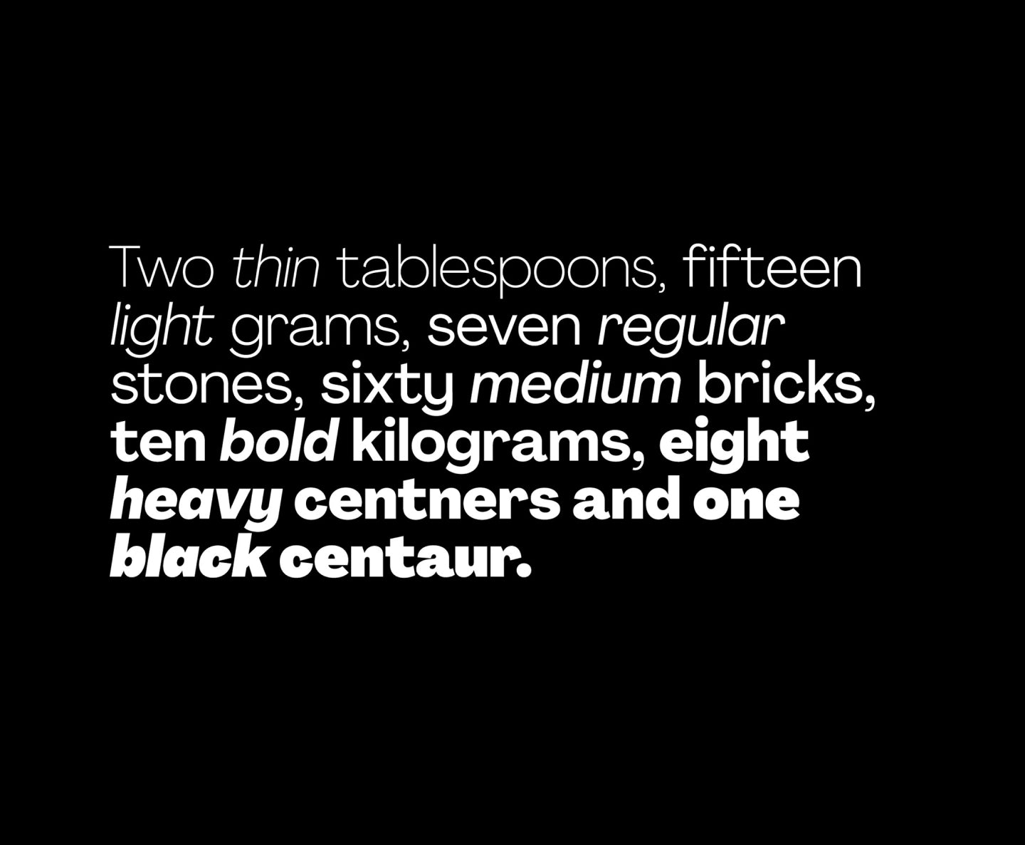
- Thin 150
- Light 230
- Regular 340
- Medium 470
- Bold 620
- Heavy 770
- Black 900
- Thin Italic 150
- Light Italic 230
- Italic 340
- Medium Italic 470
- Bold Italic 620
- Heavy Italic 770
- Black Italic 900


Agrandir
Wide Family
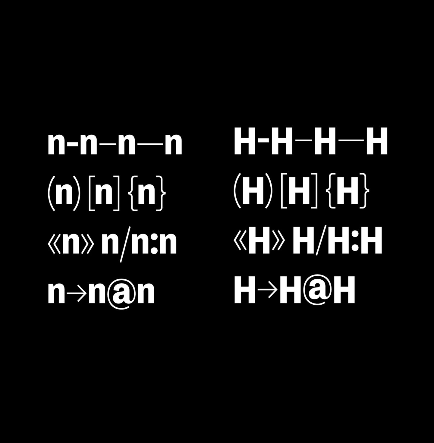
Glyphs set overview
Glyphs set overview
Glyphs View
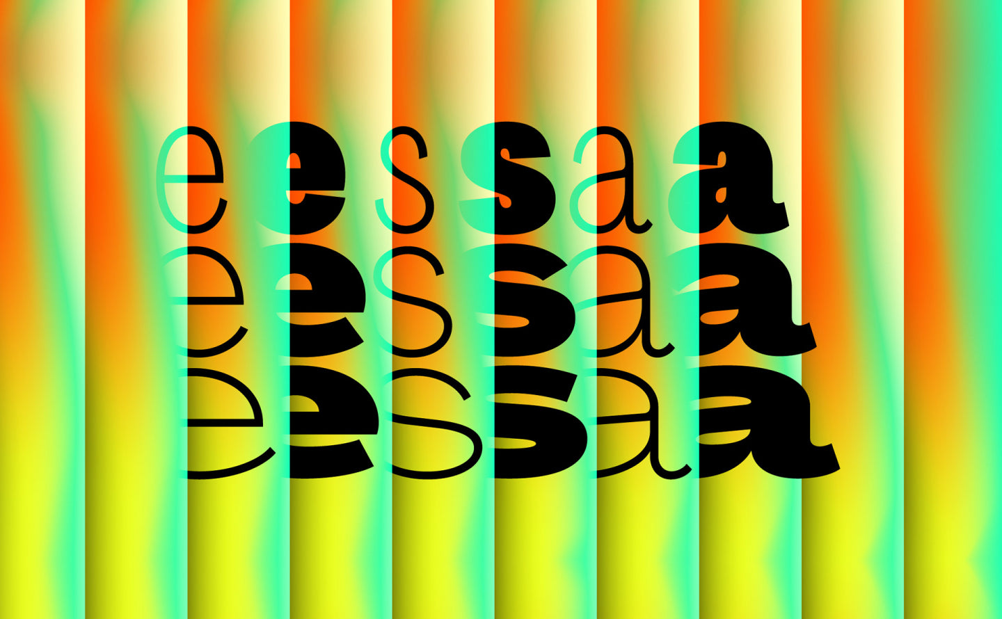
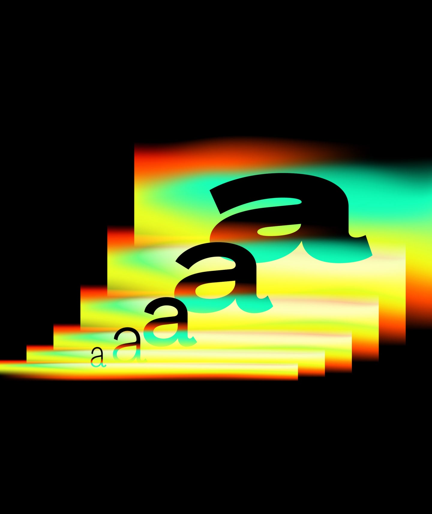
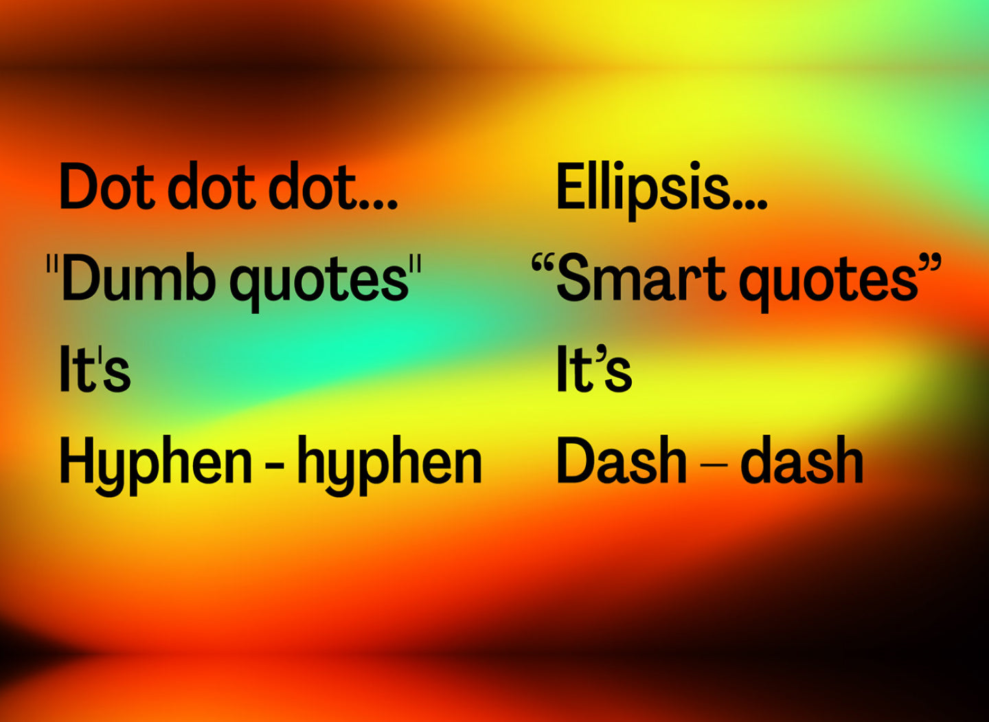
Agrandir Wide's Features
Perfectly imperfect.
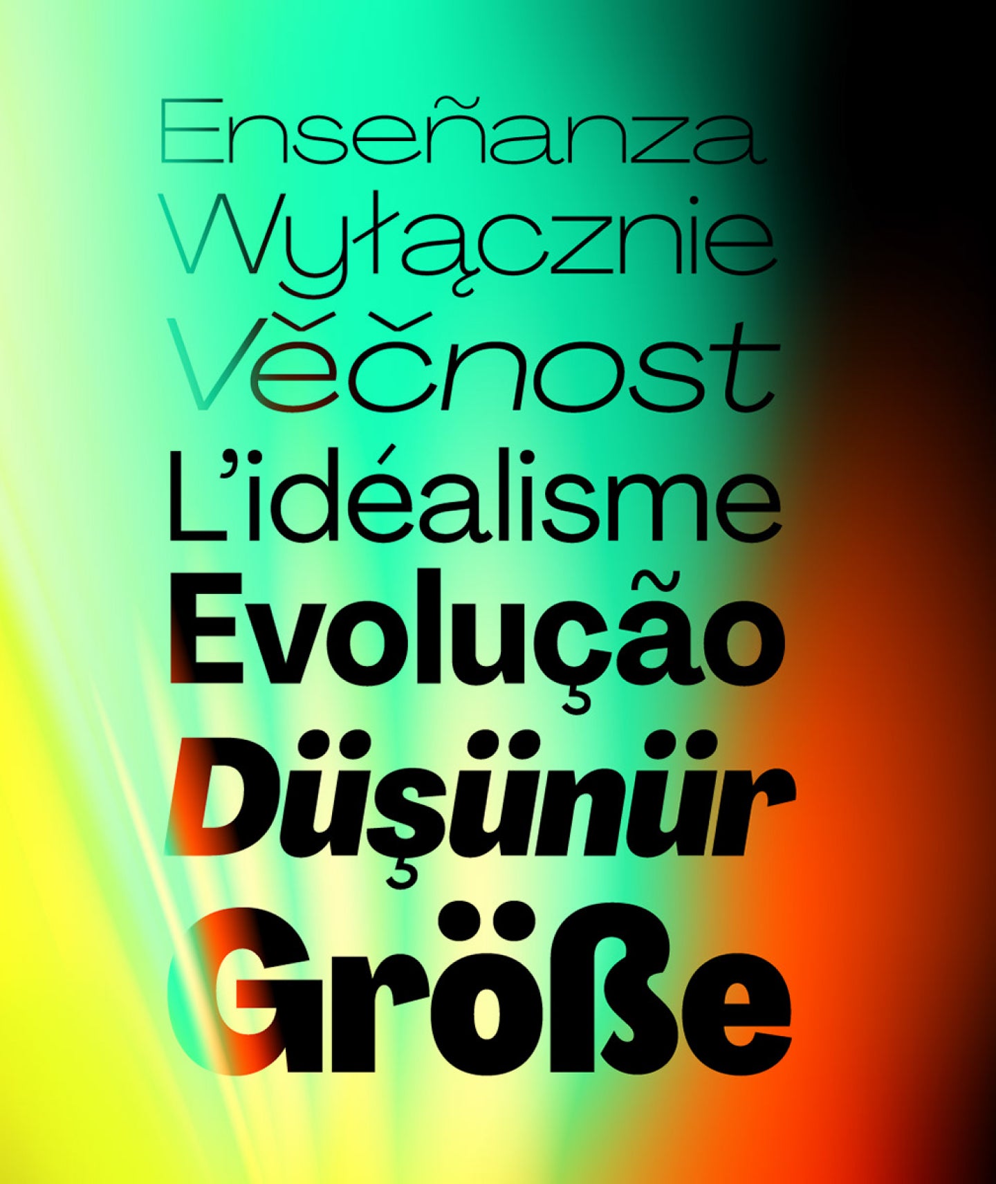
Agrandir is a contemporary serifless type family that celebrates the beauty of being imperfect. It was designed to be a brave antipode to neutral modernist fonts. Agrandir accepts its own shapes as they are – unaligned, quirky and funky. It celebrates humanity, not machines.
The type family consist of 74 fonts: 7 weights × 5 widths × Italics + 4 Text styles. Or just one 3-axes variable font. Agrandir features a fairly good number of OpenType stylistic alternatives, which can be turned on for individual letters or as overall presets – Default, Grotesk and Geometric. With its wide variety of flavors and super tight spacing Agrandir is gonna do a good job for big size headlines, websites, logos and posters, and its new text styles are great for body copy.
Designer
Categories
- Expressive
- Italics
- Sans Serif
- Variable
Styles
- 14 Styles
14 Weigths with 443 Glyphs each
Including Italic Support
Version
4.10
Latest update: June 2018
Available formats
OTF, TTF, WOFF, WOFF2
Language Support
Afrikaans, Basque, Breton, Catalan, Croatian, Czech, Danish, Dutch, English, Estonian, Finnish, French, Gaelic, German, Hungarian, Icelandic, Indonesian, Irish, Italian, Latvian, Lituanian, Norwegian, Polish, Portuguese, Romanian, Saami, Serbian, Slovak, Slovenian, Spanish, Swahili, Swedish, Turkish, (and more)
Commercial Licenses
Not sure what to get? Or can’t find the right coverage?
Please contact us for our tailored corporate licenses!
Need more information about our licenses?
Our FAQ usually contains most of the answers.
Explore the Agrandir sub-families by clicking on the cards below.
6 Sub-Families
Agrandir in use
View all using Agrandir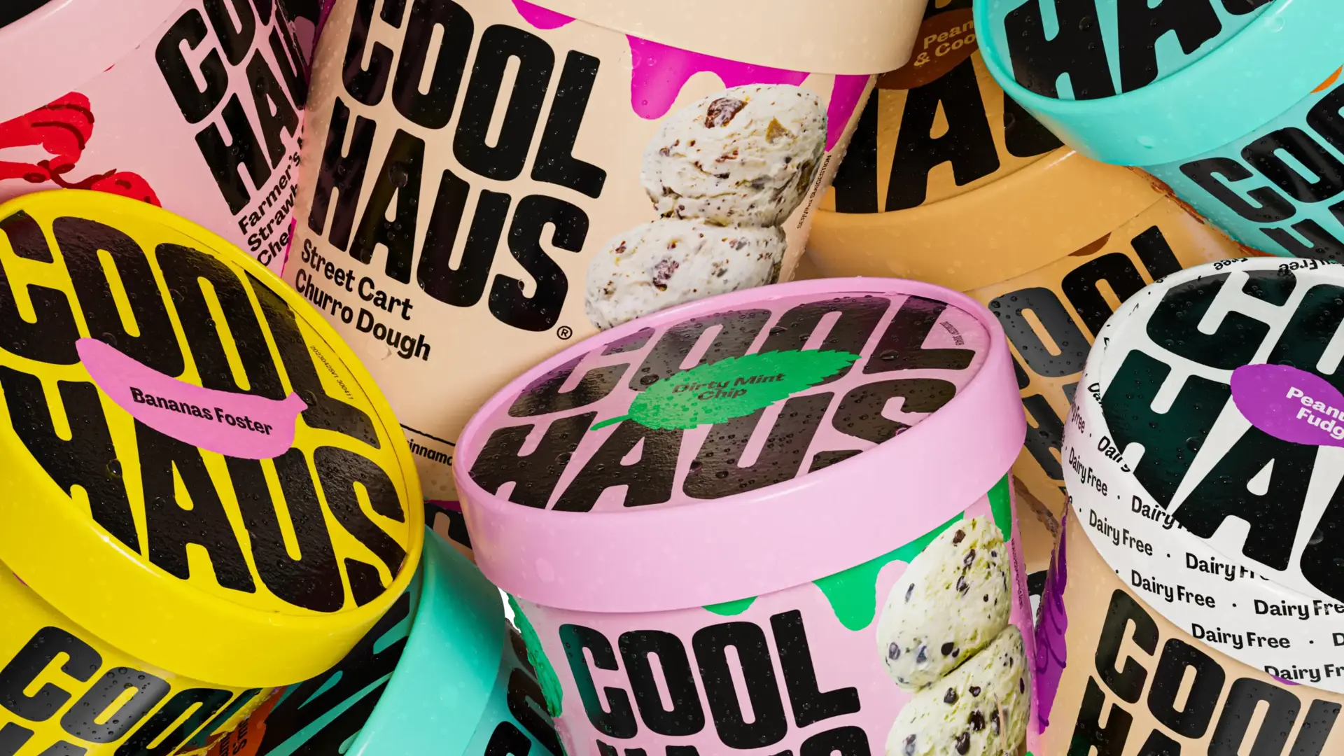
Coolhaus
View project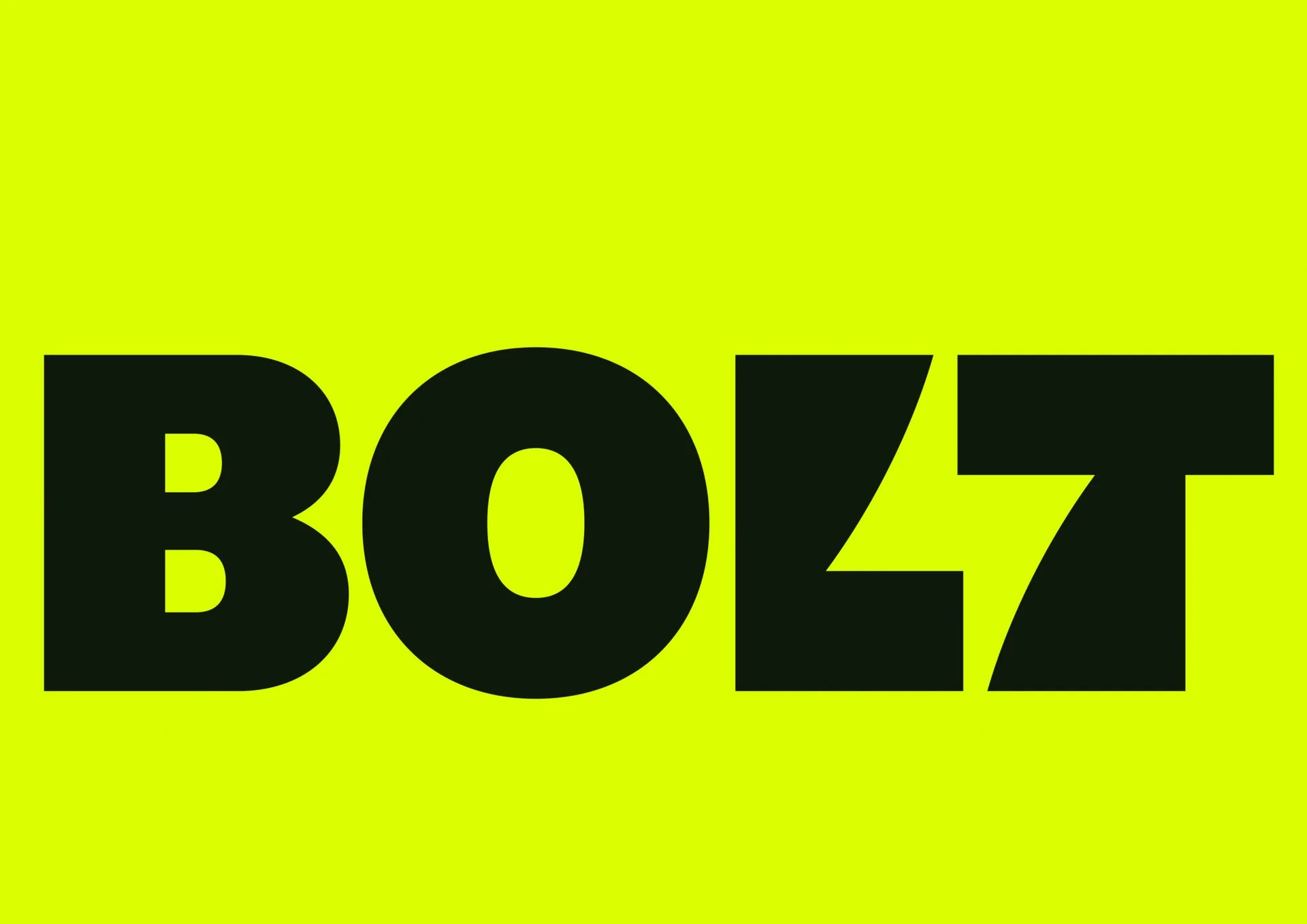
Bolt
View project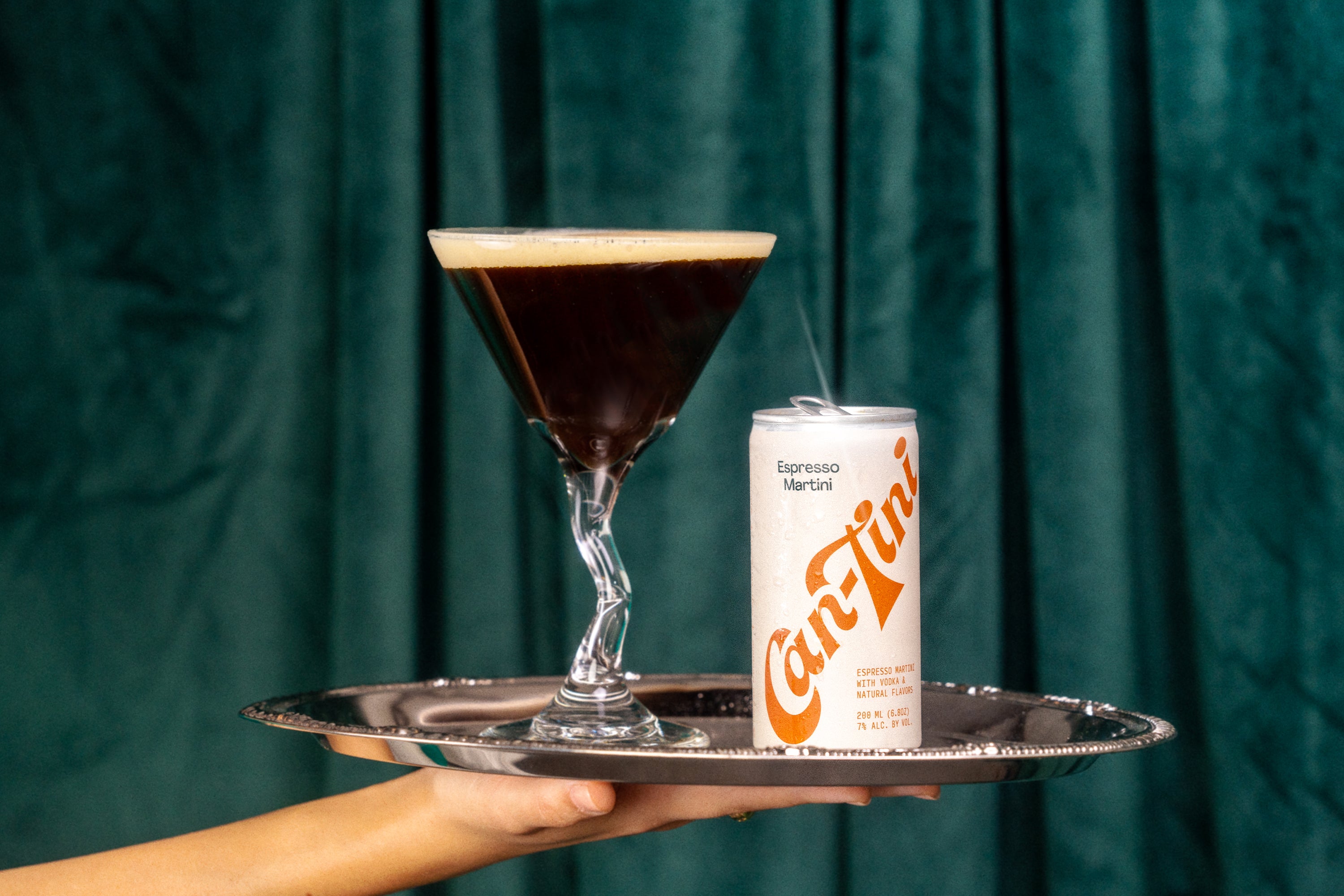
Can-Tini
View project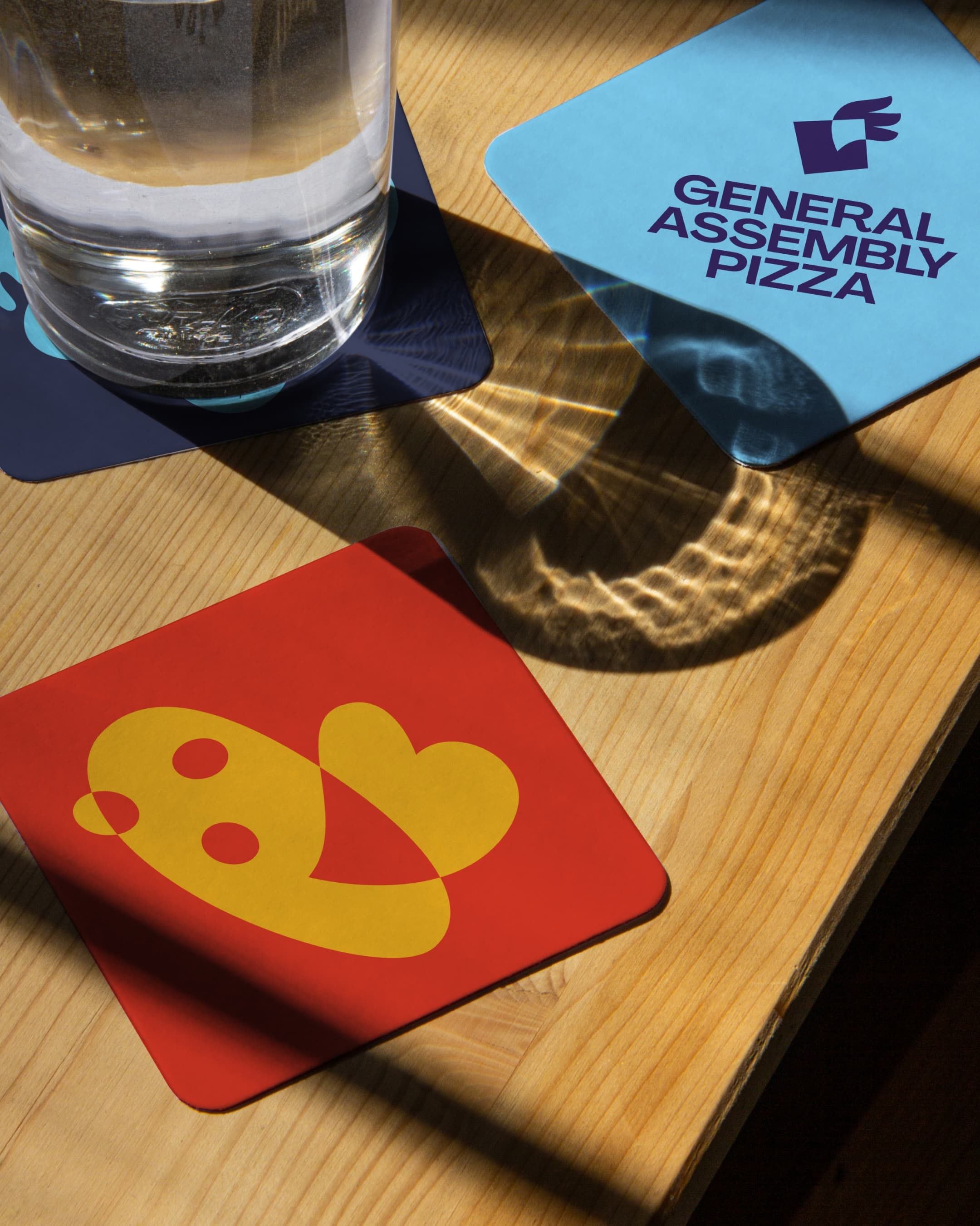
General Assembly Pizza
View project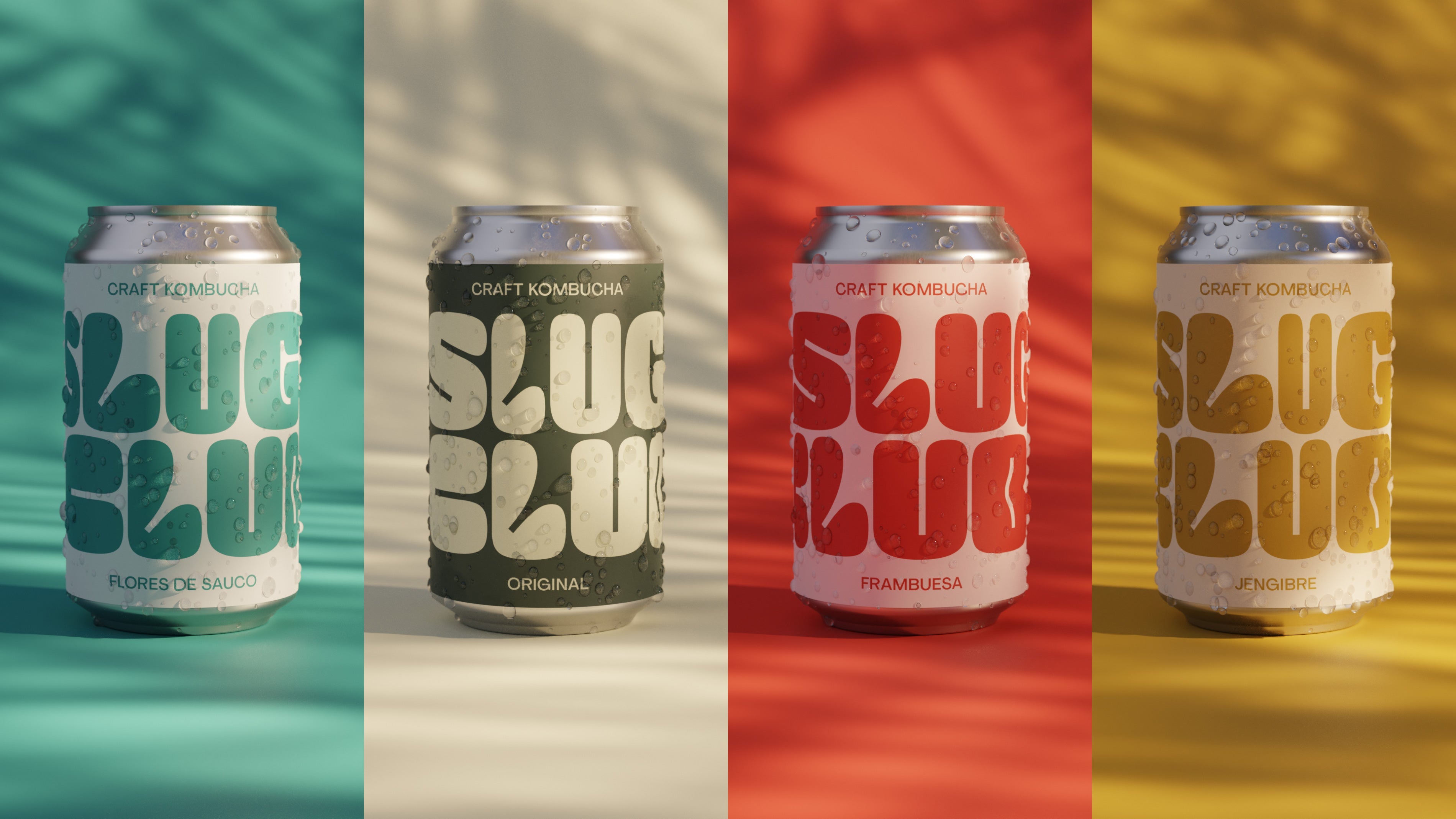
Slug Club
View project