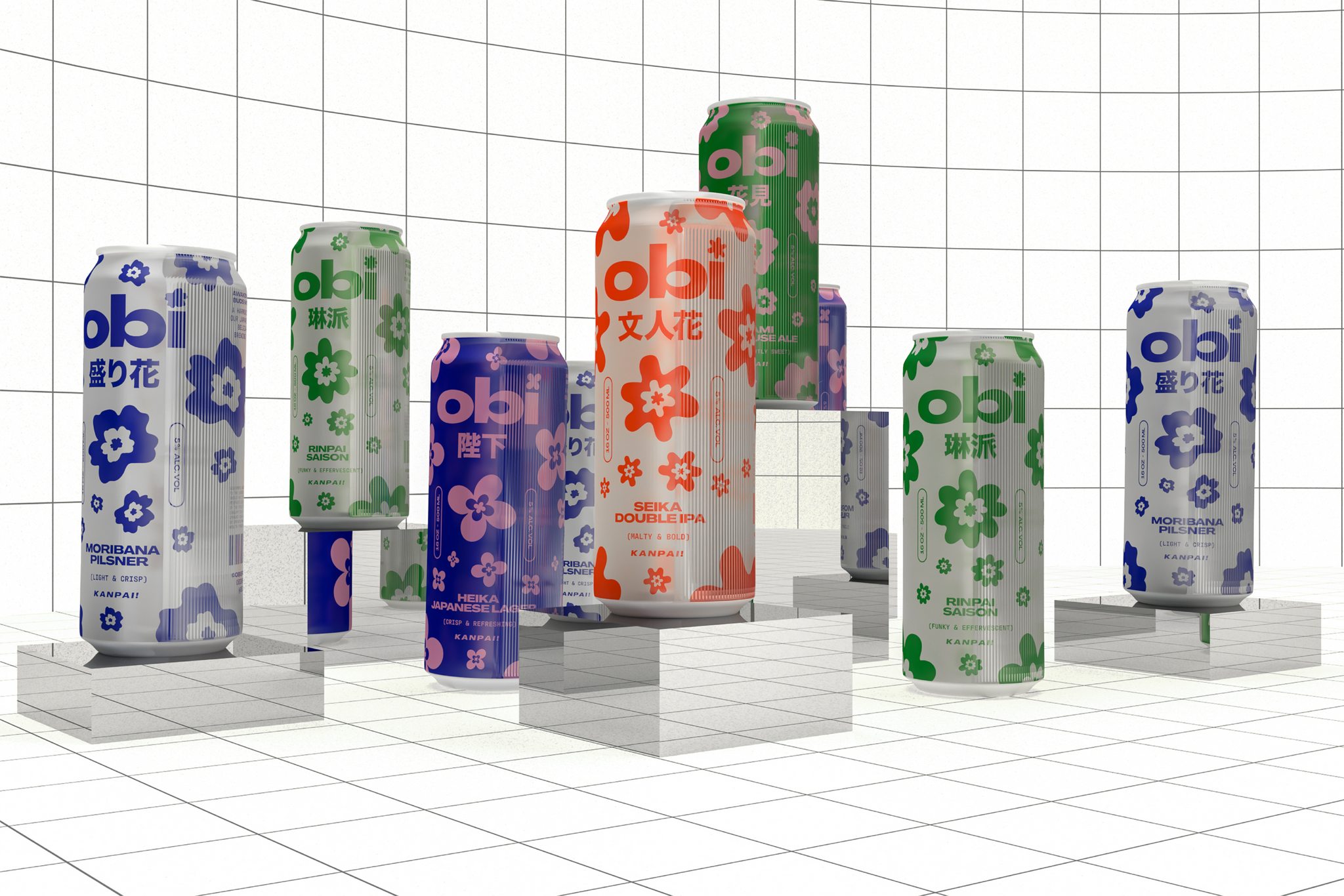
This brand identity project takes inspiration from Ikebana, the Japanese art of flower arrangement.
Each beer in Obi Brewing’s lineup is named after a specific style of floral arrangement. All of the brand elements work together to achieve the main principles of ikebana - movement, balance, harmony, and a fresh approach.


The tagline “Kanpai! Bottoms up!” is a nod to the literal translation of kanpai, which is empty the glass. The playful floral illustrations and bold colors work together to create an unexpected take on branding in the beer industry.


All images © of their respective owners.
Content taken from Barnada Studio


