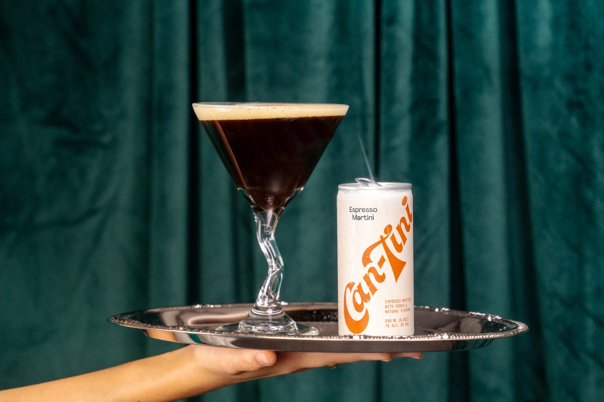
Can-Tini is a new CPG brand that specializes in ready-to-drink espresso martinis.
Our client approached us with a goal: To encapsulate the fun, social experience of ordering an espresso martini at a cool bar in can form.


Our task was to develop a brand identity, packaging system, and animation style that would embody a retro, bold, fun, and stylishaesthetic that appealed to a younger generation of sophisticated party goers / chillers. Oh, and our client’s main inspiration to combine Wes Anderson with 60s / 70s James Bond films.


To capture Can-Tini’s brand persona, we extensively researched vintage magazines and ads from the late 1960s and early 1970s in Italy. These references provided valuable insights into the prevalent design language of that era.


We created a custom script logo to embody the brand’scharacter, using a color palette, typography, and layout styles inspired by the time period. The logo became the focal point on the cans andboxes, while a repeating pattern added a whimsical touch, complementing the retro aesthetic.


All images © of their respective owners.
Content taken from Saint-Urbain


