While some ice cream brands want you to try their Neapolitan, Coolhaus encourages you to savor the taste of fries dipped in your milkshake.
When Coolhaus approached us to collaborate on their rebrand, we were invited to imagine an identity for a brand founded on the belief that ice cream offers endless possibilities.


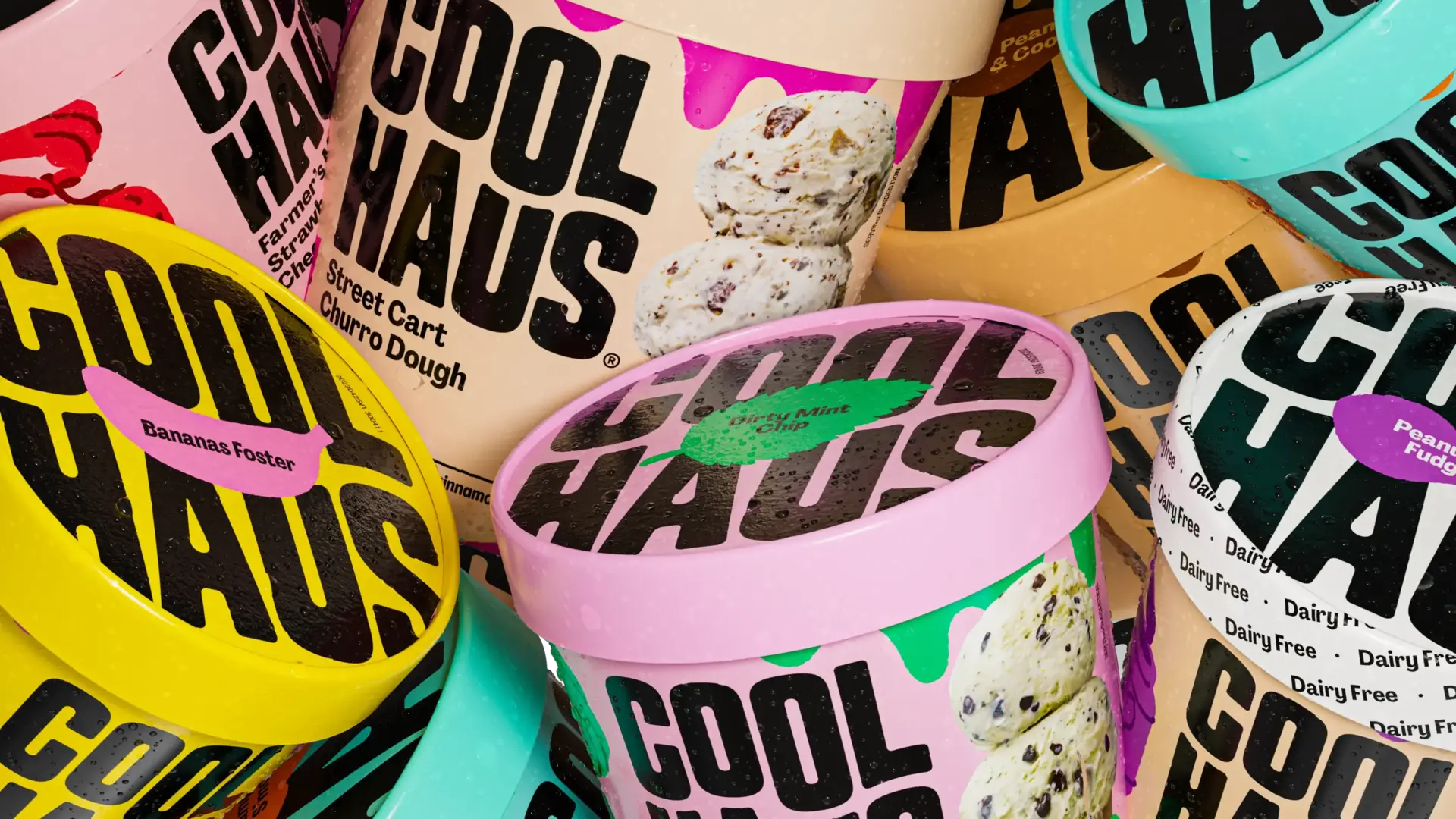
We chose to center the brand direction on "Edible Creativity," highlighting the unique personalities behind every flavor and SKU through evocative naming, vibrant colors, and a robust custom illustration system. We developed a cohesive brand hierarchy that seamlessly adapted across 60 SKUs and three distinct categories: Dairy, Dairy-Free, and Animal-Free Dairy.


We developed a hand drawn illustration system that differentiates flavors while creating a cohesive visual identity across the entire product line. Taking production constraints into account, we designed each illustration to work within the limits of printing, using just two distinct tones. This approach ensured a strong brand presence and streamlined, cost-effective production.


While some ice cream brands want you to try their Neapolitan, Coolhaus encourages you to savor the taste of fries dipped in your milkshake. When Coolhaus approached us to collaborate on their rebrand, we were invited to imagine an identity for a brand founded on the belief that ice cream offers endless possibilities. We chose to center the brand direction on "Edible Creativity," highlighting the unique personalities behind every flavor and SKU through evocative naming, vibrant colors, and a robust custom illustration system. We developed a cohesive brand hierarchy that seamlessly adapted across 60 SKUs and three distinct categories: Dairy, Dairy-Free, and Animal-Free Dairy.


We developed a hand drawn illustration system that differentiates flavors while creating a cohesive visual identity across the entire product line. Taking production constraints into account, we designed each illustration to work within the limits of printing, using just two distinct tones. This approach ensured a strong brand presence and streamlined, cost-effective production.


We developed the verbal identity and naming strategy for Coolhaus products. Our names aimed to balance the descriptive nature of the product and the fun and playful spirit of the brand. Like the “Thrilla in Vanilla”, or “A Lotta Horchata”


All images © of their respective owners.
Content taken from & Walsh


