This is a statement in defence of what’s not special.
1.
There’s a perverse expectation hidden within this caption: apparently a table can’t be too simple, normal or trivial to be worthwhile. In fact, the opinion that something could have been done by anyone has a decise negative undertone. Even among designers.
“My kid could do that”, sure, but he actually didn’t. Instead, what he did was creating a visually polluted environment by either doing or requesting objects that had to “stand out” and forcefully “grab” the attention of the viewer.
2.
As soon as the excitement of getting something “outstanding” is commodified, simplicity is at risk. Design becomes a temporary entertainment that looses its value the moment that the initial emotion wears off.
As a result, today it’s incredibly hard to find a wood table with four straight legs, a book cover without images, a logotype with no irregularities made to fit a silly concept. That doesn’t mean they don’t exist (thanks Muji), but they are quite inaccessible by those who aren’t interested in looking for these sort of things.
The response to the continuous bombardment of “entertaining” objects may be valuing all that is unassuming. And that kind of normality is not to be labelled as “minimal”. Speaking about typography, if the casual reader's eye gets lost in the details of a text instead of just reading it, something is not right, be it ultra-minimal or highly ornate.
TThe complete absence of pretentiousness is what triggers the negative aspect of “anyone could do that”, because the lack of personal expression is seen as a mistake. Yet, as designers, we can find value in a pencil, in clothing hangers, in a quick note written by hand as the writer didn't have enough time to consciously create complexity.
They are tools, and tools are supposed to function properly, not spark emotions.
3.
On the other hand, it’s actually impossible to be special. Finding a sustainable way to produce graphic design that is always felt as unique is really just a mirage.
“It used to be possibile to be special — to sustain unique differences through time, relative to a certain sense of audience. As long as you were different from the people around you, you were safe”. A research by K-Hole concludes that due to the globalization of events and tastes the most “alternative” thing to do is to reject being different all together.
“The details that distinguish you are so small that nobody can tell you’re actually different”. If it’s hard for designers to guess the exact version of Helvetica among hundreds of grotesques, how can the general public value the use of a custom transitional serif typeface instead of that Times New Roman that is available on every computer?
“You’re so special nobody knows what you’re talking about”. We’re now supposed to consult “UX specialists” and “brand strategists” before even attempting to think about a website, but what’s the point of all these professionals? Couldn’t we just design a simple online page? The client will never be able to fully understand what a wireframe is.
“The markers of individuality are so plentiful and regenerate so quickly that it’s impossible to keep up”. Are 90s-inspired websites still trendy? Wasn’t it a thing of 2016? Is it still edgy to use gradients and shadows or are we stuck in 2009? What’s “original” comes and go in matter of days thanks to the constantly connected world. Thus being always on point everywhere is just an impossible task.
4.
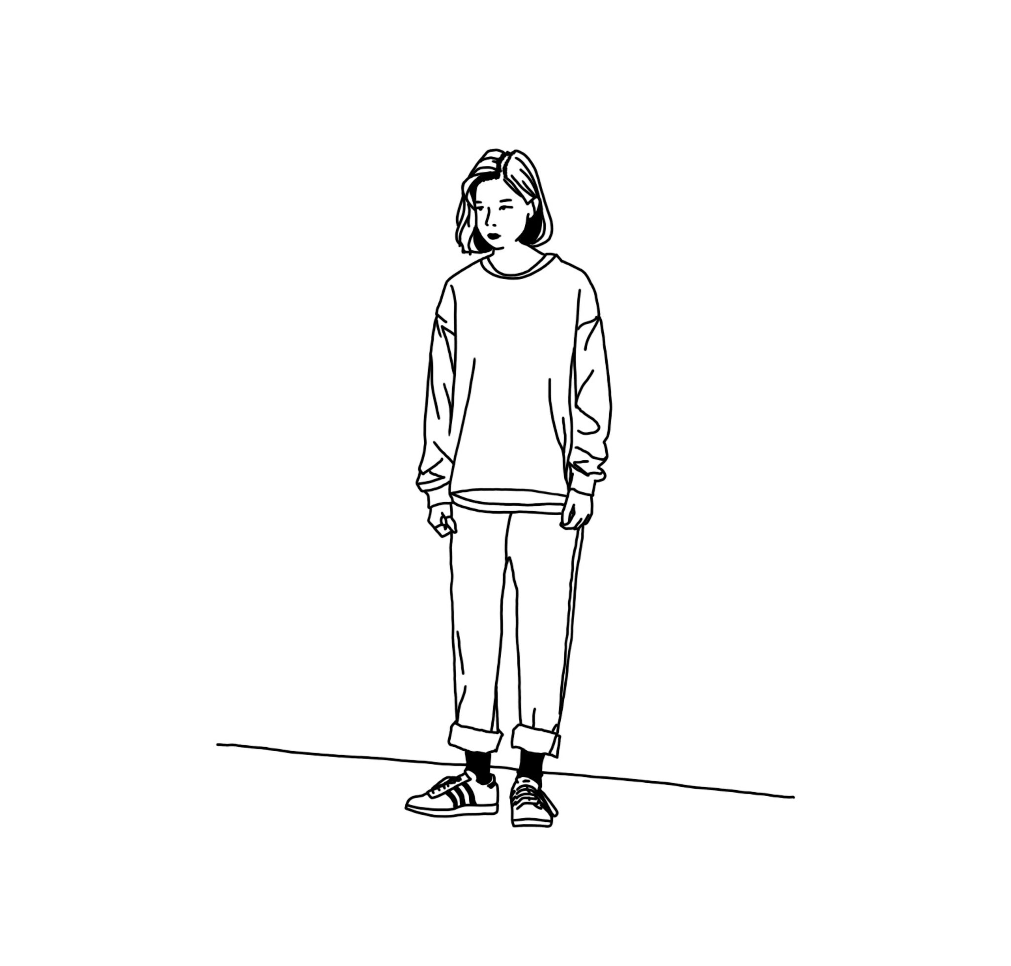
There are indeed better ways to design than wasting time in making something so special “a kid wouldn’t be able to do that”. Normcore: defined as being unconcerned with authenticity. Considering the simple, the basic and the defaults as “objet trouvé” to focus instead on delivering objects that are rewarding in the long term.
No doubt it’s a part of a wider movement of “anti-design”, but at least against the pressure to be unique, accepting the casual and the ordinary means finally finding liberation in being nothing special.


