Helvetica, with its clean lines and timeless appeal, is a typeface that stands as a symbol of modernist design – and a hugely recognisable and popular one at that!
While it pairs seamlessly with various fonts, we think it’s time people start to think a bit outside the box with what they’re pairing Helvetica with. More off-kilter, less off-the-shelf. To push your designs in unconventional, unexpected directions. Today, we’ll explore five wonderfully weird, but also really-well-made fonts, each offering a surprising twist to standard pairings with Helvetica. From the brutalist beauties to the cinematic sans serifs, these pairings are a testament to the versatility of Helvetica and its ability to harmonise with fonts that defy the norm. A pragmatic partner to fonts that push the boundaries of tradition. Redefining the way we think about type whilst demonstrating that the art of typography is a playground of endless possibilities.
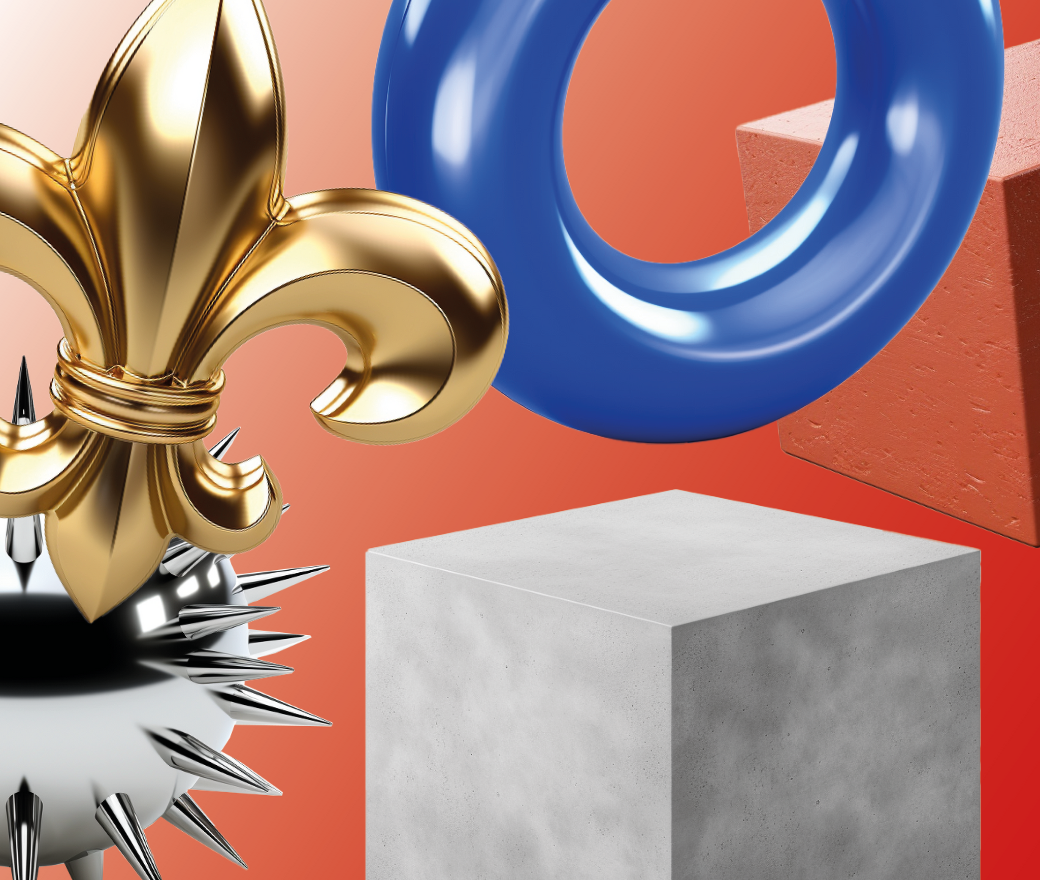
Helvetica and Brut
A stark twist on tradition, Brut defies what came before it by reimagining the classic Bodoni with a brutalist, angular design. In a surprising pairing with Helvetica, this unlikely duo brings a twist of character and construction when side by side, with Brut offering discretionary ligatures and mono styles that provide the means for exciting, interlocking compositions of type. This pairing is not only an exploration of contrasts, where the curves of Helvetica meet the curveless, characterful design of Brut – creating a captivating visual tension – but also a fascinating amalgamation of minimal and maximal forms.

Helvetica and Neue Montreal Squeezed
The trend-ready, unrelenting powerhouse pairing. Originating as the stretched counterpart of the popular Grotesque sans serif Neue Montreal, Neue Montreal Squeezed from Off Type, when paired with Helvetica, crafts an undeniably rigorous, ready-and-waiting typographic couple, one of play, practicality and personality. Here, resonant yet distorted forms are interrogated, creating an exciting space for classic and contemporary forms to collide and complement, bringing whatever creative context bang up to date. And if you fancied pairing it with something like Helvetica, but not Helvetica, simply pair it with Neue Montreal instead!

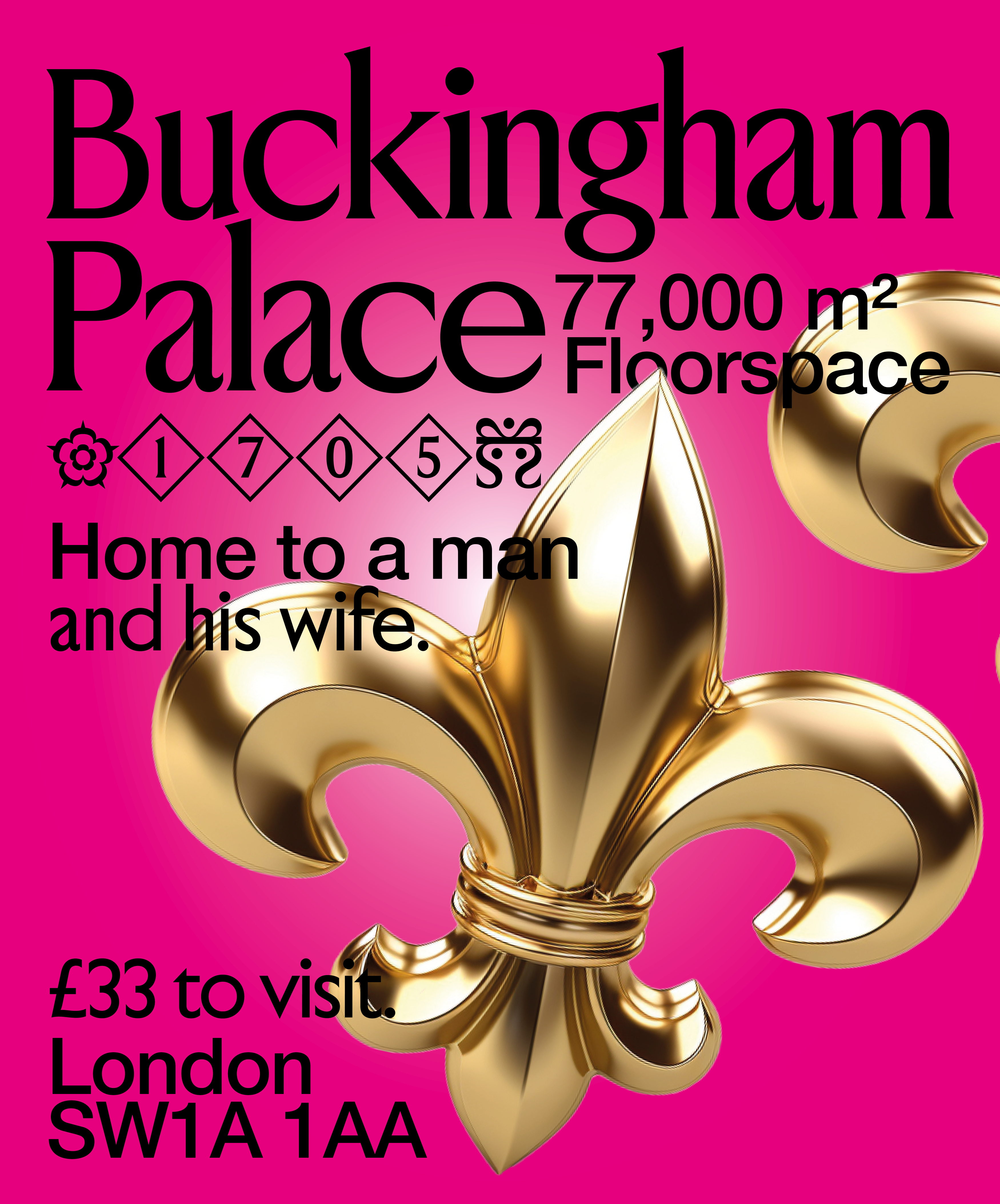
Helvetica and Jubilee
Jubilee marries the pomp of the Windsor Royal Family with the classic font Gill Sans, creating a fresh and entirely new typographic experience. When combined with Helvetica, this pairing truly unites elegance and practicality, with Jubilee offering beautifully, warmly hand-crafted proportions unlike anything in its genre. Moreover, with its sans and serif capabilities and unique icons, crests, and diamond-like punctuation, this pairing is perfect for both display and practical use, culminating in a surprising blend of elegance, regality and legacy.
Helvetica and Missouri
Missouri is a font dedicated to cinema, embodying the passion and experience of the silver screen, taking inspiration from the wide angles of cinema and translating them into bold, chunky proportions. When sat shoulder to shoulder with Helvetica, the two create a cinematic duo that ultimately stands out, loud and proud, calling on Missouri’s distinctive features – such as its chunky, broad proportions with aperture-inspired, film-reel-reminiscent ink traps.

Helvetica and Rhapsody
A melodic mashup, Rhapsody and Helvetica compose a unique symphony, combining to create a charming, thrilling pairing that only accentuates the still-timeless elegance of Helvetica and the musical charisma of Rhapsody. With its design roots found in musical notation, the Off Type display was born out of the resemblance between contemporary musical notation and the classic typeface Didot, resulting in something both eccentric and nostalgic. Packed with musical notation characters and lyrical discretionary ligatures, Rhapsody marries the orchestra-inspired profiles with minimalist decadence, creating a graceful and fluid font.

You can find all of these silly/playful/charming/wonderful/fun fonts that are really really well made over at Off Type, Pangram Pangram’s sister foundry. All free-to-try today 🌐


