What makes the person, the character and the philosophy of type designer Tré Seals so interesting is, in fact, his own perpetual interest, and continual exploration, of the field.
Noting the short – and fundamentally non-inclusive – history of typography, the Washington-based creative not only sees but thoughtfully traverses the industry with intrigue, enthusiasm and critique; crafting equally as intriguing, enthusiastic and critical typefaces and projects in the process. Recently working with cinematic legend Spike Lee in the production of their new book – proceeding the creation of his own independent type foundry Vocal Type – Tré is a creative force to be reckoned with. To date, Tré and Vocal Type have a sensational array of expansive typographic endeavours, investigating Black culture and civil rights through the powerful and expressive lens of letterforms.
We’ve spoken to Tré to discuss as much, touching upon explorative practice, the research and story behind it, as well as his recent collaboration with Spike Lee.
Hello Tré! How's everything with you?
Extremely busy, but good. Thanks for asking.

What excites you about type design, what got you into it and what keeps you interested?
The history of the type design industry is pretty young if you think about when typographic styles were created. We didn't really see slab serifs until the early 1800s and sans serifs until around the 1850s. With a history that recent, there's a lot yet to be explored.

What's the story behind the founding of Vocal Type?
In May 2015, I graduated with seven job offers ranging from art director positions at startups to a Pepsi junior design position. I ended up taking a full-time position at a staffing agency where I worked for 8 or 9 companies over the course of 2 years. I learned a lot about what kind of designer I wanted to be and what types of clients I wanted to work with. After that, I went full-time freelance and began to renovate the stable that is now my studio.
One day, while working on another brand identity for another real estate agency (I did a ton of those as a temp). As usual, I was aimlessly searching for inspiration, and suddenly, I just got really bored. Everything looked the same to me. No matter how beautiful, everything looked the same. There was no character, no culture. I started wondering if I had chosen the wrong career.
Not long after that, I came across this 1987 article titled "Black Designers: Missing In Action" by Dr. Cheryl Holmes-Miller. In it, she talked about how, like most industries, the design industry is white male-dominated. If our job (as designers) is to communicate an idea to Black communities, Black designers need to have a seat at the table. And I say the same for Latin communities, Female communities, LGBTQ+ communities, and so on. Everyone needs to have a seat at the table. The world continues to become more and more diverse, and the industry needs to catch up.
A few weeks after reading this article (2016), Cheryl released a sequel for the original article's 30th anniversary, "Black Designers: Still Missing In Action." This version was less analytical and was her way of passing the torch to the next generation of Black designers. It made me want to figure out a way to, somehow, add diversity to the design industry.
I looked back on my life and thought about those days of practicing cursive, graffitiing people's names on index cards, designing tattoos, making Unveil; it just made sense to start a font foundry.
And in thinking about diversity, I had to think about my racial experiences. Like the times I experienced racism and bigotry in the workplace, or when I got stopped by four cops in Minneapolis, or the first time I was called the' N' word, or the first time I experienced racism. However, I also had to think about my positive racial experiences. Like the pride, I felt when learning about Dr. King, Bayard Rustin, Eva Peron, Ruben Salazar, Dolores Huerta, Nelson Mandela, and many others who have left this earth better than they found it.
That's when I realized that type could be more than just a design tool, but a tool for educating and sharing stories like this one. That's why I decided to add a piece of minority culture to the root of any great work of graphic design—typography.


Your type of design practice is often fundamentally inspired by history and, in particular, historical figures. The research behind each typeface is pretty remarkable, how and where do you find the stories that inspire you, and what is most rewarding about the process?
A lot of it is self-initiated, but once I have a starting point, the process of finding the stories is the same. For example, let's say I want to design a typeface inspired by the American Indian Movement. From there, I'd start searching for famous protests (e.g., longest-lasting, most heavily attended, etc.). Once I have that, I'd try to find a piece of type that multiple people have a connection to, like a banner carried by 10 people or copies of a sign carried by hundreds of people. That way, every typeface has this all-encompassing theme of unity, regardless of movement or era. From there, I'll identify an activist who has a connection to both the movement and event to name the font after.
What makes this process work so well is that the starting points are interchangeable. But the results are the same.
While this process works for me, I also have a group of genuinely amazing followers, more like a community, who will recommend movements, events, or activists to make a typeface based on, as well bits of research to help me along the way. VTC Ruby and Du Bois are two great examples of that.

If you were to give someone wanting to start out in the type design world one piece of advice, what would it be?
Keep failing. The more you fail, the more you start to realize what's working and what's not working. More importantly, you begin to trust your eyes and instincts, not just the math and geometry involved. The more you fail, the better you get. Just don't give up.

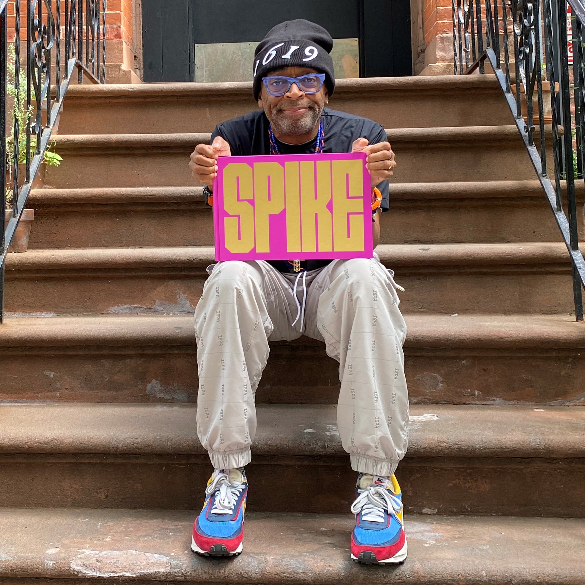
One of your latest projects has involved making four striking custom typefaces for the one-and-only Spike Lee! How did this project come about, and what did it entail?
I first got the email in September or October of 2020 regarding designing an unspecified number of custom fonts for the book. After the fonts were completed, I was asked to typeset the book and then design the entire book. After that, I was asked to design a sticker sheet for Barnes & Noble, then a mini print for NTWRK. The project just kept growing.


Where did you find the inspiration for the design of the individual cuts of VTC Spike, and how did that inform their construction?
There are 5 fonts within the Spike book (6 if you include the one we never used).
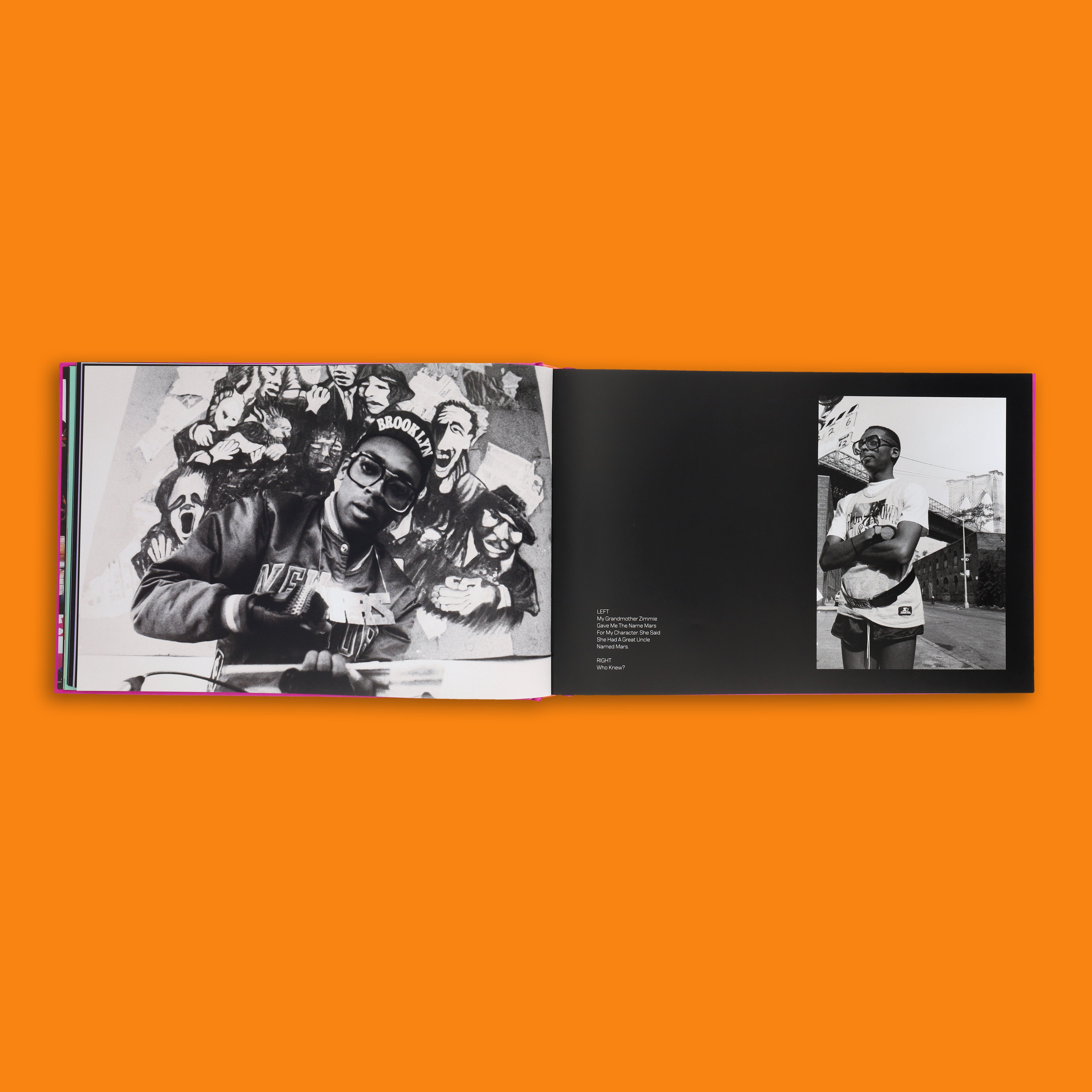
VTC Spike Headline was primarily inspired by Radio Raheem's rings from Do The Right Thing, and the MARS chain from She's Gotta Have It. But I quickly realized that making a font for the chapter titles that only tied back to two films wouldn't feel right. So I took inspiration from posters for films such as School Daze, Get On The Bus, Miracle At St. Anna, School Daze, BlacKKKlansman, and Da 5 Bloods, as well as the numbers on New York Knicks jerseys.
VTC Spike Display is a heavily condensed version of the VTC Spike Headline. Unfortunately, I was not able to use it within the book. However, I did put it to use on the spine of the book. VTC Spike Text and Italic were used for the quotes and captions throughout the entire book. Lastly, based on VTC Spike Italic is VTC Spike Tag. Inspired by the movement of graffiti tags, this font was used in the introduction and on the back.

What was the most challenging part of perfecting VTC Spike, and how did you overcome it?
My biggest challenge was in designing VTC Spike Tag. Different portions of each character extend beyond their bounding boxes, so I ended up having to make 2-4 different versions of each character so that the extended lines wouldn't cross over and confuse the eye.

You mentioned how VTC Tag was inspired by the action of graffiti and, with that in mind, the whole Spike family has a bold, physical presence to its architecture. Did graffiti lettering inspire any other elements of the project, and how important is a sense of tactility and physicality in the design of VTC Spike?
Graffiti only played a role in that one typeface. However, for that Barnes & Noble sticker sheet I mentioned, I actually designed 5 throw-ups. However, architecture, in general, played a considerable role in developing 2 parts of the book. First, the front and back inside covers consist of a few dozen images arranged in a brick pattern. Then the chapter titles, which have these long solid blocks, are actually based on a map of Brooklyn (as in city blocks).
Do you have a favourite glyph from across the entire family?
Can I just list the entire character set?

How long was the research and development process that went into VTC Spike, what was the most interesting thing you discovered along the way, and were there any key turning points across the project's development?
The research and development process took somewhere between 2 and 3 months. As I'd design each typeface, I'd constantly search for more source material, just in case I missed something that could inform the design of a character.
The most significant turning point was when I decided to remove any curves from all of the typefaces to match Spike's brand typeface (or at least the one that was on his shop). The most interesting thing that I discovered along the way was that there was a different set of LOVE and HATE rings from what appeared in the film.
As for key turning points, that didn't really happen until I started designing layouts for the book. After a few iterations, we realized that one of the fonts I designed wouldn't work, as we didn't have enough content to require a sub-headline font.

What was the most rewarding part of the journey of VTC Spike's creation?
I felt the most pride and joy, not when the type was finished, but I received my first copy of the book. Seeing the physical book in person is entirely different from looking at the design on screen. As I flipped through the pages, I could finally see how the research, the type, the photos all came together to make one cohesive image of Spike. It was like the type was no longer representative of a personality but the person and his journey.
Looking ahead, what project or artist would you most love to develop a typeface for?
I would love to work on a typeface for fellow Young Gun Kerby Jean-Raymond and designer Ouigi Theodore. Beyond fashion, one of my dreams is to work with film production companies to design types for historical films. Other than that, I'm simply excited to see what's next.

Turning towards the future, what do you think lies ahead for type design, what do you see sticking and what do you see as passing trends?
I'm not one to predict, but here's what I've noticed. I've seen quite a few people trying to make fonts similar to those of Violaine & Jeremy (VJ Type). I've noticed an increase in the creation of monospaced type and type that explores the limits of either flare or wedge serifs. Lastly, I'm seeing an increase in purely experimental type that is more illustrative than legible.
My dad always said that fashion trends repeat by decade, and I believe the same is true for type. So if I had to pick a decade, I'd say that right now, we're in the 1970s, slowly transitioning into the 1980s.
What's on the horizon for Vocal Type?
I've been trying to figure that out lately. I'm not a fan of labels, so simply because I design type doesn't mean I should only be a type designer. So I've been looking at other designers and companies that have created types and done other things. Like Berthold Wolpe, my favorite type designer, who also designed book covers. Or how Herb Lubalin and Tom Carnasse did everything type-related. Or like how House Industries seems to do whatever they enjoy. I think we've gotten to a point where we forget that type foundries of the past also sold stock illustrations, which would also be amazing. But, until I figure it out, I'll continue to make Vocal Type.


