Other than intense competition and seeing the best of the best (at their best), the Olympics also provides a totally unique platform for type and design, so, last week over at the Pangram Paper newsletter we thought we’d take the chance to look back at some of our favourite Olympic identities.🏃♂️
We looked at some great brands, from Tokyo ‘64 to Munich ‘72, and it left us wanting to delve into even more! So here we are, with four more brilliant, interesting and historical Olympic identities that you may or may not know about.
If you like the sound of this, subscribe to the Pangram Paper newsletter to get more of this good stuff straight into your inbox 📥 then, next time you won’t miss out on Part One of our explorations!
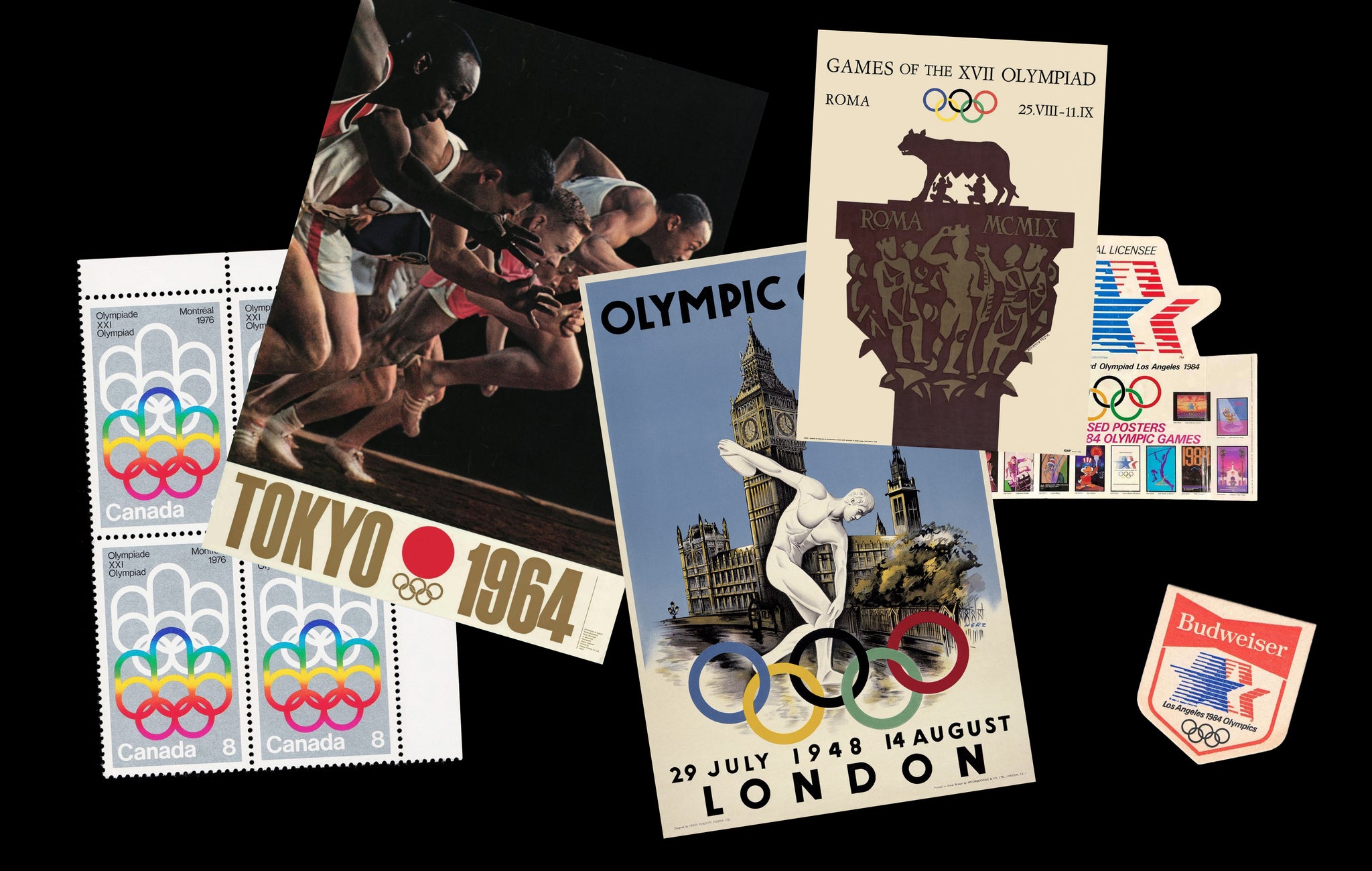
Montreal 1976
The Montreal 1976 Olympic identity, designed by Georges Huel and Pierre-Yves Pelletier, is an absolute stunner, showcasing a logo that neatly integrated the Olympic rings with a podium-like structure, symbolising athletic achievement and celebration. Its modernist approach, somewhat akin to Montreal’s World Expo not long before, opted for geometric shapes and a vibrant colour palette to reflect Montreal’s dynamic and progressive spirit – projecting a forward-thinking image through simplicity and abstract forms. As such, it emphasised the transformative power of the Olympics in a city known for its cultural vibrancy and architectural innovation (and not to mention, a fantastic typographic legacy), all while acting as a phenomenal playground for its hero typeface, Univers, to do its thing.


London 1948
The London 1948 Olympic identity was marked by its simplicity and functionality, reflecting the austere post-war period, which, at least in retrospect, has an undeniable charm and arresting stoicism. The logo incorporated the traditional Olympic rings and featured the iconic silhouette of the Houses of Parliament, symbolising the city’s resilience and the event’s role in post-war recovery. With limited resources, the design focused on the symbolic importance of the games as a beacon of peace and unity, eschewing ornamental excess for practicality and significance in a time of reconstruction. Turning to designer Walter Herz for the bespoke lettering used throughout, the typography of the brand is similarly striking and astute, which an acute sincerity to it that feels – to put it plainly – prim and proper.


Los Angeles 1984
The Los Angeles 1984 Olympics brand identity, created by Deborah Sussman, is widely recognised for her vivid and energetic design, encapsulating the exuberant lifestyle and cultural diversity of Los Angeles, as well as the propulsive motion (and emotion) of sport. Featuring star motifs and kinetic shapes in an array of bright colours, each representing different sports, the design was a pioneering integration of local cultural elements with the global spirit of the Olympics, becoming a hallmark for how the Olympic games could reflect the unique character of the host city. And, as an FU to the so-called typographic purists out there, the entire brand identity harnesses Arial Bold (notably Arial Bold Italic as the primary style), showing just how versatile and cool the often overlooked font can be.


Rome 1960
The Rome 1960 Olympics presented a brand identity that blended minimalism with classical Italian aesthetics, aligning perfectly with Rome’s rich historical and cultural backdrop, all while looking increddddddibly stylish. Designed by Armando Testa, and founded by a remarkable Roman serif, the brand stars Rome’s historical founders Romulus and Remus suckling the Capitoline Wolf, as per the myth. The twin brothers and their canine companion stand atop the olympic year’s roman numerals, MCMLX, that rest upon the olympic rings below. Elegant and contrasting – pairing intricate imagery and simple symbols – the brand logo echoed Italy’s ancient heritage through a modern lens, projected a contemporary image of Italy whilst paying homage to its profound historical roots. It is still to this day the only Olympic brand that doesn’t feature the host’s name. Now that’s confidence.


Subscribe to the Pangram Paper newsletter here to read more fun/interesting/useful graphic designy things📥


