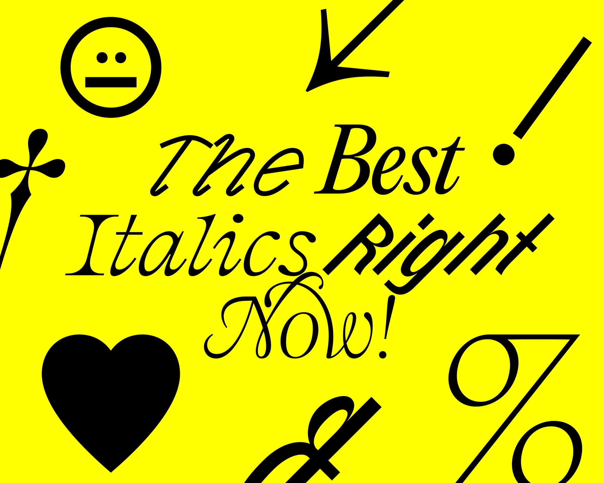
Who doesn’t like Italics? Undoubtedly the fanciest of the typographic family, they can also be the most playful, eccentric and fascinating styles of a set. With italics, you're sure to see the typeface you've chosen from a whole new angle (we're sorry).
Traditionally used for more academic purposes – from emphasising phrases and highlighting terms to formal citations and credits – the stylised constitution of calligraphic handwriting has a long, long history (see what we did there) in Western typography, with Aldus Manutius typesetting what is widely recognised as the first Italic type in Venice in 1500.
Whilst they’re still commonly used in everyday life, across both digital and physical spaces, and continue to be a valuable tool for any designer, italics have hit new creative heights, with some of the most unique, distinctive and exciting typefaces of recent years thriving within their italic counterpart – often challenging the style's capability and functionality. Also, some are just really, really cool (whoops, we did it again).
Here we’ve curated five of our favourite italics out in the world right now, hopefully offering a spark of inspiration, some new names or even simply a starting point if you’re stuck in a creative rut and italics seem the only way out. Enjoy!
Editorial New by Pangram Pangram
Now, we’ve spoken about Editorial New before on The Pangram Paper. We’ve spoken about the narrow serif’s 16 styles ranging from Thin to Heavy, each with 463 glyphs. We’ve spoken about its ability to flex between bold, expressive design lead and dutiful long-form copy proficiency. We’ve even praised its beautiful balance of contemporary and nostalgic tones, nodding to its 90s inspirations. However, what we haven’t had the opportunity to chat about is its sensational italics. Available in each of the typeface’s styles, Editorial New Italic is a powerful, personality-abundant font that brings all the contrast, character and consideration of its up-right counterpart to an entirely new (slanted) realm.


Clifton by 205TF
Taking the separation between standard roman fonts and their inclined pair to a whole new level, Clifton Italic, from 205TF, is an entire typeface in its own right, designed alongside its standing style rather than after the fact. As a result, Clifton’s part-Italian, part-Western inspirations shine through to create an all-original, fun affair – imbued with an innately organic sense of tactility. It also just looks really nice, doesn’t it?


G2 Ciao by Gruppo Due
Created by Gruppo Due as an exploration of the visual correlations between the written and spoken word, G2 Ciao isn’t your typical typeface and, therefore, doesn’t exactly fall into the standard categories – opting for ‘Silent’, ‘Shrill’, ‘Soft’ and ‘Swift’ over your everyday Italic or Regular. That said, we thought we’d make an exception for this article. After all, look at it!
The distinctive letterforms of G2 Ciao’s alphabet take inspiration from type, book and puppet designer William Addison Dwiggins’ sketches, which Gruppo Due subsequently built out. Monoline in nature, the typeface makes for a fascinating investigation into legibility, letterforms and connectivity – especially in its ‘Shrill’ cut, the style most closely resembling a traditional Italic.


Bourrasque by Bureau Brut
The enduring energy of Bureau Brut’s Bourrasque continues the kinetic tone of its origins – having been initially drawn as a custom opening credit sequence for ‘Un certain regard,’ a short film directed by the students of the Gobelins school. Sitting alongside moving escalators in the movie, this energetic, lively and thoughtful essence is evident outside the silver screen, championing an undeniably unique aesthetic of 45° rotation of strokes, set to either Ouest (West) or Est (East). This distinctive setup has been coined by Bureau Brit as rotalic and italic, giving creatives the freedom to choose the direction they wish to head – a notion befitting the definition of its French title; ‘a sudden wind.’


Romie by Margot Lévêque
Recently expanded following the success and reverence of its launch, Margot Lévêque’s Romie is a truly striking calligraphy-inspired display typeface, befitted with captivating, plunging flourishes, alternatives and mythical ligatures set. Now with Italic, you can bring a touch of slanted French finesse and contemporary flair to any project. Be it digital or printed, Lévêque’s meticulous, ornamental craftsmanship will enliven any and all spaces.


