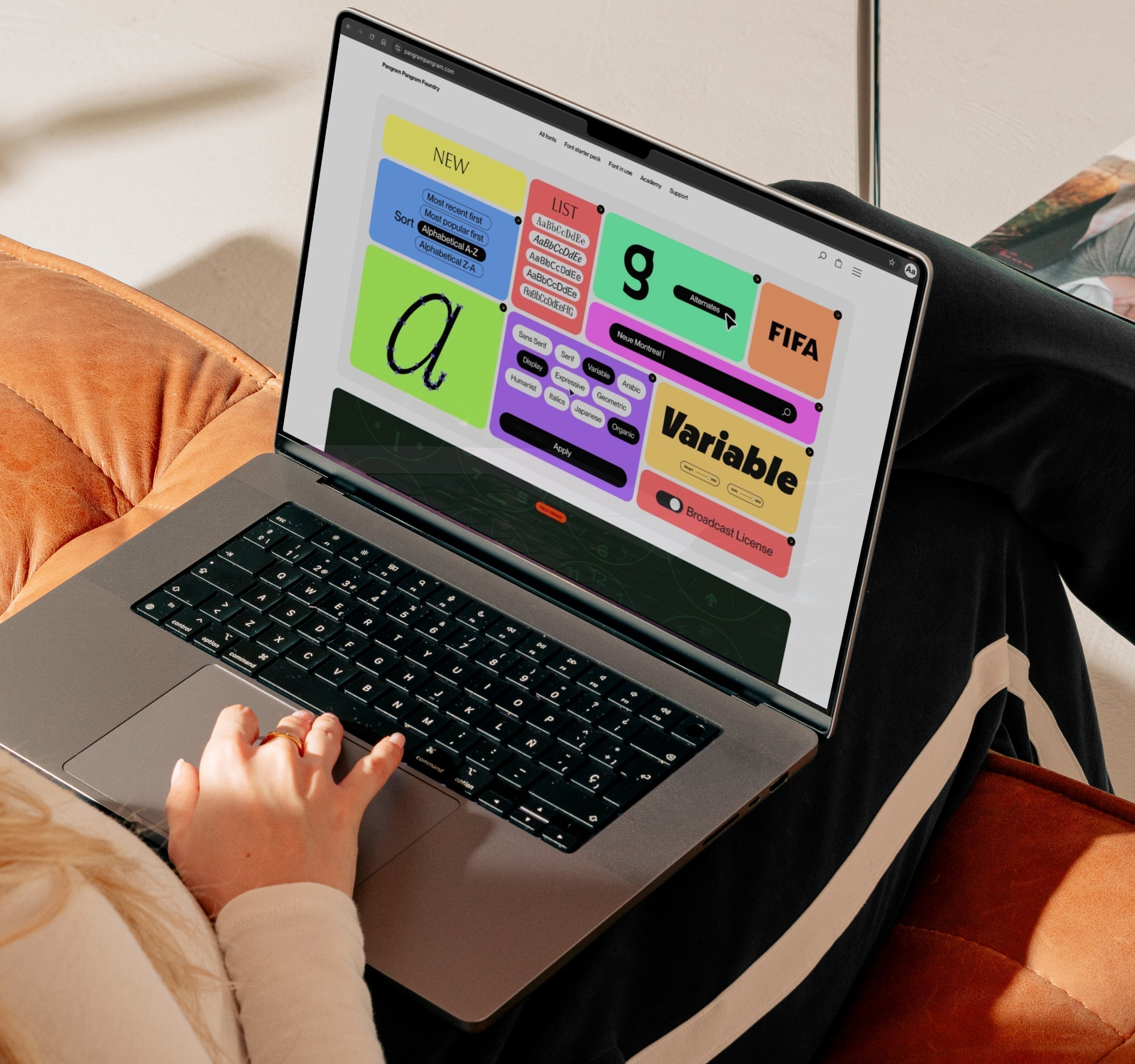
Fonts can be expensive, so, it’s no surprise that so many people recycle the same free fonts again and again. But that can get boring, even soul destroying… and that’s where Pangram Pangram’s alternatives to Google Fonts comes in!
Avoiding (for now) the enormous topic of free fonts and their effect on the type design scene, license-free typefaces play their role in servicing big and small studios. The result, however, is bland, overly familiar and encourages a world of identical brand identities and graphic design projects. Whilst we wouldn’t turn our noses up at the occasional free font, we’re here to provide you with some inspiration for free-to-try and excellent-value-to-buy Pangram fonts as alternatives to those Google fonts that you always fall back on.

MERRIWEATHER Vs.WOODLAND
Both semi-chunky, curvy serifs; however, it’s clear which one would better suit your project… Built to last, Woodland’s organic letterforms and practicality ensure a unique, ownable aesthetic – no matter the application. Why settle for less?

OPEN SANS Vs. NEUE MONTREAL
A pragmatic showdown for sure, but Neue Montreal’s timeless architecture makes for a genuinely unbeatable sans serif. Whether it’s purely practical type treatment you’re after or a modernist typographic treat, Open Sans doesn’t even compare. Maybe they’re born with it; maybe it’s Neue Montreal.

PLAYFAIR Vs. FRAGMENT
Both may be playful and eccentric, but only one truly stands out from the crowd. In an over-saturated world of dud headline serifs, why go for something static when you could be electric? Variable from display serif to workhorse sans, Fragment will take you the distance. We tried to play fair, but we couldn’t help ourselves!

ROBOTO Vs. RADIO GROTESK
Google’s juggernaut sans. A popular, typographic triumph. But a bit… boring? Why not go for something equally practical but a bit more… interesting? Characterful? Fun? But Pangram Pangram, we hear you ask, that’s not possible! Well, let me introduce you to Radio Grotesk. Thank us later, and tag us!

QUICKSAND Vs. PANGRAM SANS ROUNDED
I mean, need we say more?


