
Variable typefaces are everywhere. For some designers, they’re simply a creative tool. For others, they signify the future of contemporary typography — a technology that is at the forefront of an interesting, and evolving discipline. Either way, they've been around for a while now, and it looks like they're here to stay. But, when you're choosing a variable font for your project, where do you start? In a world of seemingly boundless possibility, how do you find what's just right?
As a quick explainer, if you’re somewhat hazy on what the hell we’re on about, a variable font is a single font file that contains many different variations of a typeface, allowing variables to be quickly and easily adjusted to select from and interpolate between a range of different styles – from light to bold, regular to italic, serif to sans, and everything in between.
It is this innate flexibility that is so appealing to designers. Their ability to be quickly and easily tailored and tweaked to find just the right style makes variable typefaces an excellent tool for the often fast pace of the creative scene – ideal for rapid ideation, sketching and concepting. Additionally, their file sizes are smaller than the traditional typographic tribulation of having different font files for different weights and styles.
With their popularity and use ever increasing, however, it’s easy to get lost in the multitude of variable fonts being released – not to mention determining whether the fonts themselves are well designed and engineered in the first place. That’s where we come in.
We’ve chatted to the designers of three dependable, well-made, and ultimately striking typefaces – each with their own special something – outlining each variable font, as well as the concept, processes and thought behind them.
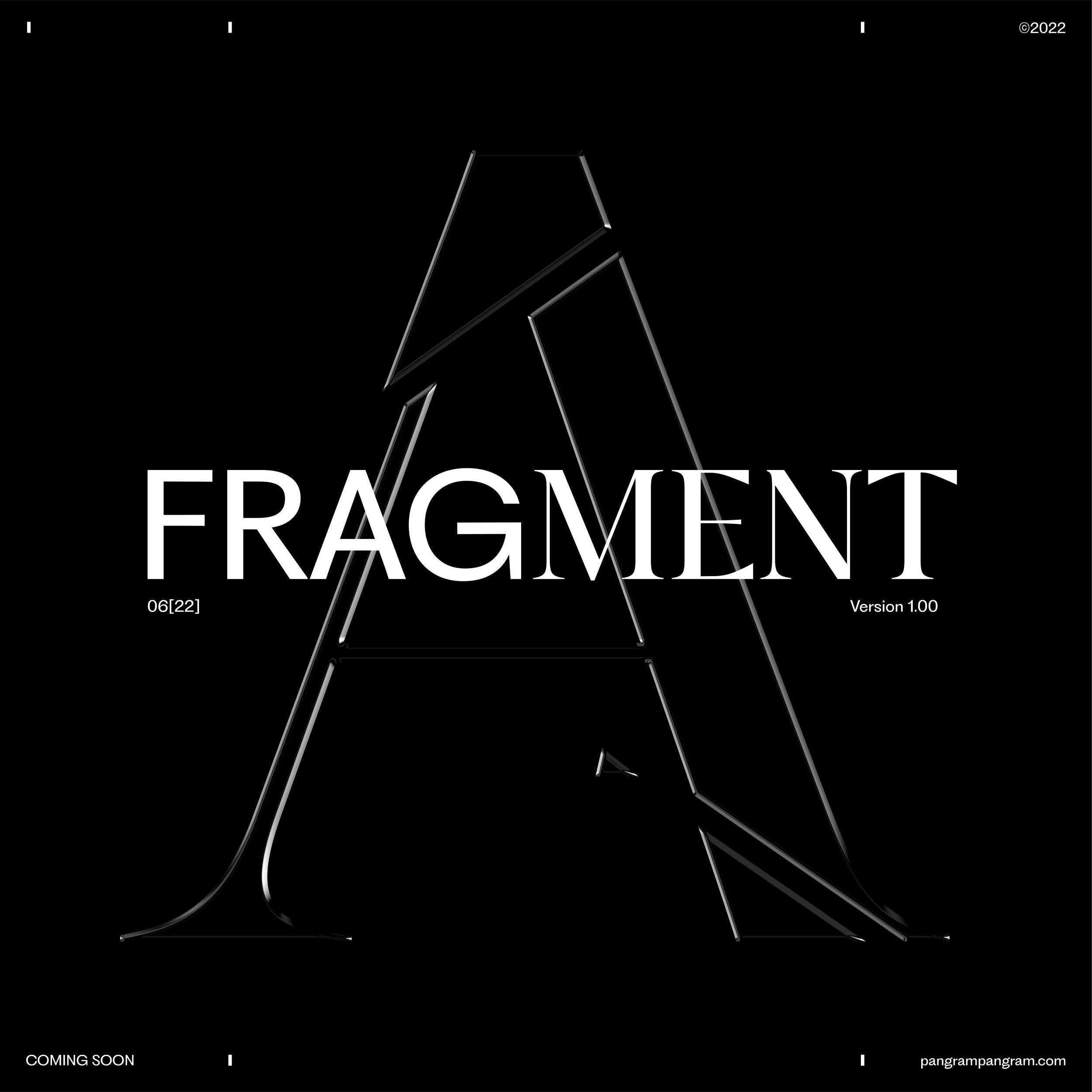
Fragment by Pangram Pangram
Fusing the 19th-century letterforms of vintage signage that inspired its design with the latest in contemporary typographic technology, Pangram Pangram’s Fragment is a variable typeface for the modern day – providing the infinite flexibility associated with the genre, alongside four preset cuts – Sans, Serif, Glare and Text. Each with its own unique personality and quirks, each of Fragment’s weights features 581 glyphs with remarkable alternates and symbols, each bringing a distinct balance of strength and elegance. “At the beginning of the project, what we had in mind was creating a new version of Hatton,” Designer Francesca Bolognini tells us, referring to the foundry’s romantic, jewellery-inspired serif. “I loved the proportions of the font and how its imperfections bring that humanistic, art nouveau sentiment to it,” Francesca continues, “and later, by experimenting with a range of styles and weights, we got fascinated by how we could introduce this texture from sans to serif,” bridging that gap through its late 19th century, early 20th-century type influences.
“We wanted Fragment to cover this spectrum,” she adds, “from a Gothic to an almost Tuscan Antique,” turning to other notably successful ‘hybrid’ designs. “I was particularly intrigued by Latin Antique N.120,” Francesca remarks, “originally from the Inland Type Foundry, later bought by ATF,” translating these interests into Fragment’s construction. “Regarding the constructions of the caps, we refer primarily to the classical monumental proportion with wide rounds,” she details, continually trialling and testing proportions, contrasts and weights that worked across its sans, serif and glare styles. “We wanted to create a new variable font that would be quirky yet functional,” Francesca concludes, “in all its 90,000 possible instances.”
Make sure you check out the award-winning microsite showcasing its full potential!


GT Ultra by Grilli Type
“When picking typefaces, there’s often the distinction between either picking a sans or a serif typeface,” Designer Noël Leu tells us, “or having a sans typeface having one role in the design and the serif another,” he continues, asking himself, “what really separates the two? Where does sans ends and serif begins?” Enter GT Ultra. Blending the classic characteristics of serif typefaces with the dynamism of modern sans-serifs, Grilli Type’s GT Ultra uniquely combines centuries-old typographic styles with contemporary design elements to create a unique, versatile typeface system. Drawing on ‘70s and ‘80s serif typefaces for inspiration, Noël’s energetic, forward-thinking creativity has arguably resulted in an entirely new type style – a humanist flare sans.
“The project started with a sketch for the letter ‘a’ as it often does,” Noël recalls, looking back on the process of GT Ultra’s creation. “More characters soon followed and at first had a more ‘serify’ feeling to them,” he details, “by toning back the contrast and details and adding more strict geometric principles to the design, it gradually felt more like a sans,” finding himself exploration the sweet spot and unique tone between the two. “Variable font technology really enabled the project to oscillate more between sans and serif,” Noël concludes, “helping define the typographic space of a typeface that lives in both worlds.”


Kachi-Buwa by Emi Takahashi
From Tkaronto and Toronto-based Japanese-French-Canadian artist and designer Emi Takahashi, Kachi-Buwa is an undeniably unique exploration of variable type technology, language and letterforms – expressing the meaningful linguistic prominence and nuance of onomatopoeia in Japanese speech through graphic letterforms. “It came about from my deep interest in language, meaning-making, and type design,” Emi tells us, detailing the importance of onomatopoeias in the Japanese language. “Generally speaking, onomatopoeias are defined as words that phonetically imitate the sound that they describe,” she explains, “in Japanese language, however, there are over 4500 onomatopoeic expressions that also convey a vast array of meanings linked to sensory experiences,” expressing visceral emotive and psychological thoughts and feelings that are difficult to descriptively translate from their sonic context.
“I looked at both Western and East Asian usages of onomatopoeias from etymological, linguistic, historical, and semantic perspectives and their relative positions to each other,” Emi recalls, with her comprehensive research forming the core foundations of the project. “Concurrently, I conducted research on the landscape of modern typographic technologies, namely variable typefaces,” she details, using the technology to express the relevant nuances. “They’re also interesting because they’re dynamic and fluid in shape and in appearance,” Emi adds, discussing the use of variable technology, “in many ways, I felt that this typographic tool mirrored the synesthetic and multi-sensory qualities of Japanese onomatopoeic expressions.” In using this technology to translate as much visually, and indeed revealing a cultural process in doing so, Kachi-Buwa makes for a variable font that is as striking as it is speculative and meaningful – designed in one of Japan’s three writing systems, katakana. “The decisions around how the letters portrayed variability were dictated by the script itself,” Emi explains, “I wanted to follow Japanese typographic conventions for legibility and structure,” she notes, “all the while pushing the boundaries to design a more expressive typeface.”


