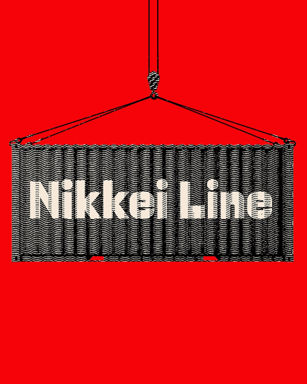
Nikkei Line
A tribute to Japanese immigration to America through typography.
Free to try
Licenses start at $40
Nikkei Line style list
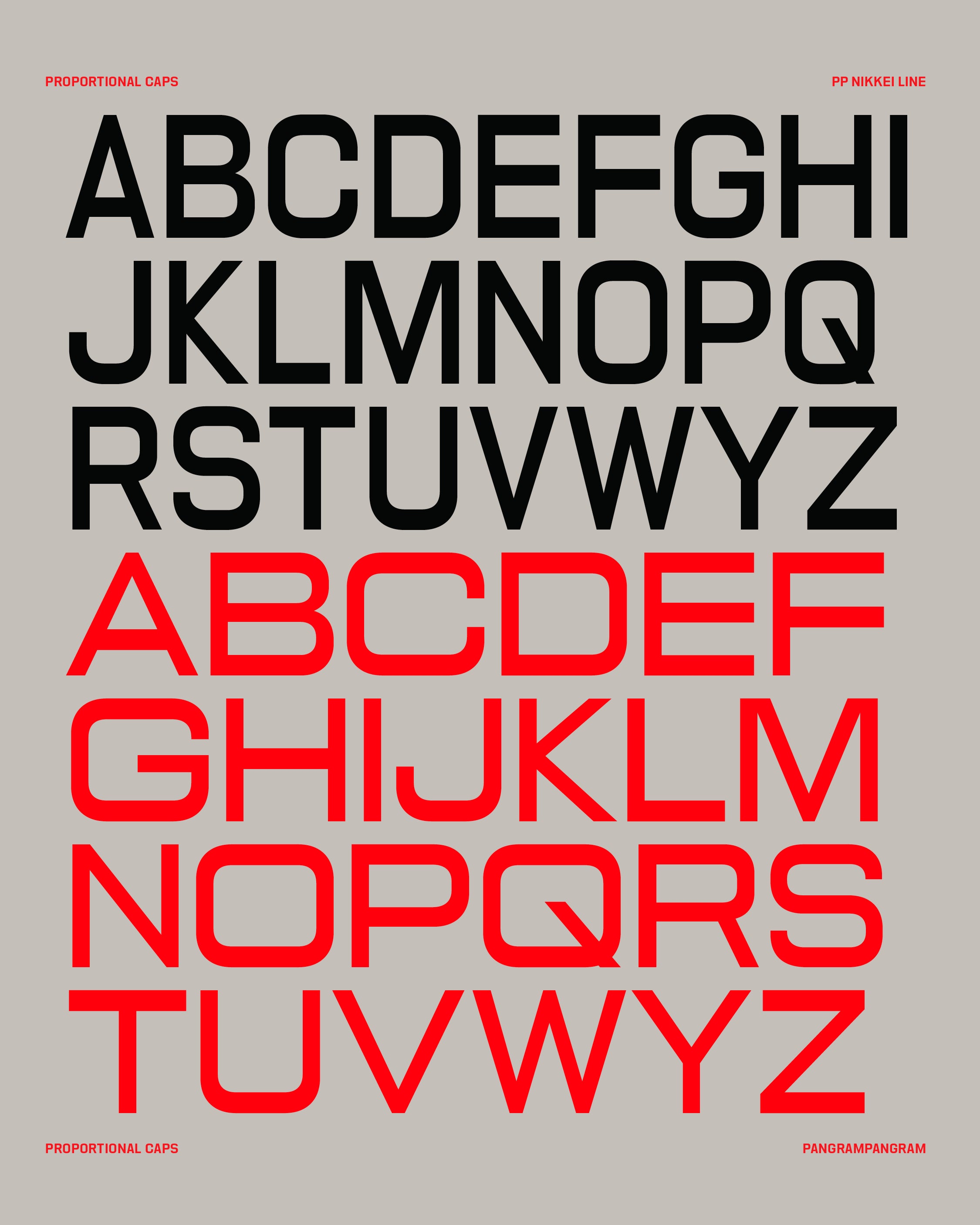
18 Styles
01234567
{(!@#$?&)}
01234567
{(!@#$?&)}
- Thin 100
- Ultralight 200
- Light 300
- Regular 400
- Medium 500
- Semibold 600
- Bold 700
- Ultrabold 800
- Heavy 900
- Thin Italic 100
- Ultralight Italic 200
- Light Italic 300
- Regular Italic 400
- Medium Italic 500
- Semibold Italic 600
- Bold Italic 700
- Ultrabold Italic 800
- Heavy Italic 900
Nikkei
Line
Glyphs set overview
Glyphs set overview
Glyphs View
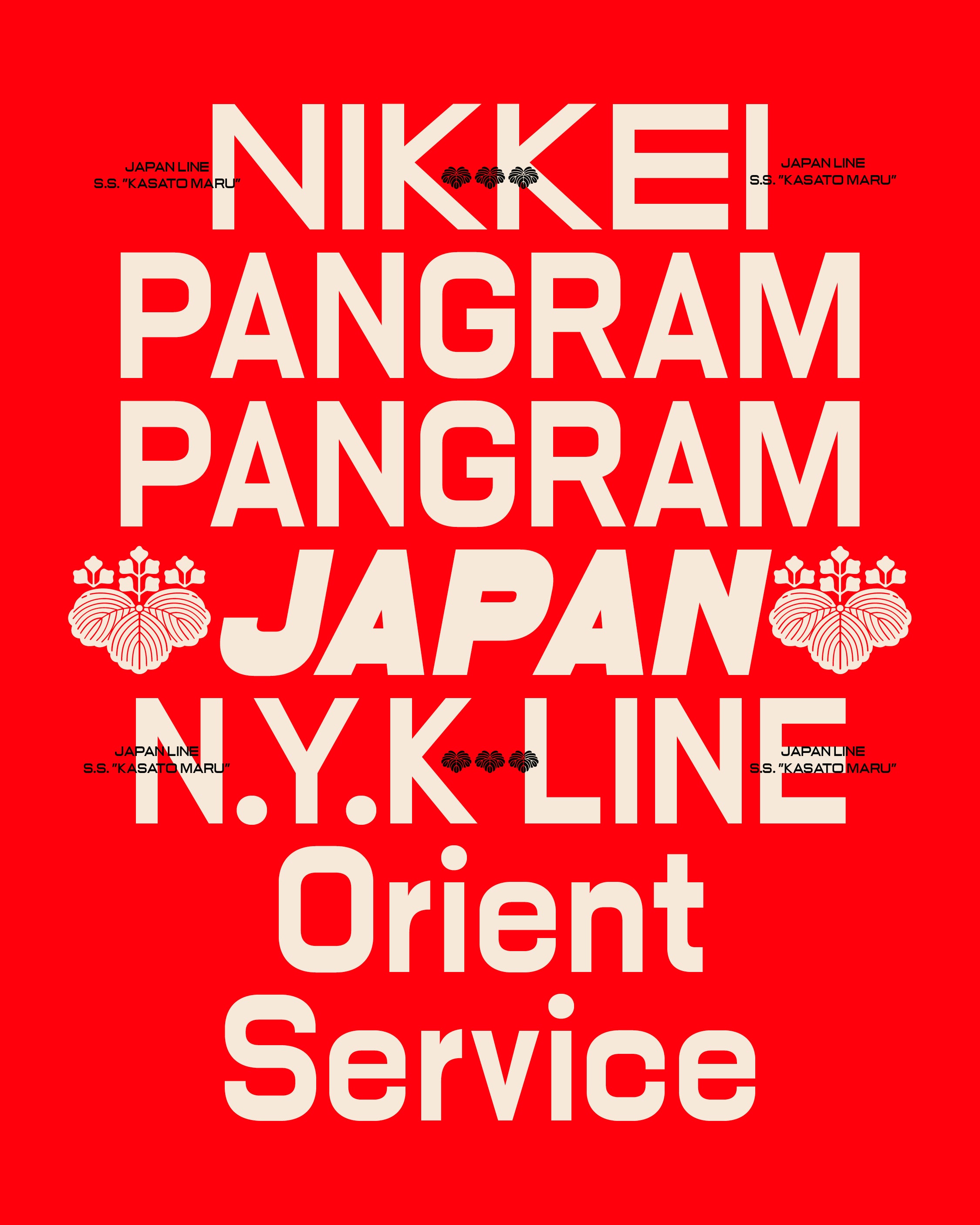
Nikkei Line's Features
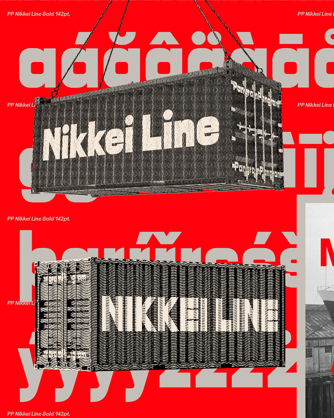
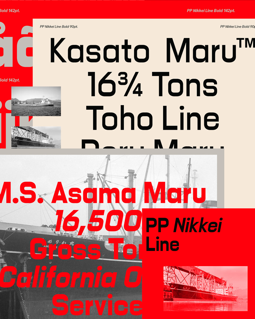
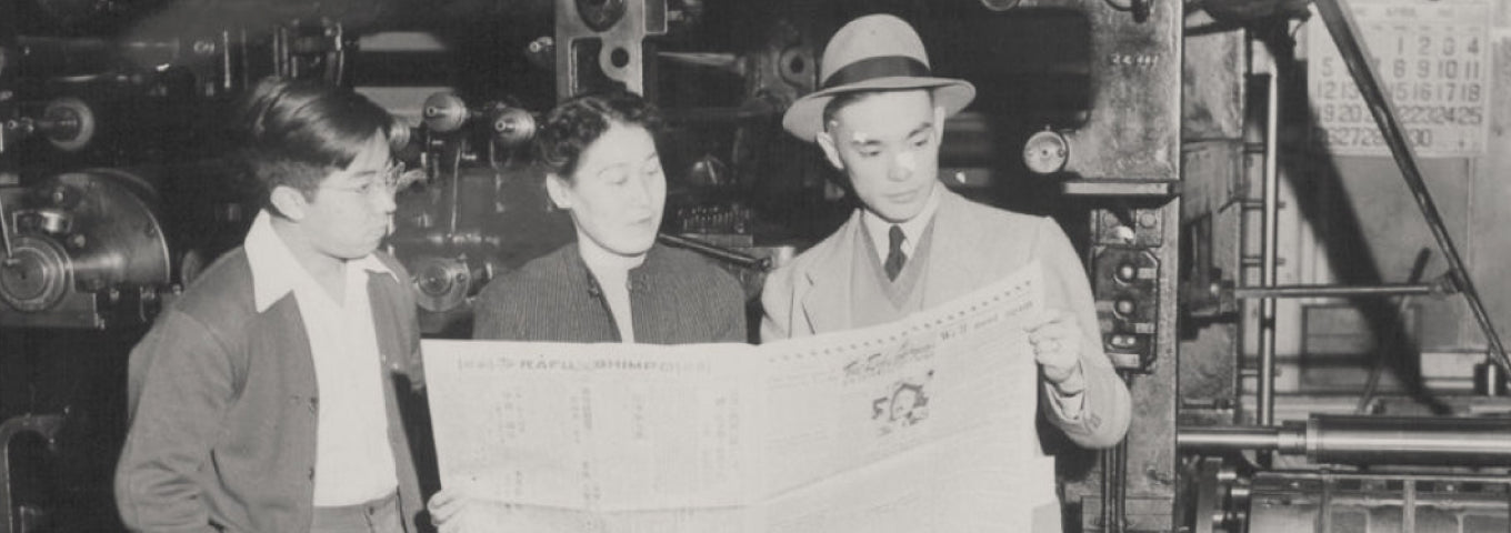
A Typeface Woven With Memory.
Ships, historical landmarks of this journey, showed through photos from a historical archive a uniform typographic system in the letters painted on their hulls. A notable feature was the reverse contrast, and the common use of the “Line” suffix in names, such as “Toho Line” and “Japan Line.”
PP Nikkei is a tribute to Japanese immigration to America through typography, honoring the stories of Japanese immigrants and their descendants. “Nikkei” refers to Japanese individuals and their descendants who live outside Japan.
Designers
Collaborator
- Radek Górniak (Visuals)
Categories
- Brutalist
- Expressive
- Italics
- Serif
- Variable
Styles
- 18 Styles
18 Styles with 513 Glyphs each
Including Italics & Crest Set
Version
1.00
Latest update: March 2024
Available formats
OTF, TTF, WOFF, WOFF2
Language Support
Afrikaans, Basque, Breton, Catalan, Croatian, Czech, Danish, Dutch, English, Estonian, Finnish, French, Gaelic, German, Hungarian, Icelandic, Indonesian, Irish, Italian, Latvian, Lituanian, Norwegian, Polish, Portuguese, Romanian, Saami, Serbian, Slovak, Slovenian, Spanish, Swahili, Swedish, Turkish, (and more)
Commercial Licenses
Not sure what to get? Or can’t find the right coverage?
Please contact us for our tailored corporate licenses!
Need more information about our licenses?
Our FAQ usually contains most of the answers.
Explore the Nikkei sub-families by clicking on the cards below.
4 Sub-Families