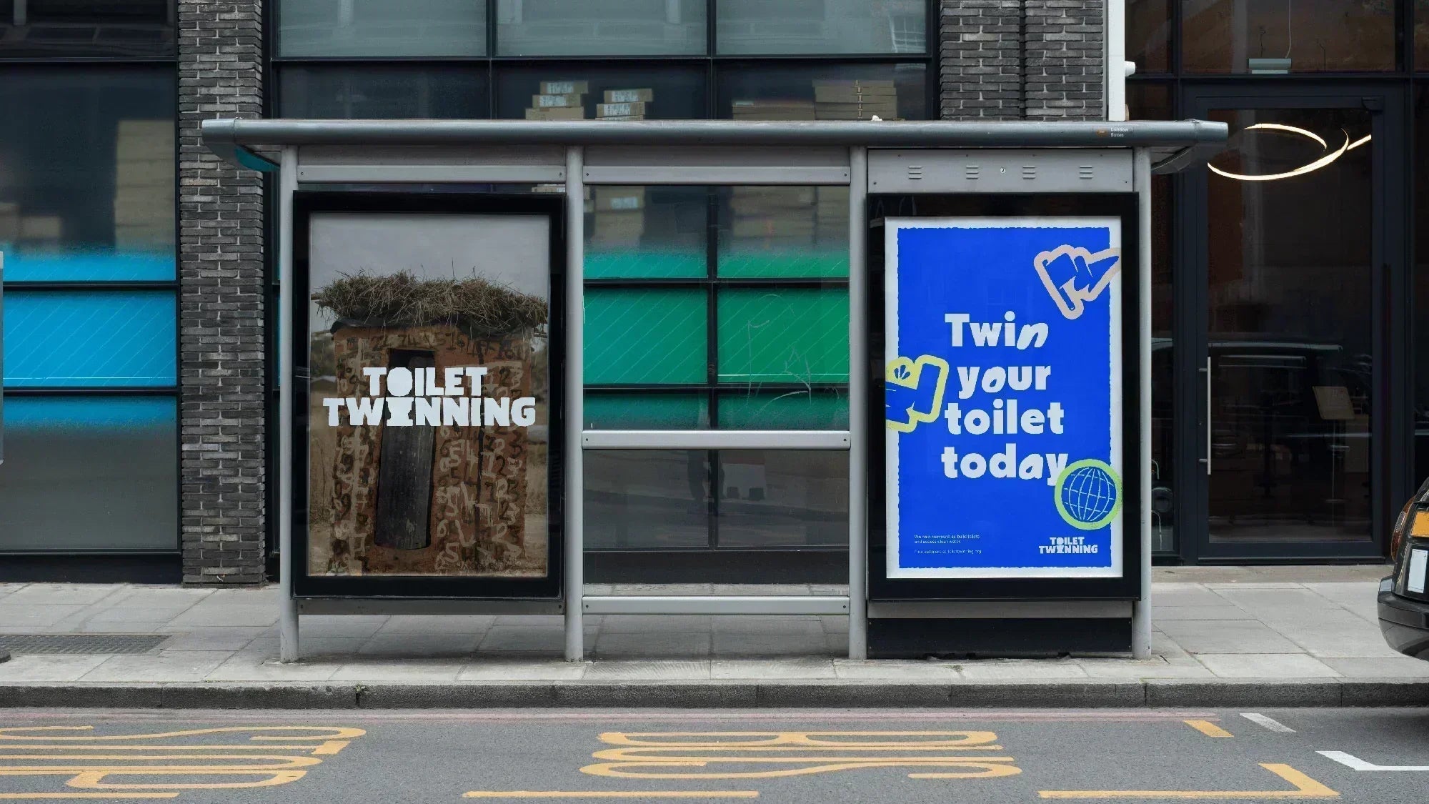
Wildish & Co. flushes convention and brings some play into Toilet Twinning’s serious cause.
Toilet Twinning, a Tearfund initiative, tackles the global sanitation crisis by connecting donors’ toilets with those in countries supported by their WASH (Water, Sanitation and Hygiene) programmes. To help amplify this serious cause, they sought the creative direction of London agency Wildish & Co. who crafted a bold, playful visual identity that maintains the gravity of the cause while making it more approachable and engaging for donors.

While the project initially began as a brand refresh, “as the project progressed,” says Designer Alisha Mann, “the client was on board with much bigger changes and trusted the process, which we always look for in any branding work.” The resulting outcome was much more of a rebrand, boasting an eye-catching, engaging, and accessible look. Their reference point was not only other charities’ brand elements – “exploring how other great brands are doing it well” – but other examples of branding that carried the modern and playful energy that the agency was aiming for.
The logo development process began with the existing brand assets, particularly the toilet icon which the client wanted to retain in some form. However, the wordmark itself was crafted as a custom creation, drawing inspiration from the typeface Stubby Rough. Wildish and Co. deliberately roughened the edges and introduced imperfections to achieve an authentic, rustic aesthetic. The witty integration of the toilet icon came naturally – using the toilet lid as the ‘O’ and the base as the ‘I’ in ‘twinning.’
Complementing the personality of the wordmark, the brand’s typographic system pairs Pangram Pangram’s punchy Nikkei Journal Ultrabold with Google’s Knewave, which appears as animated accents within headlines. This intentional contrast in typefaces also echoes the brand’s mission of ‘twinning’ different elements together.
Animations bring these typefaces to life, while custom illustrations (that function as sticker-like elements) and a hand-drawn style tie the identity together across digital, print, and experiential touchpoints. As Mann notes, “With Toilet Twinning being a great cause and charity, we wanted to ‘take the edge off’ and bring a bit of playfulness into the brand.” A vibrant blue, evolved from the organisation’s original brand colour, rounds out the identity. “It was originally more of a dull, sky blue that felt very safe,” Mann explains. “We wanted to challenge them to become bolder and brighter.”
All images © of their respective owners.
Content taken from Wildish & Co.


