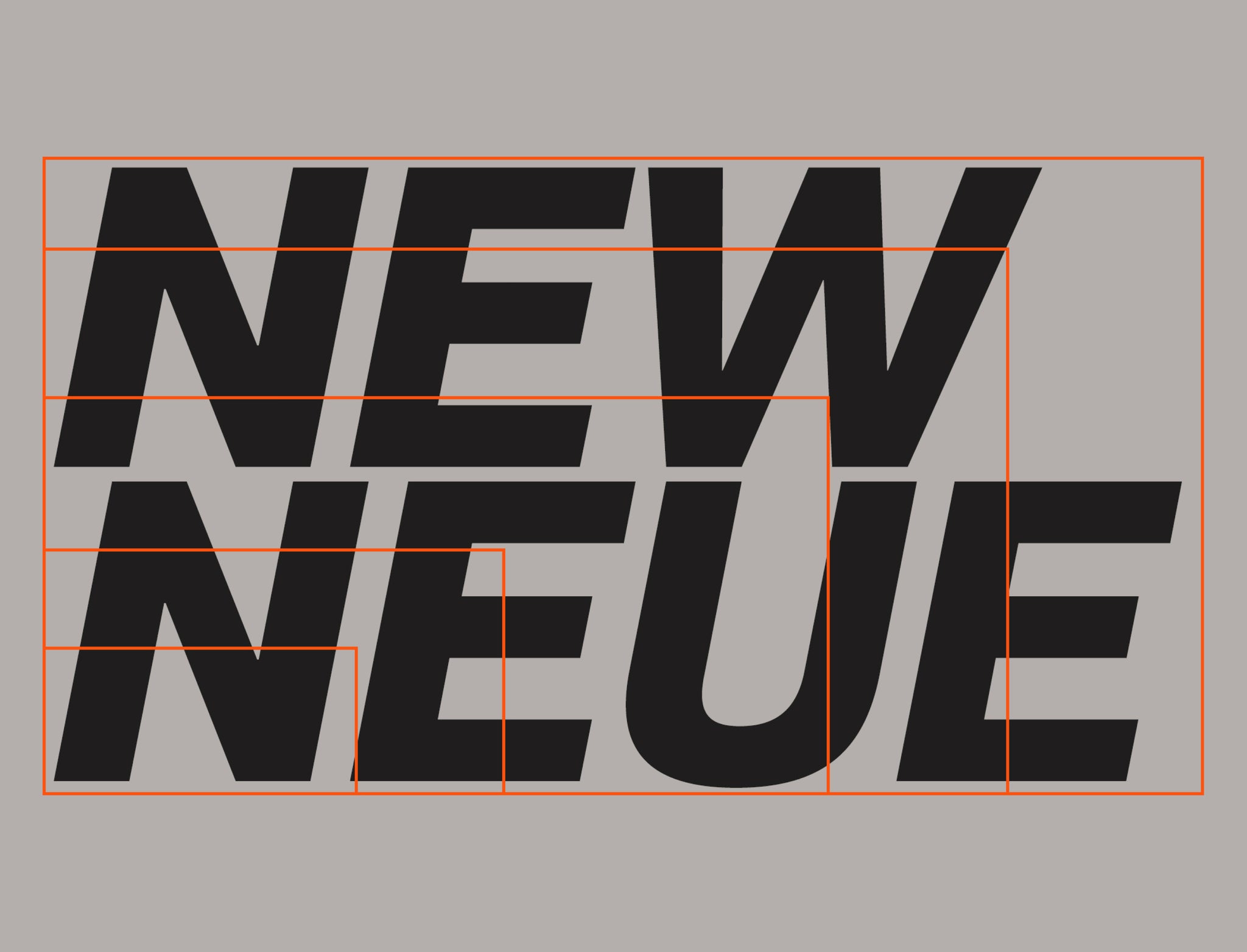
We recently launch Neue Montreal with the intention of creating a font that could be used in many if not all graphic design situations. We wanted to create a fresh Grotesk family that would have all the quality of what a font like Helvetica or Akzidenz Grotesk can bring while adding subtle details like a tighter kerning to make it unique
.
It's the font we use for our website and all our communications, working with it is a charm. I feel every time I try it in a design the font takes on a different meaning, it blends with its environnement and yet makes it stand out.
We created a couple of examples/designs to highlight the possible pairings with our other free fonts and hopefully inspire you!
Neue Montreal and... Neue Montreal
Uhh... This is the obvious pairing, right?! When a font is versatile and has a lot of weights, it's a good idea to only use that one font throughout the design. Different weights, size and spacing can make it feel quite different but still part of the same family.
Neue Montreal has 8 weights (4 romans and 4 italics) so you have plenty of options to choose from to create a great design. The examples below show you some possibility of layouts and weight arrangements. You can also browse through our site to see the concept in action since we're only using Neue Montreal.


Neue Montreal and Pangram Sans
Pairing a Grotesk with a geometric font like Pangram Sans can create interesting tension in your designs. The minimalist lines of Pangram coupled with the subtle curves of Neue Montreal can make a project defining visual contrast for your next design.
The few examples below show you how you can create interesting and visually tense designs using the two typefaces. I find that outlining Neue Montreal in its italic weight goes really well with the lighter weights of Pangram Sans. You can also switch them around and use one or the other as hero text, the other as body and vice versa.
Make sure you try this pairing and design approach in your next project by trying Pangram Sans for free.


Neue Montreal and Fuji Sans
This pairing is great especially for editorial pieces. Fuji Sans Bold in All Caps works great for titles while Pangram Sans works magic at long-form text.
The examples show how you can use this pairing in a clean an minimalist design using imagery of the same nature. Make sure Fuji Sans is nice and big and that the regular or medium weight of Neue Montreal is used.
Try Fuji Sans for free and start creating those clean editorial designs.


Neue Montreal and Supply Mono
Everyone likes a good monospace. It gives you structure and order to your design while being stylish. This pairing works well for me because I like how the Supply Mono curves/angles complements the curves of Neue Montreal. Again, you can use either as hero or body text. Supply Mono looks especially good all caps in titles.
In the examples below you can see how Supply Mono works really well with the curvy numbers of Neue Montreal on a black background. You can also notice that if you reverse the roles things still make sense visually just add a dash of pastel color and you're set!
Download Supply Mono for free and start creating your next eye-catching layout!


Neue Montreal and Stellar Sans
Last but not least — Stellar Sans. Paired with Neue-Montreal, this condensed typeface can really set your design apart when used in bold and all-caps.
These last examples are a bit more brutalist but you can see how versatile Neue Montreal can be even in an unconventional design. I like the use of outlines, pictures and earthy colors with this pairing, you get that contemporary feeling while staying clear and legible.
Go try Stellar Sans for free and start making your designs stand out!


