Everything a beginner needs to know about typography. When it comes to typography, a little bit of knowledge goes a long way. People who understand good typography make our world a little more legible and beautiful. Let’s learn how…
Let’s learn how.
Typeface vs. Font
Before you go any further, let’s address an area of confusion—the difference between a typeface and a font.
- A typeface describes the design of the letterform — a font is its vehicle.
For example, Editorial New
is a typeface; its different styles (like italic or bold) are fonts.Type anatomy
Cap Height, X-Height, and Baseline
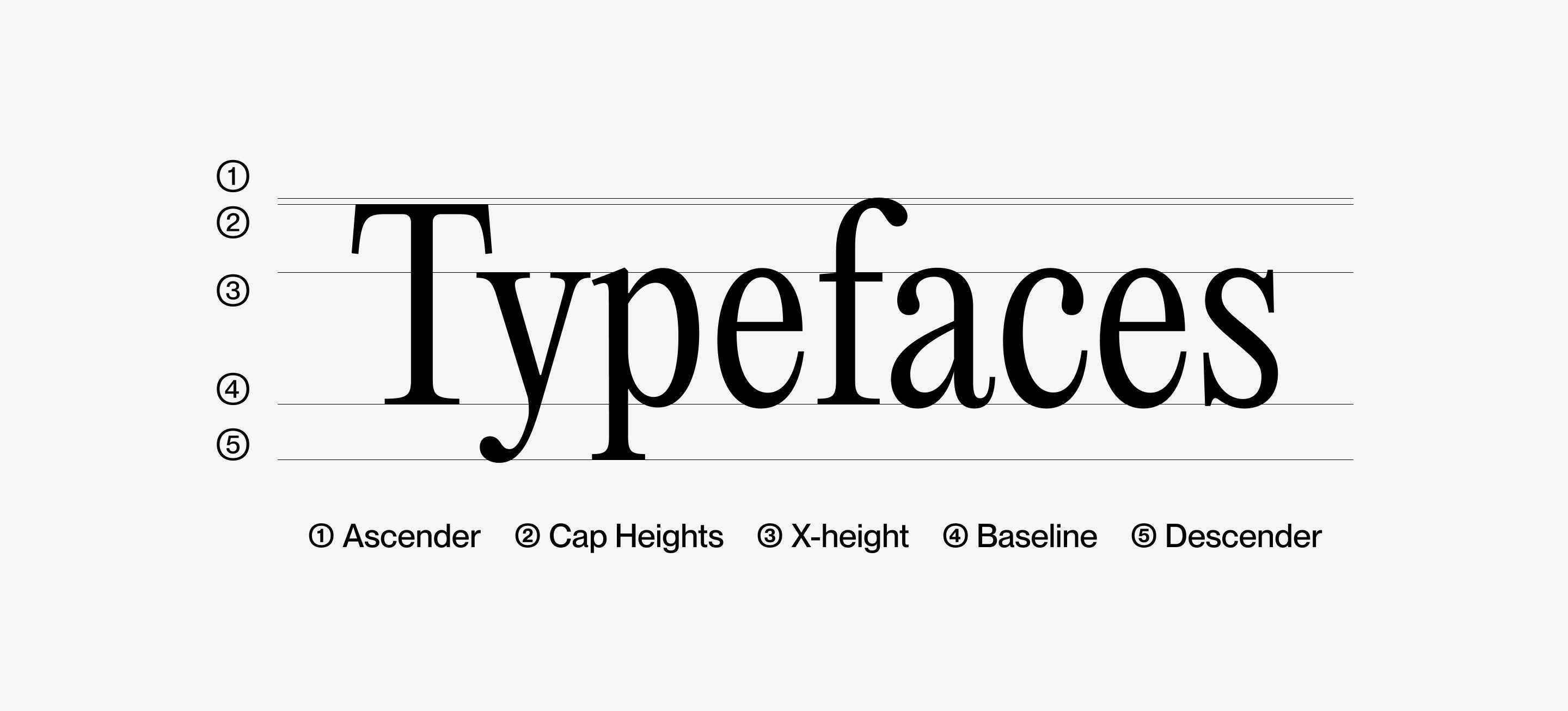
The cap height defines the height of the flat capital letters of a typeface. However, round letters like an “O” and pointed letters like an “A” overshoot the cap height to balance text visually.
The baseline is the horizontal plane where the text sits. Lowercase letters with descenders like the letter “y” extend below the baseline.
The X-height is the height of the lowercase x of a typeface. The copy of typefaces with larger x-heights appears bigger than typefaces with smaller x-height. In the example above, Neue Machina appears larger than Neue Montreal because of its higher x-height even though they are both rendered at 18px.

Serif

A serif is an ending stroke of the larger stroke of a letter.
Uppercase

Uppercase letters are the larger form of letters. The beginning of sentences and proper nouns use an uppercase letter.
Lowercase

Lowercase letters are the smaller version of letters that comprise the majority of the text in paragraphs.
Stem

A bowl is the curved, rounded, closed area of a letter like in a lowercase a.
Descender

A descender is the part of some lowercase letters that go below the baseline of a typeface like a lowercase y.
Ascender

An ascender is the part of some lowercase letters that go above the x-height of a typeface like a lowercase k.
Ligature

A ligature joins letters together to form one character.
Finial

A finial is a tapered end of a letter like in a lowercase e.
Terminal

A terminal is the curved end of a stroke like in a lowercase f.
Spine

A spine is the body of a lowercase s.
Cross Bar

A cross bar is the horizontal connector of a letter like an uppercase A or B.
Counter

A counter is the enclosed area of a letter.
Type classification
Serif and Sans-serif are the two main typeface categories. Serif typefaces have extending features at the end of their strokes. Sans-serif typefaces are defined by what they are not; they don’t have serifs at the end of their strokes.

Editorial New is an example of a serif typeface and Neue Montreal a sans-serif.
Serif typefaces work well for traditional uses and in printed materials, whereas sans-serif typefaces are best suited for modern settings and on the web. However, it’s less about the category and more about the use of the typeface.
Serif and sans-serif typefaces further break down into these main classifications:
Humanist Sans-serif

Humanist typefaces incorporate aspects of calligraphy and have more stylistic flair than other sans-serif typefaces. Humanist typefaces often include modulating stroke widths, whereas others are closer to their Geometric brothers and sisters.
Geometric

Geometric typefaces were born out of the influential Bauhaus school in German. Geometric typefaces incorporate near-perfect universal shapes and embody minimalism.
Old-Style

Old-style typefaces, like humanist sans-serifs, have strong calligraphic influence. They feel classical and embody tradition.
Transitional

Transitional typefaces have the classical traits of old-style typefaces as well as modern tendencies. They are a great choice if you want a sophisticated look for a modern application.
Modern

Modern typefaces, also known as Didone, are characterized by thin, consistent serifs and thick strokes. This variation of the letterform creates a contrast that defines the classification.
Slab-serif

Slab-serif typefaces have thick block-like serifs. They became popular in the 19th-century when American advertising was being born.
Don’t forget about display typefaces

Display typefaces are fun, eccentric specimens. Things like posters or invitations often employ display typefaces. Display fonts look unique, but when they are overused, they start looking silly.
Typefaces to resist

Typefaces like Papyrus, Comic Sans, and Brush Script are notorious for being overused and dated. They have become a cliche of what not to use in the type world. Proceed with caution.
Font styles

Combining typefaces
For an amateur, it’s far easier to mess up a good thing than improve it with more elements. Before incorporating an additional typeface, consider differentiating your existing typeface with varying sizes and styles.

However, if you decide to combine typefaces, look for contrast rather than similarity. And for the love of type, limit yourself to one or at most two additional typefaces.
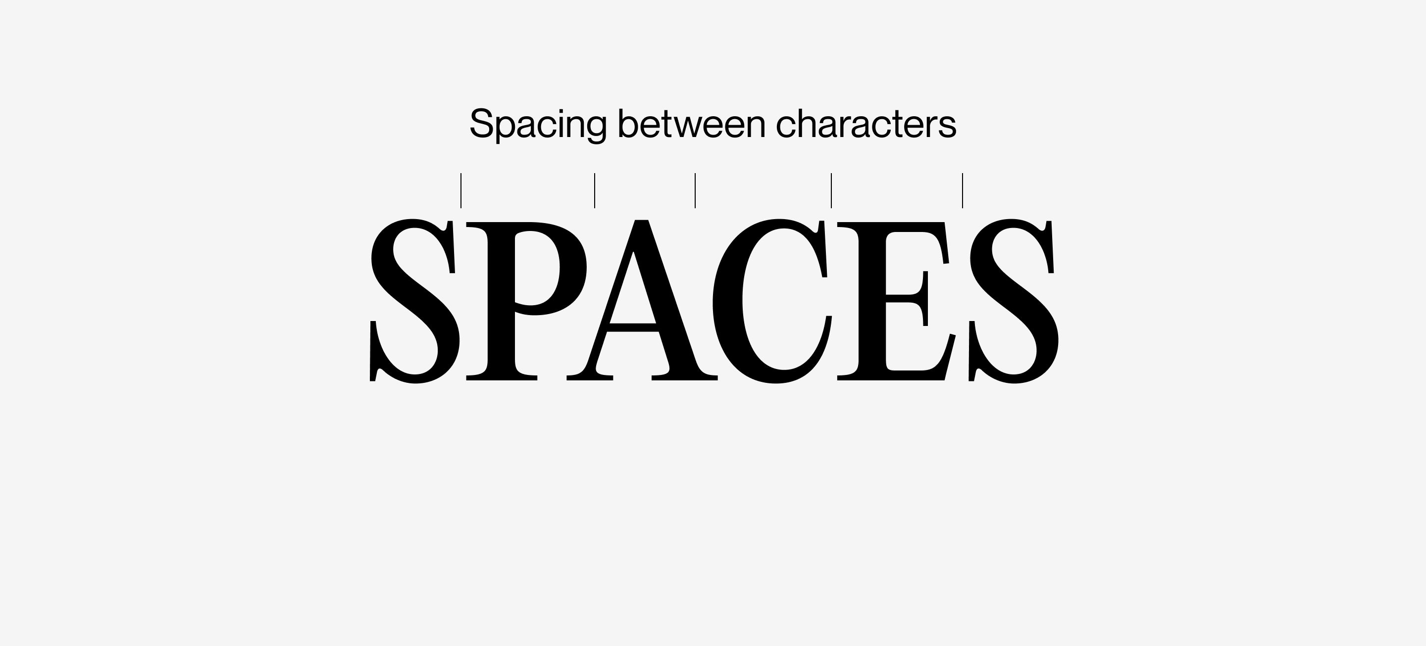
Kerning
Kerning, also known as letter spacing, is the individual area between each letter of a word. Bad kerning is everywhere and very few realize it. Kerning is usually adjusted in headings and logos.

An amateur designer may make countless revisions to a logo that looks a little off, all the while being oblivious to the inconsistency between each letter. Kerning issues become more obvious the larger you increase text./p>
Tracking
Tracking, also known as character spacing, is the space between letters. Increasing character spacing gives secondary text elements, like captions, a stylistic flair. Avoid character spacing in body copy.
Line spacing

Line spacing, also known as leading, is the space between each line of text. Too little leading makes text uncomfortable to read, but too much makes each line look like its own element. Leading between 1.3x and 1.6x the font size is ideal.
Alignment

Text alignment can make or break a page. Usually, paragraphs are aligned left. Beware of justified text as it can cause spaces that run down the paragraph called “rivers.”
Hierarchy

Creating a typographic hierarchy is the most important way to guide the viewer through a text. Establish hierarchy by distinguishing text in various ways. You can differentiate a header from its body copy in multiple ways, like increasing its size or merely making it bold. There is no limitation to the various ways a designer can add hierarchy; the important thing is that they do.
I hope this article has given you enough knowledge to improve your typography. Together we can make the world a more legible and beautiful place.


