Pensive, practical and powerful, the intuitive practice of Berlin-based creative Vivien Hoffmann is fascinating; challenging the distinctions between digital and analogue process, whilst using her platform, prowess and privilege as a method of protest, and simultaneously a sign of solidarity.
From Nike to New Aesthetic and Solace to Solitype, the graphic designer, art director and letterform designer has a client list as eclectic as the work itself. Crafting unique curvaceous explorations of typographic form that truly take their place front-and-centre of the contemporary creative scene.
Discussing this and more, we’ve spoken to Vivien about putting her practice to use in support of progressive efforts, working off-screen, and celebrating the mistakes of physical work.
Hey Vivien! How’s life?
Big question to start with haha. Life’s good. The last year has also been quite challenging though to be honest. The pandemic and all uncertainties coming with it really made me question my work a lot. At the same time it helped me to think about where I wanna go and what really makes me happy.

Your work is sculptural and fluid — it often feels as if you’re moulding the forms of your characters to create the final product. Do you see lettering as something which is more mathematical or more innately artistic?
Generally speaking, I don’t think that it’s one or the other. It depends on the purpose of the letters and if they have to be functional in a classical sense or if their shapes are asked to be expressive and unfamiliar.My practice is definitely leaning towards the latter. I rarely design entire typefaces and am focusing more on one off letterings which allows me to work in a more experimental sense. When creating a lettering I don’t have to focus on perfect legibility and consistency throughout an entire alphabet. I can rather explore how letter shapes interact with each other and how those letters create an image in themselves.
That being said, I have a lot of respect for type designers that work on a typeface for years and design every detail with the highest precision. However I realised quickly that my approach to designing letters is different and that I like exploring what else typography can be.

Your focus is on typography that leans away from the standards and expectations of the discipline — was this a conscious decision or was this something that naturally evolved?
I don’t have a traditional background in type design and therefore tried to teach myself as much as possible. Hands down, I’m not the most patient person and within the process I always drifted off and started drawing letterings instead. Creating an entire typeface felt like an endless task to me that I couldn’t enjoy as much as I wanted to.
I felt a bit guilty for a while and thought that I’m not Pro enough if I don’t master classical type design. It took me a while to realise that I’m just freaking myself out and that I should instead focus on what I enjoy doing and become better at that.


Your artistic approach extends through to sculpting and painting, do you find that these inform your type and lettering? How does the physical inform your more digital outputs?
When working digitally I feel like the spontaneity of creating shapes can get a little lost sometimes. You can undo and re-edit everything to perfection but I often find the little mistakes and unintentional moments that happen when working analogue, the most interesting. I find it easier (and more fun) to work off screen and transfer and pair the results with the digital world later on.


Solitype is such a brilliant project! Could you tell us a bit about how this came about and what your aims are with it?
Thank you! The concept for SoliType arose from the question of how we as graphic and type designers can use our skills to support the people that suffer from the inhumane border politics of Europe. Charlotte Rhode and I were often struggling with this question and wanted to find a way to share our resources and privileges.
The initial and very spontaneous idea was to trade some of our own typefaces in exchange for donations. Almost a year later this has developed into a quarterly campaign in which we invite five designers to offer one of their typefaces for the duration of one week in exchange for a small donation to an NGO that does humanitarian work on the EU borders.
Besides collecting donations we’re also trying to spread some information and awareness within our Design bubble. The crimes that happen on the EU borders are too often made invisible and we’d like to encourage everyone to use their platform to protest and speak up about it.

You often work with people who are actively involved in progressive ventures, such as your lettering for NIA records, who use their platform to decolonise and dismantle oppressive structures. How do you go about choosing who to work with so that you stick to your values?
NIA is a great example of one of my dream-collabs. Working with creatives that share the same political values and are pushing to make a change is the ideal situation of course. But let’s be real, I’m also selling my soul from time to time to pay rent. Especially at the beginning of your career you can’t always be super picky and it takes a little while to figure out what moral/money balance you’re aiming for. Besides having some obvious No-Go clients there are always projects that don’t tick all the boxes and that I’m not suuuper proud of, but I haven’t managed to escape capitalism yet unfortunately :(

Your forms are so elegant and contemporary, they really carve out a new frontier of what type design and lettering could be, where do you find your inspiration?
Thanks for saying that :) Sounds cheesy af – but inspiration is everywhere. I take a lot of pictures when walking around in the streets and combine elements from different styles to come up with new letter shapes.
We always love seeing glimpses of people’s sketchbooks and yours are no exception, we loved your lettering sketch for North Naim! Does your process often start with physical sketches? How do you approach the beginnings of a project?
Always! I’m honestly not able to freely draw anything in glyphs. Sketching feels more direct and intuitive to me. When starting to work on a new lettering I always start off with some quick and dirty pencil sketches that help to narrow down a style direction. Only after making all final adjustments by hand I move over to vectorise the sketches. This last digital step is then mostly about cleaning up the shapes and adding final details.


If you were to give one piece of advice to someone wanting to break more rules and be more experimental in their practice, what would it be?
Allow yourself to play and have fun.
And finally, what are you most excited about that you’ve got coming up?
Answering those questions is actually the last thing on my to-do list before leaving for the Christmas holiday. Very excited about that hehe.
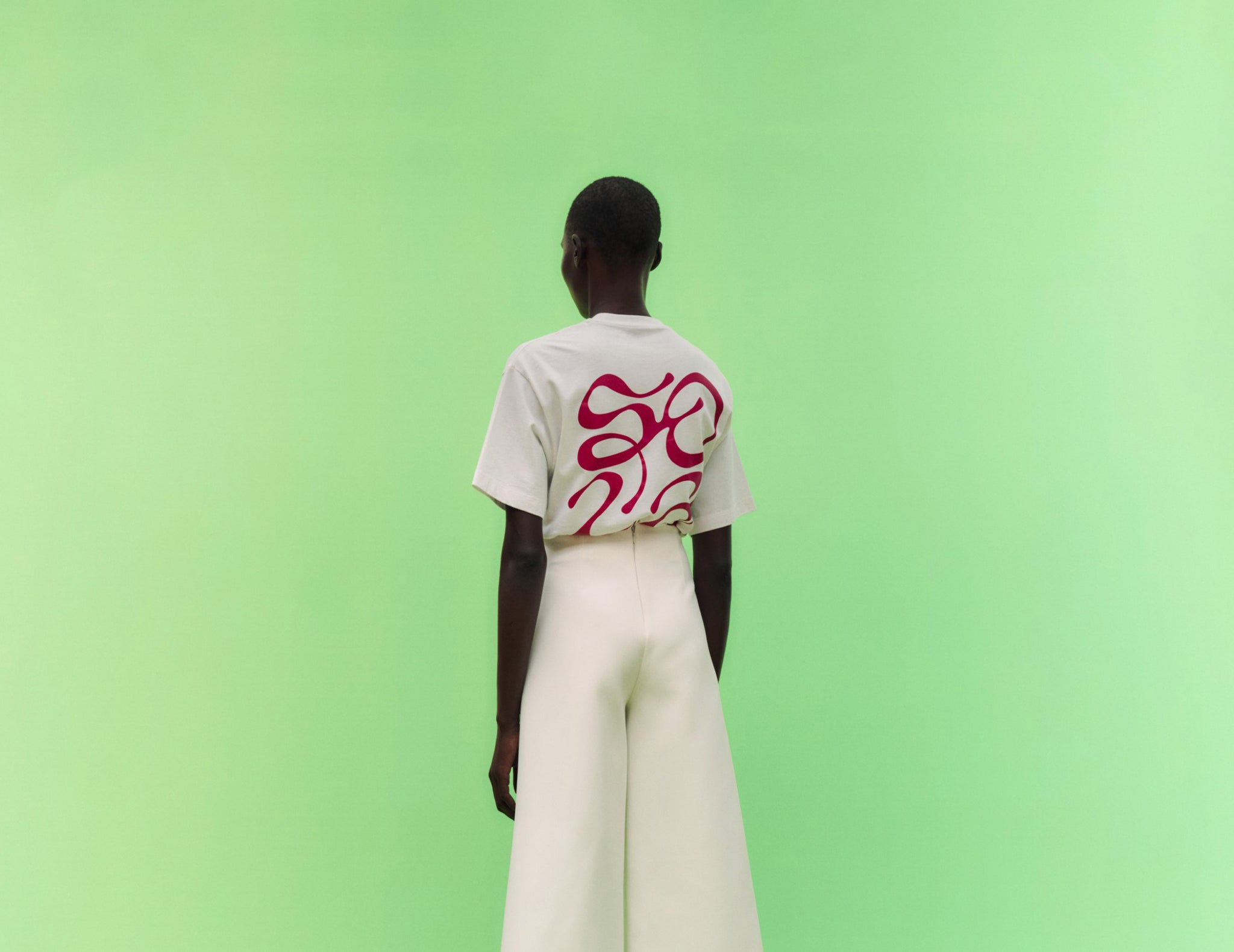
Here image caption: Vivien Hoffmann – Solace London: Tee Shirt Collab (Copyright © Solace London, 2021)


