Earnest, honest and masterful in their creative exploration, London-based design practice Studio NARI are shaping what is expected from a contemporary creative studio; commanding collaborative and candid projects across a vibrant, varied collection of industries.
Having notably worked alongside Nike, Apple, Levis, Yoko Ono, Vogue, V&A, and more, as well as most recently tackling the visual identity for Mob Kitchen, Studio NARI finds a sense of satisfaction and innate personability in whatever they turn their attention to. Effortlessly crafting typographically-led expressions of voice into something that seems both immediately familiar and ever so unconventional. A graphic voice that is unafraid of process and imperfection.
In conversation with Studio NARI's Creative Director Caterina Bianchini, we discuss the meaning behind ‘NARI,’ the role collaboration plays in the studio’s practice, and the duty of experimenting.
Hey Caterina! How are things with you?
Hello! Things are great, thanks for asking! We are about to open our new studio in Dalston and are expanding our team next year, so it feels like we have a lot to look forward to. We have also worked on some incredible projects this year and had the opportunity to work with lots of new clients. For now, we are beginning to wind down for the year which feels much needed.


Studio NARI is an exceptional example of finding the sweet spot between artistic experimentation and sophistication. How do you balance these tensions within your work?
Well, our mantra, hidden within our acronymized name “Not Always Right Ideas” really drives this process and mindset of moving away from the do’s and don’ts of textbook graphic design and working in a more conceptual artistic way. This is that ‘arty’ thread you probably feel in a lot of the work we produce, alongside we work with a lot of strategic thinking which keeps the work grounded enough for it to be considered and understood commercially.
NARI’s identities always have a undeniably strong typographic foundation (which we think makes them all the better!). What role does type play for you in creating visual identities?
Huge! Type is a visual language that allows you to communicate on an almost auditory level, without physically talking. It can become the essence of a brand, the one thing a viewer connects to across various different touchpoints. There are so many elements you can build into typography, little character cues or graphic motifs that allow it to be interpreted and felt in a certain way by the viewer. There is a balance to be had, though. I think sometimes when type becomes too expressive, we lose that essence of ‘brand’ and it becomes something altogether more editorial or stand alone. This is something we consider a lot when creating bespoke logotypes for clients or specific projects.


For Modular by Mensah you worked with Margot Leveque to create stunning, sculptural-feeling bespoke typography. What do collaborations with type designers bring to NARI’s work?
With all our type collaborations, they usually begin with us draft sketching the font. We then hand this over to one of our very trusted typographers. We have so many talented people that we work with all across the globe, which brings really interesting perspectives, conversations and developments into the final pieces. We call this network of people our “extended family” because we really trust them, believe in their artistic vision and support their practice.


NARI being an acronym of ‘Not always right ideas’ is something that really struck a chord with us. How does this mindset manifest in your process and output?
I think I touched upon this a little earlier, but the way we actually put this into practice is through our process. For instance, a lot of our initial ideas begin ‘off screen’ i.e. sketching, looking in books, visiting a gallery or a certain space. This allows us to conceptualise in a more natural and human way, rather than attempting to come up with the ‘perfect;’ concept or idea - we’re not robots. It’s more about the thoughtfulness of it. How does that one overarching conceptual thread work through the entire project; is it subliminal queues or working with slightly different ways of application? Considering juxtapositions rather than harmonisations, or creating interesting tensions through colour, type, style, etc. I think the ability to have that freedom of thought and process is something I pulled from Art School. I used to love sitting in my art studio just thinking/writing and then would begin working. The silence of contemplation and taking a moment to listen to internal dialogue can be so powerful.

We were super excited to see you using Right Grotesk for your exceptional, energetic rebrand of Mob Kitchen! Why did you make the type choices you did in this project and what did these typographic decisions bring to the work?
As soon as we were working on expanding the visual identity, we instantly knew Right Grotesk was the typeface we wanted to use due to the flexibility and continuity through the variables. We used three variables that we combined to create an energetic type language for headlines across the brand and ‘Right Grotesk’ had an amazing balance between soft, playfulness and simplicity. We felt that the combination of fonts created movement, were expressive but also felt editorial, which was important as they would be used across different assets from monthly recipe books, newsletters, subtitles and more.

We love your work for HOME. From the Celebrating Joy campaign weto the identity itself, there is a tone that is undeniably refined, yet unexpected. How do you approach creating visual identities that at their core have a robust foundation but still leave room for flexibility?
We always try to create brands that feel present, and what we really mean by that is that they have an element of being ‘alive’, or the ability to shift with contemporary culture. They are set to a degree but have flexibility or different facets that allow them to adapt. We usually try to do this through the typographic language that supports the brand and the colours. Another way we introduce this idea is through the art of collaboration. We recommended that these brands collaborate where possible with inspiring individuals to allow them to be constantly connected to an ever changing cultural landscape.

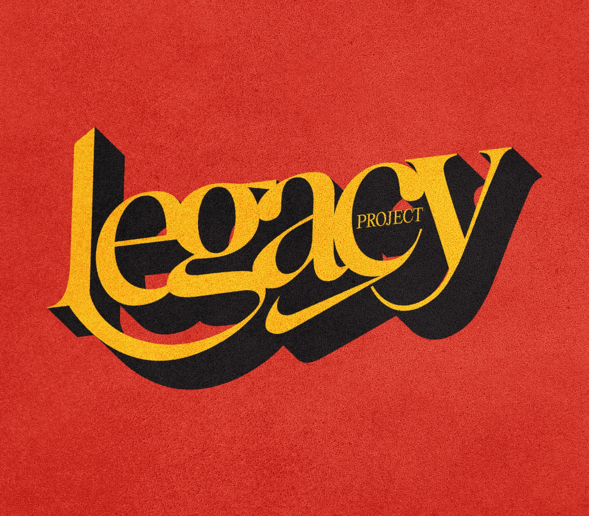
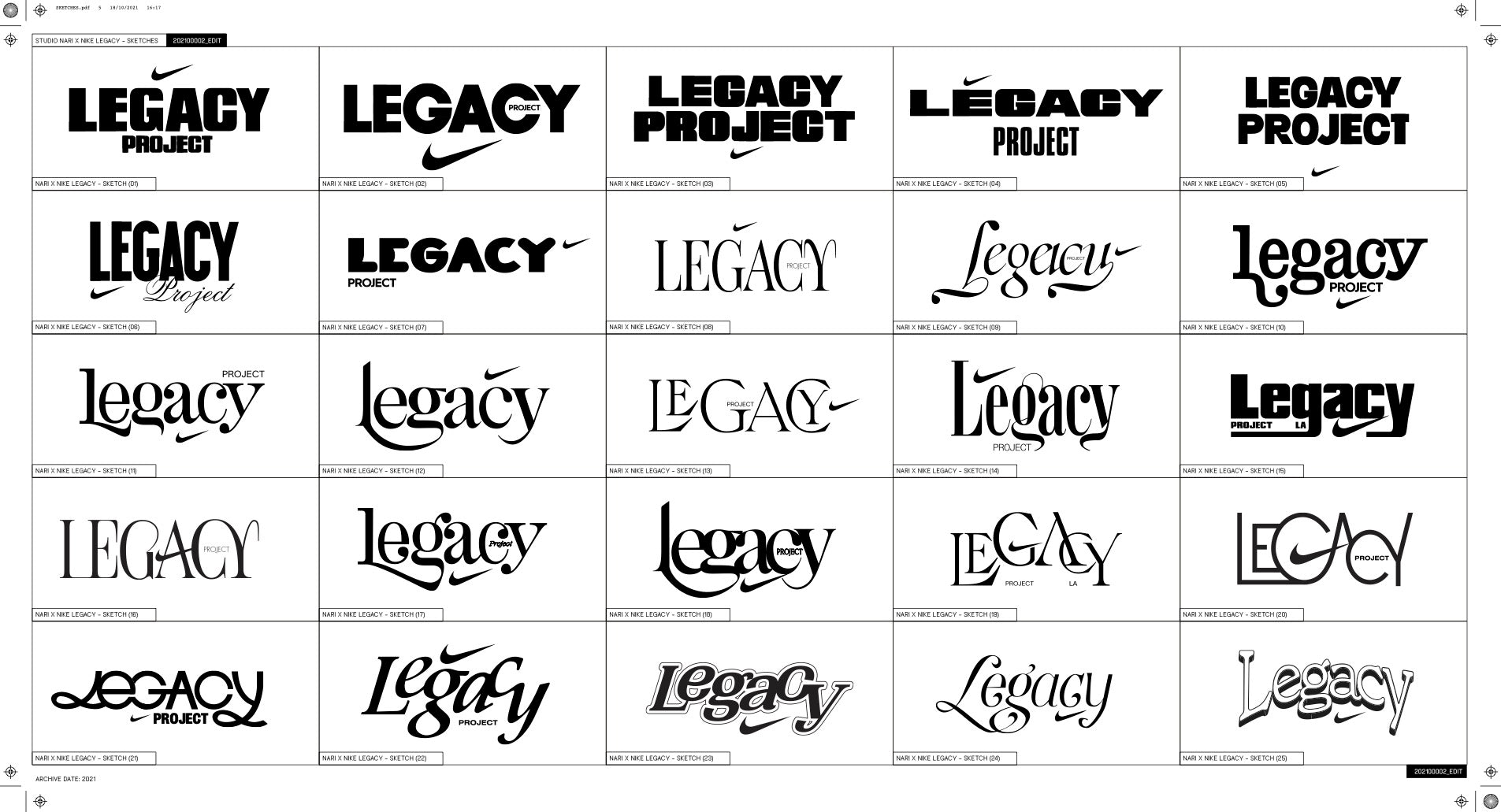
On Instagram you often post sketches and experimentation that didn’t quite make the cut, such as for Nike LA’s the Legacy Project. Do you always approach projects with this explorative mindset or are there times when a visual direction feels crystal clear to you from the start?
I don’t think a visual direction ever feels crystal clear but sometimes you feel intuitive about how it should feel. Actually, that is what happened with Mob. Before we even began the research stage, I just knew how this thing had to feel, and when you can understand the feeling you start to visualise how that feeling can be portrayed graphically. For instance, Mob had to feel full, energetic, youthful, bold. What was developed was a logotype that felt full and bold, and a mark that felt energetic - with the colour palette and application giving the brand that youthful edge. In terms of multiple sketches and developments for projects this is always the case. We can produce a lot of work between us as a team and I think it’s your duty as a designer to test and experiment in all the different ways this thing could exist, as it allows you to make an informed decision.


If you were to give a designer wanting to focus on typography more in their work one piece of advice, what would it be?
Have fun and don’t give up. At the beginning stages of NARI it was really tough, and pre-NARI, I individually had to do so much work to break through and get noticed. There were a few times where I really thought, this isn’t working and it’s never going to. I had people around me who kept me on track, who supported me, but most of all I really loved what I was doing and didn’t want to let it go.


And lastly, if you didn’t run NARI, what would you want to do instead?
I think about this quite a lot as I think it is probably going to be my retirement plan...I have always been incredibly interested in psychology, so I think probably an Art Therapist. If that fails, I would like to dedicate my time to others and helping those in need. I think we all take so much for granted, so sometimes to think about a future where I can give something back makes me want to work harder now, so I have more to give in the future.


