The stats behind Public Address paint quite the picture. Five years since its founding, the creative studio is now made up of 20 people working across six countries and four US states.


“We have a physical studio in Toronto, but we are remote-first,” Co-Founder of Public Address, Chris Braden, tells us, “which has allowed the team to work where they are most inspired, and made it possible for us to find the best talent regardless of geography,” allowing the marvellous multi-disciplinary team to do what they do best: brands. “We help companies develop identities, typically at three critical points,” Chris details, those being Start-Ups, Scale-Ups and Shake-Ups – dialling up from burgeoning, fledgling ideas to reestablishing already-icon brands. No matter the context, size or scale, however, Public Address always approaches each and every idea with the same boundless design philosophy; that being having an ultimately open and unrestricted mind. “In the best case, the project itself provides the inspiration,” Chris explains, “it’s up to us to find what we think is interesting and what the opportunities for learning and experimenting are,” making it clear, all the same, that their inspirations are found outside the obvious.


“Though most of our work is creating brands,” he notes, “we don’t look at branding for inspiration,” whilst likewise steering clear of a tunnel-vision-led approach. “I think what keeps us inspired is avoiding any single source or method,” Chris suggests, often turning to other forms of art and media instead. “For a few projects we’ve created playlists to help define a tone/feeling,” he recalls, “sometimes it’s films,” raising Lars von Trier and Jørgen Leth’s Five Obstructions as a regular reference, “and sometimes it’s books – Agency as Art by C. Thi Nguyen has some great ideas about the philosophy of games,” Chris adds, “that also applies to design systems.” Alluding to a future potential release, Chris also confides, “sometimes it’s the intersection of spaceships, ancient mythologies and contemporary sculpture, but that’s coming soon!”
A perpetual creative pillar of Public Address’ output is typography – the stoic yet frequently surprising cornerstone of the studio’s studious output that doesn’t just enliven the aesthetic of the brand in question. “In most cases, we are not only developing the visual identity but also the verbal identity,” Chris details, “for us, the process of selecting a typeface starts when we define the tone of voice for a brand,” with the typography’s role being to “intuitively express” the manner of the company’s character. “It tells us how we should read the content, Serious? Friendly? Casual?” Chris postulates, “but beyond expressing the tone of voice, we also consider the technical and language requirements,” considering factors the likes of project scale and costs. As such, Public Address works with all levels of font usage, working all the way up to custom creations – a fact that indicates the success of what is ultimately their guiding philosophy: growth. “No one comes to us to stay the same,” Chris reveals, “yet most brands are designed to do just that,” prioritising consistency over creativity. “We’re always looking for ways to design brands that grow and evolve,” he continues, with the studio’s aim to create space for brands to grow from, not purely and solely destinations in their own right. “Growth doesn’t always have to relate to scale (though, it often does),” Chris expands, “it is also about quality, creativity and experimentation,” factors that are instrumental on all sizes. “Because we are often asking people and companies to take a leap of faith into something new,” he contextualises, “we spend a lot of time and care on details and craft,” whereby the smallest of details can instigate the grandest of changes.


One such project is Cliché, a remarkable, slick, stoic and satisfyingly graphic brand for winemaker, artist, and entrepreneur Dave Phinney, a figure who’d build a considerable following through his subversive wines and labels. “For him, this project started with frustration; he loved the potential of seltzers but hated the quality and brands that were becoming ubiquitous,” Chris sets the scenes, elaborating that Dave didn’t want customers to think they were ‘drinking down’. With Dave having created the name and the visual motif of lips on the label, it was Public Address’ task to do, well, everything else. “We built on those two starting points and put together a handful of insights and actions that formed the basis of our creative brief,” he explains, “from there, the team put together four design directions,” of which one was a clear favourite.
“We love working with founders to build brands,” he adds, “it’s always exciting to take an idea to a fully realised brand,” especially one – that we say with absolutely no bias at all – with such impeccable type choices, having used Neue Montreal as the hero typefaces. “It’s a great typeface because it can be both bold and recognisable, but doesn’t require a specific look to fit in,” Chris details, praising how effectively the Grotesk works in both primary and supporting contexts. “For Cliché specifically, it perfectly balanced the criteria we were looking for,” he adds, “elevated but not fussy, bold but not overpowering, timeless but not boring,” dutifully complimenting the angular rigour of the surrounding grid system.


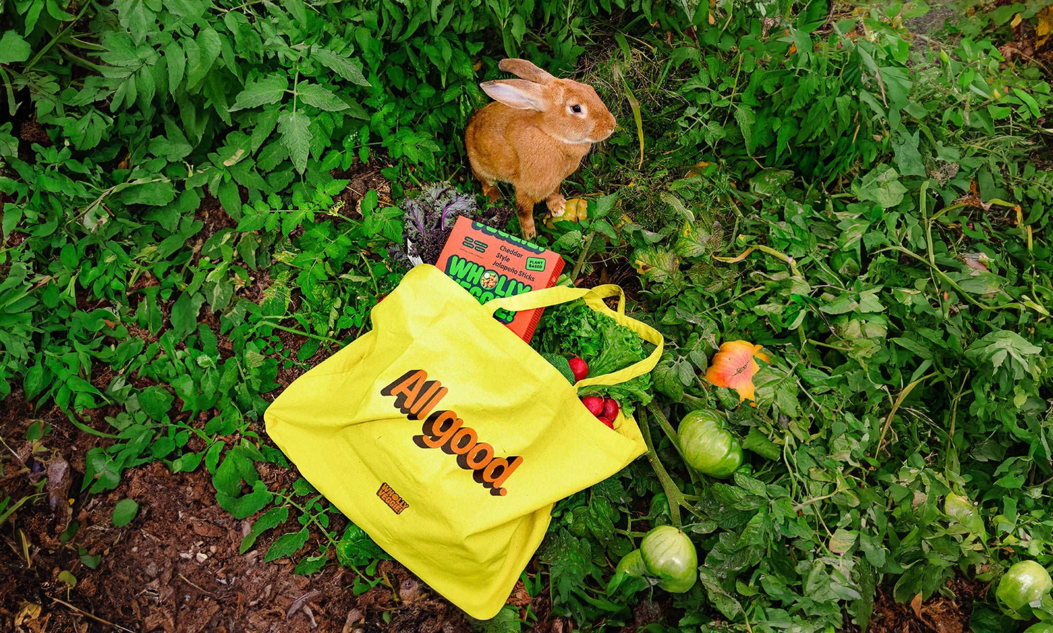
Speaking more broadly (and kindly) of Pangram Pangram, Chris highlights the diversity of the foundry’s catalogue, contextualising as much in their two most recent endeavours. “Cliché and Wholly Veggie couldn’t be more different stylistically,” he notes, “but both projects rely on Pangram Pangram typefaces,” suggesting how both Public Address and Pangram Pangram co-exist so effortlessly. “As a studio, we take pride in having ‘No Style’,” he clarifies, “for us, that means we don’t impose a house style in our work,” referencing Rick Rubin as a key inspiration for the studio. “He can work with artists as different as Johnny Cash, Jay-Z, and Adele helping them each find their own voice without imposing his,” he summarises, “what we love about the Pangram Pangram library is there is almost always a typeface that fits what we need,” with no two being the same. “The range of styles is also why we chose to work with Pangram Pangram on a custom typeface for a (very) big project that we’ll all be cheering on in 2026,” Chris concludes, a sight we cannot wait to see. Until then, however, we’re more than content in relishing, admiring and examining Public Address’ ever so meticulous and expansive practice.


