Beyond just a typeface, Pangram Pangram’s latest arrival, Pangaia, is a typographic connection to Mother Nature herself.
Blending the tactile splendour of traditional serifs with the raw, organic beauty of the natural world, Pangaia is a practical, powerful, and characterful embodiment of the Earth around us – channeling the gentle curves of its leaves, the tranquillity of its calm waters, and the rugged foundation of its mountainous landscapes. Rooted firmly within a unique unity of type, texture, and terra firma, Pangram Pangram’s latest serif not only ensures that every character is meticulously crafted to evoke earthly imagery but aims to draw the contemporary typographic scene into new, extraordinary, genre-defying spaces.
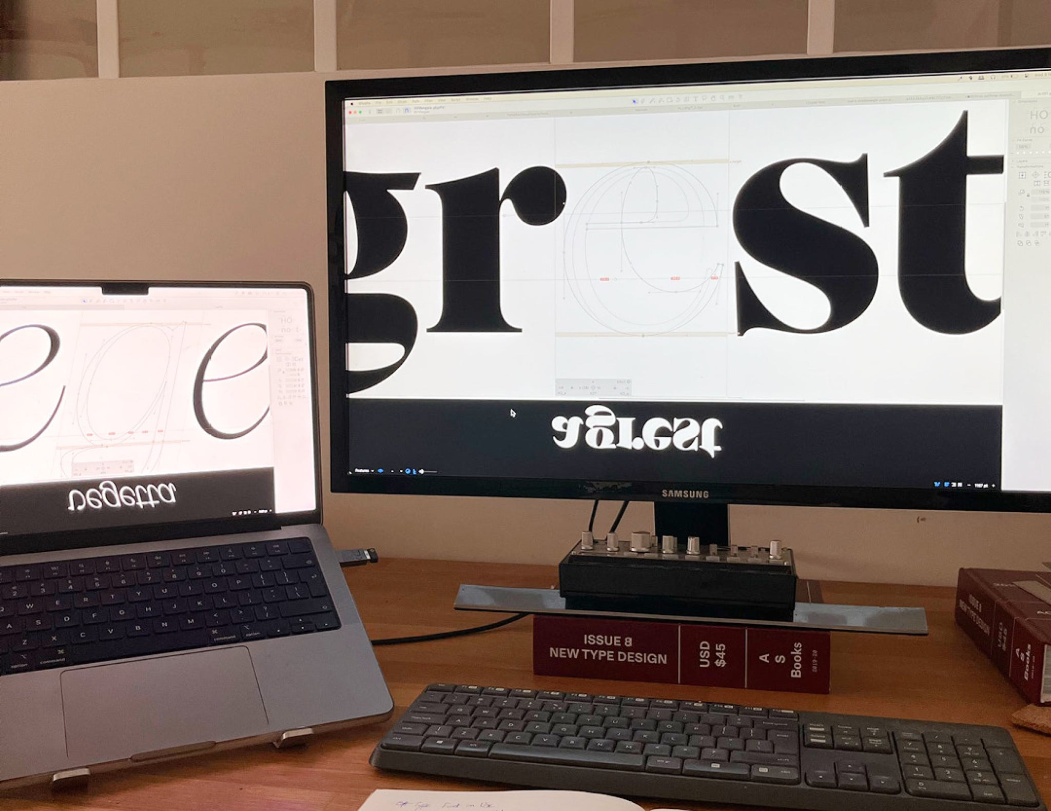
Continuing our deep-dives backstage, taking a peek behind the curtain of Pangram Pangram’s latest and greatest, we’ve spoken with the creative mind behind Pangaia, Sam Salminen, delving into the captivating genesis of this remarkable typeface, offering an intimate glimpse into the design process, the inspiration that fuelled its creation, and the challenges faced and conquered.
Hello Sam! How’re you doing?
SAM: All good, thanks! Just finished the Sunday crossword.
Can you tell us about the inspiration behind Pangaia? What drove you to create this typeface, and how do you feel it fits into the contemporary typographic landscape?
SAM: I actually made the first sketches for Pangaia back in 2020 when I was studying at the Royal Academy of Art in The Hague. As you can maybe recognize, I was inspired by the angled strokes of fonts like Windsor and Recoleta, but wanted to create something less Cooper-esque. The italics are then again quite heavily influenced by my studies of French renaissance type. In other words, quite the mixture of influences, but the way they come together doesn’t strike me as classical or traditional in any sense.


Pangaia is described as a ‘worldly typeface.’ Could you elaborate on what this means to you?
SAM: Personally I’d maybe describe it as ‘down-to-earth’. It’s about trying to find space for some organicity, something unexpected, within the rigidness of a classical serif typeface — creating an alternative flow.

Typography is often about balance. How did you strike a balance between Pangaia’s character and versatility?
SAM: This was certainly a challenge. Looking back at my first sketches, there were way too many ideas happening simultaneously and every character lived its own life. So as I began working on it again, I took a slightly more conservative approach and stripped it down to its essential characteristics. Still, a lot of very expressive shapes came about during the process and I certainly had to kill many darlings along the way. I’d be lying if I said I knew exactly what I was doing, so it was definitely a very intuitive process. To quote my dear tutor Peter Verheul: “Sometimes you have to listen to your eyes.”


The typeface industry is incredibly competitive, what unique qualities or features do you believe set Pangaia apart from the rest?
SAM: I’m not really interested in comparing my work with others’, I’m just happy to have the opportunity to do what I love and that Pangaia is now out there for anyone to use. I think it’s peculiar in many ways though. I especially like how some letter combinations, like ‘av’ for example, complement each other so well, almost as if they were carved from the same piece of wood.

Pangaia’s range spans from delicate thin weights to robust black weights. How did you ensure that the typeface maintains its personality and functionality across this broad spectrum?
SAM: I didn’t have a clear game plan for the typeface when I started, so I actually only worked on the thin weight at first. Mat suggested drawing a black version which turned out to be the key for solving all the problems I had with the lighter weights. I had never designed anything with such an extensive weight range, but I certainly learned that taking things to the extremes can really help you see things more clearly. So if you ever feel stuck with a shape, just draw the most extreme versions you can imagine and things should start falling into place!


Designing a typeface is a meticulous process. Could you walk us through some of the challenges you faced during Pangaia’s creation, and how you overcame them?
SAM: Working with angled stems turned out to come with quite a few challenges, especially regarding spacing, as they create white space in places you’re not used to. After a lot of tweaking back and forth and numerous kerning pairs, I think I managed to find a good rhythm! The second big challenge was to translate the characteristics of the roman to the italic. As many of the main characteristics of the roman didn’t directly translate too well to the angle of the italic, I had to look for other solutions — which I found in swash capitals, such as those of Granjon from the 16th-century, which I felt somehow carried a similar softness and fluidity.
It’s so exciting to think about where Pangaia could go, can you share any specific projects or industries where you envision Pangaia making a significant impact? Or even just some dream applications!
SAM: I agree! I feel like it really gets to shine at larger scales, so seeing it used at a massive scale in exhibition spaces, for instance, would be quite amazing! I’m also particularly curious to see what typefaces it will be paired with.


Do you have any favourite characters or unique glyphs in Pangaia that you’re particularly proud of? Could you tell us the story behind them?
SAM: I’d probably have to say the (black) lowercase ‘a’ because it caused me so much headache. I went through so many variations, with different terminals and bellies, and spent countless hours adjusting it before arriving at the final one. It’s unlike any ‘a’ I’ve encountered, yet it doesn’t feel alien and it really embodies the soul of Pangaia.
Finally, what’s next for you? Any clues to what you’re working on next?
SAM: I’m now working as a freelance designer in Amsterdam. Lately I’ve been mainly busy with editorial projects and some custom lettering stuff, but I’m sure it won’t be too long before I lapse into drawing another typeface!
Pangaia is available to try for free at Pangram Pangram
Commercial licenses are also available, starting at $40.


