Welcome to pairing Pangram typefaces! This time, with a twist!
So far, we’ve stuck to our own. Lovingly crafting pairs of Pangram’s very own typefaces for you to try out. Arguably, Pangram’s extensive catalogue covers so much, what more could possibly be out there?! Turns out, quite a lot!
There are oh so many talented type designers, foundries and students of type (all the sorts of people we love talking to here on the Pangram Paper!) who are crafting everything from the most beautiful, conceptual, and ornate typefaces to the most robust and technically sound.
Below you’ll find some suggested pairings for Pangram Pangram typefaces and our type foundry friends and contemporaries. Try them out and tag us (and the other foundries!) in your designs at @pangram.pangram!
VTC BAYARD by Vocal Type and SUPPLY SANS
Supply's chunky character is complemented, and its techy peculiarities wonderfully contrasted, by the bold structure and organic tone of Vocal Type's VTC Bayard. Inspired by the signs found within 1963's March On Washington For Jobs and Freedom, Bayard is fundamentally crafted with an unparalleled cultural legacy and an undeniably striking aesthetic. Combined with Supply Sans' unapologetic modernity, the pair are certifiably fit for purpose, ready for anything.

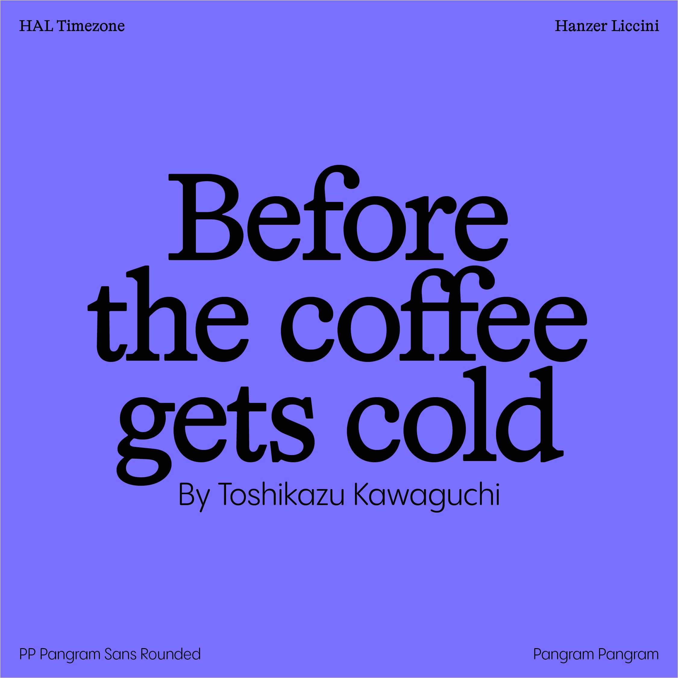
HAL TIMEZONE by Hanzer Liccini and PANGRAM SANS ROUNDED
Hanzer Liccini’s HAL Timezone is a modern staple. With its low-contrast serifs and remarkable yet often subtle eccentricities, it could easily pair with anything. We think; however, it pairs particularly well with our in-house favourite typeface, Pangram Sans Rounded. Contemporary, classic and cute. What’s not to love?

LARS by Bold Decisions and NEUE BIT
Bold Decisions' Lars is a hardcore graphic design favourite, cemented as a timeless replacement for san serifs Helvetica and Arial alike. Paired with something a little bit different (read: extra), such as Neue Bit, you have the perfect balancing act. The peculiar and the pragmatic, need we say more?

ABC Asfalt by Dinamo and Editorial New
Go big or go home, right? Dinamo’s Asfalt is another contemporary cult classic, taking inspiration for its unique design from road markings and lettering, providing an astute contrast to Editorial New’s meticulous, book-ish character and striking serifs, taken straight from the page. Together, the two craft an unconventional harmony of physical, tactile inspiration.

KALICE by Margot Lévêque and AGRANDIR
Beauty and the beast might be quite a harsh comparison, but there is certainly something there. Agrandir’s powerful, chunky construction brings an aesthetic punch to any project, providing space for Margot Lévêque’s Kalice to shine through via its technical subtitles, refined letterforms and undeniably elegant stature. Used in tandem, the two allow one another to take centre stage, flexing between gravitas and gentility.


