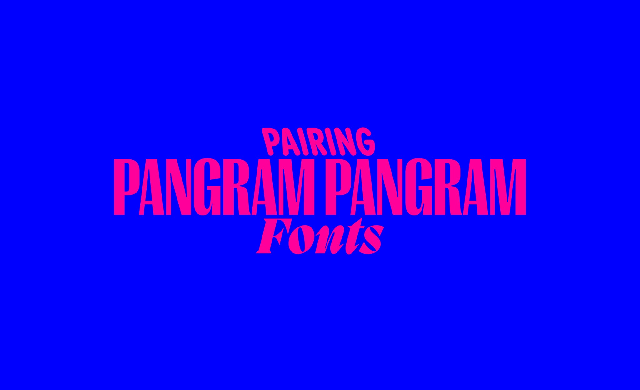
Pairing typefaces can be hard. Serifs with sans serifs? Extended with condensed? Similar typefaces side by side or complete opposites?
You might have noticed we have a fair few typefaces. 32 typefaces to be exact (with more to come soon, so keep your eyes peeled). Whilst using one on its own is great, we’d argue that two working together in perfect harmony is even better!
Below you’ll find some suggested pairings for Pangram Pangram typefaces. Try them out and tag us in your designs at @pangram.pangram!
PANGRAM SANS ROUNDED and EDITORIAL NEW
Soft and sharp, what more do you want? This contrasting pair help bring out the best in each other, providing an edge to Pangram Sans Rounded’s friendly persona, whilst relaxing Editorial New’s bookish sincerity.

EIKO and NEUE MONTREAL
A soon-to-be-classic combo. Japan meets Canada in this harmonious contrast of forms; where the charm and neutrality of Neue Montreal is juxtaposed with Eiko’s acute architecture, creating an aesthetic as dramatic as it is pragmatic.

MIGRA and FRAKTION MONO
Technology x Ornithology. The combination of these contexts seems, on paper, odd, but in practice this dynamic duo makes quite the statement when paired together. Highlighting the strengths, quirks and uniquenesses of each, without detracting from the functionality of either.

RIGHT GOTHIC and CIRKA
Even if this tall cut of Right Gothic doesn’t quite do it for you, there is definitely a style that will. With such a comprehensive family, Right Gothic can make itself comfortable in any and all contexts. Paired with Cirka, its lethal letterforms ground Right Gothic in a beautiful mixture of vertical and horizontal forms.

HATTON and RADIO GROTESK
Hatton’s cosmopolitan context is left uncompromised in any pairing. When grounded by Radio Grotesk, however, its grace is truly emboldened, crafting a palpable contrast of friendly curvaceous forms with an unmatched sartorial elegance.


