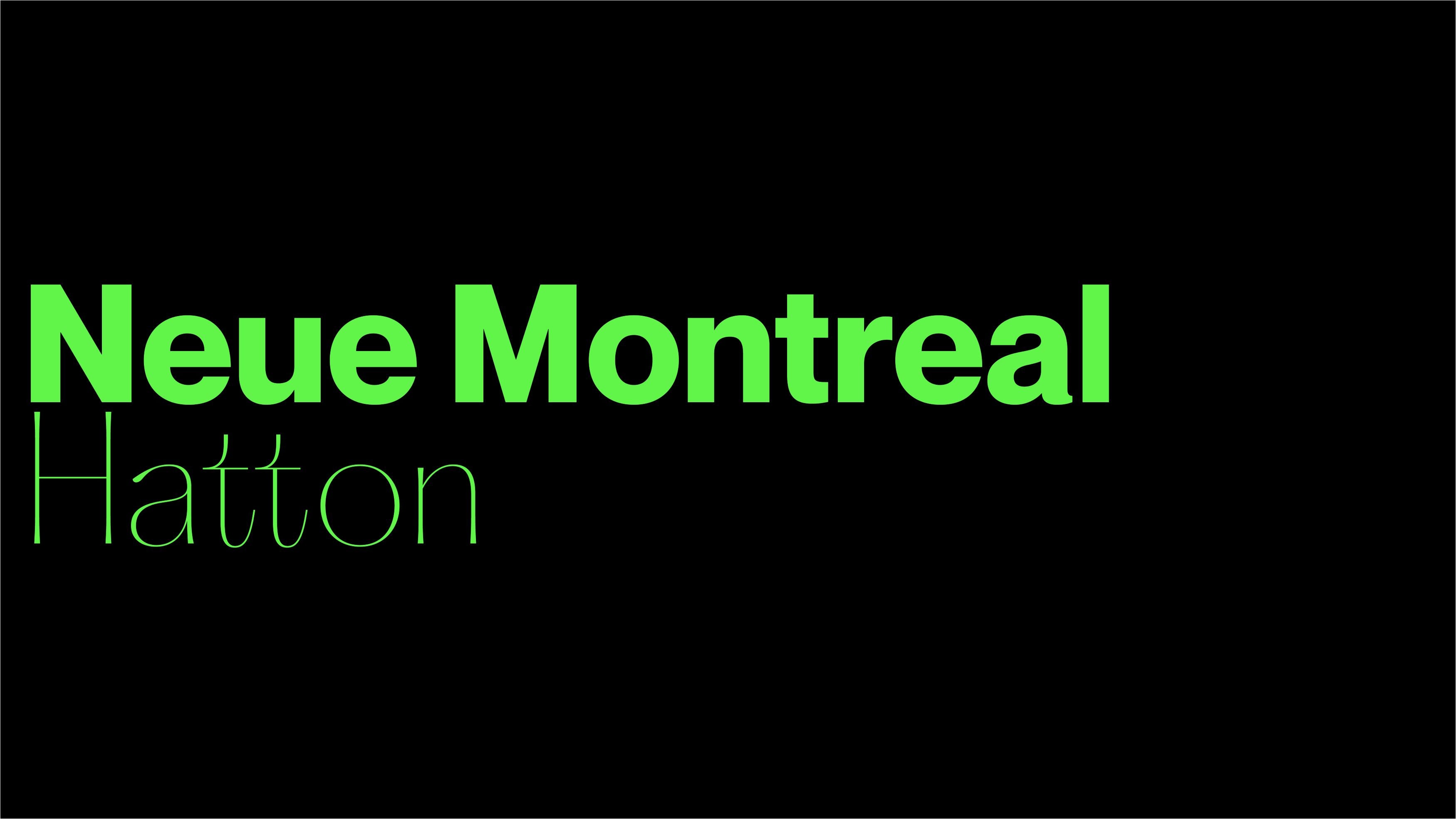
In the enchanting realm of typography, finding the perfect dance partner for a typeface can be an interesting (sometimes fun, sometimes painful) journey. Today, we embark on an exploration that brings us closer to the heart of design and celebrates the art of pairing Pangram Pangram typefaces with our beloved Neue Montreal.
At Pangram Pangram, we take pride in crafting versatile and exquisite typefaces, and Neue Montreal holds a special place in our hearts. A powerful, versatile, Grotesque fan-favourite, Neue Montreal was designed originally to capture the essence of Montreal’s vibrant design scene, from its iconic Expo 67 to its wonderful contemporary scene. But what happens when we blend the elegance of Neue Montreal with the unique charm of other Pangram typefaces?
Across this article, we invite you to discover the harmonious duets that unfold when Neue Montreal meets its perfect companions. From vintage nostalgia to modern sophistication, each pairing tells a distinct typographic tale – a harmonious typographic symphony composed of Pangram Pangram’s thoughtfully curated typefaces.
So let’s get going! Together we’ll uncover the unique strengths and captivating qualities these typefaces bring to the stage, showcasing how they enhance Neue Montreal’s timeless appeal. Boom!
Neue Montreal and Editorial Old
Editorial Old presents a delightful contrast to Neue Montreal, offering a fresh perspective on the vintage concept that inspired Editorial New. While Neue Montreal exudes contemporary elegance, Editorial Old takes a step back in time, embracing the charm of eroded vintage ads. Its softer curves, relaxed connections, and luscious ligatures create a nostalgic typographic experience that complements Neue Montreal’s clean lines with a touch of timeless flair. Together, they form a dynamic duo, where Neue Montreal’s modernity meets Editorial Old’s vintage allure, making them perfect companions for editorial layouts, branding projects, and designs seeking a unique blend of past and present.


Neue Montreal and Hatton
Collaborative and refined, Hatton forms a natural pairing with Neue Montreal, celebrating the history and elegance of London’s Hatton Garden district. Both typefaces exude a sense of timeless sophistication, with Hatton’s variable serif styles beautifully harmonizing with Neue Montreal’s Grotesque forms. The upcoming addition of true italics to Hatton enhances its expressive and dignified flair, creating a versatile typographic palette that resonates with both serious and playful projects. The refined curves and adjusted contrast in Hatton also offer an ultimately engaging rhythm to its design, complementing Neue Montreal’s dynamic spirit. Together, they convey a sense of legacy and character, making them an excellent choice for luxury branding, editorial projects, and designs seeking a touch of timeless charm.


Neue Montreal and Right Grotesk
As a versatile and distinctive typeface, Right Grotesk complements Neue Montreal’s adaptable and spirited nature. Its delicate details, smooth curves, and moderate contrast complement Neue Montreal’s clean lines, creating a dynamic typographic interplay. On top of that, Right Grotesk’s neutrality and functionality add versatility to Neue Montreal’s expressive forms, making them a happy, harmonious combination. Their collective impact ranges from bold and loud statements to humble supporting roles, making them suitable for whatever application you see fit!


Neue Montreal and Supply Mono
Inspired by industrial design and architecture, Supply Mono pairs harmoniously with Neue Montreal’s versatile Grotesque form. With precise curves and sharp angles, Supply Mono adds a touch of industrial charm to Neue Montreal’s contemporary elegance. This duo works seamlessly in structured designs, offering a solid and reliable typographic foundation for print, page or pixel. Whatever the outcome, Supply Mono and Neue Montreal are sure to deliver a cohesive, contemporary typographic experience.


Neue Montreal and Pangram Sans Rounded
As the playful sibling of Pangram Sans, Pangram Sans Rounded brings a bit of fun and approachability to Neue Montreal’s design palette – not to mention the world’s great smiley glyph. While Neue Montreal exudes sophistication, Pangram Sans Rounded infuses a more whimsical vibe with its rounded forms. Despite its playful nature, Pangram Sans Rounded remains a powerful geometric workhorse, boasting many styles. Together, they strike the perfect balance between professionalism and playfulness, making them an ideal duo for uplifting designs that need to stand out with charm and character.


