We’re excited to welcome the designers behind the Off Type’s latest freshly-squeezed creation, and what else can we say but… OOF!
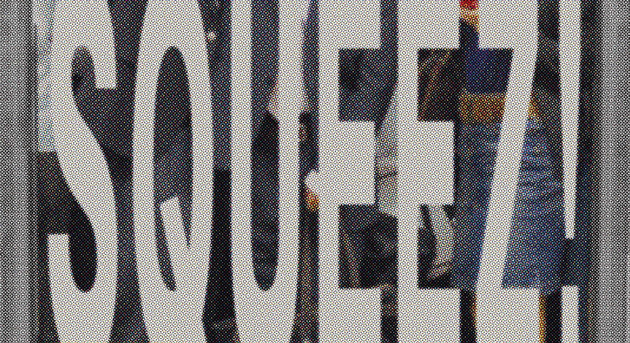
The ultra-compressed counterpart of the beloved Neue Montreal, NM Squeezed offers a similar versatility but in a package that's a bit tighter. Taking the classic’s workhorse foundation and giving it a fresh, trend-ready twist, the 14-style offering embraces its uniqueness and seamlessly balances unconventional aesthetics with its inherent practicality, embodying the off-beat beauty that Off Type is known for, coupled with the craftsmanship that underpins their designs. A properly engineered, expertly pressed font, with all the lovely weirdness from messing around with squeezing type — what’s not to love?
Bringing a breath of fresh air and confined typographic inspiration to the design world, Neue Montreal Squeezed is out now, and if you’re particularly eager to experience this typographic innovation firsthand, you’re in luck, as the typeface is already freely available to download and trial. To find out more we’ve spoken to its creators, Mat Desjardins and Valerio Monopoli, discussing the who/what/where/when/why of Off Type’s wonderful release.
Check out other weird and wonderful (oh, and super well designed) fonts over at off-type.com 🌐
So, simple question, why squeeze Neue Montreal? What’s the story behind it?
MAT: I kept seeing people just squeezing typefaces by hand and I wanted to do something about it. I thought Neue Montreal would be the perfect candidate to be “professionally” squeezed. Releasing it on Off Type just made sense given the weird result, whilst also helping to reinforce the connection between the two foundries.
Did you have to modify much structurally, beyond stretching it?
VALERIO: The original drawing stays basically untouched, except for the overshoots which had to be curbed, and some minor optical adjustments in the italic cuts. The main point of having a squeezed version and not a traditionally compressed one is to preserve the contrast distortion that makes it so unique.

What makes Neue Montreal Squeezed so unique? What sets it apart from other compressed typefaces?
MAT: Definitely a few things.
The fact that it’s based on a very solid, workhorse Grotesk - Neue Montreal. Like we mentioned above, there aren’t a lot of “professionally” squeezed fonts out there that retain all the correct contrast and metrics. That makes it very easy to use.
Also the fact that it is fully variable on all three axis! You can choose just the right amount of squeeze and weight to fit your context. It also means that you can animate it in a super unique fashion.
And lastly, we designed it so it has that reverse-contrast flare as well. We didn’t just keep the contrast of the original typeface. It makes it even more weird and fun which is why Off Type’s library exists.


In what ways does Neue Montreal Squeezed align with current design trends or respond to market demands?
MAT: As I touched on above a few times, we’re seeing a lot more manually squeezed typefaces to create eye-catching typographic elements in a design. I think the trend is here and probably here to stay for a while so why not have something that’s squeezed properly then! This just made sense to me to take one of our best typefaces, squeeze it perfectly and bring it over to Off Type, kinda the perfect triangle!

What did you find most challenging across the design process of Neue Montreal Squeezed?
VALERIO: It was actually a very simple process, we just had to stay true to the original typeface and create a consistent spacing and kerning pattern among the many subfamilies.


How do you feel Neue Montreal Squeezed aligns with Off Type’s overall philosophy?
MAT: It just felt right to publish it there given the nature of the result. It’s weird, it’s off-beat, it makes your designs stand out. And it’s a nice way to bring the two sister foundries closer. Just a huge no-brainer for us.

How does Neue Montreal Squeezed strike a balance between legibility and compactness?
VALERIO: The main structure is still the one of a grotesque font, so even very narrow instances are somewhat legible. That said, the extremely compressed subfamilies can become too vertical for long texts, that’s why we designed NM squeezed as a variable typeface that can be fine-tuned to the design requirements. Ultimately, we leave it to the user to find the perfect balance between these two qualities.
What kind of creative spaces, applications or industries do you envision Neue Montreal Squeezed being particularly well-suited for?
MAT: I’m going to say all of them! Haha! No, but to be fair, the unsqueezed version, Neue Montreal, is used in so many different contexts and industries that I think this one has the potential to do the same. If I had to choose a few though, I’d say the fashion industry and the entertainment industry like on movie posters or in shows.


What’s your favourite thing about Neue Montreal Squeezed?
VALERIO: It underlines Pangram Pangram’s commitment to understanding the designer’s typographic needs: the gesture of “artificially” squeezing a typeface already existed in the wild, we just accepted this evidence and responded to it by creating a flexible tool that gets the same job done but in a more consistent, reliable fashion.
MAT: What Valerio said! I think this typeface is a statement of giving designers what the right tools they actually need and use.


Any plans for expanding Neue Montreal Squeezed? And what other Pangram Pangram typefaces do you feel would be interesting to bring an Off Type edge to?
MAT: We’ll see how it is received by the audience and if we feel we could add things to it. One thing that could happen is to go beyond the width of the original Neue Montreal and have a Neue Montreal Stretched!
There are also definitely a few other typefaces that could go under the “Off Type Treatment”! But I won’t spoil everything here just yet!
Neue Montreal Squeezed is available to try for free at Off Type
Commercial licenses are also available, starting at $40.


