Dynamic duo and Little Troop founders Noemie Le Coz and Jeremy Elliot share a remarkable design practice that is as creatively, typographically and conceptually laudable as their projects are international in scale; having found themselves working between Melbourne and Brookyln.
Providing the world with projects that continue to delight and surprise the graphic design community and beyond, Little Troop's name is a mark of creative ingenuity, graphic character and dedication to the craft of the discipline. Finding original and lively solutions that undeniably push the aesthetic climate of the contemporary design scene.
Endlessly excelling at whatever they turn to (whilst choosing equally wonderful typefaces along the way!), Little Troop are driven by the notion of creating brands that speak in their own unique voice. With this in mind, we’ve spoken to Jeremy and Noemie on the playfulness of their process, the design world’s new favourite identity Le Puzz, and how they navigate their wide-ranging array of clients.
P.S. Welcome to the world Luca! Little Troop’s newest little troop.
Hey Noemie and Jeremy! How’s it going?
Noemie (N): Hello! Thanks for having us! Things are good, we’ve just welcomed our first little one, Luca, into the world, so right now all our lives are in a bit of a baby bubble!
Jeremy (J): We’re lucky we’ve been able to pause all things Little Troop and take a bit of time off work to be with him full-time for his first few months. It’s flying by.


Little Troop expertly wanders between function and offbeat playfulness, creating work that feels simultaneously extremely considered and extremely unexpected. Does this combination come naturally through your process? Do you have a typical approach to the start of a project?
N: Ah, thanks! I think we’re both pretty light-hearted people and try not to take ourselves too seriously — we’re by no means the “academic” breed of designers. Our work has a degree of looseness, but we also love getting really into the details and craft of our work… so I think the combination of the two comes both naturally and intentionally. We often joke with clients that we try to put the ‘fun’ in ‘functional’ — we love taking something ordinarily mundane and finding ways to give it some life and energy. The most satisfying part of our job is when we’re able to make a brand that’s both super usable and covetable, to the masses.
J: There’s usually a bit of a push and pull between the two of us. I lean more on the functional and practical side of things, and focus on best practices — whereas Noemie really loves pushing ideas to become more unexpected, which often involves a degree of playfulness. Over time I think that tension has become quite a critical success factor for us — even if it means some pretty “heated” conversations along the way. Before fighting for our ideas with the client, we have to fight for our ideas with each other!
N: At the start of most projects, we send an initial client questionnaire that helps us get to know the client’s personality, DNA and brief, and includes both fun and functional questions. Mixed in with the standard discovery stuff, we include more playful ways in — like if the brand was a book, song, color, artist etc., what would they be — which we’ve found really helpful to quickly get to the heart and soul of who we’re working with.

The studio, in your own words ‘bounces between Melbourne and Brooklyn’. In what ways does this set up influence your practice?
N: Most of our clients are still based in the US, so the biggest impact when we’re in Melbourne is really just the early starts, which can be a bit brutal sometimes! Other than those, we find that spending time in Melbourne gives us a bit of a mental break from the craziness of New York. There’s definitely a difference in pace between the two locations, and Australia is our first home, so there’s a sense of calm here that we like coming back to. Getting to see our family and old friends for a few months at a time is also really nice, especially now with a little one.
J: We’ve also managed to avoid a couple of New York winters the last two years. We’re sort of chasing an endless summer!


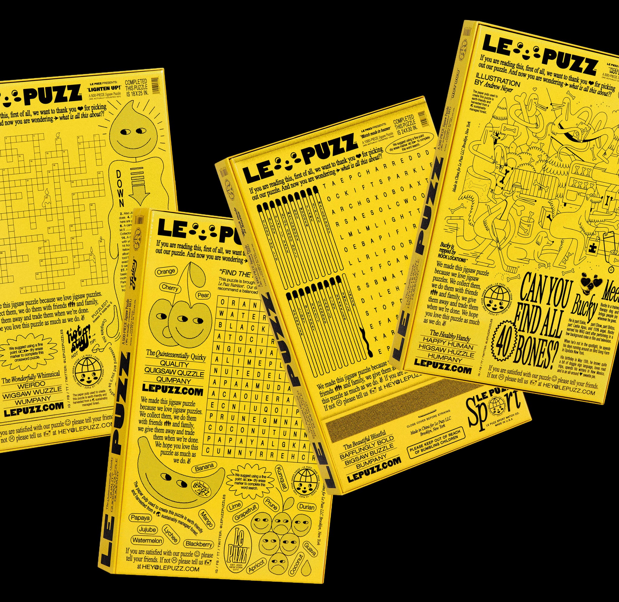
Le Puzz is one of those rare projects that the ‘design world’ has fallen head over heels in love with. There are many things that we loved about it, but of course, the typographically mischievous, slightly ‘wrong’ nature of it really caught our eye. How do you approach breaking typographic ‘rules’ in a way that enhances the work?
N: We’ve been really amazed at the response! I think with all of our projects, we’re constantly trying to find ways to make something unique, and Le Puzz was the perfect project to play with pushing the boundaries typographically — we were really encouraged to bend the rules and help the founders create something special, as a fun, fresh homage to the really off-the-wall creative direction they were drawn to from the past.
J: We chose Helvetica and Times for their “default” feel — they’re arguably two of the original typeface ‘rule makers’. Their dryness created a sort of conventional blank canvas for us to play with and push into weird, unconventional but slightly throw-back territories. We customized their widths and weights to create a new, ownable family that nodded to the vintage type we were all inspired by. Our web developer didn't love us for it, but with some CSS hacking, we managed to make it work on the .com, too, which was an unexpected win for sure.
N: Again, it all comes back to getting that balance of work that feels like it’s rooted in today or tomorrow, but also feels like something recognizable. Our projects are often influenced by total mash-ups of references, which I think creates a natural space for rule breaking. And after so many years in studios on the tools, following all the rules, we now get excited about taking what we know works and what doesn’t, and bending certain things to make our work feel a bit different.


We thought it would only be right to ask about Girlgaze, seeing as you used Editorial New as part of the identity! Why did you make the typographic choices you made and what impact did this have on the tone of the brand?
J: Girlgaze came to us wanting to create a jobs platform that essentially editorialized and celebrated its creators and their work.
N: Editorial New was a perfect match for the brand, bringing in that familiar, “editorial’, bookish feel in a way that felt new — again, hitting that past-meets-future balance. It also carried a richness and sense of gravity, it could hold its own, so we could use it for anything from a big, bold headline to long-form storytelling and articles. We also liked that it felt like an evolution of Times, in a way, and wasn’t overly trendy. Like Girlgaze, it felt rooted in the present, but with a sense of timelessness.

You work with a lot of clients end-to-end, such as for OffCourt, working on both the identity and art direction, and rolling them through to digital experiences. Is this integrated approach one that is important to you?
N: Yes, we love doing a bit of it all — the branding, art direction, web, illustration, packaging... where we often have the most fun is building a brand or campaign really holistically and carefully crafting how each element feeds into the next.
J: It also allows us to flex our entire skillset and keeps things interesting. Each day is often totally different to the next, and we’re often bouncing between multiple skills, apps, conversations at a time, which I think keeps our attention spans happy.

Having said that, when you worked on Google I/O you’re obviously working within a wider brand that already exists and has an innate familiarity to people. How did you approach creating something that felt new within these restrictions?
N: Yes, we’ve done quite a bit of work with Google now, and the challenge is always working out how to keep content king, but with just enough fun to keep it feeling fresh. I/O was no different; with the entire event taken online, our task was to package it in a brand that complemented the conference content without competing with it, and brought an energy that felt compelling.
J: We leaned heavily on a motion-driven concept that allowed us to expand on Google’s limited toolkit and design system. We added an additional animation state that transitioned from linework to fill (representing Google I/O’s literal name, from Input > Output), and as a nod to coding, to create an ownable, new, cohesive language. From there, it was all about bringing to life the content in subtle, yet super well-crafted ways — so we teamed up with our friend Nicolo Bianchino who’s an expert at conquering the subtleties of animation and making even the tiniest move, feel fun. He helped us bring to life subtle moves, like color highlights and spot illustrations, in everything from headlines, title sequences, interactive games and functional iconography.

You’ve worked with a HUGE range of clients, covering a MASSIVE spectrum of industries. Do you have a ‘dream’ project, client or industry that you’d love to work with that you haven’t yet?
N: I guess it’s a bit predictable now that I’m a new mum, but I’d really love to work on a kid’s brand of some kind. I think it’d be a bit of a natural fit for us. I’d also love to work for a not-for-profit that helps people in some way.
J: Like Noemie, as a new parent, I'm biassed towards something in the kids' world… whether that be in graphic design or doing something outside our usual stuff, like designing a product or clothes for kids.

N: Getting back to New York, and having a bit of a blank slate to work with. We’ll be starting fresh this year with totally new clients, and just taking on whatever comes in that we’re genuinely excited about. We’re holding off on taking on any new projects until we get there though, so all that’s on the horizon for us right now are just our retainer clients, Le Puzz and Billie. We get back April 1!


