“My inspiration comes mostly from the ordinary world... Music done by non-musicians, art done by non-artists, design done by non-designers and so on,” Gabriel Finotti tells us, setting the tone of our interview as well as summarising their profoundly distinctive approach. “This is usually where I find honesty in creativity,” he contextualises, “as our design process changes so much from project to project,” painting the picture of Sao Paulo and Berlin-based graphic design studio, Sometimes Always, a name that lives up to the distinctive ambiguity and ever-enticing unpredictability of the work they produce. Speaking of which, Gabriel adds, “at times it takes a deep involvement, a lot of research and pre-design thinking... Some other times it takes just a couple of hours and a dose of foolishness.”


Shedding some light into the practice’s past, having been founded by Gabriel in 2012 where it soon uncovered its own unique intersection between architecture, music and design, Finotti recalls, “back in 2012 we were mostly involved in the Brazilian fashion world, but since 2017 our work has been very much focused on visual identities for the creative industry,” from festivals and art spaces to book shops and museums. “This is due more to a market demand than to our own wish,” he adds, “but we also regularly design stand-alone work such as record covers and posters,” a motivation they continue into Sometimes Always’ self-published efforts. “Dolce Stil Criollo being the most special one,” Gabriel suggests, “it’s a complex project focused on the arts and literature of the Americas that we publish with Christopher Rey Pérez every two years or so,” with the 5th issue, Extraordinarily Apotropaic, launching in Spring of 2024.


Dolce Stil Criollo, as indicative of Sometimes Always' practice as a whole, is confidently typographic in its aesthetic drive, playing a pivotal role in the studio’s practice, process and play. “I’m not an illustrator and cannot draw anything so my resources are usually scarce,” Gabriel details, “that’s why our projects tend to rely on the typeface, especially when there is no photography involved,” utilising typography to embody the character, expression and tone of the project in question. “To be fair, I think plain text is beautiful,” he continues, “I have always loved the boring bits of a book (summary, colophon); gear technical labels, medicine leaflets…,” something I think we all (especially those reading this on The Pangram Paper) can profoundly agree with.
“We usually choose a typeface in the early stage of a project,” he tells us, testing many until finding one that sticks. “I don’t have any graphic design formation,” Gabriel admits, “my BA is in architecture and urbanism and my MFA is in publishing so I lack a lot of technical knowledge,” he adds, “that’s why my type choices are much more intuitive than scientific in a way,” a surprising factor that makes sense when we consider the ineffable, often emotive, charm of Sometimes Always’ work. Fascinating, warm and typically satisfying, there is something intangible about how they approach what they do. “There is definitely no philosophy behind the work we do…,” he explains, suggesting Sometimes Always’ lack of a definitive signature style, beyond what is seemingly meticulous and good-humoured. “We just try to find what we believe is best for the project,” Gabriel continues, “I guess this middle ground between our meticulousness and humour is due to this architectural background mixed with my interest in the ordinary and the DIY,” culminating in an unconventional mix-and-match of discipline and dedication. “A client once told me that he sees my work as a blend of Müller-Brockmann and Fugazi,” he adds, “and that makes some sense.”
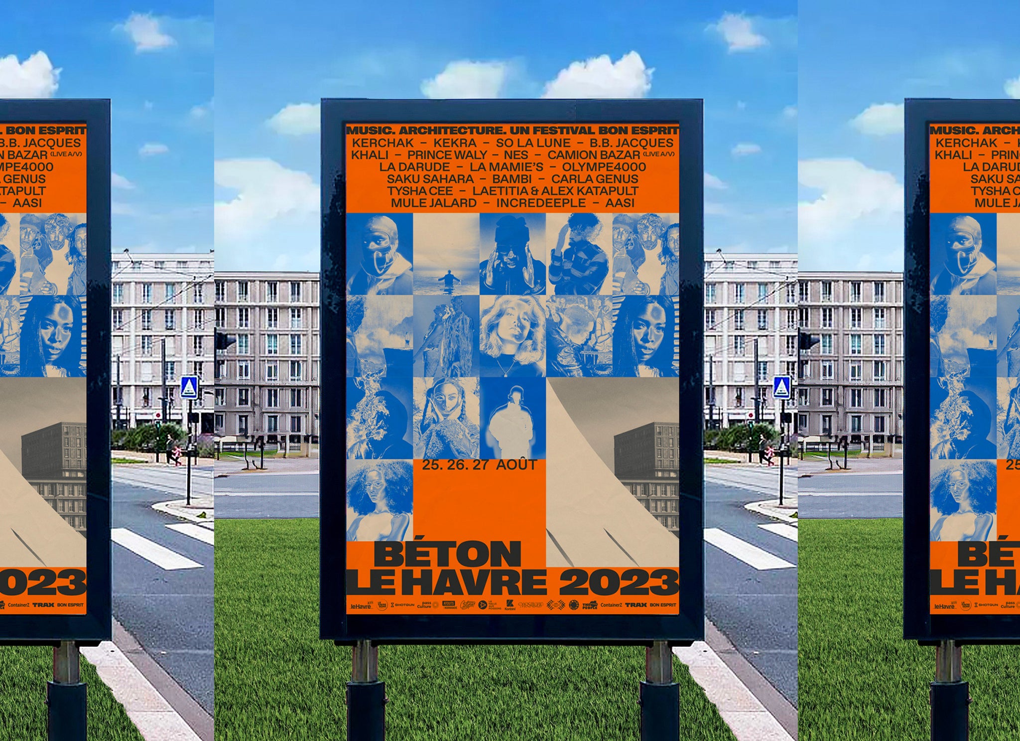
One such example of Sometimes Always’ undefinable style is their identity for Béton, Le Havre’s pop music festival. “The idea behind the Béton work was to explore a rigid grid that emphasises the brutal landscape of Le Havre,” he describes, referencing the French city’s famous use of orthogonal urban planning – that being the block-like layout of right-angled city streets – as well as its patterned facades. “Le Havre went through a long process of revitalisation after the WW2 bombing,” Gabriel contextualises, “hosting a mix of modern urbanism and brutalist architecture,” notably Volcano by Oscar Niemeyer and the apartment blocks and St. Joseph church by Auguste Perret. Alongside Béton’s brutal, rigorous structure – and the ecstatic contrast it creates with the festival’s vibrant colour palette – is the striking inclusion of Right Grotesk as the primary typeface, something we’re particular fans of here at Pangram Pangram. “From an intuitive perspective, the chunkiness and curves of Right Grotesk in its black weights were perfect to evoke the brutality of Le Havre’s modernist landscape,” Gabriel suggests, adding, “I love the round bits of some characters and how we managed to make the ligature of E+T and L+E.”


With one eye on what’s to come, Gabriel is positive about the year ahead, driven to deploy more energy into print and publishing, beginning with Dolce Stil Criollo’s next issue and supplementary monograph poetry books. “We want to go back to having stands in art book fairs, something that we did in the past but haven’t done since the pandemic,” Gabriel notes, something that the studio will have to find time for around their already busy professional schedule – working on projects spanning NYC, Berlin and Taipei. “Finally, we designed the cover for the next record of the label Lugar Alto that will be released in March,” he details, “which I’m really looking forward to, as the artist behind the album is one of the most ingenious producers of Brazilian history…”
Oh, one other thing. Our favourite thing to do on the Pangram Paper is to ask our interviewees what question they wish we asked, and our chat with Gabriel is no different. However, we believe his wonderful answer is best left unedited, and surely we must conclude this piece in a manner most Sometimes Always:
“Do you think Brazilian food is underrated or even unknown to gringos? Yes! Brazilian food is amazingly good and there is much more to it than Feijoada. Every state in Brazil (there are 26) has its own cuisine that is unique and different from the state just next door.”


