Berlin-based type and graphic designer Fabian Maier-Bode has carved out an interesting creative direction, having followed his visual communication degree with primarily editorial pursuits, including internships with the likes of Süddeutsche Zeitung Magazine, having found a passion for printed matter and typography.
After two years, Fabian shifted gears, turning towards digital design and branding, working primarily with the cultural sector, before making a (very successful) go of it as a freelancer designer where he honed his current creative passion: AKA all of the above.
Merging branding, digital design, print and type design, Fabian is quite a dab hand at diverse creative expression, allowing each discipline to inform the other, with his typographic know-how leading the charge. “I’d say that typography is the most important ingredient in my creative thinking,” Fabian tells us, “no matter if I work analogue or digital,” or the cultural or commercial context of the projects. “I always start thinking about the power of the written word and the visual world it’s embedded in,” he notes, an approach that seems somewhat more tactile than the musical inspiration behind it. “I gain a lot of inspiration from the vibe a certain sound gives me,” Fabian continues, similarly motivated by playing sport. “The moments when you’re able to switch off your design-brain completely are super rare and important to me,” he adds, noting their intangible influence. In a more physical sense, however, Fabian is often drawn to old things, such as old vinyl, books, street signage, shop-fronts and movie posters. “I guess digging up the past is a huge influence on my work as a designer,” he adds, “all the good things have already been made, it’s about shaking them up.”
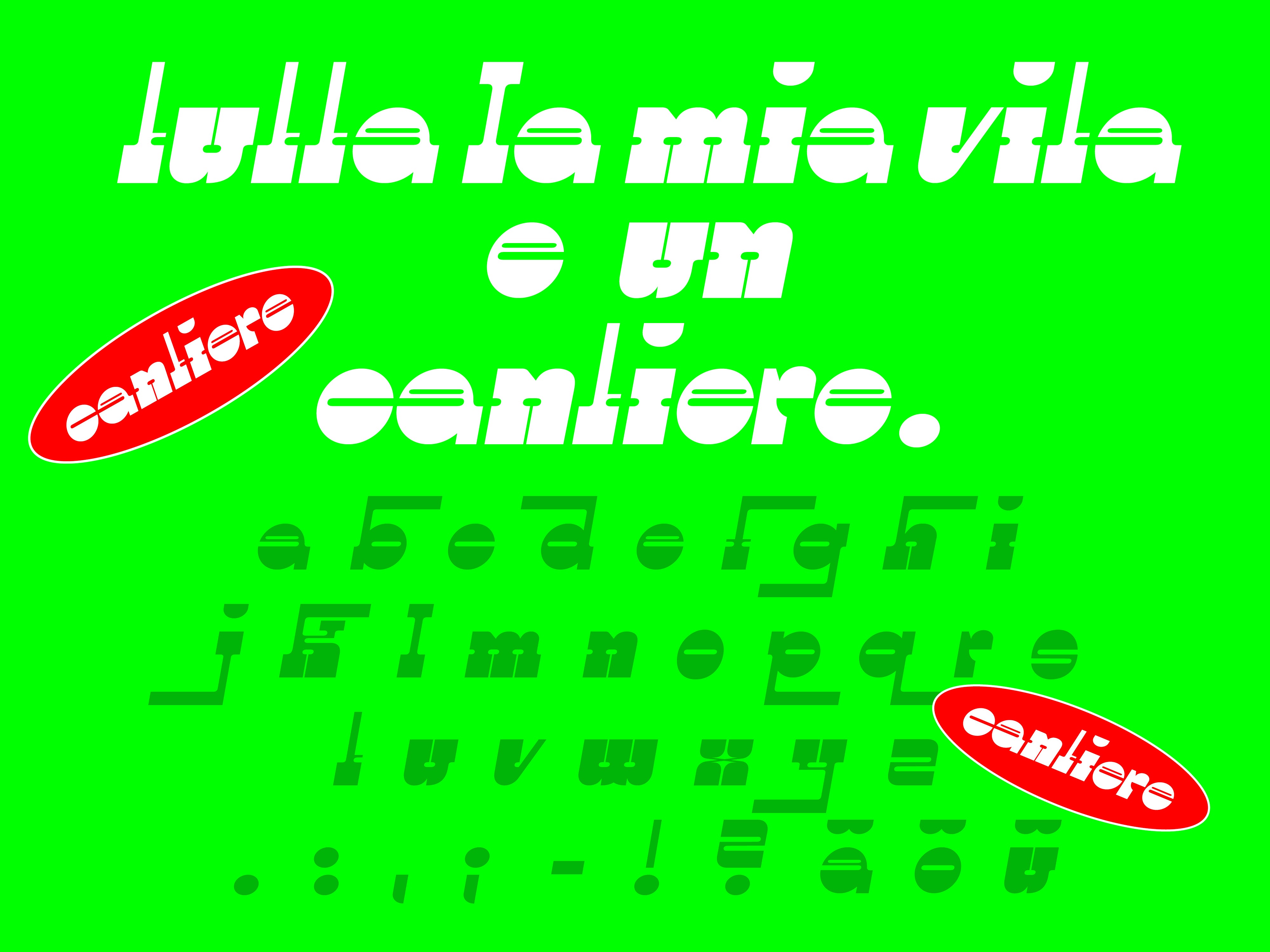

Interestingly, the nature of Fabian’s binary inspirations, whereby intangible tones and physical ephemera have equal weight, mirror not only the analogue-come-digital structure of his practice but also denote the context of his typefaces – innately crafted for page and screen. Discussing the specific starting points of such creations, Fabian recalls, “most of the time existing typographic treasures trigger something in me,” often experimenting with existing shapes. “This process generates new thinking or typographic concepts,” he continues, expressing his interest in translating analogue lettering to digital-ready display typefaces. Besides historical references, Fabian is also a great believer in coincidence. “Sometimes a single shape I sketched or created by accident can be the basis for a complete typeface,” he suggests, providing his display typeface Sissi as a prime example.


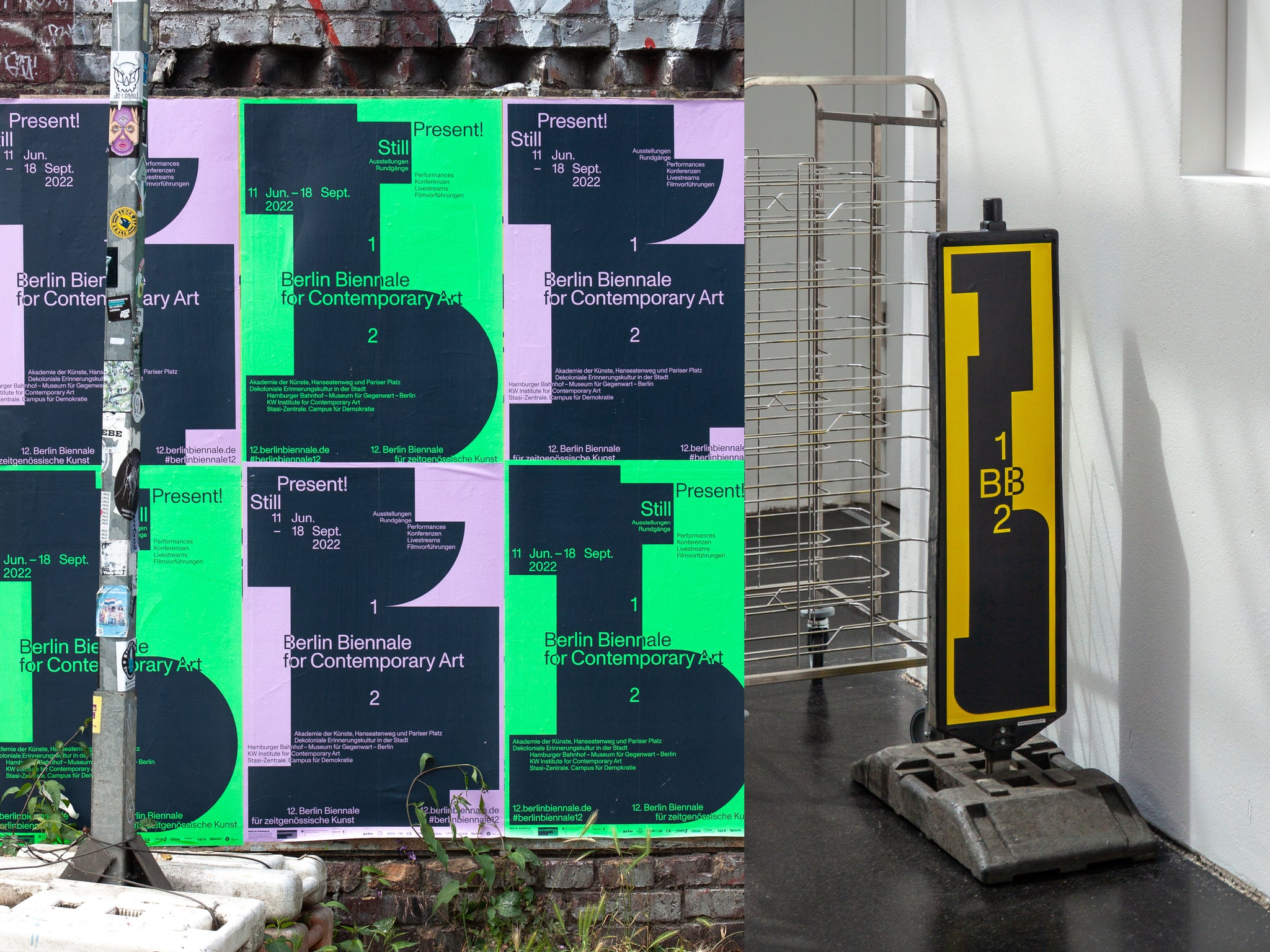
This interest and energy are also overtly evident in the graphic design arm of Fabian’s practice, an embraced return to his creative roots. “I try to bring both together more and more!” Fabian tells us, “and it makes me happy to see that there are more and more opportunities where I get the chance to,” recalling the continued, eternal relevance of type choices and design within branding and editorial. “No matter how (sur)real images will get, how immersive digital spaces will be,” he suggests, “the choice for a typeface or some significant letters is always a powerful way for a unique selling proposition.” One such project of Fabian’s that exhibits the aesthetic and practical balance between type and form is his collaborative visual identity for the 12th Berlin Biennale for Contemporary Art. Designed with Martin Wecke, the duo opted for Dinamo’s Monument Grotesk and Bradford LL by Linteto as their primary and supporting typefaces. “Although this isn’t the most unseen combination of typefaces, it worked wonderfully,” Fabian explains, “when you have to adapt it onto so many applications, the typographic framework needs to be a workhorse itself.” This rigid typographic structure was then paired with a set of 12 abstract shapes, uniquely arranged through digital or printed brand spaces. “They can be decoded as the letter ‘b’, as floor plans, sculptures and a lot more,” he proposes, “it is very interesting when letters turn into images.”


Despite the often abstract expression throughout Fabian typefaces, they have a solid, pragmatic grounding. “I guess that isn’t something I’m explicitly aiming for,” he remarks, more interested in the spontaneity and poetry of mistakes, ideas and intentions, as well as his current research. “When I stumbled upon Edda by Ralph M. Unger, for example,” Fabian suggests, “I was clearly obsessed with this art nouveau decorative, playful vibes,” whilst more geometrically-inspired or modular typefaces seem to come from elementary, practical ideas. “Simple and radical concepts is something I also really have a thing for,” Fabian states, relating this passion again to music. “I really can find treasure in any kinda genre (maybe except modern ‘Schlager’),” he explains, “I’ve got love for any kind of typographic species.”


Here, we again see the intrinsic, instinctual nature of Fabian’s practice – one that imbues potential and interest within each and every letterform or the shape of a random scribble. “Sometimes I fall in love with it and push it further and develop a complete display font out of it,” he reveals, considering himself a constant student of type design rather than a type designer. “No trend seeking, nothing based on needs of other designers,” he adds, “maybe this will change at some point, who knows.” A recent example of Fabian’s constantly-evolving/improving/learning/maturing practice is CC GIGER, a display typeface conceived, developed and designed together with his friend and collaborator André van Rueth.
“The starting point was an old specimen of Edda by Ralph M. Unger,” Fabian tells us, “from there we had some sessions where we experimented with its fundamental DNA,” introducing structural changes to the skeleton, shapes and serifs. “It was pretty much gut-driven work at the beginning,” he recalls, “and at some point, we had the feeling we found a very significant defining feature – the snake-like serifs,” allowing this typographic element to inform the grounding architecture of the letterforms. “From there on the game plan was pretty clear,” Fabian adds, explaining his fondness for collaboration that CC GIGER is emblematic of. “I love to collaborate with other talented people because that’s the best way to step your own game up,” he proposes. “We both like CC GIGER very much, because of the fact that it definitely taps into the zeitgeist but brings in a lot of its own character,” Fabian concludes, “it’s a beautiful monster.”


