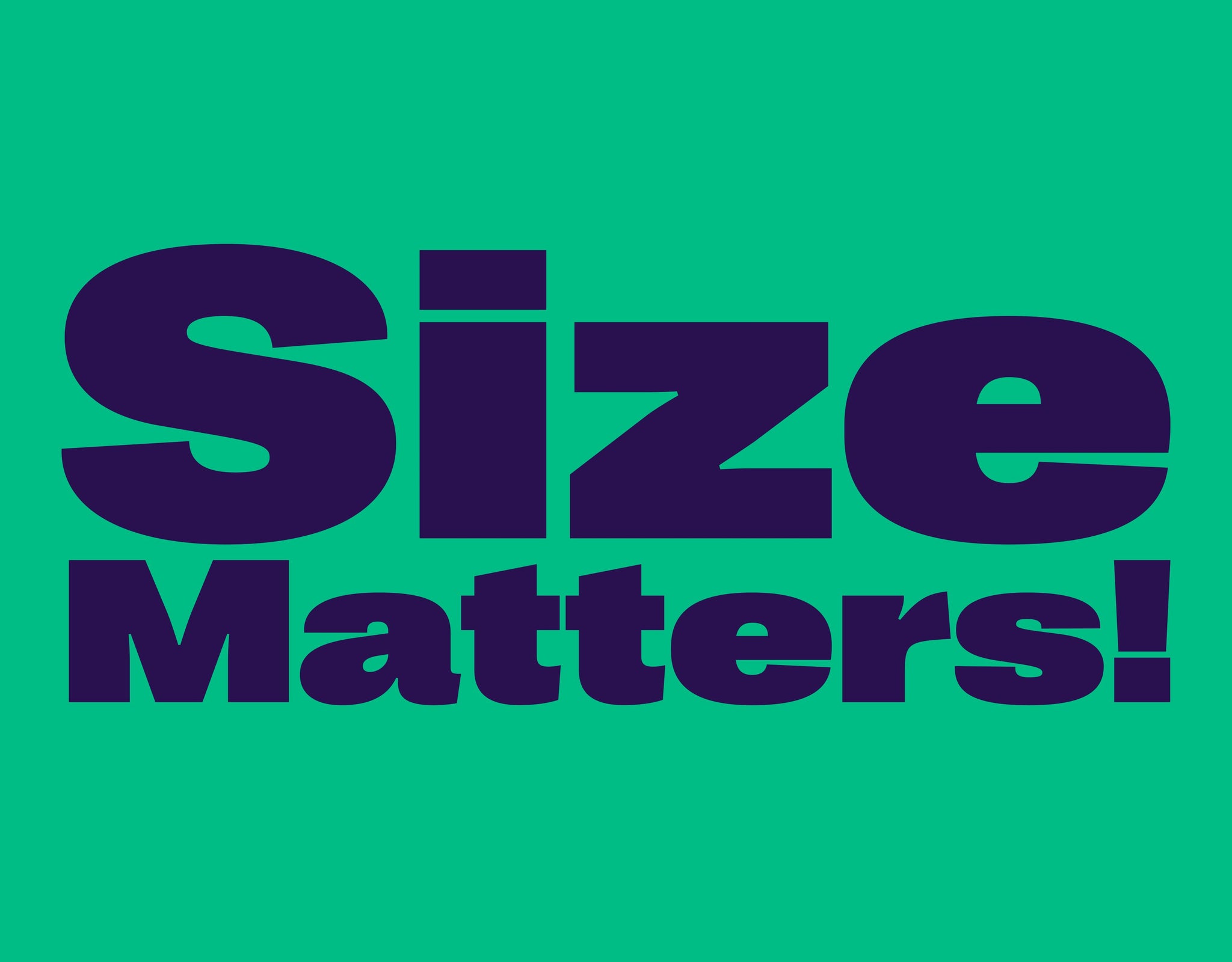
Sometimes big things require big type. And that’s where extended typefaces truly come into play. As you may have noticed, IRL, the type style has increased in popularity over recent years, especially in advertising and campaigns where the sizable impact they offer can be properly taken advantage of.
But what exactly are extended typefaces, I hear you ask? Well, to some extent, they are precisely what they say on the tin: typefaces that are extended. However, the artistry, technicality and rigour behind them is a little more complicated than it seems. Extended typefaces aren’t just stretched regular fonts… or at least, the good ones aren’t! They factor in optical alignment, the relationship between upper and lower case, their proportions to ascenders, descenders and punctuation, their weight, their contrast and so on. It’s fair to say, there is a lot to it.
That being said, after all the hard work and graft of type designers, there are some truly beautiful typefaces; ones that combine typographic history with contemporary technology to make something entirely new. And, in some cases, make modern-day classics – just like the ones we have for you today.
Neue World Extended by Pangram Pangram
With 48 cuts over six widths, Neue World is already a brilliant beast to begin with. Its extended styles, however, are in a whole new world of their own! Inspired by analogue, vintage lettering, Neue World’s utterly elegant, refined features and soft curvaceous letterforms are often unseen in the extended typeface category, meaning any in-use application is sure to turn heads. Not to mention its enormity of weights. Big, bold and beautiful for sure. With many extended typefaces feeling big and chunky and sans serif-like, the delicate serifs and elegant forms of Neue World extend (yes, that’s intentional) all the way through to its extended styles, bringing class, intrigue and impact to your next brand, book or website.

Agrandir Grand by Pangram Pangram
Self-described as ‘a brave antipode to neutral modernist fonts’, Agrandir is a perfectly imperfect font, thriving within the eccentricities and quirks of its innately welcoming, human design. This embracing nature is no more extraordinarily embodied across its gigantic 74-font family (with seven weights, five widths, corresponding italics and four text styles) than in its ‘Grand’ style, the tight spacing an electric extended design which makes for an unapologetically brazen and striking font. It’s also phenomenally hard-working, with countless alternatives, OpenType stylistic sets and variable tech, making it a truthfully modern typeface for today’s tasks and trials. So if you’re in need of an extended typeface, with a beautifully condensed counterpart, look no further.

Right Grotesk Spatial by Pangram Pangram
With an equally refined and rigorous text style to compliment its made-for-display sister, Right Grotesk Spatial is your dependable, memorable workhorse font – championing practicality and personality in equal measure. Having a display and text version allows for perfect optical spacing and sizing, whether you want to use Right Grotesk Spatial as a headline, or in the most detailed body copy — allowing the two to sit harmoniously in any design. Designed to be just Right in all situations. In its extended Spatial style, its fine features are not lost but accentuated, showing off its unconventional anatomy, versatility and smooooooth curves, befitted with all the makings of a typeface that will work hard, but isn’t afraid to stand out and lead your designs.

GT America by Grilli Type
Released in 2016, Grilli Type’s GT America has shown the longevity extended typefaces can offer, demonstrating how they can become classics based on their craft and consideration, which certainly is the case here. With 84 styles across the family, GT America’s extended cut allows the typeface’s 19th-century-American-Gothics-meets-20th-century-European vibe to flourish, prioritising functionality and meticulous detailing above all else. With many other styles in its arsenal, designer’s can be sure to utilise this flexibility beautifully within their designs.

Surt Rounded Extended by Blaze Type
Strong and circular, Blaze Type’s Norse-inspired release Surt Rounded is a wonderful embodiment of conceptual contrast, with its soft rounded design butting heads with the grit of its construction – a juxtaposition resulting from its fascinating inspirations. Following their research and adoration of cool Scandinavian Architecture and Norse Mythology during the design process, Surt’s subsequent geometric form is both dramatic and accessible, especially in its extended form. Forget mid-century modernism; mythology is where it’s at! Whilst you might expect extended typefaces to lean into heaviness and blockiness, the rounded nature of this typeface couldn’t be further from that assumption, bringing a friendliness to the world of the extended.

Monument Extended by Pangram Pangram
And to round off this article, we bring you a fan favourite — and it’s a favourite for a reason. Monument Extended brings an extensive range of weights, providing your designs excellent versatility, able to create tonal flex within just one typeface. From Thin all the way through to Heavy, with italics to match, Monument’s expansive nature extends far beyond its genre, with this all wrapped up in a variable font file. Its brutal forms allow you to instil your designs with crystal clear clarity, alongside intentional and underlying personality quirks. Instilled with alternates that provide yet more flexibility for your projects, the typeface includes a single and double storey a and g, as well as flattened top and bottom alternates to the V, W and A that allow for this single typeface to be stripped back or shine through its true construction.


