As long as there has been type – and there’s been space – there has been a need to cram lots of type into as little space as possible.
Type has been expressing itself in condensed forms from the get-go, with 19th Century letterpress technology advancing the development of the typographic genre considerably, getting ever more precise and intricate. Now widely embraced in digital and printed spaces, there are tremendous benefits to the type scene’s slimmest counterparts, most notably that of saving space.
From movie posters and newspaper headlines to website footers and editorial explorations, the narrow construction of condensed typefaces makes them efficient and accessible, accommodating significant amounts of info comparatively to standard type. However, it’s not just a practical thing – the aesthetic impact of condensed typefaces can be similarly remarkable, culminating in striking and versatile graphic spaces – be it big brands or bold books, they can draw the attention they desire or functionally service the hierarchy in play.
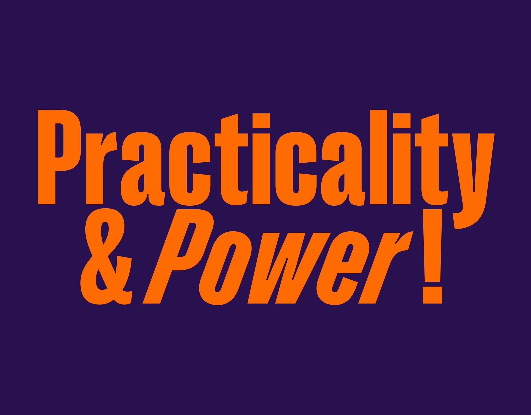
Condensed typefaces are a fantastic type style with a rich legacy behind them – both practical and powerful. We’ve collated some of the best condensed typefaces for you. From slab serifs, to grotesks and flourishing display typefaces, these 6 are sure to give you something to play with in your designs. Enjoy!
Négligé by Off Type
As one of Off Type’s maiden releases, Négligé has all the makings of a fan-favourite, with its sophisticated, subtle, stylish and, notably, condensed form mysteriously challenging the eccentricity typefaces can offer. With over ten weights to choose from and a flourishing stencil cut, its fluidity is only matched by its functionality, befitted with numerous equally-elegant alternatives, swash capitals and striking, plunging ligatures. With Off Type Foundry’s vision being to create beautifully off-beat fonts that are really really well made, so that wherever you use them, they’ll work as hard as they look wonderfully weird, Négligé truly leans into this proposition. It’s free to try as well, which is nice.


Right Slab Tight by Pangram Pangram
Described as the ‘big boi’ of the remarkable Right family, Right Slab emits giant vibes, but its Tight style offers something a little different. Both sizable and slim, Right Slab’s condensed cut exudes the brazen, welcoming energy of its wider counterparts with a slender cinematic edge, flexible at its core and comfortable at any scale – primed for both body and title text. Purely and unapologetically a hefty fella. And if the Tight version of Right Slab is too narrow or too wide for you, don’t fret, its condensed styles comes in widths ranging from a very skinny Tall through to more laidback Compact family. A true scene-stealer.


Founders Grotesk Condensed by Klim
Klim Foundry’s Founders Grotesk has garnered semi-cult status, drawing on infamous historical references – from Caslon’s Doric to Helvetica – to create something entirely new, inspired by the best of Grotesk typography’s last one hundred years of history. Its condensed cut is no different, combining together legacy and legibility in the pursuit of typographic modernity. And we’re here for it! Good looking, hard-working and history? Sign us up!


Right Grotesk Tight by Pangram Pangram
Another member of the giant Right family, Right Grotesk embodies a powerful partnership between neutrality, functionality and form – blending meticulous fine details with the unrivalled accessible character it’s become renowned for. Its grotesk structure shines through and provides ultimate practicality, but with a few little quirks included, Right Grotesk has something a little more unique that other grotesks out there. With over 14 styles to choose from as well, its distinctive charisma is evident across the entirety of its cuts, no matter the size, scale or output. Proudly neither trendy nor timeless. Content in its creation. Primed for stardom or support.


Pangram Sans Rounded Condensed by Pangram Pangram
A studio favourite, Pangram Sans Rounded not only has the best smiley face glyph going, but is one of the most interesting condensed fonts around, unrivalled in its playful and pragmatic energy. Whilst you often see big, chunky, square-like forms in condensed typefaces, this rounded typeface provides a different angle on the genre, being sure to make your designs stand out. As expansive, extensive and hard-working as both its non-condensed form and its non-rounded companion, Pangram Sans, you’d be hard pushed to find a typeface as approachable as Pangram Sans Rounded, ready to enliven each and every application it graces!


TeX Grye by Open Foundry
With a fascinating history, the condensed sans serif TeX Grye, released by Open Foundry and designed by Boguslaw Jackowski and Janusz Nowacki, was originally based on URW++ Design and Development Inc’s 1999 hit URW Nimbus Sans – which itself was inspired by Helvetica. Evidential of its typographic inspiration, TeX Grye’s eight-style family not only ticks all the condensed typeface boxes but carries with it the lineage of a fascinating era, one where the technology we accept now as standard was trialled and tested over thirty years ago. Bringing the utilitarianism and functionality of Helvetica’s core alongside the slight oddness and intrigue of the condensed versions of these forms, TeX Grye is an interesting addition to your typographic palette.


Neue Montreal Squeezed by Off Type
Now time for something a little different… Neue Montreal Squeezed might not be your typical condensed typeface buuuuuuuut, it is professionally pressed and trend-ready. Perfectly balancing weirdness with its hard working nature at its core. Taking the timeless classic Neue Montreal as its base, its squeezed version brings you all the off-beat beauty that Off Type promises, with all of the craft to back it up. It’s due to be released in the coming weeks, but if you’re desperate to get your hands on some freshly squeezed typographic goodness, the typeface is available now as a beta in Off Type’s Off Set font collection!


