The price of fonts can lead you down a sad and confusing path. Whether it’s tricky clients who just don’t want to pay up, a lack of trial fonts to test in your designs, or you’re just genuinely confused about what you have to pay, it’s no wonder creatives often turn to free fonts!
Sadly, this means that the same few free fonts are continually reused again and again (and again) by designers and brands, which can be, quite frankly, a massive downer and just plain dull. One of the most extensive archives comes at the hands of Adobe Fonts, whose monopoly on the creative industry seems to know no bounds. And that’s why we’re here to help with Pangram Pangram’s alternatives to Adobe Fonts.
Now, we’re not here to be snobby and shun free fonts – the topic is big and complicated, and they certainly have their place. The downside of free fonts, however, is their overuse, creating samey, stale graphic design and branding projects. Which is, to be completely honest, something we don’t stand for here at Pangram Pangram! That is where we come in; below, we’ve curated a list of five alternatives to Adobe Fonts that you might see a little too often, offering some inspiration from Pangram’s free-to-try and excellent-value-to-buy options.
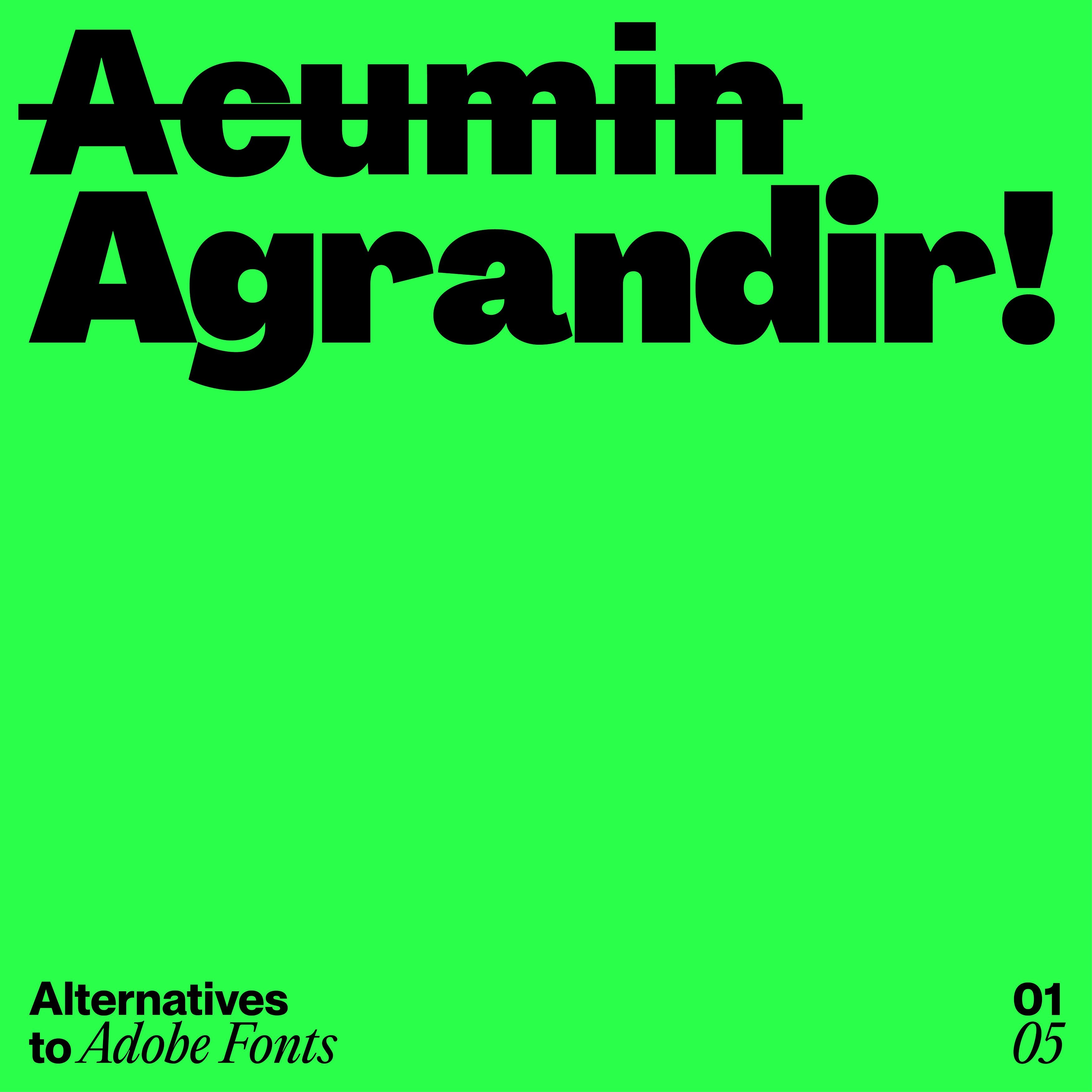
AGRANDIR > ACUMIN
Now, Acumin is a solid sans serif, with an acutely versatile balance of neo-grotesque rationality; however, it’s no Agrandir! Crafted as ‘a brave antipode to neutral modernist fonts,’ Agrandir is comprehensive to the max, offering a family of 74 fonts over seven weights, five widths, italics and four text styles – not to mention a three-axes variable font file to boot. So there really is nothing it can’t handle, from tiny text to heavy headlines; Agrandir’s got your back.

EDITORIAL NEW > PLANTIN
Whilst Plantin is an undisputed classic, offering an elegance and innate history, Editorial New brings a contemporary pizzazz that Plantin’s more economic features simply can’t while remaining equally accessible and legible. A true workhorse serif, Editorial New’s sense of nostalgia and ultimate precision makes it ideal for both long-form editorial content and grand eye-catching campaigns, giving any project a unique style and flair.


NEUE MONTREAL > NEUE HAAS GROTESK
You can’t deny Neue Haas Grotesk is an absolute banger, with a very interesting history, due to its letterforms originating from Helvetica’s original sketches. However, with this legacy comes the fact that both the typeface and its influence have almost become parodies of themselves, seen as the cliche standard typeface for graphic designers. That’s why, if you’re still looking for incredible versatility, neutrality and timeless style, Neue Montreal is the way to go. With seven weights, corresponding italics, and Cyrillic support, Neue Montreal will undoubtedly be your new grotesque go-to.


WRITER > MINION
Now, we’re all used to seeing Minion (especially as it’s Adobe Software’s default), and it certainly has plenty of perks due to its classic late Renaissance styling and high legibility. Using it, however, comes at the risk of your design looking boilerplate, unlike Writer, which is far from ordinary. Elegant and dynamic, this French Renaissance-inspired workhorse serif is dutifully harmonised between playful and practical worlds, offering 27 weights over three distinct cuts, with over 744 glyphs, alternates and ornaments in each weight. If you want something classic and hard-working, Writer is the workhorse for you.


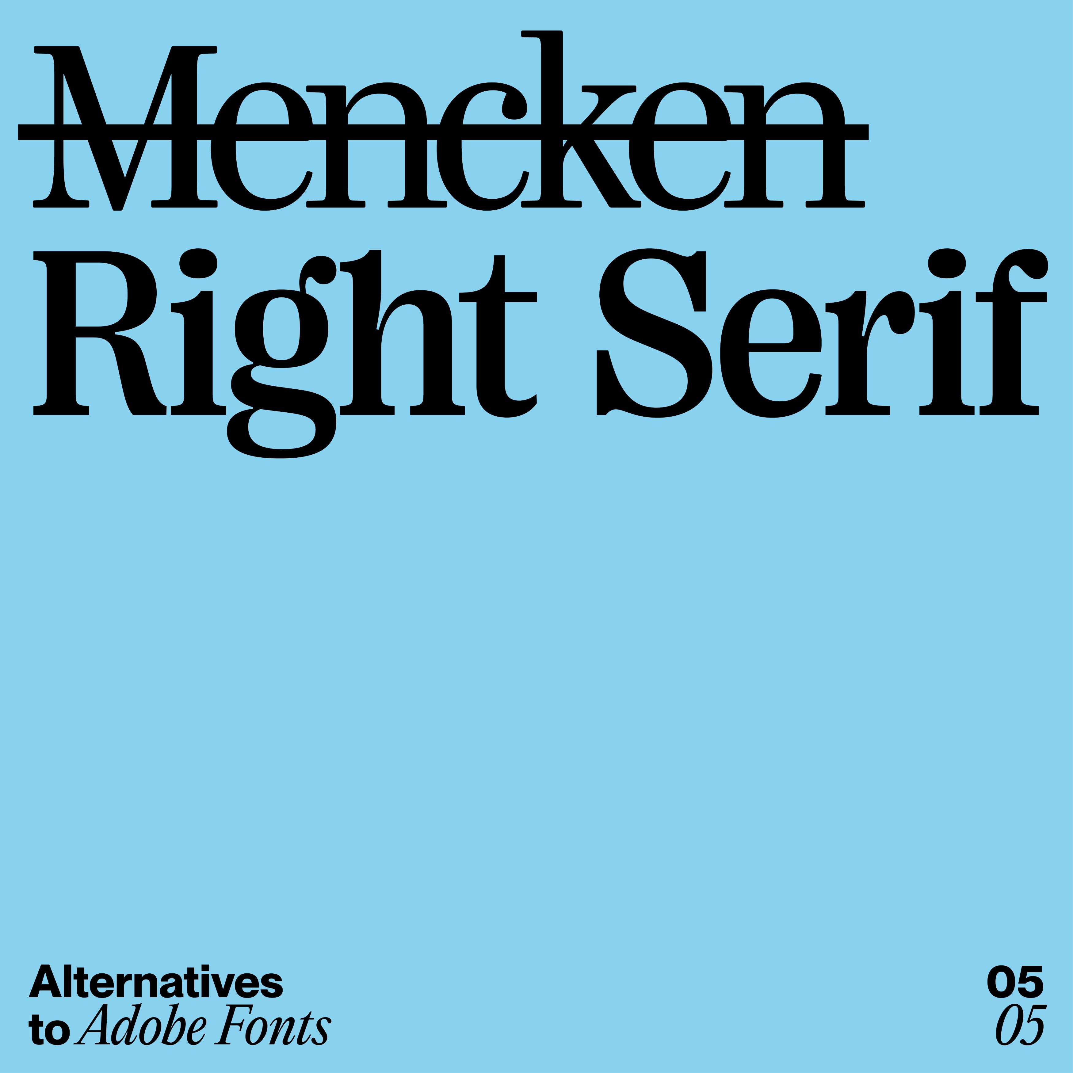
RIGHT SERIF > MENCKEN
Although Mencken has a big ol’ family of low-contrast transitional fonts designed in a contemporary Didot style, it simply doesn’t compare to Right Serif’s mix of multi-functionality and personality, exhibiting a moderate contrast rare in serif typefaces over its seven weights, seven styles and seven widths. At the end of the day, Right Serif is a wholly unique ‘funky multitool’ that is confidently unapologetic of its prolific, expert offering, large x-height and variable prowess. Once you go Right, you never go back. !