This article will delve deeper into the font choices of the 32 different national soccer teams. The research for this article led me to discover that not a lot of countries actually took the time to properly select (or create) a unique and efficient typeface for their soccer kits and that actually most of them just went with the brand's pre-selected font.
This article will delve deeper into the font choices of the 32 different national soccer teams. The research for this article led me to discover that not a lot of countries actually took the time to properly select (or create) a unique and efficient typeface for their soccer kits and that actually most of them just went with the brand's pre-selected font.
In a world where brands dictate these types of major events we see a clear correlation between the choice of fonts and their sponsors which is a bit sad for the design world.
The Nike Standard Font
For this installation of the World Cup, Nike went with what seems to be a slightly condensed geometric that feels a bit like Futura or Avant Garde. A lot of teams are using this standard font for their kits — Australia, Croatia, France, Poland, Saudi Arabia & South Korea.

I feel this font gets the job done. It's legible and graphic enough to go with the cut and fit of the kit's material but it might come off as a bit blend or without personality. Australia for example, might have gone with a funkier font to match the graphic on the sleeves.
The Adidas Standard Font
Even more football teams (12 of the 32 competing for the world cup) decided to go with the adidas standard font. A super square geometric font which reminds me of the widely popular pixel fonts back in the early to mid 2000s.

The font works well for the numbers maybe except the 1 that has a longer horizontal which makes it potentially confusable with the 7. They are easy to read even at great distances but I feel the font falls short where the rest of the alphabet comes into play. As you can see from the images below, some of the letters' shape are really similar and can become hard to read from far especially the B, K and R.

The best example (and already viral) is the name of German player Draxler. The A and the R are so similar that's it's almost impossible to differentiate the two. The D can also be mistaken for an O. What do you read at first glance? This makes it a very poor typeface choice by those teams.

The Puma Standard Font
Puma is the sponsor for 4 world cup teams Senegal, Serbia, Switzerland and Uruguay and they too have a standard fonts that those teams decided to use. The font is a bit peculiar but I feel it works. The numbers are legible but at the same time they have this playfulness to them. They kept the letters clean with no fuss to make sure every name printed would come out readable.

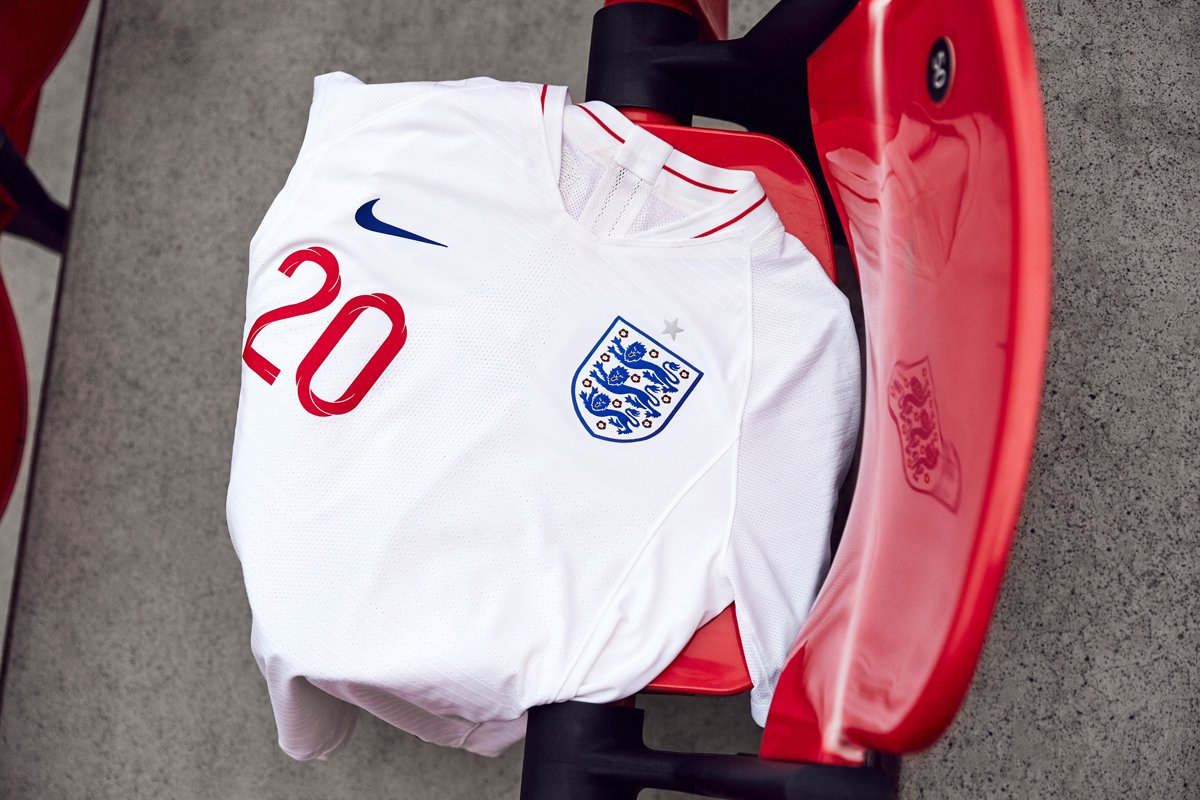
The England Font
One of the biggest football nation in the world, England, went with a beautifully designed custom typeface by designer Craig Ward. He says the type was modeled in 3D to feature the St George's cross and create a dynamic, twisting design which features inline, outline and fill weights along with a complementary numeral for use at larger sizes.

The font is unique and beautifully made. It stands out and completes the kit very well. As a designer, I feel every football team should have taken the time to create a custom typeface. The attention to details makes such a difference especially in an event that's viewed by this many people.

Other Notable Fonts
Nigeria as obviously the best kit design. It sold out really quick when it actually came out! The pattern they used feels inspired and rooted in African culture. The font is simple but has some key details that complements the kit really well.

Another notable kit design and font selection is Peru. It's the only team that went with a bold print: a red diagonal stroke across the shirt. The font is super bold as well. Personally, I think it's a bit too much of everything going on but it's definitely different and unique.

Hope you enjoyed this bit of crossover between design and sport.
What would these kits look like with one of our free fonts? Download them and give it a try! Send us the result and we'll post it on our instagram.
Thank you so much for reading!


