Soft and surreal, Bandit Design Group’s look for One Daydream takes the brand to an otherworldly place.
Operating in Australia’s influencer marketing space, One Daydream (ODd) boasts a reputation built on authenticity and genuine opportunities – a refreshing approach in an industry sometimes criticised for surface-level superficiality.
When it came to crafting their visual identity, Sydney-based brand experience studio Bandit Design Group took this distinctive positioning and ran with it, to realms beyond our imagination. “We used the brand name, ‘One Daydream,’ as creative permission to dream bigger and bolder,” explains Alanna V Walsh, Associate Creative Director & Senior Designer, resulting in a mesmerising celebration of contrasts.
Founded by Pru Corrigan, an early player in this field of marketing, ODd maintains “traditional” values while operating in the digital age. “She’s got long-standing connections, industry respect and deep-rooted values, and she shares that with the dream team to give them an edge in this digital world,” Walsh explains. As such, the design direction embodies ODd’s ethos of combining old-school values with a new-age digital presence.


The wordmark is a mix-and-match blend of typefaces – including PP Mondwest, Playfair Display, and Public Sans – with custom pixel characters that extend throughout all the assets. “The logo is very much customised to enable all the characters to work in synergy,” says Walsh about the team’s effort to create a perfect balance of scale, spacing and hierarchy. “Three of the pixel characters are custom built so that they could have equal sized pixels at all differing scales.”
This diversity in letterforms was intentional, mirroring the variety of talent ODd represents. As Walsh notes, “Each character has its own unique flavour, much like the talent at One Daydream.” The broader visual language employs OT Brut for its “brutal, bold, against the grain demeanour,” supported by PP Mondwest and Public Sans.


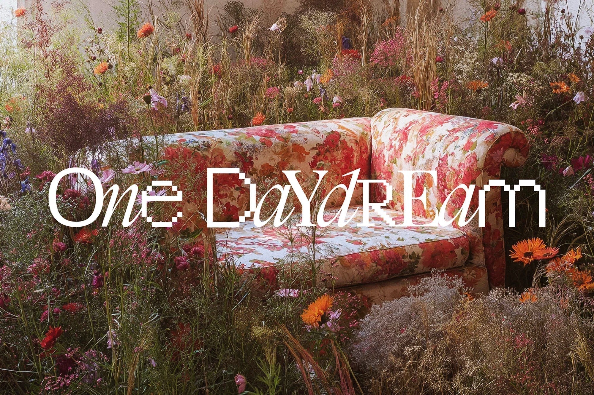
And how could we ignore the daydream-pink hero colour? Echoing the feminine energy of the team, “it felt like the perfect colour to play into and advance their narrative and point of difference,” says Walsh. This colour is amplified throughout the identity with AI-generated imagery, depicting dreamy scenes – a candy-floss-esque cloud and a pink patterned sofa among wildflowers. The decision to utilise AI was initially to support the verbal identity, but owing to budget constraints, evolved into a key component of the brand’s visual storytelling. Enamoured with the results of the initial tests, One Daydream encouraged the studio to explore imagery that could complement their existing talent imagery.


“They truly allowed us to play, dream big and go a little wild (much like they do with their talent). What has transpired is a brand that truly resonates with its story, purpose and competitive advantage, and we are so grateful to them for trusting us to take this brand to otherworldly places,” Walsh concludes.

Featuring Mondwest and Brut from Off type.
All images © of their respective owners.
Content taken from Bandit Design Group