Founded in 1670, The Bay is Canada’s oldest brand. Over the past 352 years, The Bay has gone through multiple changes and transformations to adapt to an ever-evolving market.
In today’s retail environment, it can be challenging for a large retailer to foster the same emotional connection as smaller, direct-to-consumer brands, and even more difficult to combat the convenience offered by the Amazons of the world.
Transforming The Bay from a traditional brick and mortar retailer to a modern, digital-first lifestyle marketplace became the top priority in the retailer’s race to reconnect and create meaningful, lasting connections with new generations of consumers. It was time for a significant brand refresh, from the masterbrand to the loyalty program.A New Era For Canada’s Oldest Brand “We needed The Bay's iconic brand to reflect the transformation of our business and connect to a new generation of Canadians, all the while staying true to our heritage.
“We needed The Bay's iconic brand to reflect the transformation of our business and connect to a new generation of Canadians, all the while staying true to our heritage.”
Daniel Koppenol Vice President, Executive Creative Director

Our mission was to overhaul the brand guidelines and design system in order to re-introduce this legendary company to Canadians. This would primarily be measured by new Rewards loyalty member acquisitions and member engagement levels.
Our work began with The Bay’s new brand signature: “Live a Colourful Life.” This positioning was reinforced by the company’s diversified retail offer: hundreds of thousands of curated products across all categories, from fashion to kitchenware, homeware, electronics, etc. This overarching diversity became a strategic angle.
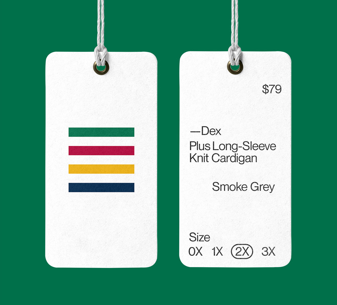
We celebrated everything Canadian, starting with our new brand font, created by a Montreal-based typographer. We created a flexible and elevated design system crafted for the speed and volume of retail, no matter the message or the medium. And, to embrace the retailer’s iconic status, we used The Bay’s stripes as a simplified brand signature and a visual endorsement on every piece of creative.


In terms of the loyalty program, The Bay Rewards, we created an ownable brand platform that felt like a natural extension of the master Bay brand. To signal proximity and loyalty, we zoomed into the four iconic colours, using full bleed red, green, blue and yellow visuals, taking the members as close as can be to the essence of The Bay. Also demonstrating the simplicity and customer-centricity of the new Rewards program with a design system that is minimalistic and reflects the new ease of becoming a member, earning points, and redeeming them for the things you love.

The Rewards rebrand also included a brand new The Bay Rewards Mastercard. We designed the card and were also mandated to create the launch and acquisition campaign. We extrapolated the new Rewards platform look and feel by creating colourful 3D universes showcasing again the sheer diversity of products at Hudson’s Bay. A new website was also designed by lg2.


Finally, after two years of successful collaboration, we were tasked to create the Spring-Summer 2022 campaign under the concept “Trends for every forecast.” By focusing on flexibility and diversity through our design system, imagery and tone of voice, we helped breathe new life into The Bay, re-establishing it as the ultimate Canadian lifestyle retailer.


All images © of their respective owners.
Content taken from Ig2


