Soto is an innovative, genderless, extroverted leather bag brand.
Their products are created from art-thought designs with excellent quality materials.


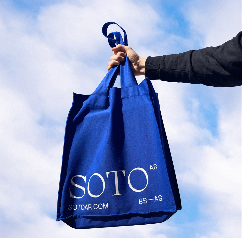
Our proposal was based on combining resources, with a perfect balance between classic and current trends. The logo was built from a serif font and the text from a Grotesk, living together in an organic way in the different layouts. We used the "Soto blue" as our black color to create a bounded but powerful color palette.


All images & texts © of their respective owners.
Content taken from Kinoto Studio

