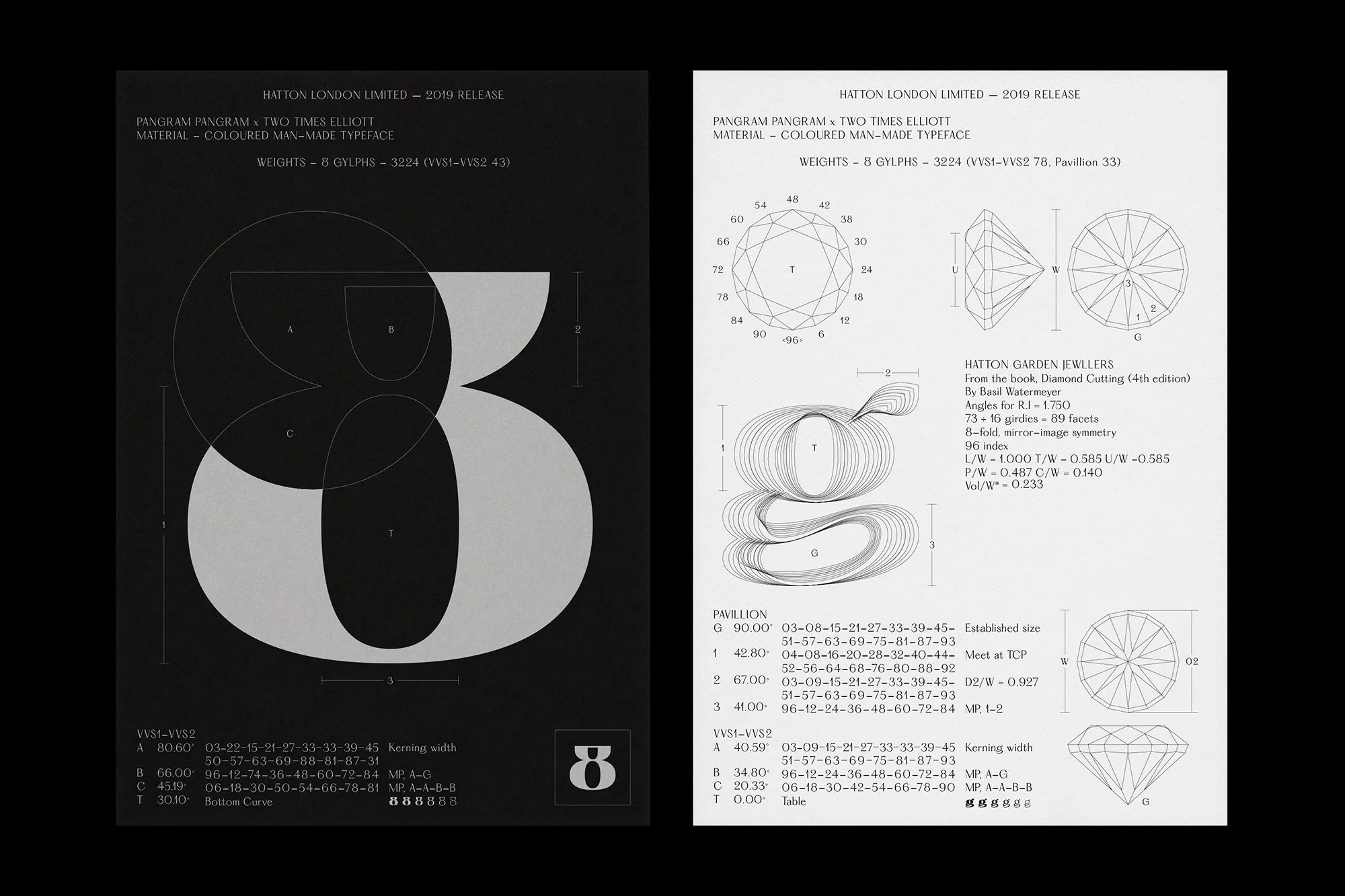
Two Times Elliott and Pangram Pangram create a typeface inspired by London's historic jewellery quarter.
Designed as a collaboration between London-based studio Two Times Elliott and Montreal-based type foundry Pangram Pangram, Hatton is a homage to the history of the London district, Hatton Garden. Nestled in the design studio’s former home of Clerkenwell, the district is famous for being London’s jewellery quarter and is at the heart of the diamond trade in the UK.


The studios worked together to create a typeface that reflects the character and nuances of local street signage, ghost signs, shop fronts and landmarks that are unique to the location, while also capturing the imperfection and hand-rendered quality of the found lettering.The result is an eclectic and idiosyncratic typeface with 3224 glyphs that comes in 8 weights, ranging from Ultralight to Black.


All images © of their respective owners.
Content taken from The Brand Identity


