Saint Urbain’s identity for NFT retailer Front of House encourages users to wine and dine online
Front of House is the internet’s one-stop-shop for ‘Off-Menu Digital Collectibles,’ from the best bars and restaurants everywhere. Created by restaurant lovers for restaurant lovers, the company collaborates with eateries to produce unique Non-Fungible-Tokens (NFTs) with the aim of creating immersive digital experiences whilst supporting the food industry.
Front of House (FOH) is the internet’s one-stop-shop for digital collectibles from the best bars and restaurants anywhere. Founded by food lovers, like Saint-Urbain’s creative director Alex Ostroff , FOH collaborates with food/bev operators to create one-of-a-kind NFTs designed to let their regulars’ wine and dine online and make the web3 space more digestible.
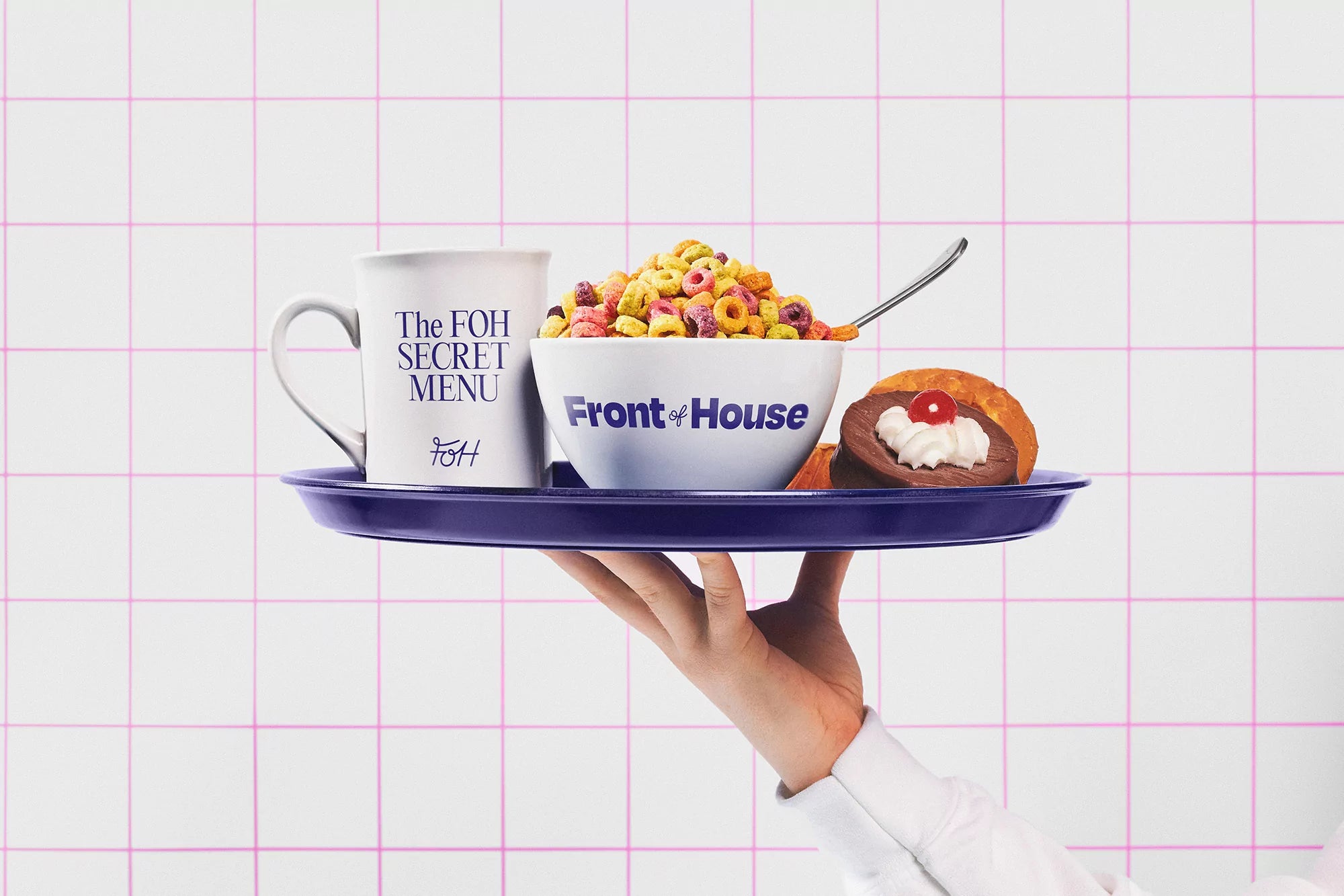
The visuals are a nostalgic wink to 90’s web experience, using vibrant RBG colors, friendly logos, animated grids, retro ad typography and bold collages of floating food. It is a whole digital experience, aiming to merge the inherent humor of food and weirdness of internet culture. Play with your food, while supporting restaurants!
The brand’s identity, created by New York and LA-based creative agency Saint Urbain, is a nostalgic wink to both food and internet culture, with inspiration ranging from foodie magazines and Lucky Peach, to kids’ TV shows and retro food advertisements.”


Saint Urbain’s Creative Director Alex Ostroff, and Co-founder of FoH, talks us through the creative process. Describing Front of House’s full logo, he explains that it “represents the link between web and food culture with a fun 90’s twist.” This link is expressed further through the playful choice of OH no Type Company’s Degular Black. “The funky, clean sans serif is friendly and digital,” Ostroff notes, “while the hand-drawn ‘of’ gives a wink to restaurant branding codes.” Ostroff’s aim is for FoH to be recognisable by its “style, humour and personality.”

The personable type choices extend throughout the visual language, with headlines set in Pangram Pangram’s Editorial New and supported by Luigi Gorlero’s Apfel Grotezk for the body copy. Bringing the identity together is a vibrant palette of colours alongside imagery of animated grids and bold collages of floating food.


Describing the initial launch, Ostroff tells us that Front of House will be “featuring some of the best restaurants in New York and LA,” however the aim, he adds, “is to become the #1 marketplace worldwide for restaurant/food-related digital collectables.” Ranging from photos and animations to unique artworks, Ostroff says that many of the collectables will feature some sort of exclusive benefit. “Perks like reservations at impossible to dine at places like Dame or limited collectable drops from Wildair, if you buy one of their Donut Friends,” he concludes.
All images © of their respective owners.
Content taken from Saint Urbain